68

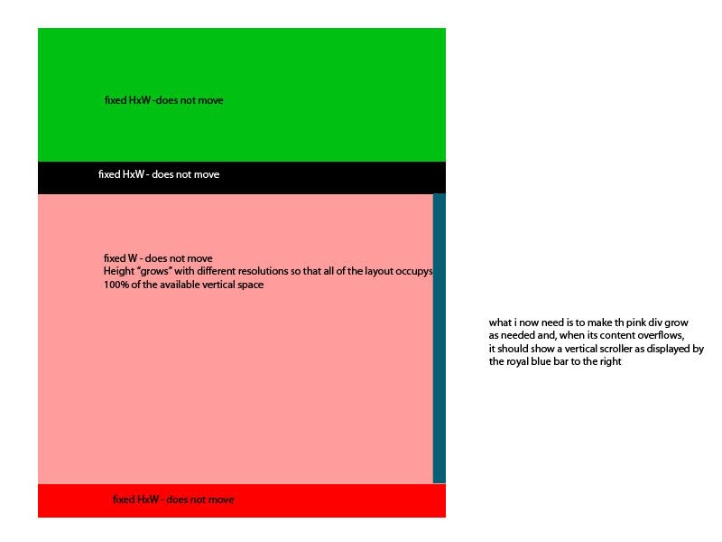
I'm trying to make a website with no vertical scrolling for a page, but i need that one of the DIVs i have to expand vertically to the bottom of the page (at most), and that when it has content that does not fit, the div should create a vertical scroller.

i already have the css for the inside of the div figured out in this fiddle, creating the scroller when needed. i also have figured out how to make the container div grow to occupy exactly the vertical space it has in the page. i just can't make them work out together!

please have in mind that in jsfiddle you won't be able to view the content of the whole website and in that sense what you get for the 2nd fiddle doesn't really show what's being done, but it works as i intended though.

just another note: as they are different fiddles, the id#container div in the 1st fiddle is he id#dcontent div of the 2nd example.

there is one other thing: for a type of content, this div will scroll vertically, but for other type of content, i want it to scroll horizontally, as it will have a product "slider" displaying elements horizontally inside this DIV.

please also look at this photo because it might be easier to understand what i'm trying to say: PICTURE

i tried looking to other questions regarding these topics, but none seemed to cover all of the aspects i'm trying to solve... :S

if there is something else i can provide to help you/me :) figuring it out, pls let me know!

thanks!

EDIT1: fixed typos

EDIT2: added picture for explanation

Joum
  • 3,189
  • 3
  • 33
  • 64

10 Answers10

63

I'm surprised no one's mentioned calc() yet.

I wasn't able to make-out your specific case from your fiddles, but I understand your problem: you want a height: 100% container that can still use overflow-y: auto.

This doesn't work out of the box because overflow requires some hard-coded size constraint to know when it ought to start handling overflow. So, if you went with height: 100px, it'd work as expected.

The good news is that calc() can help, but it's not as simple as height: 100%.

calc() lets you combine arbitrary units of measure.

So, for the situation you describe in the picture you include: picture of desired state

Since all the elements above and below the pink div are of a known height (let's say, 200px in total height), you can use calc to determine the height of ole pinky:

height: calc(100vh - 200px);

or, 'height is 100% of the view height minus 200px.'

Then, overflow-y: auto should work like a charm.

Brandon
  • 7,736
  • 9
  • 47
  • 72
20

Well, after long research, i found a workaround that does what i need: http://jsfiddle.net/CqB3d/25/

CSS:

body{
    margin: 0;
    padding: 0;
    border: 0;
    overflow: hidden;
    height: 100%; 
    max-height: 100%; 
}

#caixa{
    width: 800px;
    margin-left: auto;
    margin-right: auto;
}
#framecontentTop, #framecontentBottom{
    position: absolute; 
    top: 0;   
    width: 800px; 
    height: 100px; /*Height of top frame div*/
    overflow: hidden; /*Disable scrollbars. Set to "scroll" to enable*/
    background-color: navy;
    color: white; 
}

#framecontentBottom{
    top: auto;
    bottom: 0; 
    height: 110px; /*Height of bottom frame div*/
    overflow: hidden; /*Disable scrollbars. Set to "scroll" to enable*/
    background-color: navy;
    color: white;
}

#maincontent{
    position: fixed; 
    top: 100px; /*Set top value to HeightOfTopFrameDiv*/
    margin-left:auto;
    margin-right: auto;
    bottom: 110px; /*Set bottom value to HeightOfBottomFrameDiv*/
    overflow: auto; 
    background: #fff;
    width: 800px;
}

.innertube{
    margin: 15px; /*Margins for inner DIV inside each DIV (to provide padding)*/
}

* html body{ /*IE6 hack*/
    padding: 130px 0 110px 0; /*Set value to (HeightOfTopFrameDiv 0 HeightOfBottomFrameDiv 0)*/
}

* html #maincontent{ /*IE6 hack*/
    height: 100%; 
    width: 800px; 
}

HTML:

<div id="framecontentBottom">
    <div class="innertube">
        <h3>Sample text here</h3>
    </div>
</div>
<div id="maincontent">
    <div class="innertube">
    Lorem ipsum dolor sit amet, consectetur adipiscing elit. Sed scelerisque, ligula hendrerit euismod auctor, diam nunc sollicitudin nibh, id luctus eros nibh porta tellus. Phasellus sed suscipit dolor. Quisque at mi dolor, eu fermentum turpis. Nunc posuere venenatis est, in sagittis nulla consectetur eget... //much longer text...
    </div>
</div>

might not work with the horizontal thingy yet, but, it's a work in progress!

I basically dropped the "inception" boxes-inside-boxes-inside-boxes model and used fixed positioning with dynamic height and overflow properties.

Hope this might help whoever finds the question later!

EDIT: This is the final answer.

Massimiliano Kraus
  • 3,638
  • 5
  • 27
  • 47
Joum
  • 3,189
  • 3
  • 33
  • 64
13

Quick Answer with Main Points

Pretty much the same answer as the best chosen answer from @Joum, to quicken your quest of trying to achieve the answer to the posted question and save time from deciphering whats going on in the syntax --

Answer

Set position attribute to fixed, set the top and bottom attributes to your liking for the element or div that you want to have an "auto" size of in comparison to its parent element and then set overflow to hidden.

.YourClass && || #YourId{
   position:fixed;
   top:10px;
   bottom:10px;
   width:100%; //Do not forget width
   overflow-y:auto;
}

Wallah! This is all you need for your special element that you want to have a dynamic height according to screen size and or dynamic incoming content while maintaining the opportunity to scroll.

MattOlivos
  • 221
  • 2
  • 7
7

You can do this only with flexboxes and overflow property.

Even if parent height is computed too.

Please see this answer or JSFiddle for details.

N. Kudryavtsev
  • 3,556
  • 1
  • 26
  • 30
  • This is the best answer to this question. Thank you! – justadeveloper Dec 27 '22 at 11:30
  • Can confirm, best answer. – loot May 02 '23 at 21:22
  • This aproach always drives me to having the bottom of my scrollable flexbox out of the screen (when i have content above the scrollable container) – root Aug 18 '23 at 20:48
  • My current solution is giving my upper content a fixed % height and my scrollable flexbox the rest to fill up the 100% (ex parent flexbox height 100%, header div 10% and scrollable flexbox 90%). Note that the parent flexbox height is computed to 100% of it's own parent, which may be a fixed number or relative to the screen size. – root Aug 18 '23 at 20:59
3

Try this:
CSS:

#content {
  margin: 0 auto;
  border: 1px solid red;
  width:800px;
  position:absolute;
  bottom:0px;
  top:0px;
  overflow:auto
}

HTML:

<body>
<div id="content">
...content goes here...
</div>
<body>

If you don't like absolute positioning in this case, just can play with making a parent and child div to this one, both with position:relative.

EDIT: Below should work (I just put the css inline for the moment):

<div style="margin:0 auto; width:800px; height:100%; overflow:hidden">
<div style="border: 1px solid red; width:800px; position:absolute; bottom:0px; top:0px; overflow:auto">
...content goes here...
</div>
</div>
preahkumpii
  • 1,301
  • 4
  • 21
  • 36
  • this works fine with the *inside* of the div with the content and it does resize to ocuppy the vertical space available, but i doesn't *grow* inside the container as i need it to... btw, i'm trying out your edit.... the thing is that the parent div in your second code example is inside another container in my code... check the picture above for a clearer description... any more ideas? – Joum Apr 15 '12 at 15:31
  • yup... not working :S here's the fiddle with the outcome of your test: http://jsfiddle.net/CqB3d/ the red border div should stay overflowed between the black bars and display the vertical scroller. and if by chance the resolution were different, only the div with red border should *grow* to change size... i'm totally lost here :S dunno if its the height:auto setting that is making this behave in this manner or if it has something to do with the content of the div... – Joum Apr 15 '12 at 16:05
1

This is what I managed to do so far. I guess this is kind of what you're trying to pull out. The only thing is that I can still not manage to assign the proper height to the container DIV.

JSFIDDLE

The HTML:

<div id="container">
    <div id="header">HEADER</div>
    <div id="fixeddiv-top">FIXED DIV (TOP)</div>
    <div id="content-container">
        <div id="content">CONTENT<br>CONTENT<br>CONTENT<br>CONTENT<br>CONTENT<br>CONTENT<br>CONTENT<br>CONTENT<br>CONTENT<br>CONTENT<br>CONTENT<br>CONTENT<br>CONTENT<br>CONTENT<br>CONTENT<br>CONTENT<br>CONTENT<br>CONTENT<br>CONTENT<br>CONTENT<br>CONTENT<br>CONTENT<br>CONTENT<br>CONTENT<br>CONTENT<br>CONTENT<br>CONTENT<br>CONTENT<br>CONTENT<br>CONTENT<br>CONTENT<br>CONTENT</div>
    </div>
    <div id="fixeddiv-bottom">FIXED DIV (BOTTOM)</div>
</div>

And the CSS:

html {
    height:100%;
}
body {
    height:100%;
    margin:0;
    padding:0;
}
#container {
    width:600px;
    height:50%;
    text-align:center;
    display:block;
    position:relative;
}
#header {
    background:#069;
    text-align:center;
    width:100%;
    height:80px;
}
#fixeddiv-top {
    background:#AAA;
    text-align:center;
    width:100%;
    height:20px;
}
#content-container {
    height:100%;
}
#content {
    text-align:center;
    height:100%;
    background:#F00;
    margin:0 auto;
    overflow:auto;
}
#fixeddiv-bottom {
    background:#AAA;
    text-align:center;
    width:100%;
    height:20px;
}
  • jsfiddle link not found. Should post code in your answer not just links – Adam H Sep 02 '16 at 18:06
  • @AdamH that was not a requirement back then. If you take a better look to my post, you'll realise I added that comment more than 4 years before you down-voted it. – Rodrigo D'Agostino Sep 04 '18 at 04:17
  • Thank you, @AdamH, I appreciate the gesture :) As you might have seen, I fixed the Fiddle link and added the code to my comment as you suggested. – Rodrigo D'Agostino Sep 17 '18 at 16:04
1

This is a horizontal solution with the use of FlexBox and without the pesky absolute positioning.

body {
  height: 100vh;
  margin: 0;
  display: flex;
  flex-direction: row;
}

#left,
#right {
  flex-grow: 1;
}

#left {
  background-color: lightgrey;
  flex-basis: 33%;
  flex-shrink: 0;
}

#right {
  background-color: aliceblue;
  display: flex;
  flex-direction: row;
  flex-basis: 66%;
  overflow: scroll;   /* other browsers */
  overflow: overlay;  /* Chrome */
}

.item {
  width: 150px;
  background-color: darkseagreen;
  flex-shrink: 0;
  margin-left: 10px;
}
<html>

<body>
  <section id="left"></section>
  <section id="right">
    <div class="item"></div>
    <div class="item"></div>
    <div class="item"></div>
  </section>
</body>

</html>
Neurotransmitter
  • 6,289
  • 2
  • 51
  • 38
-1

$(document).ready(function() {
//Fix dropdown-menu box size upto 2 items but above 2 items scroll the menu box
    $("#dropdown").click(function() {
        var maxHeight = 301;
        if ($(".dropdown-menu").height() > maxHeight) { 
            maxHeight = 302;
            $(".dropdown-menu").height(maxHeight);
            $(".dropdown-menu").css({'overflow-y':'scroll'});
        } else {
            $(".dropdown-menu").height();
            $(".dropdown-menu").css({'overflow-y':'hidden'});
        }
    });
});
Ozair Ahmad
  • 1
  • 1
  • 2
-1
.content {
   height: auto;
   max-height: 785px;
   overflow-y: auto;
}

I think this should work too. The .content div will only display the scrollbar when the div contents render over the value of max-height.

Aidan
  • 39
  • 6
-6

i think it's pretty easy. just use this css

.content {
   width: 100%;
   height:(what u wanna give);
   float: left;
   position: fixed;
   overflow: auto;
   overflow-y: auto;
   overflow-x: none;
}

after this just give this class to ur div just like -

<div class="content">your stuff goes in...</div>
Gaurav Mehra
  • 141
  • 6