Use a pure CSS solution without being (that) hacky.

.page {
  position: fixed;
  top: 0;
  bottom: 0;
  right: 0;
  left: 0;
  background-color: #121519;
  color: whitesmoke;
}

.controls {
  display: flex;
  align-items: center;
  justify-content: center;
  height: 100%;
  width: 100%;
}

.arrow {
  cursor: pointer;
  transition: filter 0.3s ease 0.3s;
}

.arrow:active {
  filter: drop-shadow(0 0 0 steelblue);
  transition: filter 0s;
}
<body class="page">
<div class="controls">
<div class="arrow">
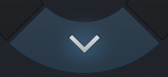
<img src="https://i.imgur.com/JGUoNfS.png" />
</div>
</div>
</body>
TylerH has a great response, but it’s a pretty complex solution. I have a solution for those of you that just want a simple "onclick" effect with pure CSS without a bunch of extra elements.
We will simply use CSS transitions. You could probably do similar with animations.
The trick is to change the delay for the transition so that it will last when the user clicks.
.arrowDownContainer:active,
.arrowDownContainer.clicked {
  filter: drop-shadow(0px 0px 0px steelblue);
  transition: filter 0s;
}
Here I add the "clicked" class as well, so that JavaScript can also provide the effect if it needs to. I use a zero pixel drop-shadow filter, because it will highlight the given transparent graphic blue this way for my case.
I have a filter at 0s here, so that it won’t take effect. When the effect is released, I can then add the transition with a delay, so that it will provide a nice "clicked" effect.
.arrowDownContainer {
  cursor: pointer;
  position: absolute;
  bottom: 0px;
  top: 490px;
  left: 108px;
  height: 222px;
  width: 495px;
  z-index: 3;
  transition: filter 0.3s ease 0.3s;
}
This allows me to set it up so that when the user clicks the button, it highlights blue then fades out slowly (you could, of course, use other effects as well).
While you are limited here in the sense that the animation to highlight is instant, it does still provide the desired effect. You could likely use this trick with animation to produce a smoother overall transition.


