37

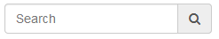
How can we add a Twitter Bootstrap icon icon-search to the right of a text input element?

The following attempt placed all the icons inside the input element, how can we crop it so it only displays the icon for icon-search?

Current Attempt

enter image description here

CSS

input.search-box {
    width: 180px;
    background: #333;
    background-image: url('/img/glyphicons-halflings-white.png');
    background-position: -48px 0;
    padding-left: 30px;
    margin-top: 45px;
    border: 0;
    float: right;
}
Nyxynyx
  • 61,411
  • 155
  • 482
  • 830

6 Answers6

90

Updated Bootstrap 3.x

You can use the .input-group class like this:

<div class="input-group">
    <input type="text" class="form-control"/>
    <span class="input-group-addon">
        <i class="fa fa-search"></i>
    </span>
</div>

Working Demo in jsFiddle for 3.x


Bootstrap 2.x

You can use the .input-append class like this:

<div class="input-append">
    <input class="span2" type="text">
    <button type="submit" class="btn">
        <i class="icon-search"></i>
    </button>
</div>

Working Demo in jsFiddle for 2.x


Both will look like this:

screenshot outside

If you'd like the icon inside the input box, like this:

screenshot inside

Then see my answer to Add a Bootstrap Glyphicon to Input Box

Community
  • 1
  • 1
KyleMit
  • 30,350
  • 66
  • 462
  • 664
15

Bootstrap 5 with 3 different way.


  1. Icon with default bootstrap Style Icon with default bootstrap Style

    <div class="input-group">
       <input type="text" class="form-control" placeholder="From" aria-label="from" aria-describedby="from">
       <span class="input-group-text"><i class="fas fa-map-marker-alt"></i></span>
    </div>
    
  2. Icon Inside Input with default bootstrap class Icon Inside Input with default bootstrap class

    <div class="input-group">
       <input type="text" class="form-control border-end-0" placeholder="From" aria-label="from" aria-describedby="from">
       <span class="input-group-text bg-transparent"><i class="fas fa-map-marker-alt"></i></span>
    </div>
    
  3. Icon Inside Input with small custom css Icon Inside Input with small custom css

    <div class="input-group">
       <input type="text" class="form-control rounded-end" placeholder="From" aria-label="from" aria-describedby="from">
       <span class="icon-inside"><i class="fas fa-map-marker-alt"></i></span>
    </div>
    

Custom Css

.icon-inside {
              position: absolute;
              right: 10px;
              top: calc(50% - 12px);
              pointer-events: none;
              font-size: 16px;
              font-size: 1.125rem;
              color: #c4c3c3;
              z-index:3;
            }

.icon-inside {
      position: absolute;
      right: 10px;
      top: calc(50% - 12px);
      pointer-events: none;
      font-size: 16px;
      font-size: 1.125rem;
      color: #c4c3c3;
      z-index:3;
    }
<link rel="stylesheet" type="text/css" href="https://cdn.jsdelivr.net/npm/bootstrap@5.1.3/dist/css/bootstrap.min.css" />
    <link rel="stylesheet" href="https://use.fontawesome.com/releases/v5.2.0/css/all.css" integrity="sha384-hWVjflwFxL6sNzntih27bfxkr27PmbbK/iSvJ+a4+0owXq79v+lsFkW54bOGbiDQ" crossorigin="anonymous">

    <div class="container">
    <h5 class="mt-3">Icon <small>with default bootstrap Style</small><h5>
    <div class="input-group">
       <input type="text" class="form-control" placeholder="From" aria-label="from" aria-describedby="from">
       <span class="input-group-text"><i class="fas fa-map-marker-alt"></i></span>
    </div>

    <h5 class="mt-3">Icon Inside Input <small>with default bootstrap class</small><h5>
    <div class="input-group">
       <input type="text" class="form-control border-end-0" placeholder="From" aria-label="from" aria-describedby="from">
       <span class="input-group-text bg-transparent"><i class="fas fa-map-marker-alt"></i></span>
    </div>

    <h5 class="mt-3">Icon Inside Input<small> with small custom css</small><h5>
    <div class="input-group">
       <input type="text" class="form-control rounded-end" placeholder="From" aria-label="from" aria-describedby="from">
       <span class="icon-inside"><i class="fas fa-map-marker-alt"></i></span>
    </div>

    </div>

Bootstrap 4.x with 3 different way.


  1. Icon with default bootstrap Style Icon with default bootstrap Style

    <div class="input-group">
          <input type="text" class="form-control" placeholder="From" aria-label="from" aria-describedby="from">
          <div class="input-group-append">
            <span class="input-group-text"><i class="fas fa-map-marker-alt"></i></span>
          </div>
        </div>
    
  2. Icon Inside Input with default bootstrap class Icon Inside Input with default bootstrap class

    <div class="input-group">
          <input type="text" class="form-control border-right-0" placeholder="From" aria-label="from" aria-describedby="from">
          <div class="input-group-append">
            <span class="input-group-text bg-transparent"><i class="fas fa-map-marker-alt"></i></span>
          </div>
    
    </div>
    
  3. Icon Inside Input with small custom css Icon Inside Input with small custom css

    <div class="input-group">
          <input type="text" class="form-control rounded-right" placeholder="From" aria-label="from" aria-describedby="from">
            <span class="icon-inside"><i class="fas fa-map-marker-alt"></i></span>
        </div> 
    

Custom Css

    .icon-inside {
          position: absolute;
          right: 10px;
          top: calc(50% - 12px);
          pointer-events: none;
          font-size: 16px;
          font-size: 1.125rem;
          color: #c4c3c3;
          z-index:3;
        }

.icon-inside {
      position: absolute;
      right: 10px;
      top: calc(50% - 12px);
      pointer-events: none;
      font-size: 16px;
      font-size: 1.125rem;
      color: #c4c3c3;
      z-index:3;
    }
<link rel="stylesheet" type="text/css" href="https://stackpath.bootstrapcdn.com/bootstrap/4.1.3/css/bootstrap.min.css" />
    <link rel="stylesheet" href="https://use.fontawesome.com/releases/v5.2.0/css/all.css" integrity="sha384-hWVjflwFxL6sNzntih27bfxkr27PmbbK/iSvJ+a4+0owXq79v+lsFkW54bOGbiDQ" crossorigin="anonymous">

    <div class="container">
    <h5 class="mt-3">Icon <small>with default bootstrap Style</small><h5>
    <div class="input-group">
      <input type="text" class="form-control" placeholder="From" aria-label="from" aria-describedby="from">
      <div class="input-group-append">
        <span class="input-group-text"><i class="fas fa-map-marker-alt"></i></span>
      </div>
    </div>

    <h5 class="mt-3">Icon Inside Input <small>with default bootstrap class</small><h5>
    <div class="input-group">
      <input type="text" class="form-control border-right-0" placeholder="From" aria-label="from" aria-describedby="from">
      <div class="input-group-append">
        <span class="input-group-text bg-transparent"><i class="fas fa-map-marker-alt"></i></span>
      </div>
    </div>

    <h5 class="mt-3">Icon Inside Input<small> with small custom css</small><h5>
    <div class="input-group">
      <input type="text" class="form-control rounded-right" placeholder="From" aria-label="from" aria-describedby="from">
        <span class="icon-inside"><i class="fas fa-map-marker-alt"></i></span>
    </div>

    </div>
HDP
  • 4,005
  • 2
  • 36
  • 58
  • Thanks, I prefer the first one because of simplicity and also because of the password managers (auto fill was covering the icon in the second one) Thank you for the nice, simple examples. – rchrd Mar 12 '20 at 15:26
1

Since the glyphicons image is a sprite, you really can't do that: fundamentally what you want is to limit the size of the background, but there's no way to specify how big the background is. Either you cut out the icon you want, size it down and use it, or use something like the input field prepend/append option (http://twitter.github.io/bootstrap/base-css.html#forms and then search for prepended inputs).

Femi
  • 64,273
  • 8
  • 118
  • 148
0

For bootstrap 4

        <link rel="stylesheet" href="https://stackpath.bootstrapcdn.com/bootstrap/4.1.0/css/bootstrap.min.css" integrity="sha384-9gVQ4dYFwwWSjIDZnLEWnxCjeSWFphJiwGPXr1jddIhOegiu1FwO5qRGvFXOdJZ4" crossorigin="anonymous">

            <script src="https://code.jquery.com/jquery-3.3.1.slim.min.js" integrity="sha384-q8i/X+965DzO0rT7abK41JStQIAqVgRVzpbzo5smXKp4YfRvH+8abtTE1Pi6jizo" crossorigin="anonymous"></script>
            <script src="https://cdnjs.cloudflare.com/ajax/libs/popper.js/1.14.0/umd/popper.min.js" integrity="sha384-cs/chFZiN24E4KMATLdqdvsezGxaGsi4hLGOzlXwp5UZB1LY//20VyM2taTB4QvJ" crossorigin="anonymous"></script>
            <script src="https://stackpath.bootstrapcdn.com/bootstrap/4.1.0/js/bootstrap.min.js" integrity="sha384-uefMccjFJAIv6A+rW+L4AHf99KvxDjWSu1z9VI8SKNVmz4sk7buKt/6v9KI65qnm" crossorigin="anonymous"></script>
        <link href="https://maxcdn.bootstrapcdn.com/font-awesome/4.7.0/css/font-awesome.min.css" rel="stylesheet">
        <form class="form-inline my-2 my-lg-0">
                        <div class="input-group">
                            <input class="form-control" type="search" placeholder="Search">
                            <div class="input-group-append">
                                <div class="input-group-text"><i class="fa fa-search"></i></div>
                            </div>
                        </div>
                    </form>

Demo

alhelal
  • 916
  • 11
  • 27
0

Bootstrap 4.x

With Bootstrap 4 (and Font Awesome), we still can use the input-group wrapper around our form-control element, and now we can use an input-group-append (or input-group-prepend) wrapper with an input-group-text to get the job done:

<div class="input-group mb-3">
  <input type="text" class="form-control" placeholder="Search" aria-label="Search" aria-describedby="my-search">
  <div class="input-group-append">
    <span class="input-group-text" id="my-search"><i class="fas fa-filter"></i></span>
  </div>
</div>

It will look something like this (thanks to KyleMit for the screenshot):

enter image description here

Learn more by visiting the Input group documentation.

tyler.frankenstein
  • 2,314
  • 1
  • 23
  • 36
0

Bootstrap 5

According to Bootstrap 5 docs

.input-group-append and .input-group-prepend. You can now just add buttons and .input-group-text as direct children of the input groups.

Example:

<div class="input-group">
    <div class="input-group-text">File input</div>
    <input class="form-control" id="formFile" type="file" />
    <button class="btn border" type="button" style="background-color: #e9ecef;">
        <i class="fas fa-times"></i>
    </button>
</div>

enter image description here

Barney0409
  • 21
  • 4