How can I add a glyphicon to a text type input box? For example I want to have 'icon-user' in a username input, something like this:

How can I add a glyphicon to a text type input box? For example I want to have 'icon-user' in a username input, something like this:
We'll get to Bootstrap in a second, but here's the fundamental CSS concepts in play in order to do this yourself. As beard of prey points out, you can do this with CSS by absolutely positioning the icon inside of the input element. Then add padding to either side so the text doesn't overlap with the icon.
So for the following HTML:
<div class="inner-addon left-addon">
    <i class="glyphicon glyphicon-user"></i>
    <input type="text" class="form-control" />
</div>
You can use the following CSS to left and right align glyphs:
/* enable absolute positioning */
.inner-addon {
    position: relative;
}

/* style icon */
.inner-addon .glyphicon {
  position: absolute;
  padding: 10px;
  pointer-events: none;
}

/* align icon */
.left-addon .glyphicon  { left:  0px;}
.right-addon .glyphicon { right: 0px;}

/* add padding  */
.left-addon input  { padding-left:  30px; }
.right-addon input { padding-right: 30px; }

Note: This presumes you're using glyphicons, but works equally well with font-awesome.
For FA, just replace.glyphiconwith.fa
As buffer points out, this can be accomplished natively within Bootstrap by using Validation States with Optional Icons. This is done by giving the .form-group element the class of .has-feedback and the icon the class of .form-control-feedback.
The simplest example would be something like this:
<div class="form-group has-feedback">
    <label class="control-label">Username</label>
    <input type="text" class="form-control" placeholder="Username" />
    <i class="glyphicon glyphicon-user form-control-feedback"></i>
</div>
Pros:
Cons:
To overcome the cons, I put together this pull-request with changes to support left aligned icons. As it is a relatively large change, it has been put off until a future release, but if you need these features today, here's a simple implementation guide:
Just include the these form changes in css (also inlined via hidden stack snippet at the bottom)
*LESS: alternatively, if you are building via less, here's the form changes in less
Then, all you have to do is include the class .has-feedback-left on any group that has the class .has-feedback in order to left align the icon.
Since there are a lot of possible html configurations over different form types, different control sizes, different icon sets, and different label visibilities, I created a test page that shows the correct set of HTML for each permutation along with a live demo.

P.S. frizi's suggestion of adding
pointer-events: none;has been added to bootstrap
Didn't find what you were looking for? Try these similar questions:
.has-feedback .form-control {
  padding-right: 34px;
}
.has-feedback .form-control.input-sm,
.has-feedback.form-group-sm .form-control {
  padding-right: 30px;
}
.has-feedback .form-control.input-lg,
.has-feedback.form-group-lg .form-control {
  padding-right: 46px;
}
.has-feedback-left .form-control {
  padding-right: 12px;
  padding-left: 34px;
}
.has-feedback-left .form-control.input-sm,
.has-feedback-left.form-group-sm .form-control {
  padding-left: 30px;
}
.has-feedback-left .form-control.input-lg,
.has-feedback-left.form-group-lg .form-control {
  padding-left: 46px;
}
.has-feedback-left .form-control-feedback {
  left: 0;
}
.form-control-feedback {
  line-height: 34px !important;
}
.input-sm + .form-control-feedback,
.form-horizontal .form-group-sm .form-control-feedback {
  width: 30px;
  height: 30px;
  line-height: 30px !important;
}
.input-lg + .form-control-feedback,
.form-horizontal .form-group-lg .form-control-feedback {
  width: 46px;
  height: 46px;
  line-height: 46px !important;
}
.has-feedback label.sr-only ~ .form-control-feedback,
.has-feedback label.sr-only ~ div .form-control-feedback {
  top: 0;
}
@media (min-width: 768px) {
  .form-inline .inline-feedback {
    position: relative;
    display: inline-block;
  }
  .form-inline .has-feedback .form-control-feedback {
    top: 0;
  }
}
.form-horizontal .has-feedback-left .form-control-feedback {
  left: 15px;
}
The official method. No custom CSS required :
<form class="form-inline" role="form">
  <div class="form-group has-success has-feedback">
    <label class="control-label" for="inputSuccess4"></label>
    <input type="text" class="form-control" id="inputSuccess4">
    <span class="glyphicon glyphicon-user form-control-feedback"></span>
  </div>
</form>
DEMO : http://jsfiddle.net/yajf3b7q
This demo is based on an example in Bootstrap docs. Scroll down to "With Optional Icons" here http://getbootstrap.com/css/#forms-control-validation

Here's a CSS-only alternative. I set this up for a search field to get an effect similar to Firefox (& a hundred other apps.)
HTML
<div class="col-md-4">
  <input class="form-control" type="search" />
  <span class="glyphicon glyphicon-search"></span>
</div>
CSS
.form-control {
  padding-right: 30px;
}

.form-control + .glyphicon {
  position: absolute;
  right: 0;
  padding: 8px 27px;
}
It can be done using classes from the official bootstrap 3.x version, without any custom css.
Use input-group-addon before the input tag, inside of input-group then use any of the glyphicons, here is the code
<form>
  <div class="form-group">
    <div class="col-xs-5">
      <div class="input-group">
          <span class="input-group-addon transparent"><span class="glyphicon glyphicon-user"></span></span>
          <input class="form-control left-border-none" placeholder="User Name" type="text" name="username">
      </div>
    </div>
  </div>
</form>
Here is the output

To customise it further add a couple of lines of custom css to your own custom.css file (adjust padding if needed)
.transparent {
    background-color: transparent !important;
    box-shadow: inset 0px 1px 0 rgba(0,0,0,.075);
 }
 .left-border-none {
    border-left:none !important;
    box-shadow: inset 0px 1px 0 rgba(0,0,0,.075);
 }
By making the background of the input-group-addon transparent and making the left gradient of the input tag to zero the input will have a seamless appearance. Here is the customised output

Here is a jsbin example
This will solve the custom css problems of overlapping with labels, alignment while using input-lg and focus on tab issue.
Here is how I did it using only the default bootstrap CSS v3.3.1:
<div class="form-group">
    <label class="control-label">Start:</label>
    <div class="input-group">
        <input type="text" class="form-control" aria-describedby="start-date">
        <span class="input-group-addon" id="start-date"><span class="glyphicon glyphicon-calendar"></span></span>
    </div>
</div>
And this is how it looks:

If you are using Fontawesome you can do this :
<input type="text" style="font-family:Arial, FontAwesome" placeholder="" />
Result

The complete list of unicode can be found in the The complete Font Awesome 4.6.3 icon reference
This 'cheat' will work with the side effect that the glyphicon class will change the font for the input control.
<input class="form-control glyphicon" type="search" placeholder=""/>
If you want to get rid of the side effect you can remove the "glyphicon" class and add the following CSS (There may be a better way to style the placeholder pseudo element and I've only tested on Chrome).
.form-control[type="search"]::-webkit-input-placeholder:first-letter {
    font-family:"Glyphicons Halflings";
}
.form-control[type="search"]:-moz-placeholder:first-letter {
    font-family:"Glyphicons Halflings";
}
.form-control[type="search"]::-moz-placeholder:first-letter {
    font-family:"Glyphicons Halflings";
}
.form-control[type="search"]:-ms-input-placeholder:first-letter {
    font-family:"Glyphicons Halflings";
}
Possibly an even cleaner solution:
CSS
.form-control.glyphicon {
    font-family:inherit;
}
.form-control.glyphicon::-webkit-input-placeholder:first-letter {
    font-family:"Glyphicons Halflings";
}
.form-control.glyphicon:-moz-placeholder:first-letter {
    font-family:"Glyphicons Halflings";
}
.form-control.glyphicon::-moz-placeholder:first-letter {
    font-family:"Glyphicons Halflings";
}
.form-control.glyphicon:-ms-input-placeholder:first-letter {
    font-family:"Glyphicons Halflings";
}
HTML
<input class="form-control glyphicon" type="search" placeholder=" search" />
<input class="form-control glyphicon" type="text" placeholder=" username" />
<input class="form-control glyphicon" type="password" placeholder=" password" />
Here is a non-bootstrap solution that keeps your markup simple by embedding the image representation of the glyphicon directly in the CSS using base64 URI encoding.
input {
  border:solid 1px #ddd;
}
input.search {
 padding-left:20px;
 background-repeat: no-repeat;
 background-position-y: 1px;
 background-image: url(data:image/png;base64,iVBORw0KGgoAAAANSUhEUgAAABQAAAASCAYAAABb0P4QAAAAAXNSR0IArs4c6QAAAARnQU1BAACxjwv8YQUAAAAJcEhZcwAADsMAAA7DAcdvqGQAAADbSURBVDhP5ZI9C4MwEIb7//+BEDgICA6C4OQgBJy6dRIEB6EgCNkEJ4e3iT2oHzH9wHbpAwfyJvfkJDnhYH4kHDVKlSAigSAQoCiBKjVGXvaxFXZnxBQYkSlBICII+22K4jM63rbHSthCSdsskVX9Y6KxR5XJSSpVy6GbpbBKp6aw0BzM0ShCe1iKihMXC6EuQtMQwukzPFu3fFd4+C+/cimUNxy6WQkNnmdzL3NYPfDmLVuhZf2wZYz80qDkKX1St3CXAfVMqq4cz3hTaGEpmctxDPmB0M/fCYEbAwZYyVKYcroAAAAASUVORK5CYII=);
}
<input class="search">
Here's another way to do it by placing the glyphicon using the :before pseudo element in CSS.
For this HTML:
<form class="form form-horizontal col-xs-12">
    <div class="form-group">
        <div class="col-xs-7">
            <span class="usericon">
                <input class="form-control" id="name" placeholder="Username" />
            </span>
        </div>
    </div>
</form>
Use this CSS (Bootstrap 3.x and Webkit-based browsers compatible)
.usericon input {
    padding-left:25px;
}
.usericon:before {
    height: 100%;
    width: 25px;
    display: -webkit-box;
    -webkit-box-pack: center;
    -webkit-box-align: center;
    position: absolute;
    content: "\e008";
    font-family: 'Glyphicons Halflings';
    pointer-events: none;
}
As @Frizi said, we have to add pointer-events: none; so that the cursor doesn't interfere with the input focus. All the others CSS rules are for centering and adding the proper spacing.
The result:

So to add a user icon, just add  to the placeholder attribute, or wherever you want it.
You may want to check this cheat sheet.
Example:
<link rel="stylesheet" href="https://maxcdn.bootstrapcdn.com/bootstrap/3.3.7/css/bootstrap.min.css">
<input type="text" class="form-control" placeholder=" placeholder..." style="font-family: 'Glyphicons Halflings', Arial">
<input type="text" class="form-control" value=" value..." style="font-family: 'Glyphicons Halflings', Arial">
<input type="submit" class="btn btn-primary" value=" submit-button" style="font-family: 'Glyphicons Halflings', Arial">Don't forget to set the input's font to the Glyphicon one, using the following code:
font-family: 'Glyphicons Halflings', Arial, where Arial is the font of the regular text in the input.
Take a form-control, and add is-valid to its class. Notice how the control turns green, but more importantly, notice the checkmark icon on the right of the control? This is what we want!
Example:
.my-icon {
    padding-right: calc(1.5em + .75rem);
    background-image: url('https://use.fontawesome.com/releases/v5.8.2/svgs/regular/calendar-alt.svg');
    background-repeat: no-repeat;
    background-position: center right calc(.375em + .1875rem);
    background-size: calc(.75em + .375rem) calc(.75em + .375rem);
}
<script src="https://cdnjs.cloudflare.com/ajax/libs/jquery/3.3.1/jquery.min.js"></script>
<script src="https://cdnjs.cloudflare.com/ajax/libs/popper.js/1.14.3/umd/popper.min.js"></script>
<link href="https://stackpath.bootstrapcdn.com/bootstrap/4.1.3/css/bootstrap.min.css" rel="stylesheet"/>
<script src="https://stackpath.bootstrapcdn.com/bootstrap/4.1.3/js/bootstrap.min.js"></script>
<div class="container">
<div class="col-md-5">
<input type="text" id="date" class="form-control my-icon" placeholder="Select...">
</div>
</div>
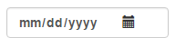
I also have one decision for this case with Bootstrap 3.3.5:
<div class="col-sm-5">
    <label for="date">
       <input type="date" placeholder="Date" id="date" class="form-control">
    </label>
    <i class="glyphicon glyphicon-calendar col-sm-pull-2"></i>
</div>
On input I have something like this:
Here's how it works in pure Bootstrap 5:
<!doctype html>
<html lang="en">

<head>
    <meta charset="utf-8">
    <meta name="viewport" content="width=device-width, initial-scale=1">
    <title>iconbutton</title>
    <link href="https://cdn.jsdelivr.net/npm/bootstrap@5.2.0-beta1/dist/css/bootstrap.min.css" rel="stylesheet">
    <link href="https://cdnjs.cloudflare.com/ajax/libs/font-awesome/6.1.1/css/all.min.css" rel="stylesheet">
</head>

<body>

<div class="d-flex flex-row align-items-center m-4 border rounded">
    <i class="fa-solid fa-search mx-2"></i>
    <input type="text" class="form-control border-0" placeholder="Search">
</div>

<script src="https://cdn.jsdelivr.net/npm/bootstrap@5.2.0-beta1/dist/js/bootstrap.bundle.min.js"></script>
</body>

</html>
To remove the border that appears on focus, add shadow-0 to the input.
You should be able to do this with existing bootstrap classes and a little custom styling.
<form>
    <div class="input-prepend">
        <span class="add-on">
            <i class="icon-user"></i>
        </span>
        <input class="span2" id="prependedInput" type="text" placeholder="Username" style="background-color: #eeeeee;border-left: #eeeeee;">
    </div>
Edit The icon is referenced via the icon-user class. This answer was written at the time of Bootstrap version 2. You can see the reference on the following page: http://getbootstrap.com/2.3.2/base-css.html#images
If you are fortunate enough to only need modern browsers: try css transform translate. This requires no wrappers, and can be customized so that you can allow more spacing for input[type=number] to accomodate the input spinner, or move it to the left of the handle.
    @import url("//netdna.bootstrapcdn.com/bootstrap/3.0.0/css/bootstrap.min.css");


.is-invalid {
  height: 30px;
  box-sizing: border-box;
}

.is-invalid-x {
  font-size:27px;
  vertical-align:middle;
  color: red;
  top: initial;
  transform: translateX(-100%);
}


 <h1>Tasty Field Validation Icons using only css transform</h1>
    <label>I am just a poor boy nobody loves me</label>
    <input class="is-invalid"><span class="glyphicon glyphicon-exclamation-sign is-invalid-x"></span>