536

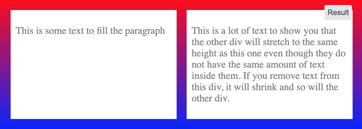
I have two div elements side by side. I'd like the height of them to be the same, and stay the same if one of them resizes. If one grows because text is placed into it, the other one should grow to match the height. I can't figure this one out though. Any ideas?

<div style="overflow: hidden">
    <div style="
        border: 1px solid #cccccc;
        float: left;
        padding-bottom: 1000px;
        margin-bottom: -1000px;
    ">
        Some content!<br />
        Some content!<br />
        Some content!<br />
        Some content!<br />
        Some content!<br />
    </div>

    <div style="
        border: 1px solid #cccccc;
        float: left;
        padding-bottom: 1000px;
        margin-bottom: -1000px;
    ">
        Some content!
    </div>
</div>
Temani Afif
  • 245,468
  • 26
  • 309
  • 415
NibblyPig
  • 51,118
  • 72
  • 200
  • 356
  • Do you want that if one of them is getting bigger, than the other one will stay the same height size? – Wai Wong Jun 08 '10 at 13:45
  • A example that is not a solution but is in an editable environment can be found here: http://jsfiddle.net/PCJUQ/ – MvanGeest Jun 08 '10 at 13:55

24 Answers24

727

Flexbox

With flexbox it's a single declaration:

.row {
  display: flex; /* equal height of the children */
}

.col {
  flex: 1; /* additionally, equal width */
  
  padding: 1em;
  border: solid;
}
<div class="row">
  <div class="col">Lorem ipsum dolor sit amet, consectetur adipisicing elit.</div>
  <div class="col">Lorem ipsum dolor sit amet, consectetur adipisicing elit. Ad omnis quae expedita ipsum nobis praesentium velit animi minus amet perspiciatis laboriosam similique debitis iste ratione nemo ea at corporis aliquam.</div>
</div>

Prefixes may be required for older browsers, see browser support.

Community
  • 1
  • 1
Pavlo
  • 43,301
  • 14
  • 77
  • 113
  • 19
    flexbox worked like a charm. If you are developing a responsive design and you want your second div to go down in smaller screens you will need to set .row to display: block; in your media query. – Nick Zulu Dec 30 '13 at 02:10
  • 10
    @NickZulu I believe in this case you should set `flex-direction: column`: http://jsfiddle.net/sdsgW/1/ – Pavlo Dec 30 '13 at 09:42
  • It appears if you've already set the widths you don't use `flex:1` as it has adverse side effects. But this is still the best modern solution – cameronjonesweb Oct 24 '14 at 03:12
  • @user1672694, without `flex: 1` the layout will try to balance columns, alt. you can set width per column: http://jsfiddle.net/sdsgW/64/ – Pavlo Oct 24 '14 at 11:13
  • this will only work in case of direct children i think – StealthTrails Oct 29 '15 at 21:58
  • 2
    Is it possible to make one specific child div determine the height of the other? So that if the content of other child div is changing, it can't change the height of that specific div – Narek Malkhasyan Apr 15 '17 at 07:03
  • Any tips for IE11 (work constraint) - i went here (https://caniuse.com/#feat=flexbox) and then here (https://developer.mozilla.org/en-US/docs/Web/CSS/flex-basis) - i'm not sure what to properties to apply, and whether to apply them to the column and/or row? Currently, I just have `display:flex` on the row. Thank You. – user1063287 Mar 19 '18 at 01:31
  • this looks ugly because the child divs cannot be floated: left and right, respectivly. it only works if they fill out the complete width of the parent element – clockw0rk Sep 21 '18 at 15:41
  • This keeps div the same size when on the same horizontal axis, but what about mobile? When the divs are stacked, they are no longer the same size. – Ryan Walker Jan 14 '20 at 21:55
  • 3
    This did not work for me, including the advice in the comments. `align-items: stretch;` in .row did the trick – Mark Aug 04 '21 at 22:48
158

This is a common problem which many have encountered, but luckily some smart minds like Ed Eliot's on his blog have posted their solutions online.

Basically what you do is make both divs/columns very tall by adding a padding-bottom: 100% and then "trick the browser" into thinking they aren't that tall using margin-bottom: -100%. It is better explained by Ed Eliot on his blog, which also includes many examples.

.container {
    overflow: hidden;
}
.column {
    float: left;
    margin: 20px;
    background-color: grey;
    padding-bottom: 100%;
    margin-bottom: -100%;
}
<div class="container">

    <div class="column">
        Some content!<br>
        Some content!<br>
        Some content!<br>
        Some content!<br>
        Some content!<br>
    </div>

    <div class="column">
        Something
    </div>

</div>
Philipp Maurer
  • 2,480
  • 6
  • 18
  • 25
mqchen
  • 4,195
  • 1
  • 22
  • 21
  • 1
    Explanation on One True Layout was a bit poor, but after checking the first link I implemented it fine from one of the examples he used. However it's really bad because you have to use an image to represent the bottom border of the columns, and it's dubious for cross-browser support. However it does work and it doesn't rely on javascript, so I'm going to mark it as correct. Thanks! – NibblyPig Jun 08 '10 at 14:15
  • This doesn't seem to work in old IE browsers (yes, unfortunately I still have to support IE6). Any way to make this compatible? – strongriley Mar 20 '12 at 14:39
  • 1
    @strongriley Checkout Ed Eliot's blog: http://www.ejeliot.com/blog/61 It should work in IE6. Maybe the problem is caused elsewhere? – mqchen Mar 22 '12 at 08:47
  • 1
    This breaks if the window is too narrow and the divs are placed beneath each other. – WhyNotHugo Aug 17 '13 at 05:13
  • The container should have an `overflow: hidden;` property. – tsega Aug 10 '15 at 21:54
  • 1
    How do you define the cell padding you actually want present in the table cell, eg `padding: 7px 10px`, if the `padding-bottom` property is set to 100%? (PS `overflow:hidden` was also required for me on the `row`) – user1063287 Mar 19 '18 at 04:23
  • @user1063287 just add another inner div and specify cell padding there – Sean T Jan 03 '19 at 13:58
58

This is an area where CSS has never really had any solutions — you’re down to using <table> tags (or faking them using the CSS display:table* values), as that’s the only place where a “keep a bunch of elements the same height” was implemented.

<div style="display: table-row;">

    <div style="border:1px solid #cccccc; display: table-cell;">
        Some content!<br/>
        Some content!<br/>
        Some content!<br/>
        Some content!<br/>
        Some content!<br/>
    </div>

    <div style="border:1px solid #cccccc;  display: table-cell;">
        Some content!
    </div>

</div>

This works in all versions of Firefox, Chrome and Safari, Opera from at least version 8, and in IE from version 8.

smac89
  • 39,374
  • 15
  • 132
  • 179
Paul D. Waite
  • 96,640
  • 56
  • 199
  • 270
  • 2
    this answer is PERFECT! just a small reminder: it might happen that some client requires "table" instead of "table-row" – tiborka Feb 19 '13 at 00:51
  • @user2025810: yikes, can't say I've ever tested in that :) Good to know though, cheers. (Given its PDF focus I bet it supports some of the print-related features of CSS 2.1 that aren't implemented very well in browsers.) – Paul D. Waite Feb 19 '13 at 17:02
  • 8
    With this solution - forget about using percentage `width` for your divs, unless you add `display: table` on the parent element, which will mess things up. – Alex G Aug 27 '13 at 13:57
  • I prefer this way. I do include the display:table parent, which is missing. When using Media Queries, you can change those td's to display block to change their behavior when you dont need two columns. – Rick Paul Oct 25 '16 at 10:03
50

Using jQuery

Using jQuery, you can do it in a super simple one-line-script.

// HTML
<div id="columnOne">
</div>

<div id="columnTwo">
</div>

// Javascript
$("#columnTwo").height($("#columnOne").height());

Using CSS

This is a bit more interesting. The technique is called Faux Columns. More or less you don't actually set the actual height to be the same, but you rig up some graphical elements so they look the same height.

TylerH
  • 20,799
  • 66
  • 75
  • 101
Derek Adair
  • 21,846
  • 31
  • 97
  • 134
  • 1
    I think using JavaScript is a very good method. The problem is - it falls apart if disabled. I think I will use this anyway and build the best contingency I can ;--) Thanks! – nicorellius Jul 02 '12 at 04:50
  • 16
    This implies that columnOne'S height is always bigger than columnTwo. – Sébastien Richer Apr 12 '14 at 14:32
  • 2
    You should compare height of columns before applying the height for them. I think js is the best method for this problem, almost all browsers are js enabled, if not, they should get out of your website and many other websites. – SalmanShariati Dec 25 '14 at 12:44
  • 6
    This will also only work when the page is first loaded. If the window is then resized, causing the divs to resize then they will not stay in sync – ikariw Apr 29 '15 at 14:05
30

Using CSS Flexbox and min-height worked for me

enter image description here

Say you have a container with two divs inside and you want those two divs to have the same height.

You would set 'display: flex' on the container as well as 'align-items: stretch'

Then just give the child divs a 'min-height' of 100%

See the code below

.container {
  width: 100%;
  background: linear-gradient(red,blue);
  padding: 1em;
  /* important */
  display: flex;
  /* important */
  align-items: stretch;
  justify-content: space-around;
}

.child {
  width: 100%;
  background: white;
  color: grey;
  margin: 0 .5em;
  padding: .5em;
  /* optional */
  min-height: 100%;
}
<div class="container">
  
  <div class="child"><p>This is some text to fill the paragraph</p></div>
  <div class="child"><p>This is a lot of text to show you that the other div will stretch to the same height as this one even though they do not have the same amount of text inside them. If you remove text from this div, it will shrink and so will the other div.</p></div>
  
</div>
Michiel J Otto
  • 2,121
  • 17
  • 13
17

I'm surprised that nobody has mentioned the (very old but reliable) Absolute Columns technique: http://24ways.org/2008/absolute-columns/

In my opinion, it is far superior to both Faux Columns and One True Layout's technique.

The general idea is that an element with position: absolute; will position against the nearest parent element that has position: relative;. You then stretch a column to fill 100% height by assigning both a top: 0px; and bottom: 0px; (or whatever pixels/percentages you actually need.) Here's an example:

<!DOCTYPE html>
<html>
  <head>
    <style>
      #container
      {
        position: relative;
      }

      #left-column
      {
        width: 50%;
        background-color: pink;
      }

      #right-column
      {
        position: absolute;
        top: 0px;
        right: 0px;
        bottom: 0px;
        width: 50%;
        background-color: teal;
      }
    </style>
  </head>
  <body>
    <div id="container">
      <div id="left-column">
        <ul>
          <li>Foo</li>
          <li>Bar</li>
          <li>Baz</li>
        </ul>
      </div>
      <div id="right-column">
        Lorem ipsum
      </div>
    </div>
  </body>
</html>
geofflee
  • 3,513
  • 2
  • 23
  • 23
11

You can use Jquery's Equal Heights Plugin to accomplish, this plugins makes all the div of exact same height as other. If one of them grows and other will also grow.

Here a sample of implementation

Usage: $(object).equalHeights([minHeight], [maxHeight]);

Example 1: $(".cols").equalHeights(); 
           Sets all columns to the same height.

Example 2: $(".cols").equalHeights(400); 
           Sets all cols to at least 400px tall.

Example 3: $(".cols").equalHeights(100,300); 
           Cols are at least 100 but no more than 300 pixels tall. Elements with too much content will gain a scrollbar.

Here is the link

http://www.cssnewbie.com/equalheights-jquery-plugin/

Starx
  • 77,474
  • 47
  • 185
  • 261
10

Just spotted this thread while searching for this very answer. I just made a small jQuery function, hope this helps, works like a charm:

JAVASCRIPT

var maxHeight = 0;
$('.inner').each(function() {
    maxHeight = Math.max(maxHeight, $(this).height());
});
$('.lhs_content .inner, .rhs_content .inner').css({height:maxHeight + 'px'});

HTML

<div class="lhs_content">
    <div class="inner">
        Content in here
    </div>
</div>
<div class="rhs_content">
    <div class="inner">
        More content in here
    </div>
</div>
Mike Wells
  • 319
  • 4
  • 4
  • 2
    I used outerHeight to include padding and borders. This is the cleanest solution I think. – Sébastien Richer Apr 12 '14 at 14:35
  • Perfect solution I was looking for. Other solutions are good for case that a row has a few columns but this approach is better for complex html content. Small adding: When document resize in responsive page, content height doesn't change because of fixed. So, I added $('.inner').css({ height: "initial" }); before 'each function' to set height to default. – bafsar Mar 05 '17 at 07:10
8

You could use Faux Columns.

Basically it uses a background image in a containing DIV to simulate the two equal-height-DIVs. Using this technique also allowes you to add shadows, rounded corners, custom borders or other funky patterns to your containers.

Only works with fixed-width boxes though.

Well tested out and properly working in every browser.

Arve Systad
  • 5,471
  • 1
  • 32
  • 58
8

The CSS grid way

The modern way of doing this (which also avoids having to declare a <div class="row"></div>-wrapper around every two items) would be to make use of a CSS grid. This also gives you easy control on the gaps between your item rows/columns.

.grid-container {
  display: grid;
  grid-template-columns: repeat(2, 1fr); /* or simply "1fr 1fr;" */
  grid-row-gap: 10px; 
  grid-column-gap: 10px;
}

.grid-item {
  background-color: #f8f8f8;
  box-shadow: 0 0 3px #666;
  text-align: center;
}

.grid-item img {
  max-width: 100%;
}
<div class="grid-container">
  <div class="grid-item">1 <br />1.1<br />1.1.1</div>
  <div class="grid-item">2</div>
  <div class="grid-item">3
    <img src="https://lorempixel.com/420/320/abstract/1/Sample" alt="" />
    3.1
  </div>
  <div class="grid-item">4</div>
  <div class="grid-item">5 <br />1.1<br />1.1.1</div>
  <div class="grid-item">6<img src="https://lorempixel.com/400/300/abstract/" alt="" />
    6.1</div>
  <div class="grid-item">7</div>
  <div class="grid-item">8</div>
  <div class="grid-item">9 <br />1.1<br />1.1.1</div>
  <div class="grid-item">10</div>
  <div class="grid-item">11
    <img src="https://lorempixel.com/420/320/abstract/1/Sample" alt="" />
    11.1
  </div>
  <div class="grid-item">12</div>
</div>
connexo
  • 53,704
  • 14
  • 91
  • 128
6

This question was asked 6 years ago, but it's still worthy to give a simple answer with flexbox layout nowadays.

Just add the following CSS to the father <div>, it will work.

display: -webkit-flex;
display: flex;
flex-direction: row;
align-items: stretch;

The first two lines declare it will be displayed as flexbox. And flex-direction: row tells browsers that its children will be display in columns. And align-items: stretch will meet the requirement that all the children elements will stretch to the same height it one of them become higher.

Hegwin
  • 385
  • 5
  • 15
  • 1
    @TylerH But asked has edited his question and added `I'd like both boxes to always be the same size, so if one grows because text is placed into it, the other one should grow to match the height.` which is not mentioned in the accepted answer...I just made a completion here. Maybe I should have commented it on the accepted answer? – Hegwin Nov 22 '16 at 02:30
  • 1
    it's not mentioned explicitly because it's covered already by the simple CSS declaration already. Open up the answer's Snippet in fullscreen and resize your browser window to see; they stay the same size as each other. – TylerH Nov 26 '16 at 04:34
  • 1
    Even if the accepted answer uses flexbox, this one has a different approach. align-items: stretch is what set me on the path to solving my problem in a very particular situation. – BenoitLussier Jun 13 '18 at 00:20
  • Isn't `align-items: stretch;` flex's default? – madav Sep 17 '18 at 04:57
3

I like to use pseudo elements to achieve this. You can use it as background of the content and let them fill the space.

With these approach you can set margins between columns, borders, etc.

.wrapper{
  position: relative;
  width: 200px;
}
.wrapper:before,
.wrapper:after{
  content: "";
  display: block;
  height: 100%;
  width: 40%;
  border: 2px solid blue;
  position: absolute;
  top: 0;
}
.wrapper:before{
  left: 0;
  background-color: red;
}
.wrapper:after{
  right: 0;
  background-color: green;
}

.div1, .div2{
  width: 40%;
  display: inline-block;
  position: relative;
  z-index: 1;
}
.div1{
  margin-right: 20%;
}
<div class="wrapper">
  <div class="div1">Content Content Content Content Content Content Content Content Content
  </div><div class="div2">Other</div>
</div>
TylerH
  • 20,799
  • 66
  • 75
  • 101
Adrian Menendez
  • 480
  • 4
  • 12
3

Step 1: Set your parent div's styling to display: flex

Step 2: Set your child divs styling to flex: 1 and height:100%

Explanation: flex: 1 will set the flex-grow to 1 which will distribute the remaining space of the container equally to all children.

here is the working jsfiddle link

For more details of how the flex and parent-child divs behave inside flex - I would recommend visiting this link : css-tricks

TylerH
  • 20,799
  • 66
  • 75
  • 101
Omair Munir
  • 135
  • 8
  • This answer works perfectly fine - I don't know why someone downvoted it without even trying it. here is the working jsfiddle link https://jsfiddle.net/maani_77/6kp1g97z/1/ – Omair Munir Mar 05 '22 at 11:26
  • I downvoted this because it just repeats numerous answers. New answers, especially to old questions with many existing answers, should take care to provide _novel_ solutions, not repeat existing ones. – TylerH Mar 15 '22 at 14:43
2

If you don't mind one of the divs being a master and dictating the height for both divs there is this:

Fiddle

No matter what, the div on the right will expand or squish&overflow to match the height of the div on the left.

Both divs must be immediate children of a container, and have to specify their widths within it.

Relevant CSS:

.container {
    background-color: gray;
    display: table;
    width: 70%;
    position:relative;
}

.container .left{
    background-color: tomato;
    width: 35%;
}

.container .right{
    position:absolute;
    top:0px;
    left:35%;
    background-color: orange;
    width: 65%;
    height:100%;
    overflow-y: auto;
}
Hashbrown
  • 12,091
  • 8
  • 72
  • 95
2

The Fiddle

HTML

<div class="container">

    <div class="left-column">

    </div>

    <div class="right-column">
        <h1>Hello Kitty!</h1>
        <p>Lorem ipsum dolor sit amet, consectetur adipisicing elit. Laudantium cum accusamus ab nostrum sit laborum eligendi, totam nam aperiam harum officia commodi tempora dolorum. Incidunt earum explicabo deleniti architecto illo!</p>
        <p>Lorem ipsum dolor sit amet, consectetur adipisicing elit. Laudantium cum accusamus ab nostrum sit laborum eligendi, totam nam aperiam harum officia commodi tempora dolorum. Incidunt earum explicabo deleniti architecto illo!</p>
    </div>

</div>

CSS

.container {
    float: left;
    width: 100%;
    background-color: black;
    position: relative;
    left: 0;
}

.container:before,
.container:after {
    content: " ";
    display: table;
}

.container:after {
    clear: both;
}

.left-column {
    float: left;
    width: 30%;
    height: 100%;
    position: absolute;
    background: wheat;
}

.right-column {
    float: right;
    width: 70%;
    position: relative;
    padding: 0;
    margin: 0;
    background: rebeccapurple;            
}
drjorgepolanco
  • 7,479
  • 5
  • 46
  • 47
1

I know its been a long time but I share my solution anyway. This is a jQuery trick.

--- HTML

<div class="custom-column">
    <div class="column-left">
        asd
        asd<br/>
        asd<br/>
    </div>
    <div class="column-right">
        asd
    </div>
</div>

<div class="custom-column">
    <div class="column-left">
        asd
    </div>
    <div class="column-right">
        asd
        asd<br/>
        asd<br/>
    </div>
</div>

---- CSS

<style>
.custom-column { margin-bottom:10px; }
.custom-column:after { clear:both; content:""; display:block; width:100%; }
    .column-left { float:left; width:25%; background:#CCC; }
    .column-right { float:right; width:75%; background:#EEE; }
</style>

--- JQUERY

<script src="js/jquery.min.js"></script>
<script>
$(document).ready(function(){
    $balancer = function() {
        $('.custom-column').each(function(){
            if($('.column-left',this).height()>$('.column-right',this).height()){
                $('.column-right',this).height($('.column-left',this).height())
            } else {
                $('.column-left',this).height($('.column-right',this).height())
            }

        });

    }
    $balancer();
    $(window).load($balancer());
    $(window).resize($balancer());

});
</script>
1

you can use jQuery to achieve this easily.

CSS

.left, .right {border:1px solid #cccccc;}

jQuery

$(document).ready(function() {
    var leftHeight = $('.left').height();
    $('.right').css({'height':leftHeight});
});

HTML

   <div class="left">
    <p>Lorem ipsum dolor sit amet, consectetur adipiscing elit. Morbi malesuada, lacus eu dapibus tempus, ante odio aliquet risus, ac ornare orci velit in sapien. Duis suscipit sapien vel nunc scelerisque in pretium velit mattis. Cras vitae odio sed eros mollis malesuada et eu nunc.</p>
   </div>
   <div class="right">
    <p>Lorem ipsum dolor sit amet.</p>
   </div>

You'll need to include jQuery

pixeltocode
  • 5,312
  • 11
  • 52
  • 69
1

I have tried almost all the mentioned methods above, but the flexbox solution won't work correctly with Safari, and the grid layout methods won't work correctly with older versions of IE.

This solution fits all screens and is cross-browser compatible:

.container {margin:15px auto;}
.container ul {margin:0 10px;}
.container li {width:30%; display: table-cell; background-color:#f6f7f7;box-shadow: 0 2px 5px 0 rgba(0, 0, 0, 0.25);}

@media (max-width: 767px){
    .container li { display: inline-block; width:100%; min-height:auto!important;}
}

The above method will equal cells height, and for the smaller screens like mobile or tablet, we can use the @media method mentioned above.

TylerH
  • 20,799
  • 66
  • 75
  • 101
Jodyshop
  • 656
  • 8
  • 12
1

I just wanted to add to the great Flexbox solution described by Pavlo, that, in my case, I had two lists/columns of data that I wanted to display side-by-side with just a little spacing between, horizontally-centered inside an enclosing div. By nesting another div within the first (leftmost) flex:1 div and floating it right, I got just what I wanted. I couldn't find any other way to do this with consistent success at all viewport widths:

<div style="display: flex;">
    <div style="flex: 1; padding-right: 15px;">
        <div style="float: right">
            <!-- My Left-hand side list of stuff -->
        </div>
    </div>

    <div style="flex: 1; padding-left: 15px;">
        <!-- My Right-hand side list of stuff -->
    </div>
</div>
StackOverflowUser
  • 945
  • 12
  • 10
0

This is a jQuery plugin which sets the equal height for all elements on the same row(by checking the element's offset.top). So if your jQuery array contains elements from more than one row(different offset.top), each row will have a separated height, based on element with maximum height on that row.

jQuery.fn.setEqualHeight = function(){

var $elements = [], max_height = [];

jQuery(this).css( 'min-height', 0 );

// GROUP ELEMENTS WHICH ARE ON THE SAME ROW
this.each(function(index, el){ 

    var offset_top = jQuery(el).offset().top;
    var el_height = jQuery(el).css('height');

    if( typeof $elements[offset_top] == "undefined" ){
        $elements[offset_top] = jQuery();
        max_height[offset_top] = 0;
    }

    $elements[offset_top] = $elements[offset_top].add( jQuery(el) );

    if( parseInt(el_height) > parseInt(max_height[offset_top]) )
        max_height[offset_top] = el_height;

});

// CHANGE ELEMENTS HEIGHT
for( var offset_top in $elements ){

    if( jQuery($elements[offset_top]).length > 1 )
        jQuery($elements[offset_top]).css( 'min-height', max_height[offset_top] );

}

};

Dejan
  • 794
  • 9
  • 9
-1
    var numexcute = 0;
    var interval;
    $(document).bind('click', function () {

        interval = setInterval(function () {
            if (numexcute >= 20) {
                clearInterval(interval);
                numexcute = 0;
            }
            $('#leftpane').css('height', 'auto');
            $('#rightpane').css('height', 'auto');
            if ($('#leftpane').height() < $('#rightpane').height())
                $('#leftpane').height($('#rightpane').height());
            if ($('#leftpane').height() > $('#rightpane').height())

                $('#rightpane').height($('#leftpane').height());
            numexcute++;
        }, 10);

    });
tcao
  • 41
  • 5
-1

I was having the same problem so i created this small function using jquery as jquery is part of every web application nowadays.

function fEqualizeHeight(sSelector) {
    var sObjects = $(sSelector);

    var iCount = sObjects.length;

    var iHeights = [];

    if (iCount > 0) {
        $(sObjects).each(function () {
            var sHeight = $(this).css('height');
            var iHeight = parseInt(sHeight.replace(/px/i,''));
            iHeights.push(iHeight);
        });

        iHeights.sort(function (a, b) {
            return a - b
        });

        var iMaxHeight = iHeights.pop();

        $(sSelector).each(function () {
            $(this).css({
                'height': iMaxHeight + 'px'
            });
        });
    }
}

You can call this function on page ready event

$(document).ready(function(){
   fEqualizeHeight('.columns');
});

I hope this works for you.

-3

I recently came across this and didn't really like the solutions so I tried experimenting.

.mydivclass {inline-block; vertical-align: middle; width: 33%;}

tushar747
  • 673
  • 2
  • 12
  • 25
-4
<div>

<div style="border:1px solid #cccccc; float:left; min-height:200px;">

Some content!<br/>
Some content!<br/>
Some content!<br/>
Some content!<br/>
Some content!<br/>

</div>

<div style="border:1px solid #cccccc; float:left; min-height:200px;">

Some content!

</div>

</div>

What I did here is to change the height to min-height and gave it a fixed value. if one of them is getting resized the other one will stay the same height. not sure if this is what you want

Wai Wong
  • 2,671
  • 4
  • 21
  • 17