Are there any ways in CSS to give outlines to text with different colors ? I want to highlight some parts of my text to make it more intuitive - like the names, links, etc. Changing the link colors etc. are common nowadays, so I want something new.
Asked
Active
Viewed 8.4e+01k times
462
-
18@Dan Better implies different. Your advice is generally good but it can also stifle creative experimenting. Furthermore, it’s usually not “common = good” … rather, it’s “common = barely good enough”. – Konrad Rudolph Feb 07 '11 at 07:59
-
8@Dan Grossman: the world evolves out of new ideas, not everything new is despicable. – yoda Feb 07 '11 at 08:04
-
8@yoda Your syntax is unusual. /EDIT never mind, confused you with someone else … little green dude. – Konrad Rudolph Feb 07 '11 at 08:05
-
1Can you describe what you need in more detail. I'm not exactly sure what you mean when you say that you want to 'give outlines to text with different colors' – Yi Jiang Feb 07 '11 at 08:06
-
I was just trying to leave something to consider, not stop anyone from answering the question! – Dan Grossman Feb 07 '11 at 08:07
-
1i want to implement something like the text is of say white color but with pink outline you must have seen this behavior in images – Mac Feb 07 '11 at 08:10
-
Chris Coyier has a good article on text strokes / outlines: http://css-tricks.com/7405-adding-stroke-to-web-text – Web_Designer Nov 27 '11 at 09:07
-
1I made a jquery plugin [http://www.uzitech.com/files/outlineletters.php](http://www.uzitech.com/files/outlineletters.php) – Tony Brix Apr 13 '12 at 21:02
-
1possible duplicate of [CSS Font Border?](http://stackoverflow.com/questions/2570972/css-font-border) – Adam Jensen Oct 15 '14 at 06:15
-
1look here, maybe helpful https://serg94.github.io/font_test/ – Sergey Sahakyan Feb 07 '20 at 01:36
17 Answers
634
There is an experimental webkit property called text-stroke in CSS3, I've been trying to get this to work for some time but have been unsuccessful so far.
What I have done instead is used the already supported text-shadow property (supported in Chrome, Firefox, Opera, and IE 9 I believe).
Use four shadows to simulate a stroked text:
.strokeme {
  color: white;
  background-color: white;
  text-shadow: -1px -1px 0 #000, 1px -1px 0 #000, -1px 1px 0 #000, 1px 1px 0 #000;
}
<div class="strokeme">
This text should have a stroke in some browsers
</div>I have made a demo for you here
And a hovered example is available here
As Jason C has mentioned in the comments, the text-shadow CSS property is now supported by all major browsers, with the exception of Opera Mini. Where this solution will work for backwards compatibility (not really an issue regarding browsers that auto-update) I believe the text-stroke CSS should be used.
-
12Sadly, IE doesn't support `text-shadow` till IE10. Oddly enough, IE9 supports `box-shadow` but not `text-shadow`. – Web_Designer Nov 27 '11 at 09:03
-
+1 for text-shadow idea. Please explain the idea of text-shadow to give stroke. – Bhojendra Rauniyar Jun 03 '13 at 10:40
-
-
-
If you have transparent text, you may be able to work around the problem of shadows showing through the text by using solid-color text and making the container element transparent. (May not be appropriate to all cases, but it will work in some.) – joanwolk Oct 30 '13 at 10:32
-
14Here is a summary of [browser support for `text-shadow`](http://caniuse.com/#search=text-shadow). It seems that currently (3 years after this answer was posted) it is supported by all major browsers with the exception of Opera Mini, which shows "partial support" (it ignores `blur-radius`). – Jason C Mar 29 '14 at 02:01
-
this answer applies only to one single possibility out of endless. you can only simulate 1px stroke, but for creating more than that, it required a ton of code, a ton..I think it's better to use canvas for this effect, or svg – vsync Jun 15 '14 at 12:10
-
Works great, and for those like me who think the outline is too powerful in some cases `rgba` works great with this as well' – Adjit Jul 09 '14 at 17:29
-
5This adds a more thin effect: ```text-shadow: -1px 0 black, 0 1px black, 1px 0 black, 0 -1px black;``` – BeauCielBleu Sep 05 '14 at 16:10
-
5Jason C pointed out ```text-shadow``` support, not ```text-stroke```. Which is only supported by webkit at this time. – Gregoire D. Feb 19 '15 at 16:44
-
1Note that `text-shadow` trick fails when your text color uses transparency/alpha, as the shadow will appear under the text. – Uriel Nov 13 '16 at 11:00
-
-
-
@rogerdpack Kind of, but it still needs the browser prefixes (tested in Chrome) https://jsfiddle.net/Kyle_/qesm1xhh/ – Kyle Apr 26 '17 at 07:46
-
-
Down-voted: Weird affects, the solution by @ancestral using , "text-shadow: #000 0px 0px 1px, #000 0px 0px 1px ....;" proved to be simpler and better. Just extend to darken. – AnthonyVO May 07 '18 at 18:22
-
@Kyle, except that I would need to include a fallback for IE 11 which has more market share then Edge at this moment. https://caniuse.com/#feat=text-stroke – AnthonyVO May 10 '18 at 16:18
-
@AnthonyVO the current global market share is just over 2%, if it works and looks fine in IE11, don't worry about fancy shadows and things. – Kyle Jun 06 '18 at 13:04
-
This tool was really helpful for generating a decent outline with shadows for me: https://owumaro.github.io/text-stroke-generator/ – Jay El-Kaake Sep 27 '19 at 14:52
156
Easy! SVG to the rescue.
This is a simplified method:
svg{
  font   : bold 70px Century Gothic, Arial;
  width  : 100%;
  height : 120px;
}

text{
  fill            : none;
  stroke          : black;
  stroke-width    : .5px;
  stroke-linejoin : round;
  animation       : 2s pulsate infinite;
}

@keyframes pulsate {
  50%{ stroke-width:5px }
}
<svg viewBox="0 0 450 50">
<text y="50">Scalable Title</text>
</svg>Here's a more complex demo.
CSS-only:
h1 {
  font: 800 40px Arial;
  -webkit-text-fill-color: transparent;
  -webkit-text-stroke: 1px;
}
<h1>I am outlined</h1>If you want a thick stroke, please read my other Stackoverflow answer
Note that as of writing, the -webkit-text-stroke property cannot be transitioned/animated.
vsync
- 118,978
- 58
- 307
- 400
-
8This is a great solution and has none of the performance issues associated with text-shadow. The difference in performance between this approach and stacking up multiple text-shadows is huge for my particular application (IE 10 on large screen displays). – djskinner Apr 23 '15 at 12:16
-
4This gave me a much better effect than text-shadows, because I needed a thick line. Thank you! – Andrea Sep 11 '15 at 04:27
-
4That's pure gold dude!! Very professional and skilled approach, perfect answered the question! This solution is ahead of W3 Council or Google or whatever, congratulations! – Heitor Jun 01 '18 at 23:43
-
1This solution would have been perfect for me too if I didn't have add the stroke to a textarea :( – brandito Nov 06 '19 at 00:32
-
For svg, I found the [answer below](https://stackoverflow.com/a/55097644/5802289) better (specially the update), since stroking looks really bad with small font-sizes or large thicknesses. – J0ANMM Nov 25 '22 at 17:13
136
Edit: text-stroke is now fairly mature and implemented in most browsers. It is easier, sharper and more precise. If your browser audience can support it, you should now use text-stroke first, instead of text-shadow.
You can and should do this with just the text-shadow effect without any offsets:
.outline {
    color: #fff;
    text-shadow: #000 0px 0px 1px;
    -webkit-font-smoothing: antialiased;
}
Why? When you offset multiple shadow effects, you’ll begin to notice ungainly, jagged corners:

Having text-shadow effects in just one position eliminates the offsets, meaning
If you feel that’s too thin and would prefer a darker outline instead, no problem — you can repeat the same effect (keeping the same position and blur), several times. Like so:
text-shadow: #000 0px 0px 1px,   #000 0px 0px 1px,   #000 0px 0px 1px,
             #000 0px 0px 1px,   #000 0px 0px 1px,   #000 0px 0px 1px;
Here’s a sample of just one effect (top), and the same effect repeated 14 times (bottom):

Also note: Because the lines become so thin, it’s a very good idea to turn off sub-pixel rendering using-webkit-font-smoothing: antialiased.
rogerdpack
- 62,887
- 36
- 269
- 388
ancestral
- 1,851
- 1
- 12
- 7
-
Interesting answer, thanks. I don't really understand what you mean by 'repeating' the effect though. – edzillion Jul 17 '14 at 10:26
-
Thanks for the `font-smoothing` option, it greatly improved the output in chrome! – Meki Aug 15 '14 at 07:06
-
This renders poorly in Safari 7.1, the outline lacks anti-aliasing and doesn't seem to build as you repeat the effect. – macguru2000 Nov 07 '14 at 21:59
-
@macguru20000: I’d love to see a screenshot of how it looks for you. I’m running Safari 8.0, and it looks like this: http://imgur.com/UD6CIrY – ancestral Nov 08 '14 at 04:49
-
I think you are supposed to supply the color last. http://www.w3schools.com/cssref/css3_pr_text-shadow.asp – Chloe May 29 '16 at 23:54
-
@Chloe: I don’t believe the order matters, as w3 shows examples: http://www.w3.org/TR/css3-background/#ltshadowgt – ancestral May 30 '16 at 00:13
-
1I note the comment added to the answer that text-stroke is now supported in most browsers, but caniuse is still (Aug 2016) showing it as unsupported in all versions of IE and Edge, and needing -webkit-text-stroke with the layout.css.prefixes.webkit flag enabled in Firefox. Methinks that's not widespread enough support for general public sites. – Nick Rice Aug 17 '16 at 14:09
-
1I think that repeating 14 times a text-shadow *could* have some performance issue. Especially when scrolling on mobile. – kaosmos Oct 25 '16 at 15:16
-
As of November 2017, every major browser supports `text-stroke` with the `-webkit` prefix. (Safari has begun supporting it without the prefix.) – ancestral Dec 01 '17 at 03:39
-
6AFAIK `text-stroke` is not the same as outline via `text-shadow`. `text-stroke` has no option to make the outline appear outside the text which means the outline bleeds into the text making it often look really horrible. In other words `text-stroke` is not a replacement for `text-shadow` for outlines – gman Mar 11 '19 at 07:28
-
Is there a way to use `text-stroke` with a fallback to `text-shadow`? i.e. `text-shadow` is ignored if `text-stroke` exists. – rococo Feb 13 '20 at 01:31
-
Mature [as in](https://developer.mozilla.org/en-US/docs/Web/CSS/-webkit-text-stroke) "This feature is non-standard and is not on a standards track"? =-D – Klesun Oct 24 '20 at 14:46
60
Just adding this answer. "Stroking" the text is not the same as "Outlining".
Outlining looks great. Stroking looks horrid.

The SVG solution listed elsewhere has the same issue. If you want an outline you need to put the text twice. Once stroked and again not stroked.
Stroking IS NOT Outlining
body {
  font-family: sans-serif;
  margin: 20px;
}

.stroked {
  color: white;
  -webkit-text-stroke: 1px black;
}

.thickStroked {
  color: white;
  -webkit-text-stroke: 10px black;
}

.outlined {
  color: white;
  text-shadow:
    -1px -1px 0 #000,
     0   -1px 0 #000,
     1px -1px 0 #000,
     1px  0   0 #000,
     1px  1px 0 #000,
     0    1px 0 #000,
    -1px  1px 0 #000,
    -1px  0   0 #000;
}

.thickOutlined {
  color: white;
text-shadow: 0.0px 10.0px 0.02px #000, 9.8px 2.1px 0.02px #000, 4.2px -9.1px 0.02px #000, -8.0px -6.0px 0.02px #000, -7.6px 6.5px 0.02px #000, 4.8px 8.8px 0.02px #000, 9.6px -2.8px 0.02px #000, -0.7px -10.0px 0.02px #000, -9.9px -1.5px 0.02px #000, -3.5px 9.4px 0.02px #000, 8.4px 5.4px 0.02px #000, 7.1px -7.0px 0.02px #000, -5.4px -8.4px 0.02px #000, -9.4px 3.5px 0.02px #000, 1.4px 9.9px 0.02px #000, 10.0px 0.8px 0.02px #000, 2.9px -9.6px 0.02px #000, -8.7px -4.8px 0.02px #000, -6.6px 7.5px 0.02px #000, 5.9px 8.0px 0.02px #000, 9.1px -4.1px 0.02px #000, -2.1px -9.8px 0.02px #000, -10.0px -0.1px 0.02px #000, -2.2px 9.8px 0.02px #000, 9.1px 4.2px 0.02px #000, 6.1px -8.0px 0.02px #000, -6.5px -7.6px 0.02px #000, -8.8px 4.7px 0.02px #000, 2.7px 9.6px 0.02px #000, 10.0px -0.6px 0.02px #000, 1.5px -9.9px 0.02px #000, -9.3px -3.6px 0.02px #000, -5.5px 8.4px 0.02px #000, 7.0px 7.2px 0.02px #000, 8.5px -5.3px 0.02px #000, -3.4px -9.4px 0.02px #000, -9.9px 1.3px 0.02px #000, -0.8px 10.0px 0.02px #000, 9.6px 2.9px 0.02px #000, 4.9px -8.7px 0.02px #000, -7.5px -6.7px 0.02px #000, -8.1px 5.9px 0.02px #000, 4.0px 9.2px 0.02px #000, 9.8px -2.0px 0.02px #000, 0.2px -10.0px 0.02px #000, -9.7px -2.3px 0.02px #000, -4.3px 9.0px 0.02px #000, 7.9px 6.1px 0.02px #000
}

svg {
  font-size: 40px;
  font-weight: bold;
  width: 450px;
  height: 70px;
  fill: white;
}

.svgStroke {
  fill: white;
  stroke: black;
  stroke-width: 20px;
  stroke-linejoin: round;
}
<h1 class="stroked">Properly stroked!</h1>
<h1 class="outlined">Properly outlined!</h1>
<h1 class="thickStroked">Thickly stroked!</h1>
<h1 class="thickOutlined">Thickly outlined!</h1>
<svg viewBox="0 0 450 70">
<text class="svgStroke" x="10" y="45">SVG Thickly Stroked!</text>
</svg>
<svg viewBox="0 0 450 70">
<text class="svgStroke" x="10" y="45">SVG Thickly Outlined!</text>
<text class="svgText" x="10" y="45">SVG Thickly Outlined!</text>
</svg>PS: I'd love to know how to make the SVG be the correct size of any arbitrary text. I have a feeling it's fairly complicated involving generating the SVG, querying it with Javascript to get the extents, then applying the results. If there is an easier non-JS way, I'd love to know.
Update: As @12me21 points out, in SVG you can use paint-order="stroke" to make it stroke before filling and then you don't have to repeat the text
svg {
  font-size: 40px;
  font-weight: bold;
  width: 450px;
  height: 70px;
  fill: white;
}

.svgText {
  fill: white;
  stroke: black;
  stroke-width: 15px;
  stroke-linejoin: round;
  paint-order: stroke;
}
<svg viewBox="0 0 450 70">
<text class="svgText" x="10" y="45">SVG Thickly Outlined!</text>
</svg>
gman
- 100,619
- 31
- 269
- 393
-
1Excellent this is the correct method, outlining, not stroking. Works beautifully and it neat and easy on the eyes. – MitchellK Aug 02 '19 at 10:38
-
1you don't need to repeat the text, you can just use the `paint-order= "stroke"` attribute – 12Me21 Jul 12 '22 at 03:43
-
Upvoted. If one only wants to have 1px thickness, an alternative with similar results is: `filter: drop-shadow(1px 0px 0px black) drop-shadow(-1px 0px 0px black) drop-shadow(0px 1px 0px black) drop-shadow(0px -1px 0px black);`. – J0ANMM Nov 25 '22 at 17:10
43
You could try stacking multiple blured shadows until the shadows look like a stroke, like so:
.shadowOutline {
  text-shadow: 0 0 4px black, 0 0 4px black, 0 0 4px black, 0 0 4px black, 0 0 4px black, 0 0 4px black, 0 0 4px black, 0 0 4px black, 0 0 4px black, 0 0 4px black, 0 0 4px black, 0 0 4px black, 0 0 4px black, 0 0 4px black, 0 0 4px black, 0 0 4px black, 0 0 4px black, 0 0 4px black, 0 0 4px black, 0 0 4px black;
}
Here's a fiddle: http://jsfiddle.net/GGUYY/
I mention it just in case someone's interested, although I wouldn't call it a solution because it fails in various ways:
- it doesn't work in old IE
- it renders quite differently in every browser
- applying so many shadows is very heavy to process :S
brohr
- 620
- 7
- 13
-
1
-
1This is fantastic. The extra layers of shadowing really add some depth to it, and it works in IE11, FF36, and Chrome 41. – RockiesMagicNumber Apr 02 '15 at 22:16
18
I was looking for a cross-browser text-stroke solution that works when overlaid on background images. think I have a solution for this that doesn't involve extra mark-up, js and works in IE7-9 (I haven't tested 6), and doesn't cause aliasing problems.
This is a combination of using CSS3 text-shadow, which has good support except IE (http://caniuse.com/#search=text-shadow), then using a combination of filters for IE. CSS3 text-stroke support is poor at the moment.
IE Filters
The glow filter (http://www.impressivewebs.com/css3-text-shadow-ie/) looks terrible, so I didn't use that.
David Hewitt's answer involved adding dropshadow filters in a combination of directions. ClearType is then removed unfortunately so we end up with badly aliased text.
I then combined some of the elements suggested on useragentman with the dropshadow filters.
Putting it together
This example would be black text with a white stroke. I'm using conditional html classes by the way to target IE (http://paulirish.com/2008/conditional-stylesheets-vs-css-hacks-answer-neither/).
#myelement {
    color: #000000;
    text-shadow:
    -1px -1px 0 #ffffff,
    1px -1px 0 #ffffff,
    -1px 1px 0 #ffffff,
    1px 1px 0 #ffffff;
}

html.ie7 #myelement,
html.ie8 #myelement,
html.ie9 #myelement {
    background-color: white;
    filter: progid:DXImageTransform.Microsoft.Chroma(color='white') progid:DXImageTransform.Microsoft.Alpha(opacity=100) progid:DXImageTransform.Microsoft.dropshadow(color=#ffffff,offX=1,offY=1) progid:DXImageTransform.Microsoft.dropshadow(color=#ffffff,offX=-1,offY=1) progid:DXImageTransform.Microsoft.dropshadow(color=#ffffff,offX=1,offY=-1) progid:DXImageTransform.Microsoft.dropshadow(color=#ffffff,offX=-1,offY=-1);
    zoom: 1;
}
9
This mixin for SASS will give smooth results, using 8-axis:
@mixin stroke($size: 1px, $color: #000) {
  text-shadow:
    -#{$size} -#{$size} 0 $color,
     0        -#{$size} 0 $color,
     #{$size} -#{$size} 0 $color,
     #{$size}  0        0 $color,
     #{$size}  #{$size} 0 $color,
     0         #{$size} 0 $color,
    -#{$size}  #{$size} 0 $color,
    -#{$size}  0        0 $color;
}
And normal CSS:
text-shadow:
  -1px -1px 0 #000,
   0   -1px 0 #000,
   1px -1px 0 #000,
   1px  0   0 #000,
   1px  1px 0 #000,
   0    1px 0 #000,
  -1px  1px 0 #000,
  -1px  0   0 #000;
Ryall
- 12,010
- 11
- 53
- 77
8
I got better results with 6 different shadows:
.strokeThis{
    text-shadow:
    -1px -1px 0 #ff0,
    0px -1px 0 #ff0,
    1px -1px 0 #ff0,
    -1px 1px 0 #ff0,
    0px 1px 0 #ff0,
    1px 1px 0 #ff0;
}
surajck
- 81
- 1
- 1
-
I wanted a bigger shadow, and had to add a couple of extra lines.... 3px 0px 0 #343a7e, -3px 0px 0 #343a7e – Jayden Lawson Sep 21 '16 at 08:04
8
h1 {
   color: black;
   -webkit-text-fill-color: white; /* Will override color (regardless of order) */
   -webkit-text-stroke-width: 1px;
   -webkit-text-stroke-color: black;
}
<h1>Properly stroked!</h1>
Dennis
- 56,821
- 26
- 143
- 139
Aashish Kumar
- 2,771
- 3
- 28
- 43
-
3Just heads up that even in 2020 this does not work with variadic fonts. https://github.com/rsms/inter/issues/292 – Gajus Oct 09 '20 at 04:12
4
Working with thicker strokes gets a bit messy, if you have the pleasure of sass try this mixin, not perfect and depending on stroke weight it generates a fair amount of css.
 @mixin stroke($width, $colour: #000000) {
      $shadow: 0 0 0 $colour; // doesn't do anything but I couldn't work out how to create a blank string and maintain commas
      @for $i from 0 through $width {
          $shadow: $shadow,
          -$i + px -$width + px 0 $colour,
          $i + px -$width + px 0 $colour,
          -$i + px $width + px 0 $colour,
          $i + px $width + px 0 $colour,
          -$width + px -$i + px 0 $colour,
          $width + px -$i + px 0 $colour,
          -$width + px $i + px 0 $colour,
          $width + px $i + px 0 $colour,
      }
      text-shadow: $shadow;
}
Subodh Ghulaxe
- 18,333
- 14
- 83
- 102
evo_rob
- 149
- 1
- 4
-
1This mixin didn't work for me but this one did: https://gist.github.com/nathggns/2984123 – akirk May 04 '14 at 09:36
3
We can use text-stroke
HTML
<h1>Sample Text</h1>
CSS
  h1{
    -webkit-text-stroke: 2px red;
    text-stroke: 2px red;
    }
Just piece of cake. Try this instead of using text-shadow
S.M Naveen
- 170
- 7
-
text-stroke should be avoided apparently... https://developer.mozilla.org/fr/docs/Web/CSS/-webkit-text-stroke – vcarel Aug 22 '22 at 16:17
-
3
I'm sorry, but if you've gotten this far, you'll realise that all the other answers are inadequate or require SVG.
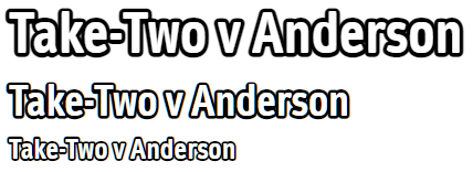
Note: This beautiful outlining will cost you the small price of maintaining a copy of the text in a data-content attribute, which is used by a layered CSS3 ::before element that renders the fill text over the actual outline.
.outline {
  color: black;
  -webkit-text-stroke: 0.15em black;
}

.outline::before {
  content: attr(data-content);
  -webkit-text-fill-color: white;
  -webkit-text-stroke: 0;
  position: absolute;
}

.outline-wrapper {
  font-family: "DaytonaW01-CondensedBold", Impact, Times, serif;
  font-size: 50px;
}
<div class="outline-wrapper">
<div class="outline" data-content="Take-Two v Anderson">Take-Two v Anderson
</div>
</div>
<link href="https://db.onlinewebfonts.com/c/998b5de3cda797387727724405beb7d4?family=DaytonaW01-CondensedBold" rel="stylesheet" type="text/css"/>The external style link is just to include the font, and is not required -- though using a thin font may require adjustment to the stroking parameter.
Orwellophile
- 13,235
- 3
- 69
- 45
-
That's a pretty cool approach! However, `-webkit-text-stroke` is still a bit quirky especially in chromium browsers when `stroke-width` is quite large (>0.1em). See also [Text Stroke (-webkit-text-stroke) css Problem](https://stackoverflow.com/questions/69253420/text-stroke-webkit-text-stroke-css-problem/69937834#69937834) – herrstrietzel Nov 13 '22 at 18:50
-
@herrstrietzel Unfortunately for me, the purpose for which I needed it (ultralig.ht embedded webkit UI) doesn't even support the property, but my testing across various old & new ios devices showed the same result as I get on my local Windows Chrome. I will checkout that link for an alternative that might work for me. – Orwellophile Nov 15 '22 at 01:28
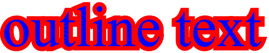
2
I had this issue as well, and the text-shadow wasn't an option because the corners would look bad (unless I had many many shadows), and I didn't want any blur, therefore my only other option was to do the following: Have 2 divs, and for the background div, put a -webkit-text-stroke on it, which then allows for as big of an outline as you like.
div {
  font-size: 200px;
  position: absolute;
  white-space: nowrap;
}

.front {
 color: blue;
}

.outline {
  -webkit-text-stroke: 30px red;
  user-select: none;
}
<div class="outline">
outline text
</div>
<div class="front">
outline text
</div> Using this, I was able to achieve an outline, because the stroke-width method was not an option if you want your text to remain legible with a very large outline (because with stroke-width the outline will start inside the lettering which makes it not legible when the width gets larger than the letters.
Note: the reason I needed such a fat outline was I was emulating the street labels in "google maps" and I wanted a fat white halo around the text. This solution worked perfectly for me.
Here is a fiddle showing this solution
Jared
- 2,999
- 1
- 28
- 39
2
Text Shadow Generator
There are lots of great answers here. It would appear the text-shadow is probably the most reliable way to do this. I won't go into detail about how to do this with text-shadow since others have already done that, but the basic idea is that you create multiple text shadows around the text element. The larger the text outline, the more text shadows you need.
All of the answers submitted (as of this posting) provide static solutions for the text-shadow. I have taken a different approach and have written this JSFiddle that accepts outline color, blur, and width values as inputs and generates the appropriate text-shadow property for your element. Just fill in the blanks, check the preview, and click to copy the css and paste it into your stylesheet.
Needless Appendix
Apparently, answers that include a link to a JSFiddle cannot be posted unless they also contain code. You can completely ignore this appendix if you want to. This is the JavaScript from my fiddle that generates the text-shadow property. Please note that you do not need to implement this code in your own works:
function computeStyle() {
    var width = document.querySelector('#outline-width').value;
  width = (width === '') ? 0 : Number.parseFloat(width);
  var blur = document.querySelector('#outline-blur').value;
  blur = (blur === '') ? 0 : Number.parseFloat(blur);
  var color = document.querySelector('#outline-color').value;
  if (width < 1 || color === '') {
    document.querySelector('.css-property').innerText = '';
    return;
  }
    var style = 'text-shadow: ';
  var indent = false;
    for (var i = -1 * width; i <= width; ++i) {
    for (var j = -1 * width; j <= width; ++j) {
        if (! (i === 0 && j === 0 && blur === 0)) {
        var indentation = (indent) ? '\u00a0\u00a0\u00a0\u00a0' : '';
            style += indentation + i + "px " + j + "px " + blur + "px " + color + ',\n';
        indent = true;
      }
    }
  }
  style = style.substring(0, style.length - 2) + '\n;';
  document.querySelector('.css-property').innerText = style;

  var exampleBackground = document.querySelector('#example-bg');
  var exampleText = document.querySelector('#example-text');
  exampleBackground.style.backgroundColor = getOppositeColor(color);
  exampleText.style.color = getOppositeColor(color);
  var textShadow = style.replace(/text-shadow: /, '').replace(/\n/g, '').replace(/.$/, '').replace(/\u00a0\u00a0\u00a0\u00a0/g, '');
  exampleText.style.textShadow = textShadow;
}
b_laoshi
- 443
- 6
- 12
2
Simple outline behind the letters. Works with any font. With any outline width.
<style>
  text {
    stroke-linejoin: round;
    text-anchor: middle;
    fill: black;
    stroke: white;
    stroke-width: 12px;
    paint-order: stroke;
  }
</style>

<svg xmlns="http://www.w3.org/2000/svg" width="100%" height="100%">
  <text x="50%" y="50%" dominant-baseline="central" text-anchor="middle">Text</text>
</svg>
RilDev
- 101
- 1
- 8
-
what would be best way to break word if width less then text width? Assume Large text and small device – Muhammad Sami Aug 22 '23 at 18:45
0
Multiple text-shadows..
Something like this:
var steps = 10,
    i,
    R = 0.6,
    x,
    y,
    theStyle = '1vw 1vw 3vw #005dab';
for (i = -steps; i <= steps; i += 1) {
    x = (i / steps) / 2;
    y = Math.sqrt(Math.pow(R, 2) - Math.pow(x, 2));
    theStyle = theStyle + ',' + x.toString() + 'vw ' + y.toString() + 'vw 0 #005dab';
    theStyle = theStyle + ',' + x.toString() + 'vw -' + y.toString() + 'vw 0 #005dab';
    theStyle = theStyle + ',' + y.toString() + 'vw ' + x.toString() + 'vw 0 #005dab';
    theStyle = theStyle + ',-' + y.toString() + 'vw ' + x.toString() + 'vw 0 #005dab';
}
document.getElementsByTagName("H1")[0].setAttribute("style", "text-shadow:" + theStyle);
punosound
- 21
- 4
0
Try Following:
<!DOCTYPE html>
<html>
<head>
<style>
h1 {
  text-shadow: 2px 2px;
}
h1.m1 {
  text-shadow: 2px 2px red;
}
h1.m2 {
  text-shadow: 2px 2px 5px red;
}
h1.m3 {
  color: white;
  text-shadow: 2px 2px 4px #000000;
}
h1.m4 {
  text-shadow: 0 0 3px #FF0000;
}
h1.m5{
color: #FFFFFF;
background: #232323;
text-shadow: 0 0 5px #FFF, 0 0 10px #FFF, 0 0 15px #FFF, 0 0 20px #49ff18, 0 0 30px #49FF18, 0 0 40px #49FF18, 0 0 55px #49FF18, 0 0 75px #49ff18;
}
h1.m6{
color: #FFFFFF;
background: #FFFFFF;
text-shadow: 2px 2px 0 #4074b5, 2px -2px 0 #4074b5, -2px 2px 0 #4074b5, -2px -2px 0 #4074b5, 2px 0px 0 #4074b5, 0px 2px 0 #4074b5, -2px 0px 0 #4074b5, 0px -2px 0 #4074b5;
}
h1.m7
{
color: #444444;
background: #FFFFFF;
text-shadow: 1px 0px 1px #CCCCCC, 0px 1px 1px #EEEEEE, 2px 1px 1px #CCCCCC, 1px 2px 1px #EEEEEE, 3px 2px 1px #CCCCCC, 2px 3px 1px #EEEEEE, 4px 3px 1px #CCCCCC, 3px 4px 1px #EEEEEE, 5px 4px 1px #CCCCCC, 4px 5px 1px #EEEEEE, 6px 5px 1px #CCCCCC, 5px 6px 1px #EEEEEE, 7px 6px 1px #CCCCCC;
}
</style>
</head>
<body>
<h1 class="m6">Text-shadow effect!</h1>
<h1 class="m7">Text-shadow effect!</h1>
<h1>Text-shadow effect!</h1>
<h1 class="m1">Text-shadow effect!</h1>
<h1 class="m2">Text-shadow effect!</h1>
<h1 class="m3">Text-shadow effect!</h1>
<h1 class="m4">Text-shadow effect!</h1>
<h1 class="m5">Text-shadow effect!</h1>
</body>
</html>
AliNajafZadeh
- 1,216
- 2
- 13
- 22