261

Before the AppCompat update came out today I was able to change the color of buttons in Android L but not on older versions. After including the new AppCompat update I am unable to change the color for either version, when I do try the button just disappears. Does anyone know how to change the button color?

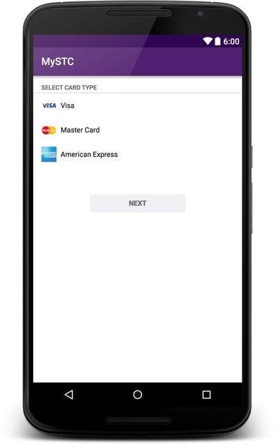
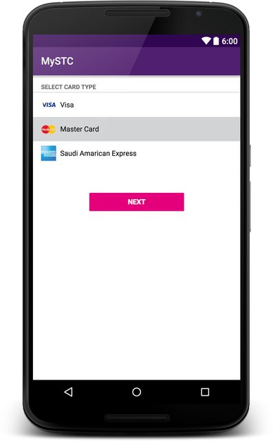
The following pictures shows what I want to achieve:

picture showing desired result

The white button is default, the red one is what I want.

This is what I was doing previously to change the color of the buttons in the styles.xml:

<item name="android:colorButtonNormal">insert color here</item>

and to do it dynamically:

button.getBackground().setColorFilter(getResources().getColor(insert color here), PorterDuff.Mode.MULTIPLY);

Also I did change the theme parent from @android:style/Theme.Material.Light.DarkActionBar to Theme.AppCompat.Light.DarkActionBar

reVerse
  • 35,075
  • 22
  • 89
  • 84
mail929
  • 2,768
  • 3
  • 15
  • 12

28 Answers28

225

Officially fixed in Support Library rev.22 (Fri March 13, 2015). See relevant google code issue:

https://issuetracker.google.com/issues/37008632

Usage example

theme.xml:

<item name="colorButtonNormal">@color/button_color</item>

v21/theme.xml

<item name="android:colorButtonNormal">@color/button_color</item>
Cœur
  • 37,241
  • 25
  • 195
  • 267
WindRider
  • 11,958
  • 6
  • 50
  • 57
  • 22
    Is there any example how to use it? How can I set colors on just one Button? – Intrications Mar 15 '15 at 14:54
  • I updated the answer with the attribute definitions that i use and know they work. – WindRider Mar 18 '15 at 15:05
  • 3
    @WindRider I have a problem though, I want to use it to create buttons with different colors. I create styles Button.Red, Button.Green, all with parent equals Button base style. I set item colorButtonNormal to requested color, set this as button theme. Unfortunately it only colours buttons for 21. Below it does not override colorButtonNormal defined in theme. – dominik4142 Mar 18 '15 at 16:29
  • What parent style do you use? Check that all your styles contain colorButtonNormal for – WindRider Mar 18 '15 at 19:40
  • @WindRider Unfortunately I'm having the same issue. When applying theme directly to a button, like ``, the theme only gets applied for v21. (If I put the colors in the app-wide theme definitions, it works for all API levels, but I cant do that because I need buttons with different colors). Seems like a bug in appcompat to me. – Greg Ennis Apr 01 '15 at 02:16
  • @dominik4142 did you find a solution for this? (see my comment above) – Greg Ennis Apr 01 '15 at 03:19
  • Greg, shouldn't it be instead? – WindRider Apr 02 '15 at 09:48
  • @WindRider you didn't mention me and I didn't get any notification. This is what I found out: In order for this styling to work, I need to set theme:= of the button. This works nicely on >21. Unfortunately, this doesn't seem to bother lower versions. They are bothered only by settings colorButtonNormal in app theme. Because I want to achieve different button colors, your solution doesn't help me much. – dominik4142 Apr 02 '15 at 15:02
  • @GregEnnis I totally agree, same for me. I worked it around by replacing button background on lower versions (this were very small contextual buttons used in one place so I could afford that). I simply used theme= and style= both on one button, theme to apply colouring on >21, style override in both <21 (background + margins) and >21 (empty to disable <21 background replacement). – dominik4142 Apr 02 '15 at 15:07
  • @WindRider - no it should not. android:theme is required here. As I mentioned, it works on v21, so that is not the problem. It sounds like you have it working - can you post a working sample? – Greg Ennis Apr 02 '15 at 15:39
  • Dont work for `Base.Widget.AppCompat.Button` in `Compat 22.1.1` – Daniel Gomez Rico Apr 25 '15 at 04:02
  • 72
    With AppCompat 22.1.1 it works for me on 2.3.7, 4.4.4 and 5.1 too for one button only: setting button's `android:theme="@style/ColoredButton"`, and in styles.xml `` – hunyadym Apr 27 '15 at 19:08
  • How do you change the text color (for example to white)? – Natix Jun 06 '15 at 14:26
  • 2
    @hunyadym, adding a theme to the button breaks onClick for some reason. I would classify this as a workaround until the Design library provides a better way. – gladed Jun 09 '15 at 19:48
  • 3
    @gladed: It seems in your case the problem is this bug: https://code.google.com/p/android/issues/detail?id=62795#c1 – hunyadym Jun 09 '15 at 20:01
  • @gladed I have the same issue. Did you manage to find a good workaround? – Rachel Jun 14 '15 at 12:32
  • @gladed My current workaround is to set the OnClickListener programmatically. – Rachel Jun 14 '15 at 13:00
  • 1
    @Rachel another way is to use AppCompatButton and programmatically set the background tint modes but this is very messy. The way you are doing it is probably the best we can do for now. – gladed Jun 15 '15 at 14:17
  • 1
    It is not working, the AppCompat library version is `22.2.0` – Shajeel Afzal Jul 09 '15 at 05:42
  • @hunyadym I can confirm it works just fine! The answer should be edited! – Aron Lorincz Jul 18 '15 at 07:18
  • It helps only partially, setEnabled(false) no effect – Kamil Nękanowicz Oct 27 '15 at 19:38
  • If anyone looking for proof android are crazy, here it is! 3 hours and counting to change button color! Jesus Christ! – epic Jan 08 '21 at 13:45
148

Edit (22.06.2016):

Appcompat library started to support material buttons after I posted the original response. In this post you can see the easiest implementation of raised and flat buttons.

Original Answer:

Since that AppCompat doesn't support the button yet you can use xml as backgrounds. For doing that I had a look at the source code of the Android and found the related files for styling material buttons.

1 - Look at the original implementation of material button from source.

Have a look at the btn_default_material.xml on android source code.

You can copy the file into your projects drawable-v21 folder. But don't touch the color attr here. The file you need to change is the second file.

drawable-v21/custom_btn.xml

<ripple xmlns:android="http://schemas.android.com/apk/res/android"
    android:color="?attr/colorControlHighlight">
    <item android:drawable="@drawable/btn_default_mtrl_shape" />
</ripple>

2 - Get the shape of the original material button

As you realise there is a shape used inside this drawable which you can find in this file of the source code.

<inset xmlns:android="http://schemas.android.com/apk/res/android"
   android:insetLeft="@dimen/button_inset_horizontal_material"
   android:insetTop="@dimen/button_inset_vertical_material"
   android:insetRight="@dimen/button_inset_horizontal_material"
   android:insetBottom="@dimen/button_inset_vertical_material">
<shape android:shape="rectangle">
    <corners android:radius="@dimen/control_corner_material" />
    <solid android:color="?attr/colorButtonNormal" />
    <padding android:left="@dimen/button_padding_horizontal_material"
             android:top="@dimen/button_padding_vertical_material"
             android:right="@dimen/button_padding_horizontal_material"
             android:bottom="@dimen/button_padding_vertical_material" />
</shape>

3 - Getting dimensions of the material button

And in this file you there are some dimensions used from the file that you can find here. You can copy the whole file and put into your values folder. This is important for applying the same size (that is used in material buttons) to all buttons

4 - Create another drawable file for old versions

For older versions you should have another drawable with the same name. I am directly putting the items inline instead of referencing. You may want to reference them. But again, the most important thing is the original dimensions of the material button.

drawable/custom_btn.xml

    <?xml version="1.0" encoding="utf-8"?>
    <selector xmlns:android="http://schemas.android.com/apk/res/android">
    
    <!-- pressed state -->
    <item android:state_pressed="true">
        <inset xmlns:android="http://schemas.android.com/apk/res/android"
            android:insetLeft="@dimen/button_inset_horizontal_material"
            android:insetTop="@dimen/button_inset_vertical_material"
            android:insetRight="@dimen/button_inset_horizontal_material"
            android:insetBottom="@dimen/button_inset_vertical_material">
            <shape android:shape="rectangle">
                <corners android:radius="@dimen/control_corner_material" />
                <solid android:color="@color/PRESSED_STATE_COLOR" />
                <padding android:left="@dimen/button_padding_horizontal_material"
                    android:top="@dimen/button_padding_vertical_material"
                    android:right="@dimen/button_padding_horizontal_material"
                    android:bottom="@dimen/button_padding_vertical_material" />
            </shape>
        </inset>
    </item>
    
    <!-- focused state -->
    <item android:state_focused="true">
        <inset xmlns:android="http://schemas.android.com/apk/res/android"
            android:insetLeft="@dimen/button_inset_horizontal_material"
            android:insetTop="@dimen/button_inset_vertical_material"
            android:insetRight="@dimen/button_inset_horizontal_material"
            android:insetBottom="@dimen/button_inset_vertical_material">
            <shape android:shape="rectangle">
                <corners android:radius="@dimen/control_corner_material" />
                <solid android:color="@color/FOCUSED_STATE_COLOR" />
                <padding android:left="@dimen/button_padding_horizontal_material"
                    android:top="@dimen/button_padding_vertical_material"
                    android:right="@dimen/button_padding_horizontal_material"
                    android:bottom="@dimen/button_padding_vertical_material" />
            </shape>
        </inset>
    </item>
    
    <!-- normal state -->
    <item>
        <inset xmlns:android="http://schemas.android.com/apk/res/android"
            android:insetLeft="@dimen/button_inset_horizontal_material"
            android:insetTop="@dimen/button_inset_vertical_material"
            android:insetRight="@dimen/button_inset_horizontal_material"
            android:insetBottom="@dimen/button_inset_vertical_material">
            <shape android:shape="rectangle">
                <corners android:radius="@dimen/control_corner_material" />
                <solid android:color="@color/NORMAL_STATE_COLOR" />
                <padding android:left="@dimen/button_padding_horizontal_material"
                    android:top="@dimen/button_padding_vertical_material"
                    android:right="@dimen/button_padding_horizontal_material"
                    android:bottom="@dimen/button_padding_vertical_material" />
            </shape>
        </inset>
    </item>
</selector>

Result

Your button will have ripple effect on Lollipop devices. The old versions will have exactly same button except the ripple effect. But since that you provide drawables for different states, they'll also respond to touch events (as the old way).

Community
  • 1
  • 1
eluleci
  • 3,489
  • 1
  • 26
  • 24
  • So after implementing this, we just add `android:background="@drawable/custom_btn"` to our button? – fernandohur Jan 08 '15 at 20:03
  • 4
    Yes exactly. If you use the same background for all buttons and if you don't want to add this again and again, define a button style in your styles.xml **** and add button style in your theme **@style/ButtonStyle** – eluleci Jan 09 '15 at 09:09
  • 1
    how can i add elevation to this button on pre-21? as i understand i should add new shape with shadow below button, but where exactly i should put it? – xakpc Jan 13 '15 at 11:51
  • the shadow should be added to drawables for each state. ex: – eluleci Jan 15 '15 at 11:34
  • 7
    Very annoying that this isn't supported out of the box – Sam Jan 19 '15 at 11:44
  • 40
    I totally agree with you. Button is the mostly used widget but it is not included in the support library for material. I wonder what they were thinking. – eluleci Jan 19 '15 at 17:53
  • It's unclear to me how to set the color for a single instance of the button. For example, I want most of my buttons to just be the standard grey, but a specific button to be red. Setting `colorButtonNormal` in the main theme will obviously make all buttons red, but when I try to include `colorButtonNormal="@color/red"` in the style which the button uses, this is ignored. What is the correct way to do this? I don't think having a different `btn_default_mtrl_shape` file for each color you may use is practical... – JMRboosties Feb 13 '15 at 19:08
  • 1
    Also, following your guide it seems that the background isn't showing up at all... – JMRboosties Feb 13 '15 at 19:16
  • 1
    I ended up getting it to work, the guide is fine. At step 2, you might want to hardcode the color resource directly into the shape's solid color instead of relying on a ?attr. I was trying to use a value from ?attr but was doing it wrong. – JMRboosties Feb 24 '15 at 18:47
  • 1
    Has anyone else noticed the drop shadow effect disappears when using a `shape` drawable in the `ripple` but not if you set a colour directly? – ScouseChris Feb 25 '15 at 11:59
  • This solution works fine, but the problem is when you need more buttons with different colors, then you have to create ripples and shapes for each button, which is quite annoying.. – Apostrofix Jan 14 '16 at 08:38
112

This has been enhanced in v23.0.0 of AppCompat library with the addition of more themes including

Widget.AppCompat.Button.Colored

First of all include appCompat dependency if you haven't already

compile('com.android.support:appcompat-v7:23.0.0') {
    exclude group: 'com.google.android', module: 'support-v4'
}

now since you need to use v23 of the app compat, you'll need to target SDK-v23 as well!

    compileSdkVersion = 23
    targetSdkVersion = 23

In your values/theme

<item name="android:buttonStyle">@style/BrandButtonStyle</item>

In your values/style

<style name="BrandButtonStyle" parent="Widget.AppCompat.Button.Colored">
    <item name="colorButtonNormal">@color/yourButtonColor</item>
    <item name="android:textColor">@color/White</item>
</style>

In your values-v21/style

<style name="BrandButtonStyle" parent="Widget.AppCompat.Button.Colored">
    <item name="android:colorButtonNormal">@color/yourButtonColor</item>
    <item name="android:textColor">@color/White</item>
</style>

Since your button theme is based on Widget.AppCompat.Button.Colored The text color on the button is by default white!

but it seems there is an issue when you disable the button, the button will change its color to light grey, but the text color will remain white!

a workaround for this is to specifically set the text color on the button to white! as I have done in the style shown above.

now you can simply define your button and let AppCompat do the rest :)

<Button
        android:layout_width="200dp"
        android:layout_height="48dp" />

Disabled State Disabled state

Enabled State Enabled State

Edit:

To add <Button android:theme="@style/BrandButtonStyle"/>

vikas kumar
  • 10,447
  • 2
  • 46
  • 52
Muhammad Alfaifi
  • 5,662
  • 2
  • 19
  • 23
  • 19
    That's the best way to do it, now! You can also use the style on individual buttons with ``. It has to be the `theme` attribute and _not_ the `style` attribute. – mohlendo Sep 02 '15 at 12:34
  • 7
    @Muhammad Alfaifi Do you have sample project or gist for this? I've created clean project and it does not work: https://github.com/Bresiu/ThemeTest. In Lolipop button colors with accent color and on API v16, button remains gray: http://i.imgur.com/EVwkpk2.png – Bresiu Sep 15 '15 at 14:48
  • It helps only partially, setEnabled(false) no effect – Kamil Nękanowicz Oct 27 '15 at 20:03
  • 4
    This only worked fro me when specifying the attribute android:theme. I could not get the attribute style to work for me with the button tag. – Ray Hunter Nov 01 '15 at 04:55
  • 8
    Using v23.1 lib, this did not work correctly, it always showed the accent color as bg, not the one defined, when trying to set it to the whole theme – Patrick Dec 13 '15 at 08:59
  • I confirm this does not work for the whole theme for API < 21, it works when assigning the theme to the button though – Rémy DAVID Dec 18 '15 at 09:46
  • 3
    Same issue here on , on v23.1 the disabled button is the same colour as the enabled button. very frustrating. anyone figure this out? – AhmedW Jan 13 '16 at 11:39
  • This approach worked for me , v23.1.1 https://code.google.com/p/android/issues/detail?id=176472 – AhmedW Jan 13 '16 at 14:02
  • 1
    From AppCompatButton javadoc: _"This will automatically be used when you use {@link android.widget.Button} in your * layouts. You should only need to manually use this class when writing custom views."_ So you dont have to manualy specify `` just use `` – Semanticer Mar 22 '16 at 10:10
  • @Semanticer thanks for noticing and you are right, old answer forgot to edit that :) – Muhammad Alfaifi Mar 22 '16 at 21:57
  • This along with TouchBoarder's answer helped me set the button color and text color in Java using: `ViewCompat.setBackgroundTintList(your_colored_button, ContextCompat.getColorStateList(getContext(),R.color.your_custom_color));` – Micro Mar 24 '16 at 16:30
  • `Error:(3732, 21) No resource found that matches the given name: attr 'textColor'.` ... the subtle difference in the values/style and values-v21/style shows you what we're up against in the Android world. – Someone Somewhere Aug 22 '17 at 17:08
  • using this method I see the lifting (shadow) effect, but not the ripple ... – Someone Somewhere Aug 22 '17 at 17:11
65

In Android Support Library 22.1.0, Google made the Button tint aware. So, another way to customise the background color of button is to use the backgroundTint attribute.

For example,

<Button
       android:id="@+id/add_remove_button"
       android:layout_width="wrap_content"
       android:layout_height="wrap_content"
       android:backgroundTint="@color/bg_remove_btn_default"
       android:textColor="@android:color/white"
       tools:text="Remove" />
JJD
  • 50,076
  • 60
  • 203
  • 339
Manabu-GT
  • 659
  • 5
  • 3
  • 1
    Finally! Blog post about the 22.1 release: http://android-developers.blogspot.no/2015/04/android-support-library-221.html – GuillermoMP Apr 22 '15 at 11:31
  • 5
    Documentation says: "This will automatically be used when you use Button in your layouts. You should only need to manually use this class when writing custom views." http://developer.android.com/reference/android/support/v7/widget/AppCompatButton.html does this mean we don't have to manually change all of our layouts and java code? – Stephane Maarek Apr 22 '15 at 14:31
  • @Stephane no, we should change layouts. https://chris.banes.me/2015/04/22/support-libraries-v22-1-0/ – Anton Holovin Apr 22 '15 at 14:46
  • AWESOME! Now, is there a AppCompatToggleButton that lets you change the background of ToggleButtons? Maybe I can plagiarize the code... – swooby Apr 22 '15 at 19:14
  • Android Support Library 22.1.1 has been released. A changelog is pending. – JJD Apr 28 '15 at 13:58
  • 19
    Unfortunately this works only on API 21+. The android:backgroundTint attribute doesn't work on pre-Lollipop even with AppCompat library. Only colorButtonNormal from theme works on pre-Lollipop. – Timur_C May 15 '15 at 11:13
  • This plus the link to the blog post is the answer. @mail929 it would be great if you could update the answer as such. – Dave Jensen Jun 03 '15 at 21:22
43

To support colored buttons use the latest AppCompat library (>23.2.1) with:

inflate - XML

AppCompat Widget:

android.support.v7.widget.AppCompatButton

AppCompat Style:

style="@style/Widget.AppCompat.Button.Colored"

NB! To set a custom color in xml: use the attr: app instead of android

(use alt+enter or declare xmlns:app="http://schemas.android.com/apk/res-auto" to use app)

app:backgroundTint="@color/your_custom_color"

Example:

<android.support.v7.widget.AppCompatButton
     style="@style/Widget.AppCompat.Button.Colored"
     app:backgroundTint="@color/your_custom_color"
     android:layout_width="wrap_content"
     android:layout_height="wrap_content"     
     android:text="Colored Button"/>

or set it programmatically - JAVA

 ViewCompat.setBackgroundTintList(your_colored_button,
 ContextCompat.getColorStateList(getContext(),R.color.your_custom_color));
Amir133
  • 2,372
  • 2
  • 18
  • 34
TouchBoarder
  • 6,422
  • 2
  • 52
  • 60
  • Your Java code worked for me. And Muhammad Alfaifi answer helped set the text color of the button. – Micro Mar 24 '16 at 16:29
  • is there an easy way to programmatically set the tint (not background)? – vault Aug 11 '16 at 15:21
  • Wonderful! Works on 4.4.4 as well! And selector state is also maintained quite well! – sud007 Oct 10 '16 at 12:36
  • [Per the docs](https://developer.android.com/reference/android/support/v7/widget/AppCompatButton.html): This is automatically used when setting buttons in your layouts. You only need to specify AppCompatButton when creating custom views. – gMale Oct 14 '16 at 00:13
  • Interestingly the XML changes worked perfectly in a fragment but not in an Activity layout. The Activity buttons used colorAccent only. The programmatic version worked though. – Leon Feb 26 '17 at 21:25
25

With latest Support Library you could just inherit you activity from AppCompatActivity, so it will inflate your Button as AppCompatButton and give you an opportunity to style color of every single button on the layout with using of android:theme="@style/SomeButtonStyle", where SomeButtonStyle is:

<style name="SomeButtonStyle" parent="@android:style/Widget.Button">
    <item name="colorButtonNormal">@color/example_color</item>
</style>

Worked for me in 2.3.7, 4.4.1, 5.0.2

JJD
  • 50,076
  • 60
  • 203
  • 339
Artem
  • 528
  • 1
  • 6
  • 10
16

if you want below style

enter image description here

add this style your button

style="@style/Widget.AppCompat.Button.Borderless.Colored"

if you want this style

enter image description here

add below code

style="@style/Widget.AppCompat.Button.Colored"
Jinu
  • 8,665
  • 4
  • 32
  • 37
15

The answer is in THEME not style

The problem is that the Button color is stick to the colorButtonNormal of the theme. I have tried to change the Style in many different ways with no luck. So I changed the button theme.

Create a theme with colorButtonNormal and colorPrimary:

<style name="ThemeAwesomeButtonColor" parent="AppTheme">
    <item name="colorPrimary">@color/awesomePrimaryColor</item>
    <item name="colorButtonNormal">@color/awesomeButtonColor</item>
</style>

Use this theme in button

<Button
        android:id="@+id/btn_awesome"
        style="@style/AppTheme.Button"
        android:theme="@style/ThemeAwesomeButtonColor"
        android:layout_width="match_parent"
        android:layout_height="wrap_content"
        android:text="@string/btn_awesome"/>

The "AppTheme.Button" can be any thing extends Button style like here I use primary color for text color:

<style name="AppTheme.Button" parent="Base.Widget.AppCompat.Button">
    ...
    <item name="android:textColor">?attr/colorPrimary</item>
    ...
</style>

And you get the button in any color you want that compatible to material design.

lonelyboycs
  • 151
  • 1
  • 2
4

I've just created an android library, that allows you to easily modify the button color and the ripple color

https://github.com/xgc1986/RippleButton

<com.xgc1986.ripplebutton.widget.RippleButton
    android:layout_width="wrap_content"
    android:layout_height="wrap_content"
    android:id="@+id/btn"
    android:text="Android button modified in layout"
    android:textColor="@android:color/white"
    app:buttonColor="@android:color/black"
    app:rippleColor="@android:color/white"/>

You don't need to create an style for every button you want wit a different color, allowing you to customize the colors randomly

xgc1986
  • 868
  • 6
  • 8
4

this work for me with appcompat-v7:22.2.0 in android + 4.0

in your styles.xml

<style name="Button.Tinted" parent="Widget.AppCompat.Button">
    <item name="colorButtonNormal">YOUR_TINT_COLOR</item>
    <item name="colorControlHighlight">@color/colorAccent</item>
    <item name="android:textColor">@android:color/white</item>
</style>

in your layout file

<Button
    android:id="@+id/but_next"
    android:layout_width="match_parent"
    android:layout_height="wrap_content"
    android:text="@string/but_continue"
    android:theme="@style/Button.Tinted" />
ingyesid
  • 2,864
  • 2
  • 23
  • 21
4

Layout:

<android.support.v7.widget.AppCompatButton
  style="@style/MyButton"
  ...
  />

styles.xml:

<style name="MyButton" parent="Widget.AppCompat.Button.Colored">
  <item name="backgroundTint">@color/button_background_selector</item>
  <item name="android:textColor">@color/button_text_selector</item>
</style>

color/button_background_selector.xml:

<?xml version="1.0" encoding="utf-8"?>
<selector xmlns:android="http://schemas.android.com/apk/res/android">
    <item android:state_enabled="false" android:color="#555555"/>
    <item android:color="#00ff00"/>
</selector>

color/button_text_selector.xml:

<?xml version="1.0" encoding="utf-8"?>
<selector xmlns:android="http://schemas.android.com/apk/res/android">
    <item android:state_enabled="false" android:color="#888888"/>
    <item android:color="#ffffff"/>
</selector>
BArtWell
  • 4,176
  • 10
  • 63
  • 106
3

For those using an ImageButton here is how you do it:

In style.xml:

<style name="BlueImageButton" parent="Base.Widget.AppCompat.ImageButton">
    <item name="colorButtonNormal">@color/primary</item>
    <item name="android:tint">@color/white</item>
</style>

in v21/style.xml:

<style name="BlueImageButton" parent="Widget.AppCompat.ImageButton">
    <item name="android:colorButtonNormal">@color/primary</item>
    <item name="android:tint">@color/white</item>
</style>

Then in your layout file:

<android.support.v7.widget.AppCompatImageButton
    android:id="@+id/my_button"
    android:theme="@style/BlueImageButton"
    android:layout_width="42dp"
    android:layout_height="42dp"
    android:layout_gravity="center_vertical"
    android:src="@drawable/ic_check_black_24dp"
    />
Micro
  • 10,303
  • 14
  • 82
  • 120
  • This helped....I guess it is important to note to apply the button style as a theme instead of a style in the Button widget. I was applying it under style="@style/BlueImageButton" and it didn't work – velval Oct 14 '16 at 01:30
3

If you use style solution with colorButtonNormal, don't forget to inherit from Widget.AppCompat.Button.Colored so the ripple effect is working ;)

Like

<style name="CustomButtonStyle" parent="Widget.AppCompat.Button.Colored">
      <item name="colorButtonNormal">@android:color/white</item>
</style>
didi.yeah
  • 29
  • 3
2

Another simple solution using the AppCompatButton

<android.support.v7.widget.AppCompatButton
     android:layout_width="wrap_content"
     android:layout_height="wrap_content"
     style="@style/Widget.AppCompat.Button.Colored"
     app:backgroundTint="@color/red"
     android:text="UNINSTALL" />
Amir133
  • 2,372
  • 2
  • 18
  • 34
Hanzyusuf
  • 369
  • 5
  • 11
2

I use this. Ripple effect and button click shadow working.

style.xml

<style name="Button.Red" parent="Widget.AppCompat.Button.Colored">
    <item name="android:textColor">@color/material_white</item>
    <item name="android:backgroundTint">@color/red</item>
</style>

Button on layout:

<Button
        style="@style/Button.Red"
        android:layout_width="match_parent"
        android:layout_height="wrap_content"
        android:text="@string/close"/>
Mete
  • 2,805
  • 1
  • 28
  • 38
2

Use:

android:backgroundTint="@color/customColor"

Or even :

android:background="@color/customColor"

and that will give custom color to the button.

Maifee Ul Asad
  • 3,992
  • 6
  • 38
  • 86
SuKu
  • 41
  • 6
1

If you only want "Flat" material button, you can customize their background using selectableItemBackground attribute as explained here.

Community
  • 1
  • 1
kiruwka
  • 9,250
  • 4
  • 30
  • 41
  • If you don't want to change any of the "tint" colors or selected colors this is definitely an easy solution to still get a feedback with colored buttons. Thanks! – theblang Feb 16 '15 at 22:33
1

To change the color of a single button

ViewCompat.setBackgroundTintList(button, getResources().getColorStateList(R.color.colorId));
Jaydeep Solanki
  • 2,895
  • 5
  • 36
  • 50
1

For me, the problem was that in Android 5.0 the android:colorButtonNormal had no effect, and actually, no item from the theme (like android:colorAccent), but in Android 4.4.3, for example, did. The project was configured with compileSdkVersion and targetSdkVersion to 22, so I've made all the changes as @Muhammad Alfaifi sugessted, but in the end, I've noticed that the problem was the buildToolsVersion, that wasn't updated. Once I changed to 23.0.1, everything start working almost as normal. Now, the android:colorButtonNormal still has no effect, but at least the button reacts to android:colorAccent, which for me is acceptable.

I hope that this hint could help someone. Note: I've applied the style directly to the button, since the button's android:theme=[...] also didn't have effect.

Bianca Daniciuc
  • 920
  • 1
  • 13
  • 22
  • You almost found the 100% correct way how to use new @style/Widget.AppCompat.Button.Colored ;) - see this answer http://stackoverflow.com/a/35811157/19733911 – wrozwad May 13 '16 at 22:19
1

One way to pull this off allows you to just point to a style and NOT theme ALL the buttons in your app the same.
In themes.xml add a theme

    <style name="Theme.MyApp.Button.Primary.Blue" parent="Widget.AppCompat.Button">
        <item name="colorButtonNormal">@color/someColor</item>
        <item name="android:textColorPrimary">@android:color/white</item>
    </style>

Now in styles.xml add

    <style name="MyApp.Button.Primary.Blue" parent="">
        <item name="android:theme">@style/Theme.MyApp.Button.Primary.Blue</item>
    </style>

Now in your layout simply point to the STYLE in your Button

    <Button
        ...
        style="@style/MyApp.Button.Primary.Blue"
        ...  />
1

UPDATE

Use design support library(23.2.0) and appcompatwidgets as below

In Android Support Library 22.1 :

This is done automatically when inflating layouts - replacing Button with AppCompatButton, TextView with AppCompatTextView, etc. to ensure that each could support tinting. In this release, those tint aware widgets are now publicly available, allowing you to keep tinting support even if you need to subclass one of the supported widgets.

The full list of tint aware widgets:

AppCompatAutoCompleteTextView
AppCompatButton
AppCompatCheckBox
AppCompatCheckedTextView
AppCompatEditText
AppCompatMultiAutoCompleteTextView
AppCompatRadioButton
AppCompatRatingBar
AppCompatSpinner
AppCompatTextView

Material Design for Pre-Lollipop Devices :

AppCompat (aka ActionBarCompat) started out as a backport of the Android 4.0 ActionBar API for devices running on Gingerbread, providing a common API layer on top of the backported implementation and the framework implementation. AppCompat v21 delivers an API and feature-set that is up-to-date with Android 5.0


Amit Vaghela
  • 22,772
  • 22
  • 86
  • 142
1

If you want to use AppCompat style like Widget.AppCompat.Button , Base.Widget.AppCompat.Button.Colored, etc., you need to use these styles with compatible views from support library.

Code below does not work for pre-lolipop devices:

<Button
   android:layout_width="wrap_content"
   android:layout_height="wrap_content"
   android:theme="@style/Widget.AppCompat.Button" />

You need to use AppCompatButton to enabled AppCompat styles:

<android.support.v7.widget.AppCompatButton
   android:layout_width="wrap_content"
   android:layout_height="wrap_content"
   android:theme="@style/Widget.AppCompat.Button" />
farukcankaya
  • 544
  • 7
  • 11
  • 2
    Aren't app compat widgets used automatically when inflating XML layouts? I believe `ImageView` gets replaced with `AppCompatImageView` and it should be the same with all widgets, that have corresponding `AppCompat` version. – d.aemon Aug 02 '17 at 10:04
  • Nope, If you don't target last target version, you need to define `android.support.v7.widget.AppCompatImageView` explicitly. – farukcankaya Aug 08 '17 at 11:48
  • What do you mean by `last target version`, @power? – d.aemon Aug 09 '17 at 19:18
0

I actually didn't want a change to my custom button styles but unfortunately they weren't working anymore.

My App has a minSdkVersion of 9 and everything worked before.

I don't know why but since I removed the android: before the buttonStyle it seems to work again

now = working:

<item name="buttonStyle">@style/ButtonmyTime</item>

before = just gray material buttons:

<item name="android:buttonStyle">@style/ButtonmyTime</item>

I have no spezial folder for newver android version since my buttons are quite flat and they should look the same across all android versions.

Maybe someone can tell me why I had to remove the "android:" The ImageButton is still working with "android:"

<item name="android:imageButtonStyle">@style/ImageButtonmyTimeGreen</item>
stefan
  • 1,336
  • 3
  • 21
  • 46
0

After 2 days looking for answers, the button theming didn't work for me in API < 21.

My only solution is to override AppCompatButton tinting not only with the base app theme "colorButtonNormal" but also the view backgroundTint like this :

public class AppCompatColorButton extends AppCompatButton {

    public AppCompatColorButton(Context context) {
        this(context, null);
    }

    public AppCompatColorButton(Context context, AttributeSet attrs) {
        this(context, attrs, android.support.v7.appcompat.R.attr.buttonStyle);
    }

    public AppCompatColorButton(Context context, AttributeSet attrs, int defStyleAttr) {
        super(context, attrs, defStyleAttr);

        if (TintManager.SHOULD_BE_USED) {
            setSupportBackgroundTintList(createButtonColorStateList(getContext(), attrs, defStyleAttr));
        }
    }

    static final int[] DISABLED_STATE_SET = new int[]{-android.R.attr.state_enabled};
    static final int[] FOCUSED_STATE_SET = new int[]{android.R.attr.state_focused};
    static final int[] PRESSED_STATE_SET = new int[]{android.R.attr.state_pressed};
    static final int[] EMPTY_STATE_SET = new int[0];

    private ColorStateList createButtonColorStateList(Context context, AttributeSet attrs, int defStyleAttr) {
        final int[][] states = new int[4][];
        final int[] colors = new int[4];
        int i = 0;

        final int themeColorButtonNormal = ThemeUtils.getThemeAttrColor(context, android.support.v7.appcompat.R.attr.colorButtonNormal);
        /*TypedArray a = context.obtainStyledAttributes(attrs, new int[] { android.R.attr.backgroundTint }, defStyleAttr, 0);
        final int colorButtonNormal = a.getColor(0, themeColorButtonNormal);*/
        TypedArray a = context.obtainStyledAttributes(attrs, android.support.v7.appcompat.R.styleable.View, defStyleAttr, 0);
        final int colorButtonNormal = a.getColor(android.support.v7.appcompat.R.styleable.View_backgroundTint, themeColorButtonNormal);
        a.recycle();
        final int colorControlHighlight = ThemeUtils.getThemeAttrColor(context, android.support.v7.appcompat.R.attr.colorControlHighlight);

        // Disabled state
        states[i] = DISABLED_STATE_SET;
        colors[i] = ThemeUtils.getDisabledThemeAttrColor(context, android.support.v7.appcompat.R.attr.colorButtonNormal);
        i++;

        states[i] = PRESSED_STATE_SET;
        colors[i] = ColorUtils.compositeColors(colorControlHighlight, colorButtonNormal);
        i++;

        states[i] = FOCUSED_STATE_SET;
        colors[i] = ColorUtils.compositeColors(colorControlHighlight, colorButtonNormal);
        i++;

        // Default enabled state
        states[i] = EMPTY_STATE_SET;
        colors[i] = colorButtonNormal;
        i++;

        return new ColorStateList(states, colors);
    }
}

You can then define your Button color like this :

<com.example.views.AppCompatColorButton
            android:layout_width="match_parent"
            android:layout_height="wrap_content"
            android:backgroundTint="#ffff0000"
            app:backgroundTint="#ffff0000"
            android:text="Button"
            android:textColor="@android:color/white" />
Thomas G.
  • 882
  • 9
  • 10
0

This SO answer helped me arrive at an answer https://stackoverflow.com/a/30277424/3075340

I use this utility method to set the background tint of a button. It works with pre-lollipop devices:

// Set button background tint programmatically so it is compatible with pre-lollipop devices.
public static void setButtonBackgroundTintAppCompat(Button button, ColorStateList colorStateList){
    Drawable d = button.getBackground();
    if (button instanceof AppCompatButton) {
        // appcompat button replaces tint of its drawable background
        ((AppCompatButton)button).setSupportBackgroundTintList(colorStateList);
    } else if (Build.VERSION.SDK_INT >= Build.VERSION_CODES.LOLLIPOP) {
        // Lollipop button replaces tint of its drawable background
        // however it is not equal to d.setTintList(c)
        button.setBackgroundTintList(colorStateList);
    } else {
        // this should only happen if
        // * manually creating a Button instead of AppCompatButton
        // * LayoutInflater did not translate a Button to AppCompatButton
        d = DrawableCompat.wrap(d);
        DrawableCompat.setTintList(d, colorStateList);
        button.setBackgroundDrawable(d);
    }

}

How to use in code:

Utility.setButtonBackgroundTintAppCompat(myButton,
ContextCompat.getColorStateList(mContext, R.color.your_custom_color));

This way, you do not have to specify a ColorStateList if you just want to change the background tint and nothing more but maintain the pretty button effects and what not.

Community
  • 1
  • 1
Micro
  • 10,303
  • 14
  • 82
  • 120
0

I set android:textColor to @null in my button theme and it helps.

styles.xml

<style name="Button.Base.Borderless" parent="Widget.AppCompat.Button.Borderless.Colored">
    <item name="android:textColor">@null</item>
</style>

some_layout.xml

<Button
    style="@style/Button.Base.Borderless"
    android:layout_width="wrap_content"
    android:layout_height="wrap_content"
    android:text="@string/hint" />

Now button text color is colorAccent defined in AppTheme

<style name="AppTheme" parent="@style/Theme.AppCompat.Light.NoActionBar">
    <item name="colorAccent">@color/colorAccent</item>
    <item name="borderlessButtonStyle">@style/Button.Base.Borderless</item>
    <item name="alertDialogTheme">@style/AlertDialog</item>
</style>
Denis Rybnikov
  • 169
  • 1
  • 4
0

if you want to do this via code in any color use this:

DrawableCompat.setTintList(button.getBackground(), ColorStateList.valueOf(yourColor));
Amir Hossein Ghasemi
  • 20,623
  • 10
  • 57
  • 53
0

In my case, instead of using Button, I use androidx.appcompat.widget.AppCompatButton and it worked for me.

NhatVM
  • 1,964
  • 17
  • 25