To expand the bottom border on hover, you can use transform:scaleX'(); (mdn reference) and transition it from 0 to 1 on the hover state.
Here is an example of what the border hover effect can look like :

The border and transition are set on a pseudo element to prevent transitioning the text and avoid adding markup.
To expand the bottom border from left or right, you can change the transform-origin property to the left or right of the pseudo element:
h1 { color: #666;display:inline-block; margin:0;text-transform:uppercase; }
h1:after {
  display:block;
  content: '';
  border-bottom: solid 3px #019fb6;
  transform: scaleX(0);
  transition: transform 250ms ease-in-out;
}
h1:hover:after { transform: scaleX(1); }
h1.fromRight:after{ transform-origin:100% 50%; }
h1.fromLeft:after{  transform-origin:  0% 50%; }
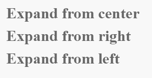
<h1 class="fromCenter">Expand from center</h1><br/>
<h1 class="fromRight">Expand from right</h1><br/>
<h1 class="fromLeft">Expand from left</h1>
Note : You need to add vendor prefixes to maximize browser support (see canIuse).
Expand bottom border on hover with 2 lines
You can achieve this effect when the text spans on 2 lines. The before pseudo element is absolutely positioned to make underline of the first line with bottom:1.2em;:
h1 { position:relative;color: #666;display:inline-block; margin:0;text-transform:uppercase;text-align:center;line-height:1.2em; }
h1:after, h1:before {
  display:block;
  content: '';
  border-bottom: solid 3px #019fb6;
  transform: scaleX(0);
  transition: transform 250ms ease-in-out;
}
h1:before{
  position:absolute;
  bottom:1.2em; left:0;
  width:100%;
}
.ef2:hover:after {
  transition-delay:150ms;
}

h1:hover:after, h1:hover:before { transform: scaleX(1); }
<h1>Expand border<br/>on two lines</h1>
<br/>
<br/>
<h1 class="ef2">Expand border<br/>effect two</h1>
Different transition direction on hover in and out :
The point is to change the transform-origin position from one side to the other on the hover state. This way the bottom boder enters from one side on hover and exits on the other when the element isn't hovered anymore.
Here is a demo :
h1 { color: #666;display:inline-block; margin:0;text-transform:uppercase; }
h1:after {
  display:block;
  content: '';
  border-bottom: solid 3px #019fb6;
  transform: scaleX(0);
  transition: transform 250ms ease-in-out;
}
h1.fromLeft:after{ transform-origin: 100% 50%; }
h1.fromRight:after{  transform-origin:   0% 50%; }
h1.fromLeft:hover:after{ transform: scaleX(1); transform-origin:   0% 50%; }
h1.fromRight:hover:after{ transform: scaleX(1); transform-origin: 100% 50%; }
<h1 class="fromRight">Expand from right</h1><br/>
<h1 class="fromLeft">Expand from left</h1>
