123

Is it possible to change the datepicker (and also the timepicker) color scheme for Android 5.0?

I've tried setting the accent colors, but this doesn't work (both with and without android):

<!-- colorPrimary is used for the default action bar background -->
<item name="colorPrimary">@color/purple</item>

<!-- colorPrimaryDark is used for the status bar -->
<item name="colorPrimaryDark">@color/purple_tint</item>

<!-- colorAccent is used as the default value for colorControlActivated
     which is used to tint widgets -->
<item name="colorAccent">@color/purple_tint</item>

From original:

Original

To something like this:

Recolored

Troll
  • 1,895
  • 3
  • 15
  • 34
Warpzit
  • 27,966
  • 19
  • 103
  • 155

10 Answers10

351

The reason why Neil's suggestion results in a fullscreen DatePicker is the choice of parent theme:

<!-- Theme.AppCompat.Light is not a dialog theme -->
<style name="DialogTheme" parent="**Theme.AppCompat.Light**">
    <item name="colorAccent">@color/blue_500</item>
</style>

Moreover, if you go this route, you have to specify the theme while creating the DatePickerDialog:

// R.style.DialogTheme
new DatePickerDialog(MainActivity.this, R.style.DialogTheme, new DatePickerDialog.OnDateSetListener() {
    @Override
    public void onDateSet(DatePicker view, int year, int monthOfYear, int dayOfMonth) {
        //DO SOMETHING
    }
}, 2015, 02, 26).show();

This, in my opinion, is not good. One should try to keep the styling out of java and inside styles.xml/themes.xml.

I do agree that Neil's suggestion, with a bit of change (changing the parent theme to say, Theme.Material.Light.Dialog) will get you the desired result. But, here's the other way:

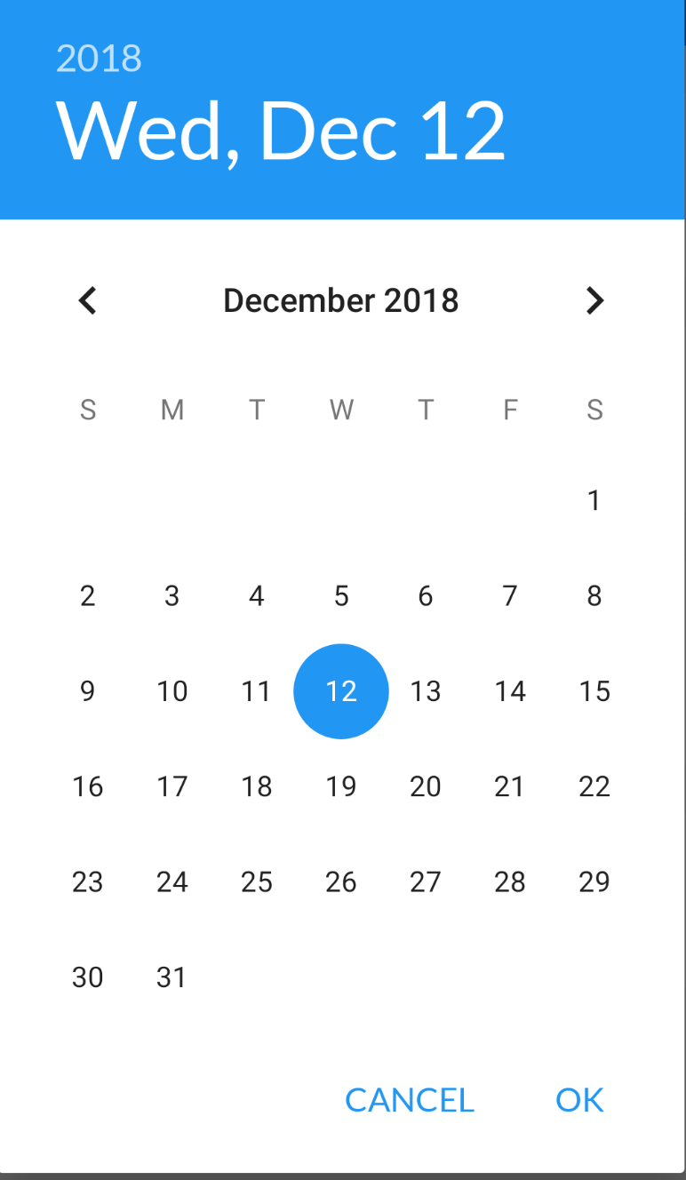
On first inspection, we come across datePickerStyle which defines things such as: headerBackground(what you are trying to change), dayOfWeekBackground, and a few other text-colors and text-styles.

Overriding this attribute in your app's theme will not work. DatePickerDialog uses a separate theme assignable by the attribute datePickerDialogTheme. So, for our changes to take affect, we must override datePickerStyle inside an overriden datePickerDialogTheme.

Here we go:

Override datePickerDialogTheme inside your app's base theme:

<style name="AppBaseTheme" parent="android:Theme.Material.Light">
    ....
    <item name="android:datePickerDialogTheme">@style/MyDatePickerDialogTheme</item>
</style>

Define MyDatePickerDialogTheme. The choice of parent theme will depend on what your app's base theme is: it could be either Theme.Material.Dialog or Theme.Material.Light.Dialog:

<style name="MyDatePickerDialogTheme" parent="android:Theme.Material.Light.Dialog">
    <item name="android:datePickerStyle">@style/MyDatePickerStyle</item>
</style>

We have overridden datePickerStyle with the style MyDatePickerStyle. The choice of parent will once again depend on what your app's base theme is: either Widget.Material.DatePicker or Widget.Material.Light.DatePicker. Define it as per your requirements:

<style name="MyDatePickerStyle" parent="@android:style/Widget.Material.Light.DatePicker">
    <item name="android:headerBackground">@color/chosen_header_bg_color</item>
</style>

Currently, we are only overriding headerBackground which by default is set to ?attr/colorAccent (this is also why Neil suggestion works in changing the background). But there's quite a lot of customization possible:

dayOfWeekBackground
dayOfWeekTextAppearance
headerMonthTextAppearance
headerDayOfMonthTextAppearance
headerYearTextAppearance
headerSelectedTextColor
yearListItemTextAppearance
yearListSelectorColor
calendarTextColor
calendarSelectedTextColor

If you don't want this much control (customization), you don't need to override datePickerStyle. colorAccent controls most of the DatePicker's colors. So, overriding just colorAccent inside MyDatePickerDialogTheme should work:

<style name="MyDatePickerDialogTheme" parent="android:Theme.Material.Light.Dialog">
    <item name="android:colorAccent">@color/date_picker_accent</item>

    <!-- No need to override 'datePickerStyle' -->
    <!-- <item name="android:datePickerStyle">@style/MyDatePickerStyle</item> -->
</style>

Overriding colorAccent gives you the added benefit of changing OK & CANCEL text colors as well. Not bad.

This way you don't have to provide any styling information to DatePickerDialog's constructor. Everything has been wired properly:

DatePickerDialog dpd = new DatePickerDialog(this, new DatePickerDialog.OnDateSetListener() {
    @Override
    public void onDateSet(DatePicker view, int year, int monthOfYear, int dayOfMonth) {

    }
 }, 2015, 5, 22);

 dpd.show();
Vikram
  • 51,313
  • 11
  • 93
  • 122
  • 10
    Thanks for a good and full description of how it works and how it had to be overriden in styles – Warpzit Mar 18 '15 at 09:08
  • Excellent explanation @Vikram how can we change ok, cancel text color ? – Dilip Jun 19 '15 at 07:04
  • @Dipu Sorry about this late response - busy with work. I hope that you've found the solution by now. In case you haven't, I explain this process in detail over here: [How to explore styling in android](http://stackoverflow.com/a/28683713/2558882). – Vikram Jul 13 '15 at 04:00
  • @Vikram I found the solution same day after few R&D – Dilip Jul 13 '15 at 06:16
  • 1
    @Vikram calendarSelectedTextColor not found. – Akhilesh Dhar Dubey Dec 01 '15 at 14:25
  • 7
    Is it possible to be backward compatible for android < 21 the datePicker? – RoCkDevstack May 13 '16 at 16:15
  • 1
    @RoCk Not sure what you mean, but I built a library to back port the Date & Time pickers from android version 23 to version 14. The project is hosted at: [https://github.com/vikramkakkar/SublimePicker](https://github.com/vikramkakkar/SublimePicker). – Vikram May 13 '16 at 16:23
  • @Vikram - Sorry for vague question, I have an app that open datePicker for Birthdate. For Android not runnig Lollipop their date picker is not the same as shown above. How do I make that one, backward compatible? – RoCkDevstack May 13 '16 at 16:26
  • @RoCk You will have to use a library project like the one I posted above. DatePicker as shown above is only available on API v21 & above. Android's own DatePicker also changed on API v23 - the months now scroll left-and-right, rather than up-and-down. – Vikram May 13 '16 at 16:31
  • @Vikram Is it possible to increase the datepicker dialog width and height ? I have already tried: datePickerDialog.getWindow().setLayout(width, height); – r.bhardwaj May 18 '16 at 07:30
  • 1
    Fantastic answer! I just wanted to add that I've found that `android:colorAccent` apparently does not cover the selection circle color, but plain `colorAccent` will cover *both* the selection color and the "OK"/"Cancel" button text. (Or you can different colors by using both!) This is with AndroidX Material 1.1.0 library and may well vary with different versions of the DatePicker. – big_m Mar 11 '20 at 11:58
  • @Vikram can we change the dialog shape ? For eg: the rounded corner radius – Jeevan Rupacha Jun 21 '22 at 06:36
71

Give this a try.

The code

new DatePickerDialog(MainActivity.this, R.style.DialogTheme, new DatePickerDialog.OnDateSetListener() {
    @Override
    public void onDateSet(DatePicker view, int year, int monthOfYear, int dayOfMonth) {
        //DO SOMETHING
    }
}, 2015, 02, 26).show();

The Style In your styles.xml file

EDIT - Changed theme to Theme.AppCompat.Light.Dialog as suggested

<style name="DialogTheme" parent="Theme.AppCompat.Light.Dialog">
    <item name="colorAccent">@color/blue_500</item>
</style>
the-ginger-geek
  • 7,041
  • 4
  • 27
  • 45
  • 2
    Yes it's purple, but also full screen :) but maybe if I put it inside a fragment it will be contained. Any suggestions before I start playing around with it again? – Warpzit Feb 26 '15 at 09:41
  • I'll see if I can find a more appropriate solution that doesn't cause it to go full screen – the-ginger-geek Feb 26 '15 at 09:49
  • 11
    Just use `parent="Theme.AppCompat.Light.Dialog"` instead of `parent="Theme.AppCompat.Light"` – Chupik Mar 12 '15 at 16:23
  • @Neil thanks for the answer, pointed me in the right direction and this is properly the quickest solution but I was looking for an all style/theme approach :) – Warpzit Mar 18 '15 at 09:09
  • Not working on android 6, it is full screen and color is not changed – Jemshit May 16 '16 at 12:39
26

Create a new style

<!-- Theme.AppCompat.Light.Dialog -->
<style name="DialogTheme" parent="Theme.AppCompat.Light.Dialog">
    <item name="colorAccent">@color/blue_500</item>
</style>

Java code:

The parent theme is the key here. Choose your colorAccent

DatePickerDialog = new DatePickerDialog(context,R.style.DialogTheme,this,now.get(Calendar.YEAR),now.get(Calendar.MONTH),now.get(Calendar.DAY_OF_MONTH);

Result:

enter image description here

9

try this, work for me

Put the two options, colorAccent and android:colorAccent

<style name="AppTheme" parent="@style/Theme.AppCompat.Light.NoActionBar">
    <!-- Customize your theme here. -->
   ....
    <item name="android:dialogTheme">@style/AppTheme.DialogTheme</item>
    <item name="android:datePickerDialogTheme">@style/Dialog.Theme</item>
</style>

<style name="AppTheme.DialogTheme" parent="Theme.AppCompat.Light.Dialog">

<!-- Put the two options, colorAccent and android:colorAccent. -->
    <item name="colorAccent">@color/colorPrimary</item>
    <item name="android:colorPrimary">@color/colorPrimary</item>
    <item name="android:colorPrimaryDark">@color/colorPrimaryDark</item>
    <item name="android:colorAccent">@color/colorPrimary</item>
 </style>
3

Just to mention, you can also use the default a theme like android.R.style.Theme_DeviceDefault_Light_Dialog instead.

new DatePickerDialog(MainActivity.this, android.R.style.Theme_DeviceDefault_Light_Dialog, new DatePickerDialog.OnDateSetListener() {
@Override
public void onDateSet(DatePicker view, int year, int monthOfYear, int dayOfMonth) {
    //DO SOMETHING
    }
}, 2015, 02, 26).show();
user1214120
  • 173
  • 1
  • 2
  • 15
1

You don't have create theme just write it in your dialog creation object

DatePickerDialog datePicker = new DatePickerDialog(getActivity(), AlertDialog.THEME_HOLO_LIGHT,this, mYear, mMonth, mDay);

follow this it will give you all type date picker style it's really work

http://www.android-examples.com/change-datepickerdialog-theme-in-android-using-dialogfragment/

Avinash Ajay Pandey
  • 1,497
  • 12
  • 19
1

I had the problem that time picker buttons have not been seen in the screen for API 24 in android. (API 21+) it is solved by

<style name="MyDatePickerDialogTheme" parent="android:Theme.Material.Light.Dialog">
            <item name="android:colorAccent">@color/colorPrimary2</item></style>

<style name="Theme" parent="BBaseTheme">
         <item name="android:datePickerDialogTheme">@style/MyDatePickerDialogTheme</item>
</style>
Samet ÖZTOPRAK
  • 3,112
  • 3
  • 32
  • 33
1
<style name="AppThemeDatePicker" parent="Theme.AppCompat.Light.NoActionBar">
    <item name="colorAccent">@color/select2</item>
    <item name="android:colorAccent">@color/select2</item>
    <item name="android:datePickerStyle">@style/MyDatePickerStyle</item>
</style>


<style name="MyDatePickerStyle" parent="@android:style/Widget.Material.Light.DatePicker">
    <item name="android:headerBackground">@color/select2</item>
</style>
Keshav Gera
  • 10,807
  • 1
  • 75
  • 53
0

For Changing Year list item text color (SPECIFIC FOR ANDROID 5.0)

Just set certain text color in your date picker dialog style. For some reason setting flag yearListItemTextAppearance doesn't reflect any change on year list.

<item name="android:textColor">@android:color/black</item>
user3354265
  • 777
  • 1
  • 10
  • 26
0

Kotlin, 2021

// set date as button text if pressed
btnDate.setOnClickListener(View.OnClickListener {

    val dpd = DatePickerDialog(
        this,
        { view, year, monthOfYear, dayOfMonth ->
            val selectDate = Calendar.getInstance()
            selectDate.set(Calendar.YEAR, year)
            selectDate.set(Calendar.MONTH, monthOfYear)
            selectDate.set(Calendar.DAY_OF_MONTH, dayOfMonth)

            var formatDate = SimpleDateFormat("dd/MM/yyyy", Locale.getDefault())
            val date = formatDate.format(selectDate.time)
            Toast.makeText(this, date, Toast.LENGTH_SHORT).show()
            btnDate.text = date
        }, 1990, 6, 6
    )

    val calendar = Calendar.getInstance()
    val year = calendar[Calendar.YEAR]
    val month = calendar[Calendar.MONTH]
    val day = calendar[Calendar.DAY_OF_MONTH]
    dpd.datePicker.minDate = GregorianCalendar(year - 90, month, day, 0, 0).timeInMillis
    dpd.datePicker.maxDate = GregorianCalendar(year - 10, month, day, 0, 0).timeInMillis
    dpd.show()
})

Styles.xml

<style name="AppTheme" parent="Theme.AppCompat.Light.NoActionBar">
    <!-- This is main Theme Style for your application! -->
    <item name="android:datePickerDialogTheme">@style/MyDatePickerDialogTheme</item>
</style>

<style name="MyDatePickerDialogTheme" parent="android:Theme.Material.Dialog">
    <item name="android:datePickerStyle">@style/MyDatePickerStyle</item>
</style>

<style name="MyDatePickerStyle" parent="@android:style/Widget.Material.DatePicker">
    <item name="android:headerBackground">#A500FF</item>
</style>

enter image description here

J A S K I E R
  • 1,976
  • 3
  • 24
  • 42