I am looking to Custom The Switch Button to becoming as following :

How to achieve this ?
I am looking to Custom The Switch Button to becoming as following :
How to achieve this ?
However, I might not be taking the best approach, but this is how I have created some Switch like UIs in few of my apps.
Here is the code -
<RadioGroup
        android:checkedButton="@+id/offer"
        android:id="@+id/toggle"
        android:layout_width="match_parent"
        android:layout_height="30dp"
        android:layout_marginBottom="@dimen/margin_medium"
        android:layout_marginLeft="50dp"
        android:layout_marginRight="50dp"
        android:layout_marginTop="@dimen/margin_medium"
        android:background="@drawable/pink_out_line"
        android:orientation="horizontal">

        <RadioButton
            android:layout_marginTop="1dp"
            android:layout_marginBottom="1dp"
            android:layout_marginLeft="1dp"
            android:id="@+id/search"
            android:background="@drawable/toggle_widget_background"
            android:layout_width="0dp"
            android:layout_height="match_parent"
            android:layout_weight="1"
            android:button="@null"
            android:gravity="center"
            android:text="Search"
            android:textColor="@color/white" />

        <RadioButton
            android:layout_marginRight="1dp"
            android:layout_marginTop="1dp"
            android:layout_marginBottom="1dp"
            android:id="@+id/offer"
            android:layout_width="0dp"
            android:layout_height="match_parent"
            android:layout_weight="1"
            android:background="@drawable/toggle_widget_background"
            android:button="@null"
            android:gravity="center"
            android:text="Offers"
            android:textColor="@color/white" />
    </RadioGroup>
pink_out_line.xml
<shape xmlns:android="http://schemas.android.com/apk/res/android"
    android:shape="rectangle">
    <corners android:radius="2dp" />
    <solid android:color="#80000000" />
    <stroke
        android:width="1dp"
        android:color="@color/pink" />
</shape>
toggle_widget_background.xml
<?xml version="1.0" encoding="UTF-8" standalone="no"?>
<selector xmlns:android="http://schemas.android.com/apk/res/android">
    <item android:drawable="@color/pink" android:state_checked="true" />
    <item android:drawable="@color/dark_pink" android:state_pressed="true" />
    <item android:drawable="@color/transparent" />
</selector>
And here is the output -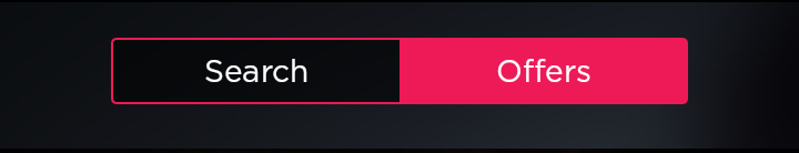
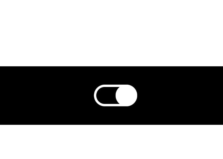
Its a simple xml design. It looks like iOS switch, check this below image
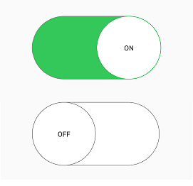
You need to create custom_thumb.xml and custom_track.xml
This is my switch,I need a very big switch so added layout_width/layout_height parameter
 <androidx.appcompat.widget.SwitchCompat
        android:id="@+id/swOnOff"
        android:layout_width="@dimen/_200sdp"
        android:layout_marginStart="@dimen/_50sdp"
        android:layout_marginEnd="@dimen/_50sdp"
        android:layout_marginTop="@dimen/_30sdp"
        android:layout_gravity="center"
        app:showText="true"
        android:textSize="@dimen/_20ssp"
        android:fontFamily="@font/opensans_bold"
        app:track="@drawable/custom_track"
        android:thumb="@drawable/custom_thumb"
        android:layout_height="@dimen/_120sdp"/>
Now create custom_thumb.xml
<?xml version="1.0" encoding="utf-8"?>
<selector
    xmlns:android="http://schemas.android.com/apk/res/android">
    <item android:state_checked="false">
        <shape android:shape="oval">
            <solid android:color="#ffffff"/>
            <size android:width="@dimen/_100sdp"
                android:height="@dimen/_100sdp"/>
            <stroke android:width="1dp"
                android:color="#8c8c8c"/>
        </shape>
    </item>
    <item android:state_checked="true">
        <shape android:shape="oval">
            <solid android:color="#ffffff"/>
            <size android:width="@dimen/_100sdp"
                android:height="@dimen/_100sdp"/>
            <stroke android:width="1dp"
                android:color="#34c759"/>
        </shape>
    </item>
</selector>
Now create custom_track.xml
<?xml version="1.0" encoding="utf-8"?>
<selector xmlns:android="http://schemas.android.com/apk/res/android">
    <item android:state_checked="false">
        <shape android:shape="rectangle">
            <corners android:radius="@dimen/_100sdp" />
            <solid android:color="#ffffff" />
            <stroke android:color="#8c8c8c" android:width="1dp"/>
            <size android:height="20dp" />
        </shape>
    </item>
    <item android:state_checked="true">
        <shape android:shape="rectangle">
            <corners android:radius="@dimen/_100sdp" />
            <solid android:color="#34c759" />
            <stroke android:color="#8c8c8c" android:width="1dp"/>
            <size android:height="20dp" />
        </shape>
    </item>
</selector>
you can use the following code to change color and text :
<org.jraf.android.backport.switchwidget.Switch
                        android:id="@+id/th"
                        android:layout_width="match_parent"
                        android:layout_height="wrap_content"
                        app:thumb="@drawable/apptheme_switch_inner_holo_light"
                        app:track="@drawable/apptheme_switch_track_holo_light"
                        app:textOn="@string/switch_yes"
                        app:textOff="@string/switch_no"
                        android:textColor="#000000"
                        />
Create a xml named colors.xml in res/values folder:
<?xml version="1.0" encoding="utf-8"?>
<resources>
    <color name="red">#ff0000</color>
    <color name="green">#00ff00</color>
</resources>
In drawable folder, create a xml file my_btn_toggle.xml:
  <selector xmlns:android="http://schemas.android.com/apk/res/android">
        <item android:state_checked="false" android:drawable="@color/red"  />
        <item android:state_checked="true" android:drawable="@color/green"  />
    </selector>
and in xml section defining your toggle button add:
android:background="@drawable/my_btn_toggle
to change the color of textOn and textOffuse
android:switchTextAppearance="@style/Switch"
<Switch android:layout_width="wrap_content"
                    android:layout_height="wrap_content"
                    android:thumb="@drawable/custom_switch_inner_holo_light"
                    android:track="@drawable/custom_switch_track_holo_light"
                    android:textOn="@string/yes"
                    android:textOff="@string/no"/>
drawable/custom_switch_inner_holo_light.xml
<selector xmlns:android="http://schemas.android.com/apk/res/android">
    <item android:state_enabled="false" android:drawable="@drawable/custom_switch_thumb_disabled_holo_light" />
    <item android:state_pressed="true"  android:drawable="@drawable/custom_switch_thumb_pressed_holo_light" />
    <item android:state_checked="true"  android:drawable="@drawable/custom_switch_thumb_activated_holo_light" />
    <item                               android:drawable="@drawable/custom_switch_thumb_holo_light" />
</selector>
drawable/custom_switch_track_holo_light.xml
<selector xmlns:android="http://schemas.android.com/apk/res/android">
    <item android:state_focused="true"  android:drawable="@drawable/custom_switch_bg_focused_holo_light" />
    <item                               android:drawable="@drawable/custom_switch_bg_holo_light" />
</selector>
Next images are 9.paths drawables and they must be in different density (mdpi, hdpi, xhdpi, xxhdpi). As example I give xxhdpi (you can resize they if u needed):
drawable/custom_switch_thumb_disabled_holo_light

drawable/custom_switch_thumb_pressed_holo_light

drawable/custom_switch_thumb_activated_holo_light

drawable/custom_switch_thumb_holo_light

drawable/custom_switch_bg_focused_holo_light

drawable/custom_switch_bg_holo_light

I achieved this

by doing:
1) custom selector:
<?xml version="1.0" encoding="utf-8"?>
<selector xmlns:android="http://schemas.android.com/apk/res/android">
    <item android:drawable="@drawable/ic_switch_off"
          android:state_checked="false"/>
    <item android:drawable="@drawable/ic_switch_on"
          android:state_checked="true"/>
</selector>
2) using v7 SwitchCompat
<android.support.v7.widget.SwitchCompat
    android:layout_width="wrap_content"
    android:layout_height="wrap_content"
    android:background="@null"
    android:button="@drawable/checkbox_yura"
    android:thumb="@null"
    app:track="@null"/>
I use this approach to create a custom switch using a RadioGroup and RadioButton;
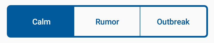
<color name="blue">#FF005a9c</color>
<color name="lightBlue">#ff6691c4</color>
<color name="lighterBlue">#ffcdd8ec</color>
<color name="controlBackground">#ffffffff</color>
control_switch_color_selector (in res/color folder)
<selector xmlns:android="http://schemas.android.com/apk/res/android">
    <item
        android:state_checked="true"
        android:color="@color/controlBackground"
    />
    <item
        android:state_pressed="true"
        android:color="@color/controlBackground"
        />
    <item
        android:color="@color/blue"
        />
</selector>
control_switch_background_border.xml
<shape xmlns:android="http://schemas.android.com/apk/res/android"
    android:shape="rectangle">
    <corners android:radius="5dp" />
    <solid android:color="@android:color/transparent" />
    <stroke
        android:width="3dp"
        android:color="@color/blue" />
</shape>
control_switch_background_selector.xml
<selector xmlns:android="http://schemas.android.com/apk/res/android">
    <item android:state_checked="true">
        <shape>
            <solid android:color="@color/blue"></solid>
        </shape>
    </item>
    <item android:state_pressed="true">
        <shape>
            <solid android:color="@color/lighterBlue"></solid>
        </shape>
    </item>
    <item>
        <shape>
            <solid android:color="@android:color/transparent"></solid>
        </shape>
    </item>
</selector>
control_switch_background_selector_middle.xml
<selector xmlns:android="http://schemas.android.com/apk/res/android">
    <item android:state_checked="true">
        <shape>
            <solid android:color="@color/blue"></solid>
        </shape>
    </item>
    <item android:state_pressed="true">
        <shape>
            <solid android:color="@color/lighterBlue"></solid>
        </shape>
    </item>
    <item>
        <layer-list>
            <item android:top="-1dp" android:bottom="-1dp" android:left="-1dp">
                <shape>
                    <solid android:color="@android:color/transparent"></solid>
                    <stroke android:width="1dp" android:color="@color/blue"></stroke>
                </shape>
            </item>
        </layer-list>
    </item>
</selector>
<RadioGroup
        android:checkedButton="@+id/calm"
        android:id="@+id/toggle"
        android:layout_width="match_parent"
        android:layout_height="wrap_content"
        android:layout_marginLeft="24dp"
        android:layout_marginRight="24dp"
        android:layout_marginBottom="24dp"
        android:layout_marginTop="24dp"
        android:background="@drawable/control_switch_background_border"
        android:orientation="horizontal">
        <RadioButton
            android:layout_marginTop="3dp"
            android:layout_marginBottom="3dp"
            android:layout_marginLeft="3dp"
            android:paddingTop="16dp"
            android:paddingBottom="16dp"
            android:id="@+id/calm"
            android:background="@drawable/control_switch_background_selector_middle"
            android:layout_width="0dp"
            android:layout_height="match_parent"
            android:layout_weight="1"
            android:button="@null"
            android:gravity="center"
            android:text="Calm"
            android:fontFamily="sans-serif-medium"
            android:textColor="@color/control_switch_color_selector"/>
        <RadioButton
            android:layout_marginTop="3dp"
            android:layout_marginBottom="3dp"
            android:paddingTop="16dp"
            android:paddingBottom="16dp"
            android:id="@+id/rumor"
            android:background="@drawable/control_switch_background_selector_middle"
            android:layout_width="0dp"
            android:layout_height="match_parent"
            android:layout_weight="1"
            android:button="@null"
            android:gravity="center"
            android:text="Rumor"
            android:fontFamily="sans-serif-medium"
            android:textColor="@color/control_switch_color_selector"/>
        <RadioButton
            android:layout_marginTop="3dp"
            android:layout_marginBottom="3dp"
            android:layout_marginRight="3dp"
            android:paddingTop="16dp"
            android:paddingBottom="16dp"
            android:id="@+id/outbreak"
            android:layout_width="0dp"
            android:layout_height="match_parent"
            android:layout_weight="1"
            android:background="@drawable/control_switch_background_selector"
            android:button="@null"
            android:gravity="center"
            android:text="Outbreak"
            android:fontFamily="sans-serif-medium"
            android:textColor="@color/control_switch_color_selector" />
</RadioGroup>
Use the code below to create a custom switch button like the one shown below.
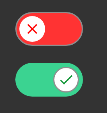
<androidx.appcompat.widget.SwitchCompat
        android:layout_width="wrap_content"
        android:layout_height="wrap_content"
        android:id="@+id/customSwitch"
        app:layout_constraintBottom_toBottomOf="parent"
        app:layout_constraintLeft_toLeftOf="parent"
        app:layout_constraintRight_toRightOf="parent"
        app:layout_constraintTop_toTopOf="parent"
        android:checked="false"
        app:track="@drawable/track"
        android:thumb="@drawable/thumb"
        android:text="" />
@drawable/track
<?xml version="1.0" encoding="utf-8"?>
<selector xmlns:android="http://schemas.android.com/apk/res/android">

    <item android:state_checked="false">
        <shape android:shape="rectangle">
            <solid android:color="#FF3333"/>
            <corners android:radius="100sp"/>
            <stroke android:color="#8e8e8e"
                android:width="1dp"/>
        </shape>
    </item>

    <item android:state_checked="true">
        <shape android:shape="rectangle">
            <solid android:color="@color/color_green"/>      <!--color name="color_green">#3bd391</color-->
            <corners android:radius="100sp"/>
        </shape>
    </item>
</selector>
@drawable/thumb
<?xml version="1.0" encoding="utf-8"?>
<selector xmlns:android="http://schemas.android.com/apk/res/android">

    <item android:state_checked="false"
        android:drawable="@drawable/switch_thumb_false"/>

    <item android:state_checked="true"
        android:drawable="@drawable/switch_thumb_true"/>

</selector>
@drawable/switch_thumb_false
<?xml version="1.0" encoding="utf-8"?>
<layer-list xmlns:android="http://schemas.android.com/apk/res/android">

    <item
        android:bottom="4dp"
        android:top="4dp"
        android:left="4dp"
        android:right="4dp">

        <shape android:shape="oval">
            <solid android:color="#FFFFFF"/>
            <size android:height="3dp"
                android:width="3dp"/>
        </shape>
    </item>

    <item android:drawable="@drawable/ic_baseline_close_16"
        android:bottom="8dp"
        android:top="8dp"
        android:left="8dp"
        android:right="8dp"/>

</layer-list>
@drawable/switch_thumb_true
<?xml version="1.0" encoding="utf-8"?>
<layer-list xmlns:android="http://schemas.android.com/apk/res/android">

    <item
        android:bottom="4dp"
        android:top="4dp"
        android:left="4dp"
        android:right="4dp">

        <shape android:shape="oval">
            <solid android:color="#FFFFFF"/>
            <size android:height="3dp"
                android:width="3dp"/>
            <stroke android:width="1sp"
                android:color="#8e8e8e" />
        </shape>
    </item>


    <item android:drawable="@drawable/ic_baseline_correct_16"
        android:bottom="8dp"
        android:top="8dp"
        android:left="8dp"
        android:right="8dp"
        />


</layer-list>
@drawable/ic_baseline_correct_16
<vector xmlns:android="http://schemas.android.com/apk/res/android"
    android:width="16dp"
    android:height="16dp"
    android:viewportWidth="24"
    android:viewportHeight="24"
    android:tint="#008F28"
    android:alpha="0.9">
    <path
        android:fillColor="#FF000000"
        android:pathData="M9,16.2L4.8,12l-1.4,1.4L9,19 21,7l-1.4,-1.4L9,16.2z"/>
</vector>
@drawable/ic_baseline_close_16
<vector
    android:height="16dp"
    android:tint="#FF0000"
    android:viewportHeight="24"
    android:viewportWidth="24"
    android:width="16dp"
    xmlns:android="http://schemas.android.com/apk/res/android">
    <path android:fillColor="@android:color/white" android:pathData="M19,6.41L17.59,5 12,10.59 6.41,5 5,6.41 10.59,12 5,17.59 6.41,19 12,13.41 17.59,19 19,17.59 13.41,12z"/>
</vector>
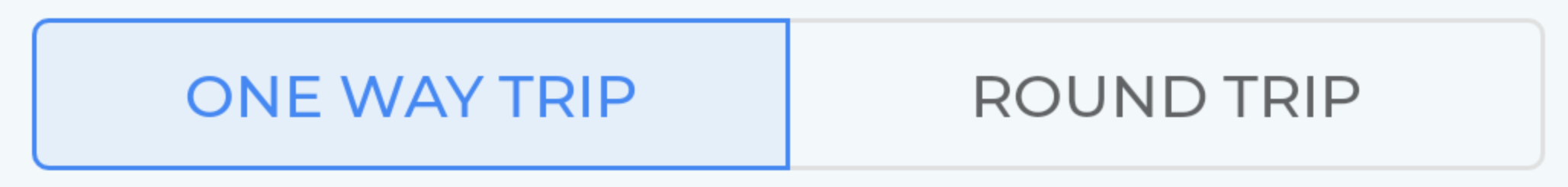
You can use Android Material Components.
build.gradle:
implementation 'com.google.android.material:material:1.0.0'
layout.xml:
<com.google.android.material.button.MaterialButtonToggleGroup
        android:id="@+id/toggleGroup"
        android:layout_width="match_parent"
        android:layout_height="wrap_content"
        app:checkedButton="@id/btn_one_way"
        app:singleSelection="true">

    <Button
            style="@style/Widget.MaterialComponents.Button.OutlinedButton"
            android:id="@+id/btn_one_way"
            android:layout_width="0dp"
            android:layout_weight="1"
            android:layout_height="wrap_content"
            android:text="One way trip" />

    <Button
            style="@style/Widget.MaterialComponents.Button.OutlinedButton"
            android:id="@+id/btn_round"
            android:layout_width="0dp"
            android:layout_weight="1"
            android:layout_height="wrap_content"
            android:text="Round trip" />

</com.google.android.material.button.MaterialButtonToggleGroup>
You can use the regular Switch widget and just call setTextOn() and setTextOff(), or use the android:textOn and android:textOff attributes.
Example 1:

custom_thumb.xml
<?xml version="1.0" encoding="utf-8"?>
<selector xmlns:android="http://schemas.android.com/apk/res/android">
    <item android:state_checked="true">
        <shape android:dither="true" android:shape="rectangle" android:useLevel="false" android:visible="true">
            <corners android:radius="20dp" />
            <solid android:color="@color/white"/>
            <size android:width="37dp" android:height="37dp" />
            <stroke android:width="4dp" android:color="@color/white" />
        </shape>
    </item>
    <item android:state_checked="false">
        <shape android:dither="true" android:shape="rectangle" android:useLevel="false" android:visible="true">
            <corners android:radius="20dp" />
            <solid android:color="@color/white"/>
            <size android:width="37dp" android:height="37dp" />
            <stroke android:width="4dp" android:color="#0000ffff" />
        </shape>
    </item>
</selector>
custom_track.xml
<?xml version="1.0" encoding="utf-8"?>
<shape android:shape="rectangle"
    android:visible="true"
    android:dither="true"
    android:useLevel="false"
    xmlns:android="http://schemas.android.com/apk/res/android">
    <solid android:color="@color/black"/>
    <corners
        android:radius="20dp"/>
    <size
        android:width="50dp"
        android:height="26dp" />
    <stroke android:color="@color/white"
        android:width="4dp"/>
</shape>
activity_main.xml
<?xml version="1.0" encoding="utf-8"?>
<LinearLayout xmlns:android="http://schemas.android.com/apk/res/android"
    xmlns:tools="http://schemas.android.com/tools"
    android:layout_width="match_parent"
    android:layout_height="match_parent"
    android:gravity="center"
    android:orientation="vertical"
    tools:context=".MainActivity">

    <LinearLayout
        android:layout_width="match_parent"
        android:layout_height="100dp"
        android:background="@color/black"
        android:gravity="center">

        <Switch
            android:id="@+id/switch1"
            android:layout_width="wrap_content"
            android:layout_height="wrap_content"
            android:layout_marginStart="4dp"
            android:thumb="@drawable/custom_thumb"
            android:track="@drawable/custom_track"
            tools:ignore="UseSwitchCompatOrMaterialXml" />

    </LinearLayout>

</LinearLayout>
Example 2:


custom_thumb.xml
<?xml version="1.0" encoding="utf-8"?>
<selector xmlns:android="http://schemas.android.com/apk/res/android">
    <item android:state_checked="true">
        <shape android:dither="true" android:shape="rectangle" android:useLevel="false" android:visible="true">
            <corners android:radius="20dp" />
            <solid android:color="@color/black"/>
            <size android:width="37dp" android:height="37dp" />
            <stroke android:width="4dp" android:color="@color/white" />
        </shape>
    </item>
    <item android:state_checked="false">
        <shape android:dither="true" android:shape="rectangle" android:useLevel="false" android:visible="true">
            <corners android:radius="20dp" />
            <solid android:color="@color/black"/>
            <size android:width="37dp" android:height="37dp" />
            <stroke android:width="4dp" android:color="@color/white" />
        </shape>
    </item>
</selector>
custom_track.xml
<?xml version="1.0" encoding="utf-8"?>
<shape android:shape="rectangle"
    android:visible="true"
    android:dither="true"
    android:useLevel="false"
    xmlns:android="http://schemas.android.com/apk/res/android">
    <solid android:color="@color/black"/>
    <corners
        android:radius="20dp"/>
    <size
        android:width="50dp"
        android:height="26dp" />
    <stroke android:color="@color/white"
        android:width="4dp"/>
</shape>
activity_main.xml
<?xml version="1.0" encoding="utf-8"?>
<LinearLayout xmlns:android="http://schemas.android.com/apk/res/android"
    xmlns:tools="http://schemas.android.com/tools"
    android:layout_width="match_parent"
    android:layout_height="match_parent"
    android:gravity="center"
    android:orientation="vertical"
    tools:context=".MainActivity">

    <LinearLayout
        android:layout_width="match_parent"
        android:layout_height="100dp"
        android:background="@color/black"
        android:gravity="center">

        <Switch
            android:id="@+id/switch1"
            android:layout_width="wrap_content"
            android:layout_height="wrap_content"
            android:layout_marginStart="4dp"
            android:thumb="@drawable/custom_thumb"
            android:track="@drawable/custom_track"
            tools:ignore="UseSwitchCompatOrMaterialXml" />

    </LinearLayout>

</LinearLayout>
Example 3:


custom_thumb.xml
<?xml version="1.0" encoding="utf-8"?>
<selector xmlns:android="http://schemas.android.com/apk/res/android">
    <item android:state_checked="true">
        <shape android:dither="true" android:shape="rectangle" android:useLevel="false" android:visible="true">
            <corners android:radius="20dp" />
            <solid android:color="@color/white" />
            <size android:width="37dp" android:height="37dp" />
            <stroke android:width="4dp" android:color="@color/black" />
        </shape>
    </item>
    <item android:state_checked="false">
        <shape android:dither="true" android:shape="rectangle" android:useLevel="false" android:visible="true">
            <corners android:radius="20dp" />
            <solid android:color="@color/white" />
            <size android:width="37dp" android:height="37dp" />
            <stroke android:width="4dp" android:color="#cdcdcd" />
        </shape>
    </item>
</selector>
custom_track.xml
<?xml version="1.0" encoding="utf-8"?>
<selector xmlns:android="http://schemas.android.com/apk/res/android">
    <item android:state_checked="true">
        <shape android:dither="true" android:shape="rectangle" android:useLevel="false" android:visible="true">
            <solid android:color="@color/black" />
            <corners android:radius="20dp" />
            <size android:width="50dp" android:height="26dp" />
        </shape>
    </item>
    <item android:state_checked="false">
        <shape android:dither="true" android:shape="rectangle" android:useLevel="false" android:visible="true">
           <solid android:color="#cdcdcd" />
            <corners android:radius="20dp" />
            <size android:width="50dp" android:height="26dp" />
        </shape>
    </item>
</selector>
activity_main.xml
<LinearLayout xmlns:android="http://schemas.android.com/apk/res/android"
    xmlns:tools="http://schemas.android.com/tools"
    android:layout_width="match_parent"
    android:layout_height="match_parent"
    android:gravity="center"
    android:background="#EDEDED"
    android:orientation="vertical"
    tools:context=".MainActivity">

    <Switch
        android:id="@+id/switch1"
        android:layout_width="wrap_content"
        android:layout_height="wrap_content"
        android:layout_marginStart="4dp"
        android:thumb="@drawable/custom_thumb"
        android:track="@drawable/custom_track"
        tools:ignore="UseSwitchCompatOrMaterialXml" />

</LinearLayout>
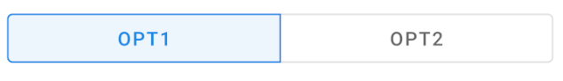
With the Material Components Library you can use the MaterialButtonToggleGroup:
        <com.google.android.material.button.MaterialButtonToggleGroup
            android:layout_width="match_parent"
            android:layout_height="wrap_content"
            app:checkedButton="@id/b1"
            app:selectionRequired="true"
            app:singleSelection="true">

            <Button
                style="?attr/materialButtonOutlinedStyle"
                android:id="@+id/b1"
                android:layout_width="0dp"
                android:layout_weight="1"
                android:layout_height="wrap_content"
                android:text="OPT1" />

            <Button
                style="?attr/materialButtonOutlinedStyle"
                android:id="@+id/b2"
                android:layout_width="0dp"
                android:layout_weight="1"
                android:layout_height="wrap_content"
                android:text="OPT2" />

        </com.google.android.material.button.MaterialButtonToggleGroup>
More info on this link: http://www.mokasocial.com/2011/07/sexily-styled-toggle-buttons-for-android/
<ToggleButton
        android:layout_width="wrap_content"
        android:layout_height="wrap_content"
        android:background="@drawable/toggle_me"/>
and the drawable will be something like:
<selector xmlns:android="http://schemas.android.com/apk/res/android">
    <item android:state_checked="true"
        android:drawable="@drawable/toggle_me_on" /> <!-- checked -->
    <item android:drawable="@drawable/toggle_me_off" /> <!-- default/unchecked -->
</selector>
There are two ways to create custom ToggleButton
1) By defining custom background 2) By creating custom button
Check http://www.zoftino.com/android-toggle-button for custom styles
Toggle button with custom background
Define drawable as xml resource like below and set it as background of toggle button. In the below example, drawable toggle_color is a color selector, you need to define this also.
<?xml version="1.0" encoding="utf-8"?>
<inset xmlns:android="http://schemas.android.com/apk/res/android"
    android:insetLeft="4dp"
    android:insetTop="4dp"
    android:insetRight="4dp"
    android:insetBottom="4dp">
    <layer-list android:paddingMode="stack">
        <item>
            <ripple android:color="?attr/android:colorControlHighlight">
                <item>
                    <shape android:shape="rectangle"
                        android:tint="?attr/android:colorButtonNormal">
                        <corners android:radius="8dp"/>
                        <solid android:color="@android:color/white" />
                        <padding android:left="8dp"
                            android:top="6dp"
                            android:right="8dp"
                            android:bottom="6dp" />
                    </shape>
                </item>
            </ripple>
        </item>
        <item android:gravity="left|fill_vertical">
            <shape android:shape="rectangle">
                <corners android:radius="4dp"/>
                <size android:width="8dp" />
                <solid android:color="@color/toggle_color" />
            </shape>
        </item>
        <item android:gravity="right|fill_vertical">
            <shape android:shape="rectangle">
                <corners android:radius="4dp"/>
                <size android:width="8dp" />
                <solid android:color="@color/toggle_color" />
            </shape>
        </item>
    </layer-list>
</inset>
Toggle button with custom button
Create your own images for two state of toggle button (make sure images exist for all sizes of screens) and place them in drawable folder, create selector and set it as button.
   <selector xmlns:android="http://schemas.android.com/apk/res/android">
    <item android:state_checked="true" android:drawable="@drawable/toggle_on" />
    <item android:drawable="@drawable/toggle_off" />
</selector>
 <androidx.appcompat.widget.SwitchCompat
     android:layout_centerVertical="true"
     android:layout_alignParentRight="true"
     app:track="@drawable/track"
     android:thumb="@drawable/thumb"
     android:id="@+id/switch1"
     android:layout_width="wrap_content"
     android:layout_height="wrap_content" />
<?xml version="1.0" encoding="utf-8"?>
<selector xmlns:android="http://schemas.android.com/apk/res/android">

    <item android:state_checked="false"
        android:drawable="@drawable/switch_thumb_false"/>

    <item android:state_checked="true"
        android:drawable="@drawable/switch_thumb_true"/>

</selector>
<?xml version="1.0" encoding="utf-8"?>
<selector xmlns:android="http://schemas.android.com/apk/res/android">


    <item android:state_checked="false">
        <shape android:shape="rectangle">

            <size android:width="24dp" android:height="12dp" />
            <solid android:color="#EFE0BB" />
            <corners android:radius="6dp" />
        </shape>
    </item>

    <item android:state_checked="true">

        <shape android:shape="rectangle">

            <size android:width="24dp" android:height="12dp" />
            <solid android:color="@color/colorPrimary" />
            <corners android:radius="6dp" />
        </shape>
    </item>

</selector>
<?xml version="1.0" encoding="utf-8"?>
<layer-list xmlns:android="http://schemas.android.com/apk/res/android">

    <item>
        <shape android:shape="oval">
            <solid android:color="#EFE0BB" />
            <size
                android:width="10dp"
                android:height="10dp" />
            <stroke
                android:width="2dp"
                android:color="@color/colorPrimary" />
        </shape>
    </item>
</layer-list>
<?xml version="1.0" encoding="utf-8"?>
<layer-list xmlns:android="http://schemas.android.com/apk/res/android">

    <item >
        <shape android:shape="oval">
            <solid android:color="@color/colorPrimary"/>
            <size android:height="12dp"
                android:width="12dp"/>
            <stroke android:color="#EFE0BB"
                android:width="2dp"/>
        </shape>
    </item>

</layer-list>
 <Switch
        android:thumb="@drawable/thumb"
        android:track="@drawable/track"
        android:layout_width="wrap_content"
        android:layout_height="match_parent" />

