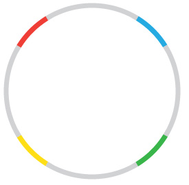
Does anybody know how to create this in CSS or if it's even possible. I know how to make quarter circles but I am not sure how to apply it in this format. Small chunks of the border need to be in different colors.
Does anybody know how to create this in CSS or if it's even possible. I know how to make quarter circles but I am not sure how to apply it in this format. Small chunks of the border need to be in different colors.
You have already good answers.
Just to give you another way to get this result, you can do it with multiple backgrounds. The good news about this approach is that you only need a div for it.
.test {
  margin: 25px 0;
  width: 200px;
  height: 200px;
  border-radius: 50%;
  border: 12px solid transparent;
  background-size: 100% 100%, 50% 50%, 50% 50%, 50% 50%, 50% 50%;
  background-repeat: no-repeat;
  background-image: linear-gradient(white, white),
                    linear-gradient(30deg, red 36%, lightgrey 30%),
                    linear-gradient(120deg, yellow 36%, lightgrey 30%),
                    linear-gradient(300deg, blue 36%, lightgrey 30%),
                    linear-gradient(210deg, green 36%, lightgrey 30%);
  background-position: center center, left top, right top, left bottom, right bottom;
  background-origin: content-box, border-box, border-box, border-box, border-box;
  background-clip: content-box, border-box, border-box, border-box, border-box;
  transform: rotate(30deg);
}
<div class="test"></div>The sectors can be get with an inclined linear gradient, limited to one quarter of the space available. - we need 4 of these, changing the position and the angle.
Over those, another gradint, set fully to white, will hide the center.
And changing the background-origin and clip to border-box or content-box makes the colors use the space reserved for the border.
Note that this solution will work for any border / border-radius combination
Using CSS:
It is definitely possible to achieve with CSS (as already shown in Quantastical's answer and here) but is CSS really the right tool to do this? My answer would be NO. The reason is because creating such shapes/effects using CSS is very tough in itself and in-addition to it, they come with some restrictions. For example, the below snippet works only when the background is a solid color. Clip Path example is not supported in IE completely and in FF it works only with inline SVG.
If you still wish to proceed doing it using CSS then the below is another alternate. Here, we make use of skew transforms on 4 elements (real or pseudos) all of which are 50% x 50% of their parent's size. The skew transforms produces the sector like appearance and thus looks more realistic. Background color assigned to these skewed elements is overlayed on top of another element which has full border and it looks as though part of the border is differently colored. Finally, we add another div with white background on top of all these to mask the inner portions of the circle (so that only border is visible).
.circle {
  position: relative;
  height: 100px;
  width: 100px;
}
.circle, .dummy-border, .border, .dummy-background {
  border-radius: 50%;
  overflow: hidden;
}
.dummy-border, .border, .dummy-background {
  position: absolute;
  top: 0px;
  left: 0px;
  height: 100%;
  width: 100%;
}
.border {
  border: 4px solid #AAA;
  border-radius: 50%;
  z-index: -2;
}
.dummy-background {
  padding: 4px;
  background-color: white;
  background-clip: content-box;
}
.circle:after, .circle:before, .dummy-border:before, .dummy-border:after {
  position: absolute;
  content: '';
  height: 50%;
  width: 50%;
  z-index: -1;
}
.circle:before {
  top: 0%;
  left: 0%;
  background: red;
  transform-origin: right bottom;
  transform: skewY(30deg) skewX(30deg);
}
.circle:after {
  top: 0%;
  left: 50%;
  background: green;
  transform-origin: left bottom;
  transform: skewY(-30deg) skewX(-30deg);
}
.dummy-border:before {
  top: 50%;
  left: 0%;
  background: orange;
  transform-origin: right top;
  transform: skewY(-210deg) skewX(-30deg);
}
.dummy-border:after {
  top: 50%;
  left: 50%;
  background: blue;
  transform-origin: left top;
  transform: skewY(210deg) skewX(30deg);
}
*, *:after, *:before {
  box-sizing: border-box;
}
<div class='circle'>
<div class='border'></div> <!-- gray border -->
<div class='dummy-border'></div> <!-- produces colors along with parent's pseudos -->
<div class='dummy-background'></div> <!-- overlays a white background to mask -->
</div>Using SVG:
Because of all the aforementioned reasons, I would recommend you to use SVG for this. SVG makes creation of such shapes/effects very easy, the code is easily understandable, they are responsive by nature.
My SVG skills aren't great and it is very much possible that the no. of elements could be reduced. The below snippet is only a sample to illustrate what is possible.
Here, we use 5 circle elements (1 for the gray border and 1 each for the colors). The #gray circle has a full gray border whereas all the other circles only have partial border (in the required color). The partial borders are produced using stroke-dasharray and stroke-dashoffset.
The stroke-dasharray property is used to produce dashed borders by giving the length of the stroke (color) and the length of the dash (transparent) as values. For this case, the length of the dash should be equal to the circle's circumference (2 * PI * r) whereas for length of the stroke, I have used 1/8th of the circumference of the value.
The stroke-dashoffset property is used to specify the offset from where the stroke should start. The offset is calculated from the 0deg position (which is the point represented by (100%, 50%)). By setting the appropriate offset values, the required effect can be produced.
svg {
  height: 100px;
  width: 100px;
}
circle {
  stroke-width: 4px;
  fill: transparent;
}
#gray{
  stroke: #AAA;
}
#red{
  stroke: red;
  stroke-dasharray: 35.5, 284; /* length of arc, circumference of circle */
  stroke-dashoffset: -159.75; /* offset of arc from start point (1/2 arc length + 1/4 circumference) */
}
#orange{
  stroke: orange;
  stroke-dasharray: 35.5, 284; /* length of arc, circumference of circle */
  stroke-dashoffset: -88.75; /* offset of arc from start point (1/2 arc length + 1/4 circumference) */
}
#blue{
  stroke: blue;
  stroke-dasharray: 35.5, 284; /* length of arc, circumference of circle */
  stroke-dashoffset: -17.75; /* offset of  arc from start point (1/2 of arc length) */
}
#green{
  stroke: green;
  stroke-dasharray: 35.5, 284; /* length of arc, circumference of circle */
  stroke-dashoffset: -230.75; /* offset of arc from start point (1/2 arc length + 3/4 circumference) */
}
<svg viewBox='0 0 100 100'>
<circle cx='50' cy='50' r='45' id='gray'/>
<circle cx='50' cy='50' r='45' id='red'/>
<circle cx='50' cy='50' r='45' id='green'/>
<circle cx='50' cy='50' r='45' id='blue'/>
<circle cx='50' cy='50' r='45' id='orange'/>
</svg>If you really want to do this with CSS, you could potentially use a clipping mask to get the effect you're after. This approach is subject to browser compatibility, though, so I don't know how useful it would be, unless you're in a closed environment.
It's not perfect, either. The clipping path should probably be a polygon to ensure the segment edges are pointed toward the center of the circle instead of in-line with bounding box.
#circle, #circle .segment {
  border-color: lightgray;
  border-radius: 50%;
  border-style: solid;
  border-width: 5px;
  box-sizing: border-box;
  height: 100px;
  position: relative;
  width: 100px;
}

#circle .segment {
  -webkit-clip-path: inset(0 40px 50px 40px);
  /*content: ''; EDIT: not needed */
  left: -5px;
  position: absolute;
  top: -5px;
}

#circle .segment:nth-child(1) {border-color: red; transform: rotate(-20deg);}
#circle .segment:nth-child(2) {border-color: blue; transform: rotate(70deg);}
#circle .segment:nth-child(3) {border-color: green; transform: rotate(160deg);}
#circle .segment:nth-child(4) {border-color: yellow; transform: rotate(250deg);}
<div id="circle">
<div class="segment"></div>
<div class="segment"></div>
<div class="segment"></div>
<div class="segment"></div>
</div>
This solution uses conic-gradient to draw the color stops, and mask-image with a linear gradient to remove the inner circle.
.target {
  width: 60vmin;
  height: 60vmin;
  background: conic-gradient(
    lightgrey 0deg 30deg,
    red 30deg 60deg,
    lightgrey 60deg 120deg,
    yellow 12deg 150deg,
    lightgrey 150deg 210deg,
    green 210deg 240deg,
    lightgrey 240deg 300deg,
    blue 300deg 330deg,
    lightgrey 330deg 360deg
  );
  -webkit-mask-image: radial-gradient(transparent 65%, black 65%);
  mask-image: radial-gradient(transparent 65%, black 65%);
  border-radius: 50%;
}

body {
  display: flex;
  align-items: center;
  justify-content: center;
  margin: 0;
  height: 100vh;
}
<div class="target"></div>