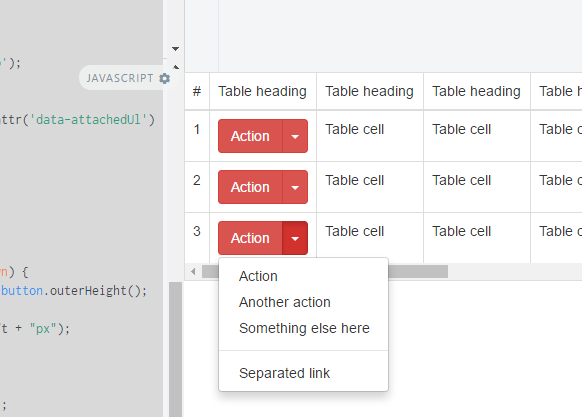
I have a problem with drop-down buttons inside tables when are responsive and scroll active because the drop-down is not visible because of overflow: auto; property. How can I fix that in order to show drop-down option of button when this is collapsed? I can use some jQuery but after I have problems with scroll left-right so I decided to find another solution.
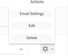
I have attached a photo to understand better.
Asked
Active
Viewed 1.5e+01k times
117
Carol Skelly
- 351,302
- 90
- 710
- 624
BurebistaRuler
- 6,209
- 11
- 48
- 66
30 Answers
78
I solved myself this and I put the answer in scope to help other user that have same problem: We have an event in bootstrap and we can use that event to set overflow: inherit but this will work if you don't have the css property on your parent container.
$('.table-responsive').on('show.bs.dropdown', function () {
     $('.table-responsive').css( "overflow", "inherit" );
});

$('.table-responsive').on('hide.bs.dropdown', function () {
     $('.table-responsive').css( "overflow", "auto" );
})
info: In this fiddle example works strange and I'm not sure why but in my project works just fine.
Community
- 1
- 1
BurebistaRuler
- 6,209
- 11
- 48
- 66
-
4This only works for tables with a dropdown on the first cell of the line. – Almino Melo Jan 19 '15 at 21:41
-
6in case of dynamic loaded table : `$('body') .on('show.bs.dropdown', '.table-responsive', function () { $(this).css("overflow", "visible"); }) .on('hide.bs.dropdown', '.table-responsive', function () { $(this).css("overflow", "auto"); });` – Exlord Jan 17 '16 at 16:15
-
6But after the click the data goes outside the min size of the screen. So this doesn't work.!!!! – Shreya Shah Apr 13 '17 at 10:02
-
1This would work if you could stop the table from scrolling back to the left when the dropdown is opened. But as is, if you have a dropdown to the right of the screen the table jerks to the left when opening. Dropdowns that are far to the right (masked by the `.table-responsive` class) are completely hidden when trying to edit them. – Ponyboy Apr 18 '18 at 21:30
55
For reference, it's 2018 and I'm using BS4.1
Try adding data-boundary="viewport" to the button that toggles the dropdown (the one with the class dropdown-toggle). See https://getbootstrap.com/docs/4.1/components/dropdowns/#options
Ben
- 2,957
- 2
- 27
- 55
-
4
-
4I can't speak for earlier versions, but for Bootstrap 4 this really is the best solution. It's simple, it doesn't sacrifice responsiveness, it uses functionality that is already provided in the framework instead of trying to hack around it with extra styles or scripts. – Tez LaCoyle Nov 01 '18 at 15:29
-
"bootstrap": "4.6.0", "bootstrap-vue": "2.21.1", doesnt work , not work! – Yogi Arif Widodo Jan 13 '22 at 16:07
-
This was working when this answer was posted but doesn't seem to work anymore. – user3071284 Apr 08 '22 at 17:21
-
1I consider this the correct answer. Unfortunately, this is broken in Bootstrap 5. Even if you change it to use the more current `data-bs-boundary="viewport"`. – Jonathan Wood Jun 13 '22 at 23:36
-
-
No longer working in BS 5.1+ https://stackoverflow.com/questions/70098157/bootstrap-5-1-3-dropdown-data-bs-boundary-no-longer-works :( – TCB13 Oct 07 '22 at 19:39
-
3
52
A CSS only solution is to allow the y-axis to overflow.
http://www.bootply.com/YvePJTDzI0
.table-responsive {
  overflow-y: visible !important;
}
EDIT
Another CSS only solution is to responsively apply the overflow based on viewport width:
@media (max-width: 767px) {
    .table-responsive .dropdown-menu {
        position: static !important;
    }
}
@media (min-width: 768px) {
    .table-responsive {
        overflow: inherit;
    }
}
Carol Skelly
- 351,302
- 90
- 710
- 624
-
@ZimSystem Still does the same thing, this fundamentally isn't the solution. – Jemar Jones May 10 '17 at 19:42
-
This solution works even if you remove the custom css. Maybe it's an html thing. I am still looking for a css-only solution. – Fernando Aug 08 '17 at 17:22
-
1
-
works for me except the button is on the bottom of the page... then the dropdown appears outside of the window... – Brucie Alpha Mar 28 '19 at 09:26
19
I'd took a different approach, I had detached the element from the parent and set it with position absolute by jQuery
Working JS fidle: http://jsfiddle.net/s270Lyrd/
The JS solution I am using.
//fix menu overflow under the responsive table
// hide menu on click... (This is a must because when we open a menu )
$(document).click(function (event) {
    //hide all our dropdowns
    $('.dropdown-menu[data-parent]').hide();

});
$(document).on('click', '.table-responsive [data-toggle="dropdown"]', function () {
    // if the button is inside a modal
    if ($('body').hasClass('modal-open')) {
        throw new Error("This solution is not working inside a responsive table inside a modal, you need to find out a way to calculate the modal Z-index and add it to the element")
        return true;
    }

    $buttonGroup = $(this).parent();
    if (!$buttonGroup.attr('data-attachedUl')) {
        var ts = +new Date;
        $ul = $(this).siblings('ul');
        $ul.attr('data-parent', ts);
        $buttonGroup.attr('data-attachedUl', ts);
        $(window).resize(function () {
            $ul.css('display', 'none').data('top');
        });
    } else {
        $ul = $('[data-parent=' + $buttonGroup.attr('data-attachedUl') + ']');
    }
    if (!$buttonGroup.hasClass('open')) {
        $ul.css('display', 'none');
        return;
    }
    dropDownFixPosition($(this).parent(), $ul);
    function dropDownFixPosition(button, dropdown) {
        var dropDownTop = button.offset().top + button.outerHeight();
        dropdown.css('top', dropDownTop + "px");
        dropdown.css('left', button.offset().left + "px");
        dropdown.css('position', "absolute");

        dropdown.css('width', dropdown.width());
        dropdown.css('heigt', dropdown.height());
        dropdown.css('display', 'block');
        dropdown.appendTo('body');
    }
});
Wazime
- 1,423
- 1
- 18
- 26
-
2This answer is perfect fix for me while using jquery datatable(ajax render). I adjusted accordingly and it works great. – Dec 29 '17 at 15:25
-
17
This solution worked great for me :
@media (max-width: 767px) {
    .table-responsive .dropdown-menu {
        position: static !important;
    }
}
@media (min-width: 768px) {
    .table-responsive {
        overflow: visible;
    }
}
More detail: https://github.com/twbs/bootstrap/issues/15374
pham cuong
- 849
- 1
- 12
- 24
-
but its broken my table cant scroll on horizontal! the table is much column – Yogi Arif Widodo Jan 13 '22 at 22:26
16
Bootstrap 5 Solution
This is what worked best for me:
.table-responsive .dropdown,
.table-responsive .btn-group,
.table-responsive .btn-group-vertical {
    position: static;
}
Ryan Mortier
- 763
- 1
- 10
- 23
13
Define this properties. Good Luck!
data-toggle="dropdown" data-boundary="window"
Halit Yeşil
- 181
- 1
- 3
12
my 2¢ quick global fix:
// drop down in responsive table

(function () {
  $('.table-responsive').on('shown.bs.dropdown', function (e) {
    var $table = $(this),
        $menu = $(e.target).find('.dropdown-menu'),
        tableOffsetHeight = $table.offset().top + $table.height(),
        menuOffsetHeight = $menu.offset().top + $menu.outerHeight(true);

    if (menuOffsetHeight > tableOffsetHeight)
      $table.css("padding-bottom", menuOffsetHeight - tableOffsetHeight);
  });

  $('.table-responsive').on('hide.bs.dropdown', function () {
    $(this).css("padding-bottom", 0);
  })
})();
Explications: When a dropdown-menu inside a '.table-responsive' is shown, it calculate the height of the table and expand it (with padding) to match the height required to display the menu. The menu can be any size.
In my case, this is not the table that has the '.table-responsive' class, it's a wrapping div:
<div class="table-responsive" style="overflow:auto;">
    <table class="table table-hover table-bordered table-condensed server-sort">
So the $table var in the script is actually a div! (just to be clear... or not) :)
Note: I wrap it in a function so my IDE can collapse function ;) but it's not mandatory!
BaltazarQc
- 153
- 2
- 5
-
2This is the only solution that worked for me, but I would suggest using $table.css("padding-bottom", menuOffsetHeight - tableOffsetHeight + 16); insetad of $table.css("padding-bottom", menuOffsetHeight - tableOffsetHeight); to add extra padding that's on bootstrap by default, plus a small gap at the bottom. – Phil Young Mar 07 '16 at 13:16
-
This works, but the padding makes it look bad. Wish there was a solution that made it work without the padding bloat. – Qasim Jun 01 '16 at 09:59
-
11
I have a solution using only CSS, just use position relative for dropdowns inside the table-responsive:
@media (max-width: 767px) {
  .table-responsive .dropdown-menu {
    position: relative; /* Sometimes needs !important */
  }
}
Leo Caseiro
- 1,667
- 1
- 22
- 35
-
1this is the best solution, I'm using it for ui-select in my responsive table. – Sergio Ivanuzzo Feb 10 '16 at 12:36
-
1
-
2This **fiddle doesn't work**. It **keeps hiding** the dropdown beneath the table. – HelloIT Jun 01 '18 at 09:50
-
@HelloIT try the codepen (updated) https://codepen.io/leocaseiro/pen/rKxmpz – Leo Caseiro Jun 04 '18 at 00:29
-
1Agree with @hellioIT this method does not appear to be working in the pen – MrPaulDriver Jun 08 '18 at 16:40
8
This has been fixed in Bootstrap v4.1 and above by adding data-boundary="viewport" (Bootstrap Dropdowns Docs)
But for earlier versions (v4.0 and below), I found this javascript snippet that works perfectly. It works for small tables and scrolling tables:
$('.table-responsive').on('shown.bs.dropdown', function (e) {
    var t = $(this),
        m = $(e.target).find('.dropdown-menu'),
        tb = t.offset().top + t.height(),
        mb = m.offset().top + m.outerHeight(true),
        d = 20; // Space for shadow + scrollbar.
    if (t[0].scrollWidth > t.innerWidth()) {
        if (mb + d > tb) {
            t.css('padding-bottom', ((mb + d) - tb));
        }
    }
    else {
        t.css('overflow', 'visible');
    }
}).on('hidden.bs.dropdown', function () {
    $(this).css({'padding-bottom': '', 'overflow': ''});
});
Cyrus V.
- 151
- 4
- 8
-
-
@TheRealChx101 this is JavaScript so just add this in a `` or in a JavaScript file you'll import to that page – Cyrus V. Jul 25 '22 at 08:12
6
Try it once. after 1 hour of research on net I found Best Solution for this Problem.
Solution:- just add script
(function () {
    // hold onto the drop down menu
    var dropdownMenu;

    // and when you show it, move it to the body
    $(window).on('show.bs.dropdown', function (e) {

    // grab the menu
    dropdownMenu = $(e.target).find('.dropdown-menu');

    // detach it and append it to the body
    $('body').append(dropdownMenu.detach());

    // grab the new offset position
    var eOffset = $(e.target).offset();

    // make sure to place it where it would normally go (this could be improved)
    dropdownMenu.css({
        'display': 'block',
            'top': eOffset.top + $(e.target).outerHeight(),
            'left': eOffset.left
       });
    });

    // and when you hide it, reattach the drop down, and hide it normally
    $(window).on('hide.bs.dropdown', function (e) {
        $(e.target).append(dropdownMenu.detach());
        dropdownMenu.hide();
    });
})();
OUTPUT:-
Harsh Patel
- 1,032
- 6
- 21
5
Cleaned up @Wazime solution a little. Works great as a general solution.
$(document).on('shown.bs.dropdown', '.table-responsive', function (e) {
    // The .dropdown container
    var $container = $(e.target);

    // Find the actual .dropdown-menu
    var $dropdown = $container.find('.dropdown-menu');
    if ($dropdown.length) {
        // Save a reference to it, so we can find it after we've attached it to the body
        $container.data('dropdown-menu', $dropdown);
    } else {
        $dropdown = $container.data('dropdown-menu');
    }

    $dropdown.css('top', ($container.offset().top + $container.outerHeight()) + 'px');
    $dropdown.css('left', $container.offset().left + 'px');
    $dropdown.css('position', 'absolute');
    $dropdown.css('display', 'block');
    $dropdown.appendTo('body');
});

$(document).on('hide.bs.dropdown', '.table-responsive', function (e) {
    // Hide the dropdown menu bound to this button
    $(e.target).data('dropdown-menu').css('display', 'none');
});
quakes
- 431
- 4
- 9
3
SIMPLE css only solution
Rather than modifying the parent table, Here I have a simple solutionThe idea is to add z-index to the <td></td> that holds your dropdown. So that it will be on top of all other elements.
<td style="position: absolute; z-index: 10; width: 20%;"></td>
Abdulhakim Zeinu
- 3,333
- 1
- 30
- 37
2
Burebistaruler response works ok for me on ios8 (iphone4s) but doen't woks on android that before was working. What i've donne that Works for me on ios8 (iphone4s) and andoir is:
$('.table-responsive').on('show.bs.dropdown', function () {
 $('.table-responsive').css( "min-height", "400px" );
});

$('.table-responsive').on('hide.bs.dropdown', function () {
     $('.table-responsive').css( "min-height", "none" );
})
Oscar Jofre
- 153
- 3
- 17
2
Based on the accepted answer and the answer of @LeoCaseiro here is what I ended up using in my case :
@media (max-width: 767px) {
    .table-responsive{
        overflow-x: auto;
        overflow-y: auto;
    }
}
@media (min-width: 767px) {
    .table-responsive{
        overflow: inherit !important; /* Sometimes needs !important */
    }
}
on big screens the dropdown won't be hidden behind the reponsive-table and in small screen it will be hidden but it's ok because there is scrolls bar in mobile anyway.
Hope this help someone.
medBouzid
- 7,484
- 10
- 56
- 86
2
The recommended and chosen solution, is not always the best solution. Unfortunately its the solution linkedin recently used and it creates multiple scrollbars on the page based on the situation.
My method was slightly different.
I contained the table-responsive div in another div. Then I applied height 100%, width:100%, display block and position absolute so the height and width is based on the page size, and set overflow to hidden.
Then on the table responsive div I added a min-height of 100%
<div class="table_container"
    style="height: 100%; width: 100%; display: block;position: absolute;overflow: hidden;">
<div class="table-responsive" style="min-height:100%;">
As you can see in the working example below, no added scroll bars, no funny behavior, and practically as its using percentages - it should work regardless of screen size. I have not testing this for that however. If that fails for some reason, one can replace 100% with 100vh and 100vw respectively.
<!-- Latest compiled and minified CSS -->
<link rel="stylesheet" href="//maxcdn.bootstrapcdn.com/bootstrap/3.3.5/css/bootstrap.min.css">

<!-- Optional theme -->
<link rel="stylesheet" href="//maxcdn.bootstrapcdn.com/bootstrap/3.3.5/css/bootstrap-theme.min.css">

            <script src="https://code.jquery.com/jquery-1.12.4.min.js"></script>
<script src="https://maxcdn.bootstrapcdn.com/bootstrap/3.3.5/js/bootstrap.min.js"></script>


<div class="table_container" style="height: 100%; width: 100%; display: block;position: absolute;overflow: hidden;">
<div class="table-responsive" style="min-height:100%;">
                <table class="table">
                    <thead>
                        <tr>
                            <th>Value1</th>
                            <th>Value2</th>
                            <th>Value3</th>
                            <th>Value4</th>
                        </tr>
                    </thead>
                    <tbody>
                        <tr>
                            <td>
                                DATA
                                <div class="btn-group btn-group-rounded">
                                    <button type="button" class="btn btn-default btn-xs" data-toggle="dropdown" aria-haspopup="true" aria-expanded="false" style="border-radius:3px;">
                                        <span class="caret"></span>
                                    </button>
                                    <ul class="dropdown-menu">
                                        <li><a href="#">One</a></li>
                                        <li><a href="#">Two</a></li>
                                        <li><a href="#">Three</a></li>
                                        <li role="seperator" class="divider"></li>
                                        <li><a href="#">Four</a></li>
                                    </ul>
                                </div>
                            </td>
                            <td>DATA</td>
                        </tr>
                        <tr>
                            <td>
                                DATA
                                <div class="btn-group btn-group-rounded">
                                    <button type="button" class="btn btn-default btn-xs" data-toggle="dropdown" aria-haspopup="true" aria-expanded="false" style="border-radius:3px;">
                                        <span class="caret"></span>
                                    </button>
                                    <ul class="dropdown-menu">
                                        <li><a href="#">One</a></li>
                                        <li><a href="#">Two</a></li>
                                        <li><a href="#">Three</a></li>
                                        <li role="seperator" class="divider"></li>
                                        <li><a href="#">Four</a></li>                                    </ul>
                                </div>
                            </td>

                            <td>
                                DATA
                                <div class="btn-group btn-group-rounded">
                                    <button type="button" class="btn btn-default btn-xs" data-toggle="dropdown" aria-haspopup="true" aria-expanded="false" style="border-radius:3px;">
                                        <span class="caret"></span>
                                    </button>
                                    <ul class="dropdown-menu">
                                        <li><a href="#">One</a></li>
                                        <li><a href="#">Two</a></li>
                                        <li><a href="#">Three</a></li>
                                        <li role="seperator" class="divider"></li>
                                        <li><a href="#">Four</a></li>
                                    </ul>
                                </div>
                            </td>
                            <td>DATA</td>
                        </tr>
                    </tbody>
                </table>
            </div>
</div>
Bruce
- 1,039
- 1
- 9
- 31
-
Not a solution for smaller view height. The lower dropdown links are getting no longer reachable due to out of view. – Seika85 Oct 29 '18 at 10:31
2
I've done some research and all the answers didn't solve it for me but they did sort-of point me in the right direction.
The boundary was already set to "window".
My <tbody> had a position: relative;. The dropdown-menu has a position: absolute;, but kept "relative" to the tbody, which caused the problems.
I changed the <tbody> to position: static;, which fixed my problem without any JavaScript, and the table is still responsive.
I'm using Bootstrap 4 by the way.
Bart Versluijs
- 186
- 1
- 8
-
1In my case, I was using Bootstrap's `btn-group` in my `
` which had the position as `relative`, changing it to `static` solved my problem. +1 – Hamza Khanzada May 30 '22 at 11:26
2
My simple JS solution without change global css rules.
Note: '.table-scrollable' you might need replace to '.table-responsive'
$('.table-scrollable').on('show.bs.dropdown', function (e) {
        //get button position
        offset = $(e.relatedTarget).offset()

        //get button height
        heigth = $(e.relatedTarget).outerHeight()

        //append dropdown to body and perpare position.
        $(e.relatedTarget).next('.dropdown-menu').addClass('dropdown-menu-in-table').appendTo("body").css({display:'block',top:offset.top+heigth, left: offset.left});
});

//move back dropdown menu to button and remove positon
$('body').on('hide.bs.dropdown', function (e) {
        $(this).find('.dropdown-menu-in-table').removeClass('dropdown-menu-in-table').css({display:'',top:'', left: ''}).appendTo($(e.relatedTarget).parent());
});
Sergey Kharchishin
- 434
- 4
- 6
1
The solution for me was this:
.table-responsive {
    min-height: 300px;
}

.table-responsive, .table {
    overflow-y: visible !important;
}
Vinicius Aquino
- 697
- 13
- 27
0
This could be useful for someone else. I'm using DatatablesJS. I add 500px to the current height of the table. I do this because Datatables allow you to use 10, 20, etc pages in your table. So I need to calculate dinamically the table's height.
When dropdown is shown, I add extra height.
When dropdown is hiden, I reset original table's height.
$(document).ready(function() {
    $('.table-responsive .dropdown').on('shown.bs.dropdown', function () {
          console.log($('#table-responsive-cliente').height() + 500)
          $("#table-responsive-cliente").css("height",$('#table-responsive-cliente').height() + 500 );
    })

    $('.table-responsive .dropdown').on('hide.bs.dropdown', function () {
           $("#table-responsive-cliente").css("height","auto");
    })
})
And the HTML
<div class="table-responsive" id="table-responsive-cliente">
    <table class="table-striped table-hover">
     ....

     ....
    </table>
</div>
Before:
After dropdown is shown:
miguel.angel
- 49
- 1
- 8
0
We solved this issue here at work by applying a .dropup class to the dropdown when the dropdown is close to the bottom of a table.enter image description here
roshin jose
- 11
- 1
-
I'm most happy with that solution in the end. `$('table tr:nth-last-child(-n+3) td').addClass('dropup')`. – Furgas Jun 19 '18 at 10:37
0
This worked for me in Bootstrap 4 since it has different breakpoints than v3:
@media (min-width: 992px) {
    .table-responsive {
        overflow: inherit;
    }
}
ar31an
- 241
- 5
- 9
0
Well, reading the top answer, i saw that it really dont works when you are seeing the scroll bar and the toggle button was on last column (in my case) or other column that is unseen
But, if you change 'inherit' for 'hidden' it will work.
$('.table-responsive').on('show.bs.dropdown', function () {
    $('.table-responsive').css( "overflow", "hidden" );
}).on('hide.bs.dropdown', function () {
    $('.table-responsive').css( "overflow", "auto" );
})
Try to do that way.
Luís Gustavo Batista
- 59
- 1
- 3
0
Using Bootstrap 5.2, with large tables that need to be responsive, this solution recently posted on Github (Nov 2022) - worked brilliantly for me:
I call the following javascript after rendering the drop-downs the first time (Blazor Server):
const dropdowns = document.querySelectorAll('.dropdown-toggle')
const dropdown = [...dropdowns].map((dropdownToggleEl) => new bootstrap.Dropdown(dropdownToggleEl, {
    popperConfig(defaultBsPopperConfig) {
        return { ...defaultBsPopperConfig, strategy: 'fixed' };
    }
}));
Drop-downs can now expand outside of the table-responsive wrapper - without affecting the vertical size of the table or division - and works for both large and small screens.
Daniël J.M. Hoffman
- 1,539
- 10
- 16
0
in my case on boostrap vue with v-select inside inline-edit table i solved by ...
<style lang="scss" scoped>
...
...
.custom-yo-select >>> .vs__dropdown-menu {
                max-height: 13em !important;
                position: relative !important;
                font-weight: 700 !important;
              }
              .custom-yo-select::v-deep .vs__dropdown-menu {
                max-height: 13em !important;
                position: relative !important;
                font-weight: 700 !important;
              }
here is the code
<v-select
                    v-if="
                      ['select'].includes(data.field.input.type) &&
                      'columnKey' in data.field
                    "
                    v-model="
                      data.item[data.field.key.toString().split('.')[0]][
                        data.field.key.toString().split('.')[1]
                      ]
                    "
                    class="custom-yo-select" // put the scss
                    :disabled="data.field.input.disabled"
                    :state="
                      data.field.columnKey === 'dm_master' &&
                      data.item[data.field.columnKey || data.field.key] === 0
                        ? false
                        : data.field.input.options && data.field.input.boolean
                        ? true
                        : true
                    "
                    :dir="$store.state.appConfig.isRTL ? 'rtl' : 'ltr'"
                    :options="selectModal.options"
                    @keyup.enter.shift.exact="showSelectModal(data)"
                    @keyup.enter.ctrl.exact="showSelectModal(data)"
                    @input="showSelectModal(data)"
                    @search:focus="showSelectModal(data)"
                    @search:blur="showSelectModal(data)"
                  >
"bootstrap": "4.6.0",
"bootstrap-vue": "2.21.1",
Yogi Arif Widodo
- 563
- 6
- 22
-1
Inside bootstrap.css search the next code:
.fixed-table-body {
  overflow-x: auto;
  overflow-y: auto;
  height: 100%;
}
...and update with this:
.fixed-table-body {
  overflow-x: visible;
  overflow-y: visible;
  height: 100%;
}
Cesar
- 7
- 1
-1
Simply Use This
.table-responsive {
    overflow: inherit;
}
It works on Chrome, but not IE10 or Edge because inherit property is not supported
Community
- 1
- 1
Deepak swain
- 3,380
- 1
- 30
- 26
-1
In my case, this works fine:
.table-responsive {
  overflow-y: visible !important;
}
β.εηοιτ.βε
- 33,893
- 13
- 69
- 83
Hamid
- 1,493
- 2
- 18
- 32
-
This actually works quite nice if you apply the `overflow-y` to the tbody element – Aaron Hudon Oct 26 '21 at 20:00
-1
As long as people still stuck in this issue and we are in 2020 already. I get a pure CSS solution by giving the drop down menu a flex display
this snippet works great with datatable-scroll-wrap class
.datatable-scroll-wrap .dropdown.dropup.open .dropdown-menu {
    display: flex;
}
.datatable-scroll-wrap .dropdown.dropup.open .dropdown-menu li a {
    display: flex;
}
hassan
- 7,812
- 2
- 25
- 36