I'm having trouble getting Chrome to pay attention to the flex-basis part of flex: 1 1 25% in a flex-direction: column layout. It works fine in a row layout.
The snippet below demonstrates the problem: the yellow, blue, and pink bars are flex-basis 50px, 25%, and 75%, shown in both column and row flex directions.
If you run it in Firefox (or IE11 or Edge) both column and row divide up the area as expected:
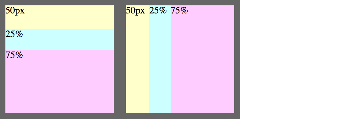
But if you run it in Chrome (47) or Safari (9.0.3), the column layout on the left seems to ignore the flex-basis entirely -- the heights of the bars seem to have no relation to the flex-basis:

The only difference between left and right is the flex-direction.
.container {
  width: 400px;
  height: 200px;
  display: flex;
  background: #666;
  position: relative;
}

.layout {
  flex: 1 1 100%; /* within .container */
  margin: 10px;
  display: flex;
}

.row {
  flex-direction: row;
}
.column {
  flex-direction: column;
}

.exact {
  flex: 1 1 50px;
  background: #ffc;
}
.small {
  flex: 1 1 25%;
  background: #cff;
}
.large {
  flex: 1 1 75%;
  background: #fcf;
}
<div class="container">
<div class="layout column">
<div class="exact">50px</div>
<div class="small">25%</div>
<div class="large">75%</div>
</div>
<div class="layout row">
<div class="exact">50px</div>
<div class="small">25%</div>
<div class="large">75%</div>
</div>
</div>I tried adding height: 100% to .column, which makes Chrome pay attention to the flex-basis, but causes a different problem -- the flex gets bigger than its container:
.column {
  flex-direction: column;
  height: 100%;
}

I gather this is a long-standing webkit bug. Is there any way to work around it? (I'm trying to create some generalized layout components, so hard-coding specific numbers of children or specific pixel heights isn't workable.)
[EDIT] Here's an additional example showing the general problem (and avoiding the margin and total-greater-than-100% issues in the example above):

.container {
  width: 300px;
  height: 300px;
  display: flex;
}

.layout {
  flex: 1 1 100%; /* within its flex parent */
  display: flex;
  background: #ffc;
}

.row {
  flex-direction: row;
}
.column {
  flex-direction: column;
  height: 100%; /* attempted workaround for webkit */
}

.small {
  flex: 1 1 30%;
  background: #cff;
}
.large {
  flex: 1 1 70%;
  background: #fcf;
}

div {
  /* border/padding just makes divs easier to see --
     you can remove all of this without changing the problem */
  box-sizing: border-box;
  border: 1px solid #999;
  padding: 10px;
}
<div class="container">
<div class="layout row">
<div class="small">row: 30%</div>
<div class="large layout column">
<div class="small">row: 70%; col: 30%</div>
<div class="large">row: 70%; col: 70%</div>
</div>
</div>
</div>