249

I know that it is impossible to actually modify an image with CSS, which is why I put crop in quotes.

What I'd like to do is take rectangular images and use CSS to make them appear square without distorting the image at all.

I'd basically like to turn this:

enter image description here

Into this:

enter image description here

MD XF
  • 7,860
  • 7
  • 40
  • 71
novicePrgrmr
  • 18,647
  • 31
  • 81
  • 103

14 Answers14

564

A pure CSS solution with no wrapper div or other useless code:

img {
  object-fit: cover;
  width: 230px;
  height: 230px;
}
Peter Kionga-Kamau
  • 6,504
  • 2
  • 17
  • 13
89

Assuming they do not have to be in IMG tags...

HTML:

<div class="thumb1">
</div>

CSS:

.thumb1 { 
  background: url(blah.jpg) 50% 50% no-repeat; /* 50% 50% centers image in div */
  width: 250px;
  height: 250px;
}

.thumb1:hover { YOUR HOVER STYLES HERE }

EDIT: If the div needs to link somewhere just adjust HTML and Styles like so:

HTML:

<div class="thumb1">
<a href="#">Link</a>
</div>

CSS:

.thumb1 { 
  background: url(blah.jpg) 50% 50% no-repeat; /* 50% 50% centers image in div */
  width: 250px;
  height: 250px;
}

.thumb1 a {
  display: block;
  width: 250px;
  height: 250px;
}

.thumb1 a:hover { YOUR HOVER STYLES HERE }

Note this could also be modified to be responsive, for example % widths and heights etc.

Raine Revere
  • 30,985
  • 5
  • 40
  • 52
Michael
  • 7,016
  • 2
  • 28
  • 41
  • 2
    this is a nice way to position AND crop with a single tag. – rlemon Mar 01 '13 at 22:05
  • 12
    Note too that when printing, mast browsers disable background images so they wouldn't show up. – j08691 Mar 01 '13 at 22:06
  • It can handle :hover states also. If the div needs to link somewhere just add an a tag. As for print, that can be fixed with print.css? Correct me if I'm wrong? – Michael Mar 01 '13 at 22:07
  • Actually, to be honest, in this case, with an A tag the print would have a fall back, and in any case, you would want to add CSS styles to fix this for print anyways. – Michael Mar 01 '13 at 22:11
  • I really like this solution, but I'm not sure that it will work for responsive will it? I tried using % for width and height and it isn't working. – novicePrgrmr Mar 01 '13 at 22:33
  • 1
    Nevermind, I changed it to ``height: 460px; width: 100%;`` and it works like a charm – novicePrgrmr Mar 01 '13 at 22:35
  • @Michael I can give you a reason why you would want to do this: when the rectangular image and the square image are both needed on the site in different contexts. If you wanted to avoid resizing all of the photos in photoshop, you could simply upload one photo to serve both purposes. – Hendeca Jun 21 '14 at 21:32
  • You can also note that now with HTML5, it is possible to wrap a `
    ` into a `` tag like this : `
    Hello
    `, which will clear up your CSS a bit since you won't need to set the size and the display properties! I don't know tho if all browsers will compile that correctly (like IE).
    – RaphBlanchet Mar 05 '15 at 04:52
  • Actually, this is not an ideal solution because it completely ignores accessibility best practices. It is only ok if the image is truly a **background** image. – nydame Jan 07 '21 at 04:49
77

If the image is in a container with a responsive width:

.rect-img-container {
  position: relative;
}

.rect-img-container::after {
  content: "";
  display: block;
  padding-bottom: 100%;
}

.rect-img {
  position: absolute;
  width: 100%;
  height: 100%;
  object-fit: cover;
}
<div class="rect-img-container">
  <img class="rect-img" src="https://picsum.photos/id/0/367/267" alt="">
</div>

(edit: updated from sass to plain css) (edit: Added dummy image for reference)

Ajith Gopi
  • 1,509
  • 1
  • 12
  • 20
jnaklaas
  • 1,619
  • 13
  • 16
  • 2
    This is really nice. It's incredibly flexible too, since once the image is squared, you can then make it circled and do other cool things. – RockyK May 13 '20 at 04:55
  • 2
    Can't tell you how many hours of work you just saved me. Thank you soooo much. For anyone confused, this is likely SASS/SCSS - If you're using straight CSS, this post tells you how to convert: https://stackoverflow.com/questions/26760776/what-is-before-after-in-css/26760854 – Steve Allday Sep 12 '20 at 23:28
  • 1
    Great answer. In my case, I had an anchor tag as container, I just had to add a `display: block` attribute, since the images were not showing initially. – JCarlosR Sep 24 '20 at 06:23
  • 2
    Converting from SASS to CSS ` .img-container { position: relative; } .img-container::after { content: ""; display: block; padding-bottom: 100%; } .img-container img { position: absolute; width: 100%; height: 100%; object-fit: cover; left: 0; top: 0; }` – Captain Fantastic Apr 11 '21 at 21:49
  • 1
    For me, this is best, the fast, the cleanest solution so far . – iskandar47 Aug 06 '22 at 20:13
  • This works amazingly well, also together with a Bootstrap Carousel. Thank you so much! – Nicholas Oct 11 '22 at 17:39
59
  1. Place your image in a div.
  2. Give your div explicit square dimensions.
  3. Set the CSS overflow property on the div to hidden (overflow:hidden).
  4. Put your imagine inside the div.
  5. Profit.

For example:

<div style="width:200px;height:200px;overflow:hidden">
    <img src="foo.png" />
</div>
j08691
  • 204,283
  • 31
  • 260
  • 272
  • 5
    Must ensure to center or at least play with the positioning of the image within. The OP sample looks centered (although I just mention this and don't expect you to change your answer at all :P). – rlemon Mar 01 '13 at 22:04
  • 1
    @rlemon - then the OP could set the position of the div to relative and the position of the image to absolute, and tweak top and left attributes. – j08691 Mar 01 '13 at 22:05
  • 7
    I'm just mentioning it before someone is all; "But it's all left aligned now!" - :P – rlemon Mar 01 '13 at 22:06
  • 2
    Yes it would be crucial that it is centered – novicePrgrmr Mar 01 '13 at 22:11
33

Using background-size:cover - http://codepen.io/anon/pen/RNyKzB

CSS:

.image-container {
  background-image: url('https://i.stack.imgur.com/GA6bB.png');
  background-size:cover;
  background-repeat:no-repeat;
  width:250px;
  height:250px;
}  

Markup:

<div class="image-container"></div>
Philip Nuzhnyy
  • 4,630
  • 1
  • 25
  • 17
17

Check out CSS aspect-ratio

https://developer.mozilla.org/en-US/docs/Web/CSS/aspect-ratio

.square-image{
  width: 50%;
  background-image: url('https://picsum.photos/id/0/367/267');
  background-size: cover;
  background-position: center;
  aspect-ratio: 1/1;
}
<div class="square-image"></div>

You can also do this with a regular img tag as follows

.square-image{
  width: 50%;
  object-fit: cover; /* Required to prevent the image from stretching, use the object-position property to adjust the visible area */
  aspect-ratio: 1/1;
}
<img src="https://picsum.photos/id/0/367/267" class="square-image"/>
Ajith Gopi
  • 1,509
  • 1
  • 12
  • 20
  • 2
    This is incredibly useful as you don't need to specify the height of the image container! – Koja Mar 15 '22 at 12:16
  • Another nice point is browser support is enough for most cases. https://caniuse.com/mdn-css_properties_aspect-ratio – Kazuya Gosho May 04 '22 at 16:43
14

I actually came across this same problem recently and ended up with a slightly different approach (I wasn't able to use background images). It does require a tiny bit of jQuery though to determine the orientation of the images (I' sure you could use plain JS instead though).

I wrote a blog post about it if you are interested in more explaination but the code is pretty simple:

HTML:

<ul class="cropped-images">
  <li><img src="http://fredparke.com/sites/default/files/cat-portrait.jpg" /></li>
  <li><img src="http://fredparke.com/sites/default/files/cat-landscape.jpg" /></li>
</ul>

CSS:

li {
  width: 150px; // Or whatever you want.
  height: 150px; // Or whatever you want.
  overflow: hidden;
  margin: 10px;
  display: inline-block;
  vertical-align: top;
}
li img {
  max-width: 100%;
  height: auto;
  width: auto;
}
li img.landscape {
  max-width: none;
  max-height: 100%;
}

jQuery:

$( document ).ready(function() {

    $('.cropped-images img').each(function() {
      if ($(this).width() > $(this).height()) {
        $(this).addClass('landscape');        
      }
    });

});
FreddyBushBoy
  • 557
  • 4
  • 8
  • I think this is superior to the CSS background alternative because the images are content, not "style", so they should be kept on the HTML layer. Also having them on the CSS instead of the HTML will have an effect on the SEO of your webpage. Thanks! – Jose Florido Nov 05 '18 at 22:37
  • A good idea to improve this is to add `$(this).load(function(){...` inside the each loop, so jQuery waits a bit until the image is loaded and gets real image dimensions. – Jose Florido Nov 05 '18 at 22:49
7

Today you can use aspect-ratio:

img {
   aspect-ratio: 1 / 1;
}

It has wide support amongst modern browsers as well: https://caniuse.com/mdn-css_properties_aspect-ratio

Mattia Rasulo
  • 1,236
  • 10
  • 15
5

object-fit: cover will do exactly what you need.

But it might not work on IE/Edge. Follow as shown below to fix it with just CSS to work on all browsers.

The approach I took was to position the image inside the container with absolute and then place it right at the centre using the combination:

position: absolute;
top: 50%;
left: 50%;
transform: translate(-50%, -50%);

Once it is in the centre, I give to the image,

// For vertical blocks (i.e., where height is greater than width)
height: 100%;
width: auto;

// For Horizontal blocks (i.e., where width is greater than height)
height: auto;
width: 100%;

This makes the image get the effect of Object-fit:cover.


Here is a demonstration of the above logic.

https://jsfiddle.net/furqan_694/s3xLe1gp/

This logic works in all browsers.
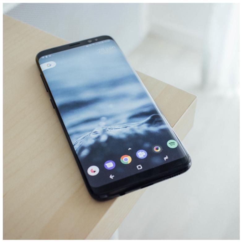

Original Image
Original Image

Vertically Cropped
Vertically Cropped Image

Horizontally Cropped
Horizontally Cropped Image

Square Container Square Cropped Image


Furqan Rahamath
  • 2,034
  • 1
  • 19
  • 29
  • This doesn't make the object squared based off your screenshots. – Adam Birds Apr 24 '22 at 22:56
  • If you observe the question, although the OP mentions "square", it is really talking about fitting an image in an arbitrary sized container while preserving the original aspect ratio. So the code I have mentioned would work, you just need a square sized container to see it. I have updated the fiddle to include a new square sized container and you can see that we get the desired rendering of the image. – Furqan Rahamath Apr 25 '22 at 15:37
  • Also, I have added a screenshot which shows the image fit in a square container. – Furqan Rahamath Apr 25 '22 at 22:32
3

I had a similar issue and could not "compromise" with background images. I came up with this.

<div class="container">
    <img src="http://lorempixel.com/800x600/nature">
</div>

.container {
    position: relative;
    width: 25%; /* whatever width you want. I was implementing this in a 4 tile grid pattern. I used javascript to set height equal to width */
    border: 2px solid #fff; /* just to separate the images */
    overflow: hidden; /* "crop" the image */
    background: #000; /* incase the image is wider than tall/taller than wide */
}

.container img {
    position: absolute;
    display: block;
    height: 100%; /* all images at least fill the height */
    top: 50%; /* top, left, transform trick to vertically and horizontally center image */
    left: 50%;
    transform: translate3d(-50%,-50%,0);
}

//assuming you're using jQuery
var h = $('.container').outerWidth();
$('.container').css({height: h + 'px'});

Hope this helps!

Example: https://jsfiddle.net/cfbuwxmr/1/

prozac
  • 239
  • 2
  • 5
2

Use CSS: overflow:

.thumb {
   width:230px;
   height:230px;
   overflow:hidden
}
Diodeus - James MacFarlane
  • 112,730
  • 33
  • 157
  • 176
0

Either use a div with square dimensions with the image inside with the .testimg class:

.test {
width: 307px;
height: 307px;
overflow:hidden
}

.testimg {
    margin-left: -76px

}

or a square div with a background of the image.

.test2 {
width: 307px;
height: 307px;
    background: url(https://i.stack.imgur.com/GA6bB.png) 50% 50%
}

Here's some examples: http://jsfiddle.net/QqCLC/1/

UPDATED SO THE IMAGE CENTRES

.test {
  width: 307px;
  height: 307px;
  overflow: hidden
}

.testimg {
  margin-left: -76px
}

.test2 {
  width: 307px;
  height: 307px;
  background: url(https://i.stack.imgur.com/GA6bB.png) 50% 50%
}
<div class="test"><img src="https://i.stack.imgur.com/GA6bB.png" width="460" height="307" class="testimg" /></div>

<div class="test2"></div>
mplungjan
  • 169,008
  • 28
  • 173
  • 236
tech292
  • 31
  • 5
0

I came with a different approach. You basically have to crop the rectangular image to fit it inside the square is all there is to it. Best approach is if the image width is greater than the height, then you crop the image alittle from left and right side of the image. If the image height is greater than the image width then you crop the bottom of the image. Here is my solution. I needed a little help from PHP though.

    <div style="position: relative; width: 154px; height: 154px; overflow: hidden;">
<?php 
        //get image dimmensions whichever way you like. I used imgaick
        $image = new Imagick("myimage.png");
        $width = $image->getImageWidth();  
        $height = $image->getImageHeight(); 
        if($width > $height){
 ?>
        <img src="myimage.png" style="display: block; position: absolute; top: 0px; left: 50%; transform: translateX(-50%); -ms-transform: translateX(-50%); -webkit-transform: translateX(-50%); height: 100%; " />
 <?php
        }else{
 ?>
        <img src="myimage.png" style="display: block; position: absolute; top: 0px; left: 0px; width: 100%; " />
 <?php
        }
 ?>

    </div>
  • Please provide an explanation to your code - it is very hard to understand something when it isn't explained. – ethry Jul 02 '22 at 21:24
0

2023 Answer

img {
    width: 200px; /* Dtermine size of square */
    aspect-ratio: 1/1; /* Keeps height equal to width */
    object-fit: cover; /* No distortion of image, and no empty space */
}
<img src="https://i.stack.imgur.com/GA6bB.png">
Ben Carp
  • 24,214
  • 9
  • 60
  • 72