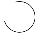
I'm interested in creating a loading spinner entirely in CSS but in order to do so I would need to be able to draw a open ring shape like this:

The ring would draw itself around the circumference of the circle. Is this achievable in CSS?
I'm interested in creating a loading spinner entirely in CSS but in order to do so I would need to be able to draw a open ring shape like this:
The ring would draw itself around the circumference of the circle. Is this achievable in CSS?
To create a circle that gradually draws it's outer path, use SVG.
SVG's stroke-dasharray property will turn any path into a dashed line, which you can use to your advantage by setting the dash size to be almost as long as the path itself.
Then use a CSS animation to gradually change the stroke-dashoffset to move the dash around the perimeter of your circle.
circle {
  fill: white;
  stroke: black;
  stroke-width: 2;
  stroke-dasharray: 250;
  stroke-dashoffset: 1000;
  animation: rotate 5s linear infinite;
}

@keyframes rotate {
  to {
    stroke-dashoffset: 0;
  }
}
<svg height="100" width="100">
<circle cx="50" cy="50" r="40" />
</svg>
A simplified example that just relies on a single HTML element and CSS class might look like this :
.arc {
  /* Border size and color */
  border: 2px solid #000;
  /* Creates a circle */
  border-radius: 50%;
  /* Circle size */
  height: 100px;
  width: 100px;
  /* Use transparent borders to define opening (more transparent = larger opening) */
  border-top-color: transparent;
  border-left-color: transparent;
  /* Use transform to rotate to adjust where opening appears */
  transform: rotate(300deg)
}
Example
.arc {
  border: 2px solid #000;
  border-radius: 50%;
  height: 100px;
  width: 100px;
  border-top-color: transparent;
  transform: rotate(300deg)
}
<div class='arc'></div>You can apply a basic rotation to the previous static example by taking advantage of CSS-based animations using @keyframes :
.arc {
  /* Border size and color */
  border: 2px solid #000;
  /* Creates a circle */
  border-radius: 50%;
  /* Circle size */
  height: 100px;
  width: 100px;
  /* Use transparent borders to define opening (more transparent = larger opening) */
  border-top-color: transparent;
  /* Rotate indefinitely (longer time = slower rotation) */
  animation: rotate 2s infinite linear;
}

@keyframes rotate {
  0%    { transform: rotate(0deg);  }
  100%  { transform: rotate(360deg);  }
}
Example
.arc {
  border: 2px solid #000;
  border-radius: 50%;
  height: 100px;
  width: 100px;
  border-top-color: transparent;
  animation: rotate 2s infinite linear;
}

@keyframes rotate {
  0%    { transform: rotate(0deg);  }
  100%  { transform: rotate(360deg);  }
}
<div class='arc'></div>Another approach that I came across, while not nearly as elegant as the previous approaches does appear to achieve your desired effect. In involves the use of several animations as well as showing/hiding different sections of the circle as necessary.
The code snippet contains an example demonstrating it.
Example
#container {
  position: absolute;
  width: 100px;
  height: 100px;
  animation: colors 1s infinite;
}
#halfclip {
  width: 50%;
  height: 100%;
  right: 0px;
  position: absolute;
  overflow: hidden;
  transform-origin: left center;
  animation: cliprotate 4s steps(2) infinite;
  -webkit-animation: cliprotate 4s steps(2) infinite;
}
.halfcircle {
  box-sizing: border-box;
  height: 100%;
  right: 0px;
  position: absolute;
  border: solid 2px transparent;
  border-top-color: #000;
  border-left-color: #000;
  border-radius: 50%;
}
#clipped {
  width: 200%;
  animation: rotate 2s linear infinite;
  -webkit-animation: rotate 2s linear infinite;
}
#fixed {
  width: 100%;
  transform: rotate(135deg);
  animation: showfixed 4s steps(2) infinite;
  -webkit-animation: showfixed 4s linear infinite;
}
@-webkit-keyframes cliprotate {
  0% {
    transform: rotate(0deg);
  }
  100% {
    transform: rotate(360deg);
  }
}
@keyframes cliprotate {
  0% {
    transform: rotate(0deg);
  }
  100% {
    transform: rotate(360deg);
  }
}
@-webkit-keyframes rotate {
  0% {
    transform: rotate(-45deg);
  }
  100% {
    transform: rotate(135deg);
  }
}
@keyframes rotate {
  0% {
    transform: rotate(-45deg);
  }
  100% {
    transform: rotate(135deg);
  }
}
@-webkit-keyframes showfixed {
  0% {
    opacity: 0;
  }
  49.9% {
    opacity: 0;
  }
  50% {
    opacity: 1;
  }
  100% {
    opacity: 1;
  }
}
<div id="container">
<div id="halfclip">
<div class="halfcircle" id="clipped">
</div>
</div>
<div class="halfcircle" id="fixed">
</div>
</div>Taking advantage of SVG is probably the best way to address this problem, as it's explicitly designed to handle drawing within the browser. I'd highly recommend that approach if SVG support is available.
Dylan's response details what this implementation might look like.
You can just take a pseudo element ::after to create the open part, with just overlapping the circle element. Advantage is, that the open part can be as long as wished (not limited to a 3/4 full circle).
.circle {
  width: 100px;
  height: 100px;
  border: 2px solid;
  border-radius: 50%;
  margin: 30px;
  animation: rotate 1s infinite linear;
}
.circle::after {
  content: "";
  display: block;
  width: 80px;
  height: 80px;
  background: white;
  border-radius: 50%;
  margin: -30% 0 0 -30%;
}
@keyframes rotate {
  0%    { transform: rotate(0deg);  }
  100%  { transform: rotate(360deg);  }
}
<div class="circle"></div>
for the pseudo version, you can also use linear-gradient (shade can be decreased or increased) and background-clip,
where it is avalaible, mix-blend-mode can make it translucide,
currentcolor and animation can also be used to animate color :
.loader {
  font-size: 1.5em;
  color: gray;
  position: relative;
  padding: 3px;
  /* make a square */
  height: 100px;
  width: 100px;
  /* center content*/
  display: flex;
  align-items: center;
  justify-content: center;
  animation: coloranim infinite 5s;
}

.circle {
  border-radius: 100%;
  overflow: hidden;
}

.loader:after {
  border-radius: inherit;
  color: inherit;
  content: '';
  position: absolute;
  top: 0;
  bottom: 0;
  left: 0;
  right: 0;
  padding: 3px;
  background: linear-gradient(white, white), linear-gradient(0deg, transparent 40%, currentcolor 60%), linear-gradient(50deg, transparent 50%, currentcolor 52%);
  background-clip: content-box, border-box, border-box;
  z-index: -1;
  mix-blend-mode: multiply;/* if avalaible, else bg remains white */
}

.spin:after {
  animation: spin 2s linear infinite;
}

@keyframes spin {
  to {
    transform: rotate(360deg);
  }
}

@keyframes coloranim {
  20% {
    color: tomato;
  }
  40% {
    color: purple;
  }
  60% {
    color: turquoise;
  }
  80% {
    color: green;
  }
}


/* demo purpose, use your own style wherever your loader is needed */

html {
  height: 100%;
  display: flex;
  background: url(http://lorempixel.com/800/800/food/3);
  background-size: cover;
  box-shadow: inset 0 0 0 2000px rgba(255, 255, 255, 0.3)
}

body {
  margin: auto;
}
<div class="spin circle loader coloranim"> loading... </div>