108

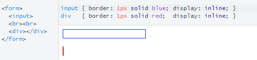
When using input and button elements inside a flex container, the flex and/or flex-grow properties don't seem to do anything.

Code that demonstrates my issue.

button,
input {
  font-size: 1rem;
}

button {
  border: none;
  background-color: #333;
  color: #EEE;
}

input {
  border: 1px solid #AAA;
  padding-left: 0.5rem;
}

.inputrow {
  width: 30rem;
  display: flex;
  margin: 0 -.25rem;
}

.inputrow>* {
  margin: 0 .25rem;
  border-radius: 2px;
  height: 1.75rem;
  box-sizing: border-box;
}

.nickname {
  flex: 1;
}

.message {
  flex: 4;
}

.s-button {
  flex: 1;
}
<div class="inputrow">
  <input type="text" class="nickname" placeholder="Nickname">
  <input type="text" class="message" placeholder="Message">
  <button type="submit" class="s-button">Submit</button>
</div>

Code that shows what I'm expecting. (using DIVs instead of input and button).

.inputrow {
  width: 30rem;
  display: flex;
  flex-flow: row nowrap;
  margin: 0 -.25rem;
}

.inputrow>* {
  margin: 0 .25rem;
  height: 1.75rem;
}

.nickname {
  flex: 1;
  background-color: blue;
}

.message {
  flex: 4;
  background-color: red;
}

.s-button {
  flex: 1;
  background-color: green;
}
<div class="inputrow">
  <div class="nickname">Nickname</div>
  <div class="message">Message</div>
  <div class="s-button">Submit</div>
</div>
Michael Benjamin
  • 346,931
  • 104
  • 581
  • 701
viderizer
  • 1,125
  • 2
  • 7
  • 7

7 Answers7

217

An input element, unlike a div, comes with a default width.

Here's a simple illustration of this setting:

enter image description here

The browser automatically gives the input a width.

input {
  border: 1px solid blue;
  display: inline;
}

div {
  border: 1px solid red;
  display: inline;
}
<form>
  <input>
  <br><br>
  <div></div>
</form>

Also, an initial setting on flex items is min-width: auto. This means that items cannot shrink below their width on the main axis.

Hence, input elements cannot shrink below their default width and may be forced to overflow the flex container.

You can override this behavior by setting your inputs to min-width: 0 (revised codepen)

Here's a full explanation: Why don't flex items shrink past content size?

In some cases, you may need to override input widths using width: 100% or width: 0.

Michael Benjamin
  • 346,931
  • 104
  • 581
  • 701
  • 9
    min-width thats it! :D – Martin Krajčírovič Aug 28 '17 at 20:10
  • 1
    For me, this didn't do it: https://jsbin.com/danaworohe/edit?html,css,output compared to using only divs: https://jsbin.com/xilubuwora/edit?html,css,output – Christof Kälin Oct 12 '17 at 15:16
  • 16
    Finally, using only ```width: 0``` for the input itself solved this issue. No need for ```min-width: 0``` in my example: https://jsbin.com/dokataxupa/edit?html,css,output – Christof Kälin Oct 12 '17 at 15:38
  • 4
    I also had to put `size="5"` on my `input`s as my browser seemed to be ensuring the default value of at least 20 characters was visible, despite `min-width: 0` and `flex-shrink: 1`. – Andy Apr 01 '18 at 15:42
  • 2
    `width: 100% || 0` worked for me here, however min-width: 0 don't. I guess that `[min || max]-width` and `width` itself has a primary character on the element sizing. Flex comes after and, based upon theis values, adds its characteristics to give flexbility and so on. The strange thing is that `flex-basis` doesn't has any prevalence over the width in this case, and in some others, it has. [CSS is Awe]some... lol – Mateus Leon Apr 27 '18 at 17:49
  • the issue is that you need to set `width: 0`, but then it doesnt behave as if its `width: auto`... [here is a codepen](https://codepen.io/tOkyO1/pen/NQNPEm) – oldboy Jul 23 '19 at 21:40
  • 1
    Use `min-width: 0` to get it to shrink as necessary. Use `width: 100%` to get it to grow as necessary. – Ryan Lue May 10 '20 at 09:31
  • i just tested min-width:0 is not enough, i need to put width:100% as well, but anyw i solved my problem – rickvian Dec 17 '20 at 08:23
  • Setting the width kind of defeats the whole flex purpose... This doesn't work anyway. – yPhil Feb 03 '21 at 17:53
10

I needed to wrap the input element with a styled element and than set the input width and min-width as below:

.field__input input {
  width: 0;
  min-width: 100%;
}
Mr. Polywhirl
  • 42,981
  • 12
  • 84
  • 132
otaviodecampos
  • 1,586
  • 16
  • 10
5

If you have an input element inside a flex box, you can define width: 0 and still can utilize flex: 1 or whatever value you need.

This is Christof Kälin's answer in the comments for another answer. Putting it here for visibility.

const
  setValue = (btn, amount) => {
    const input = btn.closest('.stepper').querySelector('.stepper-val');
    input.value = +input.value + amount;
  },
  handleDecr = e => setValue(e.target, -1),
  handleIncr = e => setValue(e.target, 1);

document.querySelectorAll('.stepper').forEach(s => {
  s.querySelector('.stepper-minus').addEventListener('click', handleDecr);
  s.querySelector('.stepper-plus').addEventListener('click', handleIncr);
});
html {
  font-family: Arial, Helvetica, sans-serif;
  /* font-size: 3vw; */
}

html, body, div, button, input {
  box-sizing: border-box;
}

#atf {
  height: 100vh;
  /* flex-container */
  display: flex;
  justify-content: center;
  align-items: center;
}

.stepper {
  /* flex-container */
  display: flex;
  /* formatting */
  width: 12rem;
  height: 2rem;
}

.stepper-minus {
  /* flex-item */
  flex-grow: 1;
  /* flex-container */
  display: flex;
  justify-content: center;
  align-items: center;
  /* formatting */
  background-color: deepskyblue;
  border: 1px solid lightgray;
  border-radius: .6rem 0 0 .6rem;
  cursor: pointer;
}

.stepper-val {
  /* flex-item */
  flex-grow: 2;
  /* flex-container */
  text-align: center;
  /* formatting */
  border-top: 1px solid lightgray;
  border-bottom: 1px solid lightgray;
  border-left: none;
  border-right: none;
  width: 0;
}

.stepper-plus {
  /* flex-item */
  flex-grow: 1;
  /* flex-container */
  display: flex;
  justify-content: center;
  align-items: center;
  /* formatting */
  background-color: deepskyblue;
  border: 1px solid lightgray;
  border-radius: 0 .6rem .6rem 0;
  cursor: pointer;
}

.stepper>button:hover {
  background-color: blue;
}
<div id="atf">
  <div class="stepper">
    <button class="stepper-minus">&minus;</button>
    <input class="stepper-val" type="text" name="val" value="32">
    <button class="stepper-plus">&plus;</button>
  </div>
</div>

Edit: Making this answer a community wiki so that I don't get unearned credit.

Mr. Polywhirl
  • 42,981
  • 12
  • 84
  • 132
oyalhi
  • 3,834
  • 4
  • 40
  • 45
3

I would like to extend @Michael Benjamin solution

In some cases, you may need to override input widths using width: 100% or width: 0.

you can also do calc(100%)

Penny Liu
  • 15,447
  • 5
  • 79
  • 98
aviram83
  • 880
  • 11
  • 15
1

if the parent is a flexible container set with the usual flex: 1 (flex-grow: 1) and you want the input to shrink with the parent, this is what has worked for me:

width: 35px;
flex: 1 2 0px;

Give this as a class to the input, this will make it take the whole space when its available, but shrink to minimum size when resized.

Edit:

This works because it's a shorthand for flex: <flex-grow> <flex-shrink> <flex-basis> as explained here https://css-tricks.com/snippets/css/a-guide-to-flexbox/#flex

The '2' is assigned to flex-shrink which makes the element shrink. Sometimes you still need to add min-width: 0; as mentioned in other comments to remove the min-width defined by browsers (for small containers)

Penny Liu
  • 15,447
  • 5
  • 79
  • 98
Husky931
  • 636
  • 6
  • 10
0

Use flex-basis: 0; for input or input container solves the problem.

Mohammad Barbast
  • 1,753
  • 3
  • 17
  • 28
0

I'd recommend setting the width to 100% or what ever percentage you want but you should set it. That works for me.

Darren Odi
  • 11
  • 1