22

I am using Boostrap 4(Bootstrap v4.0.0-beta) Beta and facing issues with offsetting columns. Earlier i used to do offset-md-* and it was working, with BS4 Beta this is removed according to docs. The new method mentioned in docs is using .ml-auto , when i try to use it with col-md-4 it is offsetting 4 columns. What i want is custom offsetting like

**<div class="col-md-4 offset-md-2"></div>**

I tried using

**<div class="col-md-4 ml-md-2"></div>**

but didn't work Is this is bug or there is another way to do it ?

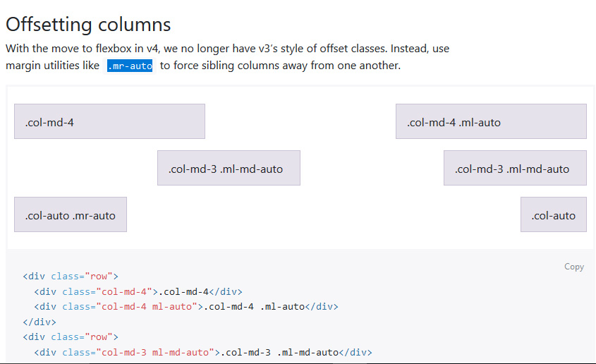
Here is official docs about offsetting https://getbootstrap.com/docs/4.0/layout/grid/#offsetting-columns Bootstrap v4 Beta

Prashant Sharma
  • 349
  • 1
  • 3
  • 11

3 Answers3

30

Bootstrap 4 offset classes were temporarily removed in Beta 1, but were restored in Beta 2.

The class names col-{breakpoint}-offset-* were replaced with offset-{breakpoint}-*

The new auto-margins also work for offsetting columns will move the column over as much as possible. So, it depends on how much you want to "push" the column to the right. If they're no other columns to the right of the col-md-4 it will go all the way if to right side of the row. Basically offset was relevant for floated columns but is no longer relevant now that Bootstrap 4 is flexbox.

If you want to move the col-md-4 over just 2 column units, the best way would be to use a dummy/placeholder column...

<div class="row">
      <div class="col-md-2"></div>
      <div class="col-md-4">
            ..
      </div>
</div>

https://www.codeply.com/go/SqrQIOAY7

If there are other col-md-4 to the right of the first, then ml-auto and mr-auto would work to center both columns...

<div class="row">
        <div class="col-md-4 ml-auto">
            .
        </div>
        <div class="col-md-4 mr-auto">
            .
        </div>
</div>

https://www.codeply.com/go/SqrQIOAY7n

If you want to center the col-md-4 then simply use mx-auto to create equal margins on both sides.


Note: specific column offsets will be restored as of Beta 2

Carol Skelly
  • 351,302
  • 90
  • 710
  • 624
  • Thanks but this blank div with col-md-2 seems like a "Hack" no?, this is what i used before posting this question. I will use your 2nd solution as i have another col-md-4 to the right, i will let you know if this solves my issue. – Prashant Sharma Aug 12 '17 at 17:20
  • It may seem like a hack, but it's the only solution now that the offsets have been replaced by auto margins. – Carol Skelly Aug 12 '17 at 17:23
  • Thanks alot for your tip , your 2nd solution worked for me and i guess for time being i will use a blank div on other places till Bootstrap get something new for offsetting. – Prashant Sharma Aug 12 '17 at 17:26
  • I'm a little confused. You're saying `offset` is no longer relevant now that Bootstrap 4 is flexbox, but that they will be restored? Why would they restore them if they aren't relevant? – BBaysinger Dec 12 '17 at 00:11
  • 1
    Beta2 is out now. Has offset been restored? – BBaysinger Dec 12 '17 at 00:12
4

Changing

offset-md-2

to:

col-md-offset-2

Worked for me

clamchoda
  • 4,411
  • 2
  • 36
  • 74
1

ml-md-auto sets margin-left: auto; for sizes md and above.

You can't set that to something like 2.

You need to do ml-md-auto.

Oliver Ni
  • 2,606
  • 7
  • 29
  • 44