347

Looking through bootstrap it looks like they support collapsing the menubar items for smaller screens. Is there something similar for other items on the page?

For example, I have a along with nav-pills floated right. On a small screen this causes issues. I'd love to at least put it into a similar click-to-show-more dropdown.

Is this possible within existing Bootstrap framework?

Marc Uberstein
  • 12,501
  • 3
  • 44
  • 72
Kaitlyn2004
  • 3,879
  • 4
  • 16
  • 16

9 Answers9

679

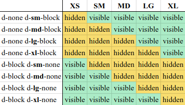
New visible classes added to Bootstrap

Extra small devices Phones (<768px) (Class names : .visible-xs-block, hidden-xs)

Small devices Tablets (≥768px) (Class names : .visible-sm-block, hidden-sm)

Medium devices Desktops (≥992px) (Class names : .visible-md-block, hidden-md)

Large devices Desktops (≥1200px) (Class names : .visible-lg-block, hidden-lg)

For more information : http://getbootstrap.com/css/#responsive-utilities


Below is deprecated as of v3.2.0


Extra small devices Phones (<768px) (Class names : .visible-xs, hidden-xs)

Small devices Tablets (≥768px) (Class names : .visible-sm, hidden-sm)

Medium devices Desktops (≥992px) (Class names : .visible-md, hidden-md)

Large devices Desktops (≥1200px) (Class names : .visible-lg, hidden-lg)


Much older Bootstrap


.hidden-phone, .hidden-tablet etc. are unsupported/obsolete.

UPDATE:

In Bootstrap 4 there are 2 types of classes:

  • The hidden-*-up which hide the element when the viewport is at the given breakpoint or wider.
  • hidden-*-down which hide the element when the viewport is at the given breakpoint or smaller.

Also, the new xl viewport is added for devices that are more then 1200px width. For more information click here.

Yuval Pruss
  • 8,716
  • 15
  • 42
  • 67
Marc Uberstein
  • 12,501
  • 3
  • 44
  • 72
  • 2
    I don't believe `.hidden-phone` and `.hidden-tablet` are **deprecated**— they're **unsupported**.  Deprecated tends to mean _“has been superseded by other approaches although still supported are intended to be phased out soon”_.  This appears to be the case with Bootstrap 3.2.0— `.visible-xs` and the like still work for now, while `.hidden-phone` and friends are completely absent from Bootstrap's functionality. – Slipp D. Thompson Nov 01 '14 at 07:29
  • 2
    Thank you - I have updated the answer to the correct wording. Should be a bit clearer to other users now. – Marc Uberstein Nov 01 '14 at 10:41
  • 2
    FYI Did a little more research— it seems “obsolete” is commonly used in formal contexts as the state of unsupportedness follow deprecation.  I think “unsupported” works just as well, but whatever.  Thanks for considering my earlier suggestion. – Slipp D. Thompson Nov 05 '14 at 14:18
  • 1
    :) I have added both ... for layman's terms sake. Thanks for doing a bit more research on correct wording, will definitely keep it in mind for future posts. cheers – Marc Uberstein Nov 05 '14 at 21:53
  • I have solved my context with `.visible-lg`; Thanks a lot. :) – int soumen Aug 22 '17 at 06:24
  • 2
    Note that the Bootstrap 4 update is for bootstrap 4 alpha. In the release version you should use .d-*-none and d-*-block classes. https://getbootstrap.com/docs/4.0/migration/#responsive-utilities – Pieter De Bie Apr 18 '18 at 08:35
237

Bootstrap 4 Beta Answer:

d-block d-md-none to hide on medium, large and extra large devices.

d-none d-md-block to hide on small and extra-small devices.

enter image description here

Note that you can also inline by replacing d-*-block with d-*-inline-block


Old answer: Bootstrap 4 Alpha

  • You can use the classes .hidden-*-up to hide on a given size and larger devices

    .hidden-md-up to hide on medium, large and extra large devices.

  • The same goes with .hidden-*-down to hide on a given size and smaller devices

    .hidden-md-down to hide on medium, small and extra-small devices

  • visible-* is no longer an option with bootstrap 4

  • To display only on medium devices, you can combine the two:

    hidden-sm-down and hidden-xl-up

The valid sizes are:

  • xs for phones in portrait mode (<34em)
  • sm for phones in landscape mode (≥34em)
  • md for tablets (≥48em)
  • lg for desktops (≥62em)
  • xl for desktops (≥75em)

This was as of Bootstrap 4, alpha 5 (January 2017). More details here: http://v4-alpha.getbootstrap.com/layout/responsive-utilities/

On Bootstrap 4.3.x: https://getbootstrap.com/docs/4.3/utilities/display/

Cava
  • 5,346
  • 4
  • 25
  • 41
Julien
  • 3,613
  • 2
  • 23
  • 25
  • 10
    These were removed from v4 beta. You now use the `.d-` classes to hide or show at different sizes. https://getbootstrap.com/docs/4.0/utilities/display/ – DriverDan Aug 14 '17 at 16:10
  • 1
    I saw, but I am still trying to work this out.... How do I hide something on a small screen only now? I need the opposite of d-md-none, since I toggle to div's depending on large vs small screen. – Leo Muller Aug 15 '17 at 06:25
  • 1
    @LeoMuller If you want an element to hide on size sm and below, but visible on md, lg and xl, use `d-none d-md-block`. https://code.luasoftware.com/tutorials/bootstrap/bootstrap-hide-element-based-on-viewport-size/ – Desmond Lua Aug 22 '17 at 04:19
  • @DesmondLua I think the same that LeoMuller... in BS4 some elements behaves as blocks and some others as flex... ¿why must I know previously about the BS4 nature of an element only if I wish to hide it in phones but I want display it as BS4 standard in tablets and laptops? It is contrary to how you normally think... I hope BS4 Team fix this before final release – JavierFuentes Dec 24 '17 at 13:51
  • I can't find the documentation on d-block on the current Bootstrap 4 documentation, did they remove this? – Mojimi Jan 23 '18 at 16:44
70

Bootstrap 4.x answer

hidden-* classes are removed from Bootstrap 4 beta onward.

If you want to show on medium and up use the d-* classes, e.g.:

<div class="d-none d-md-block">This will show in medium and up</div>

If you want to show only in small and below use this:

<div class="d-block d-md-none"> This will show only in below medium form factors</div>

Screen size and class chart

Screen Size Class
Hidden on all .d-none
Hidden only on xs .d-none .d-sm-block
Hidden only on sm .d-sm-none .d-md-block
Hidden only on md .d-md-none .d-lg-block
Hidden only on lg .d-lg-none .d-xl-block
Hidden only on xl .d-xl-none
Visible on all .d-block
Visible only on xs .d-block .d-sm-none
Visible only on sm .d-none .d-sm-block .d-md-none
Visible only on md .d-none .d-md-block .d-lg-none
Visible only on lg .d-none .d-lg-block .d-xl-none
Visible only on xl .d-none .d-xl-block

Rather than using explicit .visible-* classes, you make an element visible by simply not hiding it at that screen size. You can combine one .d-*-none class with one .d-*-block class to show an element only on a given interval of screen sizes (e.g. .d-none.d-md-block.d-xl-none shows the element only on medium and large devices).

Documentation

From Bootstrap 5.x docs (Link)

The classes are named using the format:

.d-{value} for xs

.d-{breakpoint}-{value} for sm, md, lg, xl, and xxl.

Where value is one of:

  • none
  • inline
  • inline-block
  • block
  • grid
  • table
  • table-cell
  • table-row
  • flex
  • inline-flex
kiranvj
  • 32,342
  • 7
  • 71
  • 76
26

You can enter these module class suffixes for any module to better control where it will show or be hidden.

.visible-phone  
.visible-tablet     
.visible-desktop    
.hidden-phone   
.hidden-tablet  
.hidden-desktop 

http://twitter.github.com/bootstrap/scaffolding.html scroll to bottom

Marcin Orlowski
  • 72,056
  • 11
  • 123
  • 141
john taylor
  • 1,080
  • 15
  • 31
  • Thanks - I actually DO want them to be visible... just in a condensed/collapsed form like the navbar-collapse which is exclusively for the navbar and I see no other support for other elements... – Kaitlyn2004 Jan 08 '13 at 03:16
  • They're collapsable based on their class names and/or id. If you locate the CSS/JS then you could add additional class/ids that do the same thing. – justinavery Jan 08 '13 at 07:30
  • Any chance you could provide an example? I see the collapse plugin, but not sure about implementation. at least within the navbar it seems to be handled very automatically - or at least built into core of bootstrap – Kaitlyn2004 Jan 08 '13 at 18:31
  • 7
    Deprecated since Bootstrap 3. – Gereltod Aug 02 '17 at 03:18
  • 2
    Please inform that it's only for #Bootstrap 2 – Lucas Bustamante Nov 23 '17 at 14:03
20

I have a couple of clarifications to add here:

1) The list shown (visible-phone, visible-tablet, etc.) is deprecated in Bootstrap 3. The new values are:

  • visible-xs-*
  • visible-sm-*
  • visible-md-*
  • visible-lg-*
  • hidden-xs-*
  • hidden-sm-*
  • hidden-md-*
  • hidden-lg-*

The asterisk translates to the following for each (I show only visible-xs-* below):

  • visible-xs-block
  • visible-xs-inline
  • visible-xs-inline-block

2) When you use these classes, you don't add a period in front (as confusingly shown in part of the answer above).

For example:

<div class="visible-md-block col-md-6 text-right text-muted">
   <h5>Copyright &copy; 2014 Jazimov</h5>
</div>

3) You can use visible-* and hidden-* (for example, visible-xs and hidden-xs) but these have been deprecated in Bootstrap 3.2.0.

For more details and the latest specs, go here and search for "visible": http://getbootstrap.com/css/

Jazimov
  • 12,626
  • 9
  • 52
  • 59
  • Incorrect `hidden-xs-block` is not valid, but `visible-xs-block` is – TheTechGuy Nov 24 '14 at 16:27
  • @hmd: Can you provide a source/citation for your comment, which I don't even fully understand because it's not even a full sentence. What exactly are you trying to share? Are you saying that only hidden-xs-block is not valid or are you saying that hidden-xs-* is not valid? Are you saying that hidden-md-block is valid while hidden-xs-block is not? Please elaborate especially because it seems that you downvoted my comment when I in fact had copied verbiage directly from the bootstrap online documentation. To what version of bootstrap do you refer in your comment? – Jazimov Nov 25 '14 at 00:03
  • 2
    ok, may be there are some changes in bootstrap. Just look at the top voted answer which provides correct solution. With hidden element, you can NOT use block, inline and inline block. With visible, you HAVE to use it. I think I am using bootstrap 3.x.Just try your solution for an element that hides itself on phone :) – TheTechGuy Nov 25 '14 at 03:35
7

For Bootstrap 4.0 beta (and I assume this will stay for final) there is a change - be aware that the hidden classes were removed.

See the docs: https://getbootstrap.com/docs/4.0/utilities/display/

In order to hide the content on mobile and display on the bigger devices you have to use the following classes:

d-none d-sm-block

The first class set display none all across devices and the second one display it for devices "sm" up (you could use md, lg, etc. instead of sm if you want to show on different devices.

I suggest to read about that before migration:

https://getbootstrap.com/docs/4.0/migration/#responsive-utilities

Eric Aya
  • 69,473
  • 35
  • 181
  • 253
Przemek Nowak
  • 7,173
  • 3
  • 53
  • 57
2

All hidden-*-up, hidden-* classes doesn't work for me, so I'm adding self-made hidden class before visible-*(which works for current bootstrap version). It is very useful if you need to show div only for one screen, and hide for all others.

CSS:

.hidden {display:none;}

HTML:

<div class="col-xs-12 hidden visible-xs visible-sm">
   <img src="photo.png" style="width:100%">
</div>
Gediminas Šukys
  • 7,101
  • 7
  • 46
  • 59
2

Additional CSS Remove Sidebar from all pages in Mobile view:

@media only screen and (max-width:767px)
{
#secondary {
display: none;
}
}
0

In boostrap 4.1 (run snippet because I copied whole table code from Bootstrap documentation):

.fixed_headers {
  width: 750px;
  table-layout: fixed;
  border-collapse: collapse;
}
.fixed_headers th {
  text-decoration: underline;
}
.fixed_headers th,
.fixed_headers td {
  padding: 5px;
  text-align: left;
}
.fixed_headers td:nth-child(1),
.fixed_headers th:nth-child(1) {
  min-width: 200px;
}
.fixed_headers td:nth-child(2),
.fixed_headers th:nth-child(2) {
  min-width: 200px;
}
.fixed_headers td:nth-child(3),
.fixed_headers th:nth-child(3) {
  width: 350px;
}
.fixed_headers thead {
  background-color: #333;
  color: #FDFDFD;
}
.fixed_headers thead tr {
  display: block;
  position: relative;
}
.fixed_headers tbody {
  display: block;
  overflow: auto;
  width: 100%;
  height: 300px;
}
.fixed_headers tbody tr:nth-child(even) {
  background-color: #DDD;
}
.old_ie_wrapper {
  height: 300px;
  width: 750px;
  overflow-x: hidden;
  overflow-y: auto;
}
.old_ie_wrapper tbody {
  height: auto;
}
<table class="fixed_headers">
  <thead>
    <tr>
      <th>Screen Size</th>
      <th>Class</th>
    </tr>
  </thead>
  <tbody>
    <tr>
      <td>Hidden on all</td>
      <td><code class="highlighter-rouge">.d-none</code></td>
    </tr>
    <tr>
      <td>Hidden only on xs</td>
      <td><code class="highlighter-rouge">.d-none .d-sm-block</code></td>
    </tr>
    <tr>
      <td>Hidden only on sm</td>
      <td><code class="highlighter-rouge">.d-sm-none .d-md-block</code></td>
    </tr>
    <tr>
      <td>Hidden only on md</td>
      <td><code class="highlighter-rouge">.d-md-none .d-lg-block</code></td>
    </tr>
    <tr>
      <td>Hidden only on lg</td>
      <td><code class="highlighter-rouge">.d-lg-none .d-xl-block</code></td>
    </tr>
    <tr>
      <td>Hidden only on xl</td>
      <td><code class="highlighter-rouge">.d-xl-none</code></td>
    </tr>
    <tr>
      <td>Visible on all</td>
      <td><code class="highlighter-rouge">.d-block</code></td>
    </tr>
    <tr>
      <td>Visible only on xs</td>
      <td><code class="highlighter-rouge">.d-block .d-sm-none</code></td>
    </tr>
    <tr>
      <td>Visible only on sm</td>
      <td><code class="highlighter-rouge">.d-none .d-sm-block .d-md-none</code></td>
    </tr>
    <tr>
      <td>Visible only on md</td>
      <td><code class="highlighter-rouge">.d-none .d-md-block .d-lg-none</code></td>
    </tr>
    <tr>
      <td>Visible only on lg</td>
      <td><code class="highlighter-rouge">.d-none .d-lg-block .d-xl-none</code></td>
    </tr>
    <tr>
      <td>Visible only on xl</td>
      <td><code class="highlighter-rouge">.d-none .d-xl-block</code></td>
    </tr>
  </tbody>
</table>

https://getbootstrap.com/docs/4.1/utilities/display/#hiding-elements

Tai Ly
  • 306
  • 4
  • 17