Is it even possible?
tldr; Yes.
Codepen Demo #1
Codepen Demo # 2 (Uses SASS and is configurable)
The difficulty here is that each article is a grid within itself and therefore any one article has no knowledge about another. Because of this, there is no way for a component of one article like a header to adjust according to the height of a header in another article.
There is actually a way to pull this off with css grids & without changing any markup!
We could 'flatten' the structure with CSS such that all the components of all the articles are part of just one CSS grid - the article container.
This is possible without even changing the current markup by setting the articles with display: contents
From Caniuse:
display: contents causes an element's children to appear as if they
were direct children of the element's parent, ignoring the element
itself. This can be useful when a wrapper element should be ignored
when using CSS grid or similar layout techniques.
So if we set the articles with display: contents
.container article {
display: contents;
}
Now all of the headers, sections and footer become (direct) grid items (of the container - which has display:grid) which we can arrange using the grid-template-areas property.
.container {
display: grid;
grid-column-gap: 1em; /* horizontal gap between articles */
grid-template-columns: repeat(3, 1fr);
grid-template-areas: "header1 header2 header3"
"section1 section2 section3"
"footer1 footer2 footer3"
"header4 header5 header6"
"section4 section5 section6"
"footer4 footer5 footer6"
}
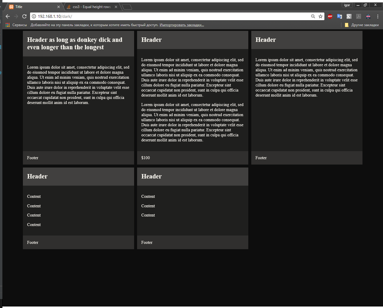
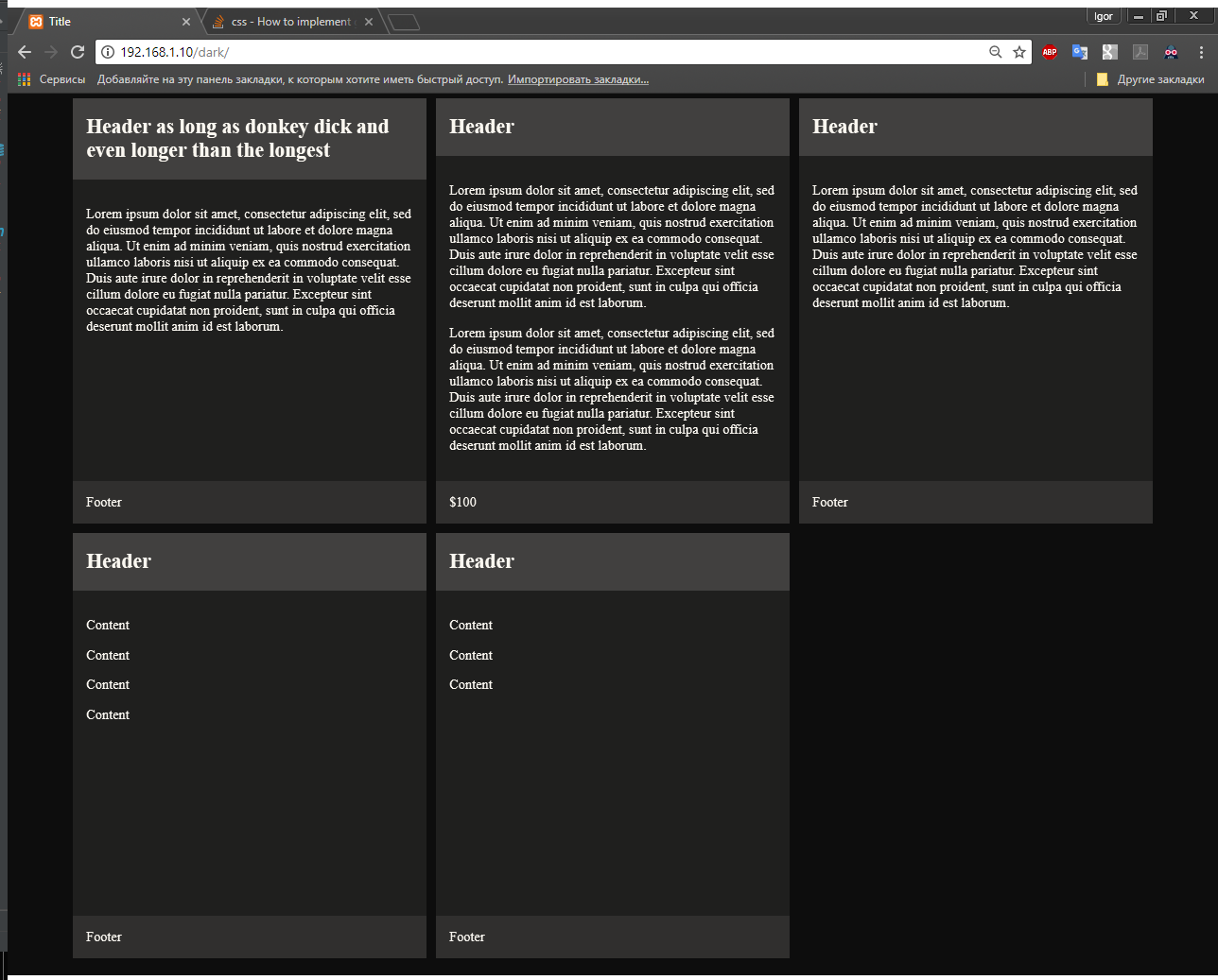
Since each header/section/footer take up exactly one cell - this forces them to take up the same vertical height. So e.g. header1,header2 and header3 will all have the same height regardless of their content.
Now set the grid-area properties on each of the cells.
article:nth-child(1) header {
grid-area: header1;
}
article:nth-child(2) header {
grid-area: header2;
}
article:nth-child(3) header {
grid-area: header3;
}
article:nth-child(4) header {
grid-area: header4;
}
article:nth-child(1) section {
grid-area: section1;
}
...
article:nth-child(4) section {
grid-area: section4;
}
article:nth-child(1) footer {
grid-area: footer1;
}
...
article:nth-child(4) footer {
grid-area: footer4;
}
Finally, set a vertical gap between each row of articles (starting from the second row of articles):
article:nth-child(n + 4) header {
margin-top: 1em;
}
Demo:
body {
width: 100%;
max-width: 1024px;
margin: auto;
}
.container {
display: grid;
grid-column-gap: 1em;
grid-template-columns: repeat(3, 1fr);
grid-template-areas: "header1 header2 header3"
"section1 section2 section3"
"footer1 footer2 footer3"
"header4 header5 header6"
"section4 section5 section6"
"footer4 footer5 footer6"
}
.container article {
display: contents;
}
article header {
background-color: #eeeeee;
}
article section {
background-color: #cccccc;
}
article footer {
background-color: #dddddd;
}
article:nth-child(n + 4) header {
margin-top: 1em;
}
article:nth-child(1) header {
grid-area: header1;
}
article:nth-child(2) header {
grid-area: header2;
}
article:nth-child(3) header {
grid-area: header3;
}
article:nth-child(4) header {
grid-area: header4;
}
article:nth-child(1) section {
grid-area: section1;
}
article:nth-child(2) section {
grid-area: section2;
}
article:nth-child(3) section {
grid-area: section3;
}
article:nth-child(4) section {
grid-area: section4;
}
article:nth-child(1) footer {
grid-area: footer1;
}
article:nth-child(2) footer {
grid-area: footer2;
}
article:nth-child(3) footer {
grid-area: footer3;
}
article:nth-child(4) footer {
grid-area: footer4;
}
<div class="container">
  <article>
    <header>
      <h2>Header</h2>
      <h2>Header</h2>
    </header>
    <section>
      <p>Content</p>
    </section>
    <footer>
      <p>Footer</p>
    </footer>
  </article>
  <article>
    <header>
      <h2>Header</h2>
    </header>
    <section>
      <p>Content</p>
      <p>Content</p>
      <p>Content</p>
      <p>Content</p>
      <p>Content</p>
    </section>
    <footer>
      <p>Footer</p>
      <p>Footer</p>
    </footer>
  </article>
  <article>
    <header>
      <h2>Header</h2>
    </header>
    <section>
      <p>Content</p>
      <p>Content</p>
      <p>Content</p>
    </section>
    <footer>
      <p>Footer</p>
    </footer>
  </article>
  <article>
    <header>
      <h2>Header</h2>
    </header>
    <section>
      <p>Content</p>
      <p>Content</p>
      <p>Content</p>
      <p>Content</p>
    </section>
    <footer>
      <p>Footer</p>
      <p>Footer</p>
    </footer>
  </article>
</div>
Of course, instead of using the grid-template-areas + grid-area properties we could instead use the grid-row + grid-column properties to achieve the same result - Codepen demo
Note: I do realise that the above is verbose and not exactly an optimal solution - but my point here is that it is possible. Also, we could use SASS loops to make that code much cleaner and also configurable.
It might be nice if there was some way to repeat a pattern using grid-template-areas - something like:
pseudo-code (not legal):
grid-template-areas: repeat("header1 header2 header3"
                           "section1 section2 section3"
                           "footer1 footer2 footer3")
...then we could get a more dynamic solution which would work for n articles solution by setting the grid-area using nth-child like:
article:nth-child(3n + 1) header {
  grid-area: header1;
}
etc. ... but I don't think that's possible at the moment (or maybe it's not necessary because subgrids will be able to do this?)
NB:
Grid Layout Module Level 2 introduces Subgrids which will make this problem easier to solve and without having to use display: contents
Should I use display: table?
For the layout which you need - display:table won't help much. Firstly, you'd have to totally restructure your markup to group article components together as apposed to articles, you'd have to hack around to style the table to look like 'articles' but even then - tables don't wrap so you'd need to wrap every three articles into a separate table.... even if it were possible it would be really messy and hard to maintain.