With iOS 11 safari, input textbox cursor are outside of input textbox. We did not get why it is having this problem. As you can see my focused text box is email text input but my cursor is outside of it. This only happens with iOS 11 Safari
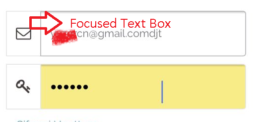
With iOS 11 safari, input textbox cursor are outside of input textbox. We did not get why it is having this problem. As you can see my focused text box is email text input but my cursor is outside of it. This only happens with iOS 11 Safari
I fixed the issue by adding position:fixed to the body when opening a modal.
Hope this will help you.
Personally, position: fixed scroll to top automatically. Quite annoying !
To avoid penalizing other devices and versions I apply this fix only to the appropriate versions of iOS.
For the javascript/jQuery
$(document).ready(function() {

    // Detect ios 11_x_x affected
    // NEED TO BE UPDATED if new versions are affected
    var ua = navigator.userAgent,
    iOS = /iPad|iPhone|iPod/.test(ua),
    iOS11 = /OS 11_0|OS 11_1|OS 11_2/.test(ua);

    // ios 11 bug caret position
    if ( iOS && iOS11 ) {

        // Add CSS class to body
        $("body").addClass("iosBugFixCaret");

    }

});
For the CSS
/* Apply CSS to iOS affected versions only */
body.iosBugFixCaret.modal-open { position: fixed; width: 100%; }
I modified the function to fire only for selected modals with a class .inputModal
Only the modals with inputs should be impacted to avoid the scroll to top.
For the javascript/jQuery
$(document).ready(function() {

    // Detect ios 11_x_x affected
    // NEED TO BE UPDATED if new versions are affected
    (function iOS_CaretBug() {

        var ua = navigator.userAgent,
        scrollTopPosition,
        iOS = /iPad|iPhone|iPod/.test(ua),
        iOS11 = /OS 11_0|OS 11_1|OS 11_2/.test(ua);

        // ios 11 bug caret position
        if ( iOS && iOS11 ) {

            $(document.body).on('show.bs.modal', function(e) {
                if ( $(e.target).hasClass('inputModal') ) {
                    // Get scroll position before moving top
                    scrollTopPosition = $(document).scrollTop();

                    // Add CSS to body "position: fixed"
                    $("body").addClass("iosBugFixCaret");
                }
            });

            $(document.body).on('hide.bs.modal', function(e) {
                if ( $(e.target).hasClass('inputModal') ) {
                    // Remove CSS to body "position: fixed"
                    $("body").removeClass("iosBugFixCaret");

                    //Go back to initial position in document
                    $(document).scrollTop(scrollTopPosition);
                }
            });

        }
    })();
});
For the CSS
/* Apply CSS to iOS affected versions only */
body.iosBugFixCaret.modal-open { position: fixed; width: 100%; }
For the HTML Add the class inputModal to the modal
<div class="modal fade inputModal" tabindex="-1" role="dialog">
    ...
</div>
Nota bene The javascript function is now self-invoking
As of iOS 11.3, the bug has been corrected. There is no need to test for OS 11_ in iOS11 = /OS 11_0|OS 11_1|OS 11_2/.test(ua);
But be careful as iOS 11.2 is still widely used (as of April 2018). See
This issue goes beyond Bootstrap, and beyond just Safari. It is a full display bug in iOS 11 that occurs in all browsers. The fix above does not fix this issue in all instances.
The bug is reported in detail here:
https://medium.com/@eirik.luka/how-to-fix-the-ios-11-input-element-in-fixed-modals-bug-aaf66c7ba3f8
Supposedly they already reported it to Apple as a bug.
Frustrating bug, thanks for identifying it. Otherwise, I would be banging my iphone or my head against the wall.
The simplest fix is (1 line of code change):
Just add the following CSS to the html or to an external css file.
<style type="text/css">
.modal-open { position: fixed; }
</style>
Here is a full working example:
.modal-open { position: fixed; }<link href="https://getbootstrap.com/docs/3.3/dist/css/bootstrap.min.css" rel="stylesheet">
<button type="button" class="btn btn-primary" data-toggle="modal" data-target="#exampleModal" data-whatever="@mdo">Open modal for @mdo</button>
<button type="button" class="btn btn-primary" data-toggle="modal" data-target="#exampleModal" data-whatever="@fat">Open modal for @fat</button>
<button type="button" class="btn btn-primary" data-toggle="modal" data-target="#exampleModal" data-whatever="@getbootstrap">Open modal for @getbootstrap</button>
...more buttons...
<div class="modal fade" id="exampleModal" tabindex="-1" role="dialog" aria-labelledby="exampleModalLabel">
<div class="modal-dialog" role="document">
<div class="modal-content">
<div class="modal-header">
<button type="button" class="close" data-dismiss="modal" aria-label="Close"><span aria-hidden="true">×</span></button>
<h4 class="modal-title" id="exampleModalLabel">New message</h4>
</div>
<div class="modal-body">
<form>
<div class="form-group">
<label for="recipient-name" class="control-label">Recipient:</label>
<input type="text" class="form-control" id="recipient-name">
</div>
<div class="form-group">
<label for="message-text" class="control-label">Message:</label>
<textarea class="form-control" id="message-text"></textarea>
</div>
</form>
</div>
<div class="modal-footer">
<button type="button" class="btn btn-default" data-dismiss="modal">Close</button>
<button type="button" class="btn btn-primary">Send message</button>
</div>
</div>
</div>
</div>
<script src="https://ajax.googleapis.com/ajax/libs/jquery/1.12.4/jquery.min.js"></script>
<script src="https://getbootstrap.com/docs/3.3/dist/js/bootstrap.min.js"></script>I submitted an issue here: https://github.com/twbs/bootstrap/issues/24059
Easiest/cleanest solution:
body.modal-open { position: fixed; width: 100%; }
This issue is no longer reproducible after updating your apple devices to iOS 11.3
Add position: fixed; to body when modal is open.
$(document).ready(function($){
    $("#myBtn").click(function(){
        $("#myModal").modal("show");
    });
    $("#myModal").on('show.bs.modal', function () {
        $('body').addClass('body-fixed');
    });
    $("#myModal").on('hide.bs.modal', function () {
        $('body').removeClass('body-fixed');
    });
});
.body-fixed {
position: fixed;
width: 100%;
}<script src="https://ajax.googleapis.com/ajax/libs/jquery/2.1.1/jquery.min.js"></script>
<script src="https://cdnjs.cloudflare.com/ajax/libs/twitter-bootstrap/3.3.7/js/bootstrap.min.js"></script>
<link href="https://cdnjs.cloudflare.com/ajax/libs/twitter-bootstrap/3.3.7/css/bootstrap.min.css" rel="stylesheet"/>
<button type="button" class="btn btn-info btn-lg" id="myBtn">Open Modal</button>
<!-- Modal -->
<div class="modal fade" id="myModal" role="dialog">
<div class="modal-dialog">
<div class="modal-content">
<div class="modal-header">
<button type="button" class="close" data-dismiss="modal">×</button>
<h4 class="modal-title">Form</h4>
</div>
<div class="modal-body">
<div class="form-group">
<label class="control-label">Input #1</label>
<input type="text" class="form-control">
</div>
<div class="form-group">
<label class="control-label">Input #2</label>
<input type="text" class="form-control">
</div>
<div class="form-group">
<label class="control-label">Input #3</label>
<input type="text" class="form-control">
</div>
<div class="form-group">
<label class="control-label">Input #4</label>
<input type="text" class="form-control">
</div>
</div>
<div class="modal-footer">
<button type="button" class="btn btn-default" data-dismiss="modal">Close</button>
</div>
</div>
</div>
</div>
Those solutions using position: fixed and position correction based on scrollTop work really well, but some people (including me) got another issue: keyboard caret/cursor not showing when inputs are focused.
I observed that caret/cursor works only when we DON'T use position: fixed on body. So after trying several things, I gave up on using this approach and decided to use position: relative on body and use scrollTop to correct modal's top position instead.
See code below:
var iosScrollPosition = 0;

function isIOS() {
   // use any implementation to return true if device is iOS
}

function initModalFixIOS() {
    if (isIOS()) {
        // Bootstrap's fade animation does not work with this approach
        // iOS users won't benefit from animation but everything else should work
        jQuery('#myModal').removeClass('fade');
    }
}

function onShowModalFixIOS() {
    if (isIOS()) {
        iosScrollPosition = jQuery(window).scrollTop();
        jQuery('body').css({
            'position': 'relative', // body is now relative
            'top': 0
        });
        jQuery('#myModal').css({
            'position': 'absolute', // modal is now absolute
            'height': '100%',
            'top': iosScrollPosition // modal position correction
        });
        jQuery('html, body').css('overflow', 'hidden'); // prevent page scroll
    }
}

function onHideModalFixIOS() {
    // Restore everything
    if (isIOS()) {
        jQuery('body').css({
            'position': '',
            'top': ''
        });
        jQuery('html, body').scrollTop(iosScrollPosition);
        jQuery('html, body').css('overflow', '');
    }
}

jQuery(document).ready(function() {
    initModalFixIOS();
    jQuery('#myModal')
        .on('show.bs.modal', onShowModalFixIOS)
        .on('hide.bs.modal', onHideModalFixIOS);
});
As previously mentioned: setting the style.position property of body to fixed solves the iOS cursor misplacement issue.
However, this gain comes at the cost of being forcibly scrolled to the top of the page.
Fortunately, this new UX problem can be negated without much overhead by leveraging HTMLElement.style and window.scrollTo().
The basic gist is to counteract the scroll to top by manipulating the body element's style.top when mounting. This is done using the YOffset value captured by the ygap variable.
From there it's simply a matter of resetting the body's style.top to 0 and reframing the user's view using window.scrollTo(0, ygap) when dismounting.
See below for a practical example.
// Global Variables (Manage Globally In Scope).
const body = document.querySelector('body') // Body.
let ygap = 0 // Y Offset.


// On Mount (Call When Mounting).
const onModalMount = () => {

  // Y Gap.
  ygap = window.pageYOffset || document.documentElement.scrollTop

  // Fix Body.
  body.style.position = 'fixed'

  // Apply Y Offset To Body Top.
  body.style.top = `${-ygap}px`

}


// On Dismount (Call When Dismounting).
const onModalDismount = () => {

  // Unfix Body.
  body.style.position = 'relative'

  // Reset Top Offset.
  body.style.top = '0'

  // Reset Scroll.
  window.scrollTo(0, ygap)

}
Incase anyone is looking for a fix in vanilla js that works on IOS >11.2 and doesnt require any additional CSS:
(function() {
    if (!/(iPhone|iPad|iPod).*(OS 11_[0-2]_[0-5])/.test(navigator.userAgent)) return

    document.addEventListener('focusin', function(e) {
        if (!e.target.tagName == 'INPUT' && !e.target.tagName != 'TEXTAREA') return
        var container = getFixedContainer(e.target)
        if (!container) return
        var org_styles = {};
        ['position', 'top', 'height'].forEach(function(key) {
            org_styles[key] = container.style[key]
        })
        toAbsolute(container)
        e.target.addEventListener('blur', function(v) {
            restoreStyles(container, org_styles)
            v.target.removeEventListener(v.type, arguments.callee)
        })
    })

    function toAbsolute(modal) {
        var rect = modal.getBoundingClientRect()
        modal.style.position = 'absolute'
        modal.style.top = (document.body.scrollTop + rect.y) + 'px'
        modal.style.height = (rect.height) + 'px'
    }

    function restoreStyles(modal, styles) {
        for (var key in styles) {
            modal.style[key] = styles[key]
        }
    }

    function getFixedContainer(elem) {
        for (; elem && elem !== document; elem = elem.parentNode) {
            if (window.getComputedStyle(elem).getPropertyValue('position') === 'fixed') return elem
        }
        return null
    }
})()
What this does is:
focusin events on the pageinput or a textarea and is contained in an element with fixed position, change the container position to absolute while regarding scrollTop and the containers original dimensions.fixed.
This solution worked for me and its working well across all browsers on iOS.
.safari-nav-force{
/* Allows content to fill the viewport and go beyond the bottom */
height: 100%;
overflow-y: scroll;
/* To smooth any scrolling behavior */
-webkit-overflow-scrolling: touch;
}
JavsScript
var iOS = /iPad|iPhone|iPod/.test(navigator.userAgent) && !window.MSStream;
$('.modal').on('shown.bs.modal', function () {
    if (iOS && $('.modal').hasClass('in')){
        $('html,body').addClass('safari-nav-force');
    }
});
$('.modal').on('hidden.bs.modal', function () {
    if (iOS && !$('.modal').hasClass('in')){
        $('html,body').removeClass('safari-nav-force');
    }
});
Have you try viewport-fit=cover for the meta viewport.
Look at this : https://ayogo.com/blog/ios11-viewport/
Override modal css and change its position from fixed to absolute
.modal {
position: absolute !important;
}
add to the #modal position:absolute it fix future issues related to the position: fixed