0

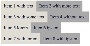
I don't know if this is possible with flex but what i need is a list with two items side by side and the width per item depends on the content. Like here:

<div class="items">
  <div class="item">Item 1 with text</div>
  <div class="item">Item 2 with more text</div>
  <div class="item">Item 3 with some text</div>
  <div class="item">Item 4 without text</div>
  <div class="item">Item 5 lorem</div>
  <div class="item">Item 6 ipsum</div>
  <div class="item">Item 7 with lorem</div>
  <div class="item">Item 8 with ipsum</div>
</div>

.items {
  display: flex;
  flex-direction: column;
  flex-wrap: wrap;
}

.item {
  align-self: flex-end;
  box-sizing: border-box;
  background: #e0ddd5;
  color: #171e42;
  padding: 10px;
}

.item:nth-child(even) {
  background-color: darkgrey;
}

How can i realise that always two items are side by side no matter how many li items i have? There is no outer container that limits the width. I don't want to use float. Is there a flexible solution with grid template columns?

Final result like this (but aligned to the right):

enter image description here

Asons
  • 84,923
  • 12
  • 110
  • 165
Jim
  • 923
  • 4
  • 17
  • 30

3 Answers3

1

If float is forbidden, I do have a simple solution for you! :)
We will use inline, block, :nth-child and ::after.

There we go:

.item {
  display: inline;
}

.item:nth-child(2n)::after {
  display: block;
  content: '';
}
<div class="items">
  <div class="item">Item 1 with text</div>
  <div class="item">Item 2 with more text</div>
  <div class="item">Item 3 with some text</div>
  <div class="item">Item 4 without text</div>
  <div class="item">Item 5 lorem</div>
  <div class="item">Item 6 ipsum</div>
  <div class="item">Item 7 with lorem</div>
  <div class="item">Item 8 with ipsum</div>
</div>

Simple, isn't it?

theAlexandrian
  • 870
  • 6
  • 18
  • if you add a padding to the .item class everything will overlap. seems to be that the float is the "best" for this... – Jim Feb 20 '18 at 13:43
1

In addition to theAlexandrian's answer, and if you can add an inner wrapper, here is an option, where you use the inner div, displayed as inline-block, for styling, e.g. padding etc.

Since we deal with inline elements, they, like characters, can have a space between them. One way is to take it out using a negative margin, and here is a few more options:

Note, since the space width is based on the font, the negative margin might need an adjustment.


Stack snippet

.items {
  text-align: right;
}

.item {
  display: inline;
  margin-right: -4px;        /*  take out inline element space  */
}

.item div {
  display: inline-block;
  background: #e0ddd5;
  color: #171e42;
  padding: 10px;
}

.item:nth-child(even) div {
  background-color: darkgrey;
}

.item:nth-child(even)::after {
  content: '\A';
  white-space: pre;
}
<div class="items">
  <div class="item"><div> Item 1 with text </div></div>
  <div class="item"><div> Item 2 with more text </div></div>
  <div class="item"><div> Item 3 with some text </div></div>
  <div class="item"><div> Item 4 without text </div></div>
  <div class="item"><div> Item 5 lorem </div></div>
  <div class="item"><div> Item 6 ipsum </div></div>
  <div class="item"><div> Item 7 with lorem </div></div>
  <div class="item"><div> Item 8 with ipsum </div></div>
</div>
Asons
  • 84,923
  • 12
  • 110
  • 165
-1

Have you tried css columns?

.items {
  columns: 2
}
<div class="items">
  <div class="item">Item 1 with text</div>
  <div class="item">Item 2 with more text</div>
  <div class="item">Item 3 with some text</div>
  <div class="item">Item 4 without text</div>
  <div class="item">Item 5 lorem</div>
  <div class="item">Item 6 ipsum</div>
  <div class="item">Item 7 with lorem</div>
  <div class="item">Item 8 with ipsum</div>
</div>
luetkemj
  • 171
  • 7