I’m testing my website and is working fine on every browser, except for the iphone browser (i think it’s mobile Safari?) that renders a piece of text with a bigger font that the rest. I’ve checked the CSS by hands and using firebug on the page and I can confirm I’ve put the same size to all of them. How do I fix this?
Asked
Active
Viewed 6.4k times
54
-
user612626's answer should be the accepted answer (144 votes at the time of writing) – Adriano Feb 22 '17 at 13:14
-
That answer didn't exist at the time I wrote the question, and I used the flagged answer. It was 7 years ago :) – Terix Mar 08 '17 at 20:25
6 Answers
177
To improve on Lukasz's idea slightly, try using the following rule in your CSS:
body {
    -webkit-text-size-adjust: 100%;
}
Using the value '100%' instead of 'none', allows all other Webkit-based browsers to still resize text when using the zoom function while still preserving your original font size.
This issue is arising only in modern browsers like safari, opera with iPhone device. Solution is
Append this style with the -webkit-text-size-adjust: 100%; or -webkit-text-size-adjust: none; with required class it works fine. Example: I want the condition to be applied only when request comes from mobile. So I have appended the complete navigation path that full fills my requirement.
.mobile-phone .authenticated-page.authenticated.mobile-community.mobile-document .notification .notification-dialog.content-frame
{
    -webkit-text-size-adjust: none;
}
or
.mobile-phone .authenticated-page.authenticated.mobile-community.mobile-document .notification .notification-dialog.content-frame {
-webkit-text-size-adjust: 100%;
} both will work fine. No need to apply the styles for complete body
Vidhya ks
- 3
- 3
user612626
- 1,786
- 2
- 11
- 2
-
1This is the right answer. I it similar -webkit-text-size-adjust: none; – Mladen Janjetovic Jul 04 '13 at 13:06
-
-
1I really thought I was losing my mind when looking in the inspector and seeing font-sizes jumping all over the place based on the width of content and not even respecting inline `!important` rules, even with meta viewport's set manually to a fixed and constrained scale. – waffl Jun 17 '15 at 15:11
-
-
After hours of debugging, finally found this answer. IT'S WORKING! – Jihad Waspada Jun 14 '20 at 12:27
-
Nearly 10 years, and still a headache for developers A full week trying to figure what i am doing wrong as not all texts rendering improperly, till i found your answer +1 – Eiad Samman Jan 13 '21 at 11:53
22
Mobile Safari does try to adapt content so that it's readable on screen by default - it has different default styles to other browsers.
I don't know the exact rules - but when it comes to font sizes, it seems to work like this:
Text inside a paragraph, list item, or other 'text' element: Apply the author's style without adapting.
Text inside a DIV or other non-specific element: Treat as 'plain text' and 'adapt' the size according to Mobile Safari's rules.
So - the short answer is, wrap your text in a paragraph, and apply the font-size rule to that.
Here's a quick and dirty example:
<!-- Recommended: Put this in an external stylesheet -->
<style type="text/css">
    p { font-size:10px; }
</style>

<div class="appro_body">
  <p>SAN BENEDETTO - Si è ufficialmente aperta la campagna elettorale per le
    comunali di San Benedetto del Tronto 2011. Le elezioni regionali, oramai
    dietro le spalle, sembra siano servite più che per organizzare il
    territorio in crisi, per muovere le pedine in vista delle elezioni a
    Sindaco.
    ...
    <a href="http://www.ilsegnale.it/it/news/approfondimento/1602/?tpl=502">Leggi tutto...</a>
  </p>
</div>
(obviously, you should move the font-size rule to the CSS file).
hitautodestruct
- 20,081
- 13
- 69
- 93
Ben Hull
- 7,524
- 3
- 36
- 56
13
I fixed this same issue with:
<meta name="viewport" content="width=device-width">
From HTML5Boilerplate currently it's here
Keith Smiley
- 61,481
- 12
- 97
- 110
-
The second link seems broken in 2018, but the first still works and the advice was a big help. – WeakPointer Jul 17 '18 at 18:09
-
This worked for me using WebView in React Native when comparing an iPhone 5 and an onePlus 5 – Eamon Jun 06 '19 at 11:19
12
Put such a rule in your CSS and your problem is gone:
body {
    -webkit-text-size-adjust: none;
}
EDIT:
A better solution, provided by user612626, is to use 100% instead of none.
Pang
- 9,564
- 146
- 81
- 122
Lukasz Korzybski
- 6,689
- 2
- 27
- 27
-
1One should be careful with this method though. It has been discovered that it prevents text from resize, on all Webkit based browsers, when zoom in/out function is used. So it blocks any possibility of enlarging text on a webpage. – Lukasz Korzybski Jan 30 '11 at 16:50
4
Give body font-size:100%,
then use "em" method to give font size to every element in your website.
This will make the font size 100% of the default font size by respective browser. For example iPhone safari browser has 12px = 1em (offcourse you need to check the default font size locally). Then if you want to have 10px font size, just divide it by 12, i.e "0.83em"
I hope you understand, also search for "css em unit" you will get better insight.
Jon Lin
- 142,182
- 29
- 220
- 220
Chandrakant
- 41
- 2
-
Is there documentation on the `12px = 1em` bit? I've been trying to figure out why iOS doesn't work, as intended, with my em-based media queries. If this is correct, then that is the reason. – doubleJ Oct 23 '13 at 16:50
1
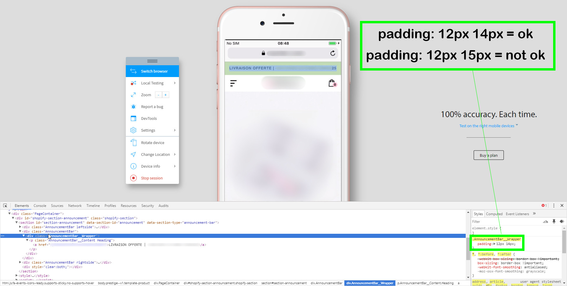
For me the other solution didn't work. Oddly enough, the only solution I found was to increase the width of my paragraph container by 2 pixels (by diminihsing the left and right padding by 1 pixel).
Here is what I tried to achieve: I wanted my paragraph to fit the width of the screen (375px), so that it does not skip a line, and so that it does not leave blank space around the text.
I tried all combination with font-size from 1.12em to 1.20em, it would either:
- leave important free space around the text
- skip one line
...but never the perfect result I expected, not even near decent. But when I reduced the padding left and padding right by 1 pixel, the problem would disappear.
I used -webkit-text-size-adjust: 100%; and other solutions but what worked for me was the above explanation. You can see on the image bellow (text is blurred but you get the idea) that now all space is used and working as intended. So, if you are desperate, give this solution a try even though that's not an ideal fix.
Max
- 169
- 2
- 11