176

I am facing difficulties to make it responsive according to various screen sizes. How to make it responsive?

@override
       Widget build(BuildContext context) {
       return new Container(
       decoration: new BoxDecoration(color: Colors.white),
       child: new Stack(
        children: [
          new Padding(
            padding: const EdgeInsets.only(bottom: 350.0),
            child: new GradientAppBar(" "),
          ),
          new Positioned(
            bottom: 150.0,
            height: 260.0,
            left: 10.0,
            right: 10.0,
            child: new Padding(
              padding: new EdgeInsets.all(10.0),
              child: new Card(
                child: new Column(
                  mainAxisSize: MainAxisSize.min,
                  children: <Widget>[
                    const ListTile(
                      title: const Text(
                        'LOGIN',
                        textAlign: TextAlign.center,
                        style: const TextStyle(
                          fontSize: 16.50,
                          fontFamily: "Helvetica",
                          fontWeight: FontWeight.bold,
                          color: Colors.black87,
                          letterSpacing: 1.00,
                        ),
                      ),
                    ),
                    new ListTile(
                      leading: const Icon(Icons.person),
                      title: new TextField(
                        controller: _user1,
                        decoration: new InputDecoration(
                            labelText: '     Enter a username'),
                      ),
                    ),
                    new ListTile(
                      leading: const Icon(Icons.person_pin),
                      title: new TextField(
                        controller: _pass1,
                        decoration: new InputDecoration(
                            labelText: '     Enter a password'),
                        obscureText: true,
                      ),
                    ),
                  ],
                ),
              ),
            ),
          ),
          new Positioned(
            bottom: 70.0,
            left: 15.0,
            right: 05.0,
            child: new ButtonTheme.bar(
            // make buttons use the appropriate styles for cards
              child: new ButtonBar(
                children: <Widget>[
                  new FlatButton(
                    padding: new EdgeInsets.only(right: 13.0),
                    child: new Text(
                      'REGISTER HERE',
                      style: new TextStyle(
                          color: Colors.black87,
                          fontFamily: "Helvetica",
                          fontSize: 15.00,
                          fontWeight: FontWeight.bold),
                    ),
                    onPressed: () {
                      Navigator.of(context).pushNamed('/facebook');
                    },
                  ),
                  new FlatButton(
                    padding: new EdgeInsets.only(right: 22.0),
                    child: new Text(
                      'FORGOT PASSWORD?',
                      style: new TextStyle(
                          color: Colors.black87,
                          fontFamily: "Helvetica",
                          fontSize: 15.00,
                          fontWeight: FontWeight.bold),
                    ),
                    onPressed: () {
                      Navigator.of(context).pushNamed('/Forgot');
                    },
                  ),
                ],
              ),
            ),
          ),
          new Positioned(
            bottom: 73.0,
            height: 180.0,
            left: 20.0,
            right: 52.0,
            child: new Padding(
              padding: new EdgeInsets.all(0.00),
              child: new ButtonTheme(
                minWidth: 10.0,
                height: 20.0,
                padding: new EdgeInsets.only(right: 37.0),
                child: new ButtonBar(children: <Widget>[
                  new CupertinoButton(
                      borderRadius:
                          const BorderRadius.all(const Radius.circular(36.0)),
                      padding: new EdgeInsets.only(left: 70.0),
                      color: const Color(0xFF426DB7),
                      child: new Text(
                        "     LOGIN                            ",
                        style: new TextStyle(
                            color: Colors.white,
                            fontSize: 12.50,
                            fontFamily: "Handwriting",
                            fontWeight: FontWeight.w500,
                            letterSpacing: 0.00),
                      ),
                      onPressed: () {})
                ]),
              ),
            ),
          ),
        ],
      ),
    );
  }
}
praveen Dp
  • 2,766
  • 4
  • 22
  • 26
  • 6
    I wrote a simple solution here https://jaycoding.tech/tutorials/guides/how-to-create-a-responsive-app-in-flutte-xmafdg as I don't think `MediaQuery` is sufficient. You might want to check it out. – NduJay Jan 06 '21 at 21:17
  • 3
    Do you know your link is shared by : [Flutter Docs](https://flutter.dev/docs/development/ui/layout/adaptive-responsive#other-resources) – Pratik Butani Mar 24 '21 at 06:26

24 Answers24

129

Using MediaQuery class:

MediaQueryData queryData;
queryData = MediaQuery.of(context);

MediaQuery: Establishes a subtree in which media queries resolve to the given data.

MediaQueryData: Information about a piece of media (e.g., a window).

To get Device Pixel Ratio:

queryData.devicePixelRatio

To get width and height of the device screen:

queryData.size.width
queryData.size.height

To get text scale factor:

queryData.textScaleFactor

Using AspectRatio class:

From doc:

A widget that attempts to size the child to a specific aspect ratio.

The widget first tries the largest width permitted by the layout constraints. The height of the widget is determined by applying the given aspect ratio to the width, expressed as a ratio of width to height.

For example, a 16:9 width:height aspect ratio would have a value of 16.0/9.0. If the maximum width is infinite, the initial width is determined by applying the aspect ratio to the maximum height.

Now consider a second example, this time with an aspect ratio of 2.0 and layout constraints that require the width to be between 0.0 and 100.0 and the height to be between 0.0 and 100.0. We'll select a width of 100.0 (the biggest allowed) and a height of 50.0 (to match the aspect ratio).

//example
new Center(
 child: new AspectRatio(
  aspectRatio: 100 / 100,
  child: new Container(
    decoration: new BoxDecoration(
      shape: BoxShape.rectangle,
      color: Colors.orange,
      )
    ),
  ),
),

Also you can use:

Baker
  • 24,730
  • 11
  • 100
  • 106
Blasanka
  • 21,001
  • 12
  • 102
  • 104
55

This class will help and then initialize the class with the init method.

import 'package:flutter/widgets.dart';

class SizeConfig {
  static MediaQueryData _mediaQueryData;
  static double screenWidth;
  static double screenHeight;
  static double blockSizeHorizontal;
  static double blockSizeVertical;
  static double _safeAreaHorizontal;
  static double _safeAreaVertical;
  static double safeBlockHorizontal;
  static double safeBlockVertical;

  void init(BuildContext context){
    _mediaQueryData = MediaQuery.of(context);
    screenWidth = _mediaQueryData.size.width;
    screenHeight = _mediaQueryData.size.height;
    blockSizeHorizontal = screenWidth/100;
    blockSizeVertical = screenHeight/100;
    _safeAreaHorizontal = _mediaQueryData.padding.left +
        _mediaQueryData.padding.right;
    _safeAreaVertical = _mediaQueryData.padding.top +
        _mediaQueryData.padding.bottom;
    safeBlockHorizontal = (screenWidth - _safeAreaHorizontal)/100;
    safeBlockVertical = (screenHeight - _safeAreaVertical)/100;
  }
}

then in your widgets dimension do this

Widget build(BuildContext context) {
    SizeConfig().init(context);
    return Container(
    height: SizeConfig.safeBlockVertical * 10, //10 for example
    width: SizeConfig.safeBlockHorizontal * 10, //10 for example
    );}

All the credits to this post author: https://medium.com/flutter-community/flutter-effectively-scale-ui-according-to-different-screen-sizes-2cb7c115ea0a

43

Easiest way to make responsive UI for different screen size is Sizer plugin. Sizer Screenshot

Make responsive UI in any screen size device also tablet. Check it this plugin ⬇️
https://pub.dev/packages/sizer

.h  - for widget height
.w  - for widget width
.sp - for font size

Use .h, .w, .sp after value like this ⬇️

Example:

Container(
  height: 10.0.h,  //10% of screen height
  width: 80.0.w,   //80% of screen width
  child: Text('Sizer', style: TextStyle(fontSize: 12.0.sp)),
);

I have build many responsive App with this plugin.

urmish patel
  • 651
  • 8
  • 4
24

What i do is to take screen width and height and calculate a grid of 100*100 out of it to position and scale things and save it as static variables that can be reused. Works quite good in most cases. Like this:

AppConfig.width = MediaQuery.of(context).size.width;
AppConfig.height = MediaQuery.of(context).size.height;
AppConfig.blockSize = AppConfig.width / 100;
AppConfig.blockSizeVertical = AppConfig.height / 100;

Then i scale everything according to these values, like this:

double elementWidth = AppConfig.blockSize * 10.0;   // 10% of the screen width

or

double fontSize = AppConfig.blockSize * 1.2;

Sometimes the safe area (notch, etc) kills a layout, so you can consider this, too:

AppConfig.safeAreaHorizontal = MediaQuery.of(context).padding.left +
    MediaQuery.of(context).padding.right;

double screenWidthWithoutSafeArea = AppConfig.width - AppConfig.safeAreaHorizontal;

This worked great on some recent projects.

dy_
  • 2,433
  • 24
  • 27
  • 1
    How to calculate fontSizes ? Is it good to calculate based on width or height? – Harsh Bhavsar Apr 16 '19 at 12:59
  • I am calculating them based on width. But to be honest, i didn't try it with apps that support both, landscape and portrait mode. But you might still be able to calculate it different on both orientations. – dy_ Apr 23 '19 at 18:25
  • 1
    How does this solve the problem of screen density differences exactly? By saying you divide the screen into 100 * 100 grid blocks you make it sound like the resultant blocks are all equally sized (i.e. squares), but they are not. If you have a device that has twice the number of pixels vertically (screen height) than horizontally (screen width) your resultant blocks will be rectangles instead of squares - which means your code still produces the same problem you started out trying to solve. Test your code on multiple screen densities to prove this. So this isn't really a solution to me. – SilSur Aug 13 '19 at 10:24
  • @SilSur, sure the blocks are not the same size on any device and density, but thats what makes it work (in most cases). i just have to decide for each widget i add to the screen if i want it's position and size to be calculated regarding a block's width or height - or both. i've used this method in apps that run on any iphone, ipad or android phone/tablet without device-specific corrections. landscape and portrait. but you are right that this method is still not perfectly solving complex UI problems. i am still looking for something better to handle this. – dy_ Aug 14 '19 at 12:54
  • 1
    @HarshBhavsar I think you can calculate font size via the screen width and even for everything you can use the screen width to calculate the size but make sure to check orientation too because in landscape mode screen width will be screen height and vise versa there is a package already to achieve responsiveness [Flutter Screen Utils](https://pub.dev/packages/flutter_screenutil) you can check it. – Shoaib Khan Mar 15 '21 at 12:05
19

Check MediaQuery class

For example, to learn the size of the current media (e.g., the window containing your app), you can read the MediaQueryData.size property from the MediaQueryData returned by MediaQuery.of: MediaQuery.of(context).size.

So you can do the following:

 new Container(
                      height: MediaQuery.of(context).size.height/2,
..            )
Shady Aziza
  • 50,824
  • 20
  • 115
  • 113
12

You can take a percentage of the width or height as input for scale size.

fontSize: MediaQuery.of(_ctxt).size.height * 0.065

Where the multiplier at the end has a value that makes the Text look good for the active emulator.

Below is how I set it up so all the scaled dimensions are centralized in one place. This way you can adjust them easily and quickly rerun with Hot Reload without having to look for the Media.of() calls throughout the code.

  1. Create the file to store all the mappings appScale.dart

    class AppScale {
      BuildContext _ctxt;
    
      AppScale(this._ctxt);
    
      double get labelDim => scaledWidth(.04);
      double get popupMenuButton => scaledHeight(.065); 

      double scaledWidth(double widthScale) {
        return MediaQuery.of(_ctxt).size.width * widthScale;
      }
    
      double scaledHeight(double heightScale) {
        return MediaQuery.of(_ctxt).size.height * heightScale;
      }
    }

  1. Then reference that where ever you need the scaled value

    AppScale _scale = AppScale(context);

    // ... 

    Widget label1 = Text(
      "Some Label",
      style: TextStyle(fontSize: _scale.labelDim),
    );

Thanks to answers in this post

Gene Bo
  • 11,284
  • 8
  • 90
  • 137
10

After much research and testing, I have developed a solution for an app I'm currently converting from Android/iOS to Flutter.

With Android and iOS I used a 'Scaling Factor' applied to base font sizes, rendering text sizes that were relative to the screen size.

This article was very helpful: https://medium.com/flutter-community/flutter-effectively-scale-ui-according-to-different-screen-sizes-2cb7c115ea0a

I created a StatelessWidget to get the font sizes of the Material Design typographical styles. Getting device dimensions using MediaQuery, calculating a scaling factor, then resetting the Material Design text sizes. The Widget can be used to define a custom Material Design Theme.
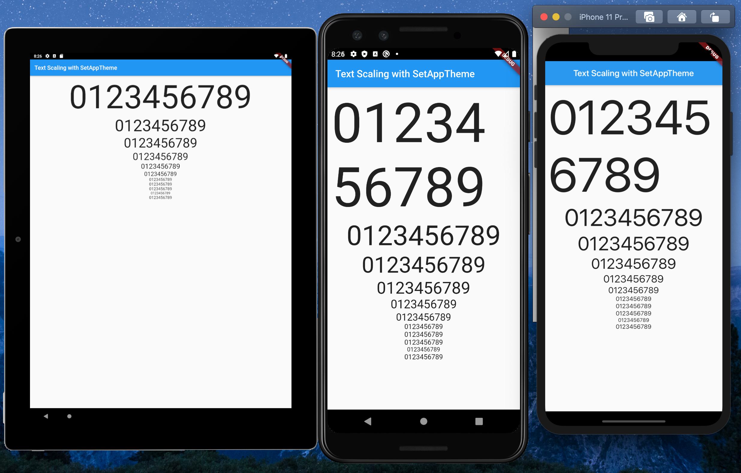
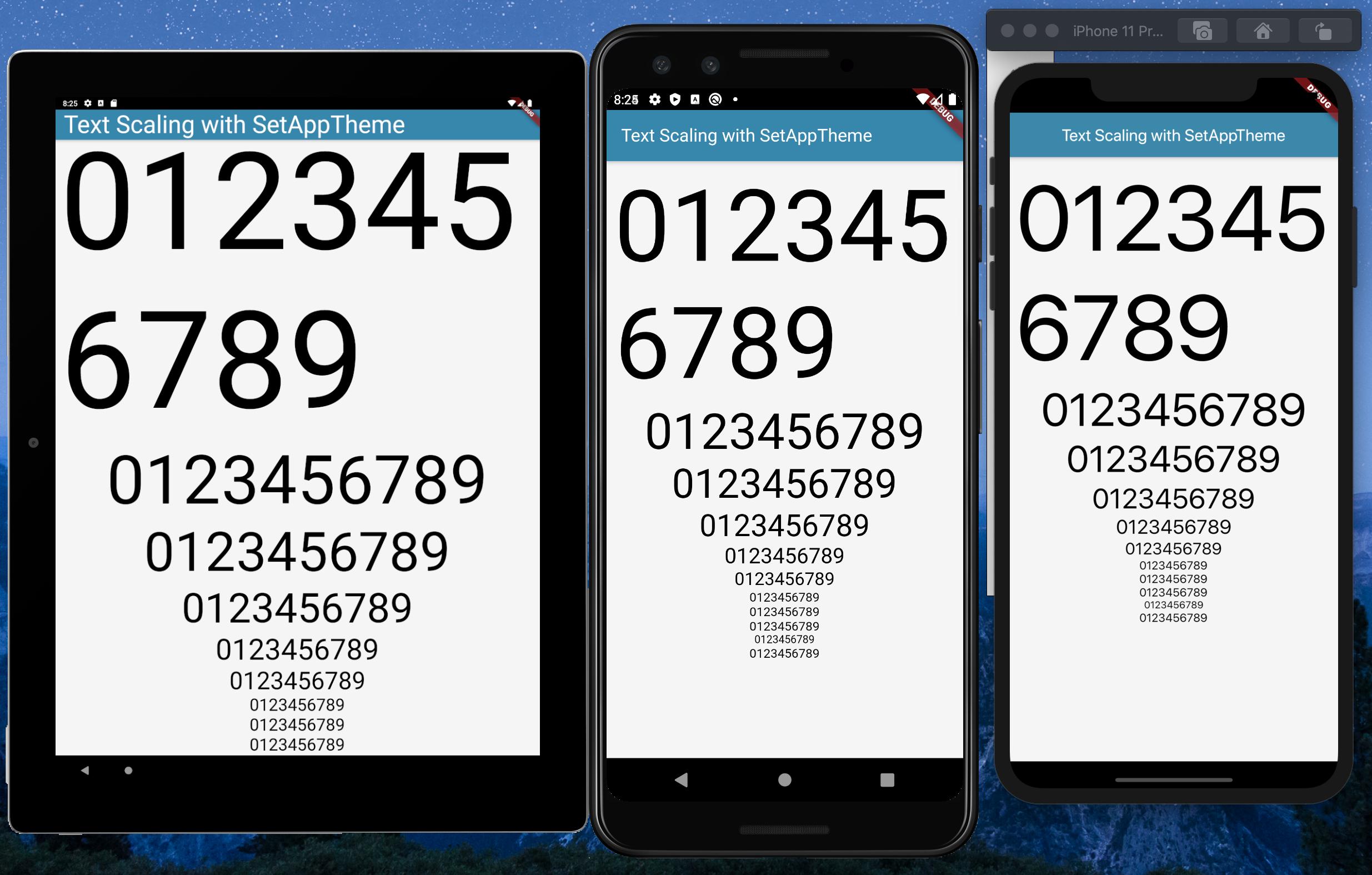
Emulators used:

  • Pixel C - 9.94" Tablet
  • Pixel 3 - 5.46" Phone
  • iPhone 11 Pro Max - 5.8" Phone

With standard font sizes

With scaled font sizes

set_app_theme.dart (SetAppTheme Widget)

import 'package:flutter/material.dart';
import 'dart:math';

class SetAppTheme extends StatelessWidget {

  final Widget child;

  SetAppTheme({this.child});

  @override
  Widget build(BuildContext context) {

    final _divisor = 400.0;

    final MediaQueryData _mediaQueryData = MediaQuery.of(context);

    final _screenWidth = _mediaQueryData.size.width;
    final _factorHorizontal = _screenWidth / _divisor;

    final _screenHeight = _mediaQueryData.size.height;
    final _factorVertical = _screenHeight / _divisor;

    final _textScalingFactor = min(_factorVertical, _factorHorizontal);

    final _safeAreaHorizontal = _mediaQueryData.padding.left + _mediaQueryData.padding.right;
    final _safeFactorHorizontal = (_screenWidth - _safeAreaHorizontal) / _divisor;

    final _safeAreaVertical = _mediaQueryData.padding.top + _mediaQueryData.padding.bottom;
    final _safeFactorVertical = (_screenHeight - _safeAreaVertical) / _divisor;

    final _safeAreaTextScalingFactor = min(_safeFactorHorizontal, _safeFactorHorizontal);

    print('Screen Scaling Values:' + '_screenWidth: $_screenWidth');
    print('Screen Scaling Values:' + '_factorHorizontal: $_factorHorizontal ');

    print('Screen Scaling Values:' + '_screenHeight: $_screenHeight');
    print('Screen Scaling Values:' + '_factorVertical: $_factorVertical ');

    print('_textScalingFactor: $_textScalingFactor ');

    print('Screen Scaling Values:' + '_safeAreaHorizontal: $_safeAreaHorizontal ');
    print('Screen Scaling Values:' + '_safeFactorHorizontal: $_safeFactorHorizontal ');

    print('Screen Scaling Values:' + '_safeAreaVertical: $_safeAreaVertical ');
    print('Screen Scaling Values:' + '_safeFactorVertical: $_safeFactorVertical ');

    print('_safeAreaTextScalingFactor: $_safeAreaTextScalingFactor ');

    print('Default Material Design Text Themes');
    print('display4: ${Theme.of(context).textTheme.display4}');
    print('display3: ${Theme.of(context).textTheme.display3}');
    print('display2: ${Theme.of(context).textTheme.display2}');
    print('display1: ${Theme.of(context).textTheme.display1}');
    print('headline: ${Theme.of(context).textTheme.headline}');
    print('title: ${Theme.of(context).textTheme.title}');
    print('subtitle: ${Theme.of(context).textTheme.subtitle}');
    print('body2: ${Theme.of(context).textTheme.body2}');
    print('body1: ${Theme.of(context).textTheme.body1}');
    print('caption: ${Theme.of(context).textTheme.caption}');
    print('button: ${Theme.of(context).textTheme.button}');

    TextScalingFactors _textScalingFactors = TextScalingFactors(
        display4ScaledSize: (Theme.of(context).textTheme.display4.fontSize * _safeAreaTextScalingFactor),
        display3ScaledSize: (Theme.of(context).textTheme.display3.fontSize * _safeAreaTextScalingFactor),
        display2ScaledSize: (Theme.of(context).textTheme.display2.fontSize * _safeAreaTextScalingFactor),
        display1ScaledSize: (Theme.of(context).textTheme.display1.fontSize * _safeAreaTextScalingFactor),
        headlineScaledSize: (Theme.of(context).textTheme.headline.fontSize * _safeAreaTextScalingFactor),
        titleScaledSize: (Theme.of(context).textTheme.title.fontSize * _safeAreaTextScalingFactor),
        subtitleScaledSize: (Theme.of(context).textTheme.subtitle.fontSize * _safeAreaTextScalingFactor),
        body2ScaledSize: (Theme.of(context).textTheme.body2.fontSize * _safeAreaTextScalingFactor),
        body1ScaledSize: (Theme.of(context).textTheme.body1.fontSize * _safeAreaTextScalingFactor),
        captionScaledSize: (Theme.of(context).textTheme.caption.fontSize * _safeAreaTextScalingFactor),
        buttonScaledSize: (Theme.of(context).textTheme.button.fontSize * _safeAreaTextScalingFactor));

    return Theme(
      child: child,
      data: _buildAppTheme(_textScalingFactors),
    );
  }
}

final ThemeData customTheme = ThemeData(
  primarySwatch: appColorSwatch,
  // fontFamily: x,
);

final MaterialColor appColorSwatch = MaterialColor(0xFF3787AD, appSwatchColors);

Map<int, Color> appSwatchColors =
{
  50  : Color(0xFFE3F5F8),
  100 : Color(0xFFB8E4ED),
  200 : Color(0xFF8DD3E3),
  300 : Color(0xFF6BC1D8),
  400 : Color(0xFF56B4D2),
  500 : Color(0xFF48A8CD),
  600 : Color(0xFF419ABF),
  700 : Color(0xFF3787AD),
  800 : Color(0xFF337799),
  900 : Color(0xFF285877),
};

_buildAppTheme (TextScalingFactors textScalingFactors) {

  return customTheme.copyWith(

    accentColor: appColorSwatch[300],
    buttonTheme: customTheme.buttonTheme.copyWith(buttonColor: Colors.grey[500],),
    cardColor: Colors.white,
    errorColor: Colors.red,
    inputDecorationTheme: InputDecorationTheme(border: OutlineInputBorder(),),
    primaryColor: appColorSwatch[700],
    primaryIconTheme: customTheme.iconTheme.copyWith(color: appColorSwatch),
    scaffoldBackgroundColor: Colors.grey[100],
    textSelectionColor: appColorSwatch[300],
    textTheme: _buildAppTextTheme(customTheme.textTheme, textScalingFactors),
    appBarTheme: customTheme.appBarTheme.copyWith(
        textTheme: _buildAppTextTheme(customTheme.textTheme, textScalingFactors)),

//    accentColorBrightness: ,
//    accentIconTheme: ,
//    accentTextTheme: ,
//    appBarTheme: ,
//    applyElevationOverlayColor: ,
//    backgroundColor: ,
//    bannerTheme: ,
//    bottomAppBarColor: ,
//    bottomAppBarTheme: ,
//    bottomSheetTheme: ,
//    brightness: ,
//    buttonBarTheme: ,
//    buttonColor: ,
//    canvasColor: ,
//    cardTheme: ,
//    chipTheme: ,
//    colorScheme: ,
//    cupertinoOverrideTheme: ,
//    cursorColor: ,
//    dialogBackgroundColor: ,
//    dialogTheme: ,
//    disabledColor: ,
//    dividerColor: ,
//    dividerTheme: ,
//    floatingActionButtonTheme: ,
//    focusColor: ,
//    highlightColor: ,
//    hintColor: ,
//    hoverColor: ,
//    iconTheme: ,
//    indicatorColor: ,
//    materialTapTargetSize: ,
//    pageTransitionsTheme: ,
//    platform: ,
//    popupMenuTheme: ,
//    primaryColorBrightness: ,
//    primaryColorDark: ,
//    primaryColorLight: ,
//    primaryTextTheme: ,
//    secondaryHeaderColor: ,
//    selectedRowColor: ,
//    sliderTheme: ,
//    snackBarTheme: ,
//    splashColor: ,
//    splashFactory: ,
//    tabBarTheme: ,
//    textSelectionHandleColor: ,
//    toggleableActiveColor: ,
//    toggleButtonsTheme: ,
//    tooltipTheme: ,
//    typography: ,
//    unselectedWidgetColor: ,
  );
}

class TextScalingFactors {

  final double display4ScaledSize;
  final double display3ScaledSize;
  final double display2ScaledSize;
  final double display1ScaledSize;
  final double headlineScaledSize;
  final double titleScaledSize;
  final double subtitleScaledSize;
  final double body2ScaledSize;
  final double body1ScaledSize;
  final double captionScaledSize;
  final double buttonScaledSize;

  TextScalingFactors({

    @required this.display4ScaledSize,
    @required this.display3ScaledSize,
    @required this.display2ScaledSize,
    @required this.display1ScaledSize,
    @required this.headlineScaledSize,
    @required this.titleScaledSize,
    @required this.subtitleScaledSize,
    @required this.body2ScaledSize,
    @required this.body1ScaledSize,
    @required this.captionScaledSize,
    @required this.buttonScaledSize
  });
}

TextTheme _buildAppTextTheme(

    TextTheme _customTextTheme,
    TextScalingFactors _scaledText) {

  return _customTextTheme.copyWith(

    display4: _customTextTheme.display4.copyWith(fontSize: _scaledText.display4ScaledSize),
    display3: _customTextTheme.display3.copyWith(fontSize: _scaledText.display3ScaledSize),
    display2: _customTextTheme.display2.copyWith(fontSize: _scaledText.display2ScaledSize),
    display1: _customTextTheme.display1.copyWith(fontSize: _scaledText.display1ScaledSize),
    headline: _customTextTheme.headline.copyWith(fontSize: _scaledText.headlineScaledSize),
    title: _customTextTheme.title.copyWith(fontSize: _scaledText.titleScaledSize),
    subtitle: _customTextTheme.subtitle.copyWith(fontSize: _scaledText.subtitleScaledSize),
    body2: _customTextTheme.body2.copyWith(fontSize: _scaledText.body2ScaledSize),
    body1: _customTextTheme.body1.copyWith(fontSize: _scaledText.body1ScaledSize),
    caption: _customTextTheme.caption.copyWith(fontSize: _scaledText.captionScaledSize),
    button: _customTextTheme.button.copyWith(fontSize: _scaledText.buttonScaledSize),

  ).apply(bodyColor: Colors.black);
}

main.dart (Demo App)

import 'package:flutter/material.dart';
import 'package:scaling/set_app_theme.dart';


void main() => runApp(MyApp());


class MyApp extends StatelessWidget {

  @override
  Widget build(BuildContext context) {

    return MaterialApp(
      home: SetAppTheme(child: HomePage()),
    );
  }
}


class HomePage extends StatelessWidget {

  final demoText = '0123456789';

  @override
  Widget build(BuildContext context) {

    return SafeArea(
      child: Scaffold(
        appBar: AppBar(
          title: Text('Text Scaling with SetAppTheme',
            style: TextStyle(color: Colors.white),),
        ),
        body: SingleChildScrollView(
          child: Center(
            child: Padding(
              padding: const EdgeInsets.all(8.0),
              child: Column(
                children: <Widget>[
                  Text(
                    demoText,
                    style: TextStyle(
                      fontSize: Theme.of(context).textTheme.display4.fontSize,
                    ),
                  ),
                  Text(
                    demoText,
                    style: TextStyle(
                      fontSize: Theme.of(context).textTheme.display3.fontSize,
                    ),
                  ),
                  Text(
                    demoText,
                    style: TextStyle(
                      fontSize: Theme.of(context).textTheme.display2.fontSize,
                    ),
                  ),
                  Text(
                    demoText,
                    style: TextStyle(
                      fontSize: Theme.of(context).textTheme.display1.fontSize,
                    ),
                  ),
                  Text(
                    demoText,
                    style: TextStyle(
                      fontSize: Theme.of(context).textTheme.headline.fontSize,
                    ),
                  ),
                  Text(
                    demoText,
                    style: TextStyle(
                      fontSize: Theme.of(context).textTheme.title.fontSize,
                    ),
                  ),
                  Text(
                    demoText,
                    style: TextStyle(
                      fontSize: Theme.of(context).textTheme.subtitle.fontSize,
                    ),
                  ),
                  Text(
                    demoText,
                    style: TextStyle(
                      fontSize: Theme.of(context).textTheme.body2.fontSize,
                    ),
                  ),
                  Text(
                    demoText,
                    style: TextStyle(
                      fontSize: Theme.of(context).textTheme.body1.fontSize,
                    ),
                  ),
                  Text(
                    demoText,
                    style: TextStyle(
                      fontSize: Theme.of(context).textTheme.caption.fontSize,
                    ),
                  ),
                  Text(
                    demoText,
                    style: TextStyle(
                      fontSize: Theme.of(context).textTheme.button.fontSize,
                    ),
                  ),
                ],
              ),
            ),
          ),
        ),
      ),
    );
  }
}
AndyW58
  • 345
  • 2
  • 6
6

Place dependency in pubspec.yaml

flutter_responsive_screen: ^1.0.0

Example:

Function hp = Screen(MediaQuery.of(context).size).hp;
Function wp = Screen(MediaQuery.of(context).size).wp;

Example :
return Container(height: hp(27),weight: wp(27));
Pratik Butani
  • 60,504
  • 58
  • 273
  • 437
Vithani Ravi
  • 104
  • 1
  • 5
  • 9
    Perhaps an explanation of what goes on under the hood would be great the next time you post a "solution"? Anyway, I checked out the GitHub for this dependency. It's basically a single class (with 16 lines of code) that takes input width & height values and scales it based on the screen width & height as a percentage. It's essentially the same as @datayeah 's solution - only difference is that this one is neatly packaged. Same problems as datayeah apply here - not a good solution at all for 1:1 scaling on varied screen density devices. Screen density problem is NOT SOLVED with this "solution". – SilSur Aug 15 '19 at 08:57
6

I've been knocking other people's (@datayeah & Vithani Ravi) solutions a bit hard here, so I thought I'd share my own attempt[s] at solving this variable screen density scaling problem or shut up. So I approach this problem from a solid/fixed foundation: I base all my scaling off a fixed (immutable) ratio of 2:1 (height:width). I have a helper class "McGyver" that does all the heavy lifting (and useful code finessing) across my app. This "McGyver" class contains only static methods and static constant class members.

RATIO SCALING METHOD: I scale both width & height independently based on the 2:1 Aspect Ratio. I take width & height input values and divide each by the width & height constants and finally compute an adjustment factor by which to scale the respective width & height input values. The actual code looks as follows:

import 'dart:math';
import 'package:flutter/material.dart';

class McGyver {

  static const double _fixedWidth = 410;    // Set to an Aspect Ratio of 2:1 (height:width)
  static const double _fixedHeight = 820;   // Set to an Aspect Ratio of 2:1 (height:width) 

  // Useful rounding method (@andyw solution -> https://stackoverflow.com/questions/28419255/how-do-you-round-a-double-in-dart-to-a-given-degree-of-precision-after-the-decim/53500405#53500405)
  static double roundToDecimals(double val, int decimalPlaces){
    double mod = pow(10.0, decimalPlaces);
    return ((val * mod).round().toDouble() / mod);
  }

  // The 'Ratio-Scaled' Widget method (takes any generic widget and returns a "Ratio-Scaled Widget" - "rsWidget")
  static Widget rsWidget(BuildContext ctx, Widget inWidget, double percWidth, double percHeight) {

    // ---------------------------------------------------------------------------------------------- //
    // INFO: Ratio-Scaled "SizedBox" Widget - Scaling based on device's height & width at 2:1 ratio.  //
    // ---------------------------------------------------------------------------------------------- //

    final int _decPlaces = 5;
    final double _fixedWidth = McGyver._fixedWidth;
    final double _fixedHeight = McGyver._fixedHeight;

    Size _scrnSize = MediaQuery.of(ctx).size;                // Extracts Device Screen Parameters.
    double _scrnWidth = _scrnSize.width.floorToDouble();     // Extracts Device Screen maximum width.
    double _scrnHeight = _scrnSize.height.floorToDouble();   // Extracts Device Screen maximum height.

    double _rsWidth = 0;
    if (_scrnWidth == _fixedWidth) {   // If input width matches fixedWidth then do normal scaling.
      _rsWidth = McGyver.roundToDecimals((_scrnWidth * (percWidth / 100)), _decPlaces);
    } else {   // If input width !match fixedWidth then do adjustment factor scaling.
      double _scaleRatioWidth = McGyver.roundToDecimals((_scrnWidth / _fixedWidth), _decPlaces);
      double _scalerWidth = ((percWidth + log(percWidth + 1)) * pow(1, _scaleRatioWidth)) / 100;
      _rsWidth = McGyver.roundToDecimals((_scrnWidth * _scalerWidth), _decPlaces);
    }

    double _rsHeight = 0;
    if (_scrnHeight == _fixedHeight) {   // If input height matches fixedHeight then do normal scaling.
      _rsHeight = McGyver.roundToDecimals((_scrnHeight * (percHeight / 100)), _decPlaces);
    } else {   // If input height !match fixedHeight then do adjustment factor scaling.
      double _scaleRatioHeight = McGyver.roundToDecimals((_scrnHeight / _fixedHeight), _decPlaces);
      double _scalerHeight = ((percHeight + log(percHeight + 1)) * pow(1, _scaleRatioHeight)) / 100;
      _rsHeight = McGyver.roundToDecimals((_scrnHeight * _scalerHeight), _decPlaces);
    }

    // Finally, hand over Ratio-Scaled "SizedBox" widget to method call.
    return SizedBox(
      width: _rsWidth,
      height: _rsHeight,
      child: inWidget,
    );
  }

}

... ... ...

Then you would individually scale your widgets (which for my perfectionist disease is ALL of my UI) with a simple static call to the "rsWidget()" method as follows:

  // Step 1: Define your widget however you like (this widget will be supplied as the "inWidget" arg to the "rsWidget" method in Step 2)...
  Widget _btnLogin = RaisedButton(color: Colors.blue, elevation: 9.0, 
                                  shape: RoundedRectangleBorder(borderRadius: BorderRadius.circular(McGyver.rsDouble(context, ScaleType.width, 2.5))),
                                  child: McGyver.rsText(context, "LOGIN", percFontSize: EzdFonts.button2_5, textColor: Colors.white, fWeight: FontWeight.bold),
                                  onPressed: () { _onTapBtnLogin(_tecUsrId.text, _tecUsrPass.text); }, );

  // Step 2: Scale your widget by calling the static "rsWidget" method...
  McGyver.rsWidget(context, _btnLogin, 34.5, 10.0)   // ...and Bob's your uncle!!

The cool thing is that the "rsWidget()" method returns a widget!! So you can either assign the scaled widget to another variable like _rsBtnLogin for use all over the place - or you could simply use the full McGyver.rsWidget() method call in-place inside your build() method (exactly how you need it to be positioned in the widget tree) and it will work perfectly as it should.

For those more astute coders: you will have noticed that I used two additional ratio-scaled methods McGyver.rsText() and McGyver.rsDouble() (not defined in the code above) in my RaisedButton() - so I basically go crazy with this scaling stuff...because I demand my apps to be absolutely pixel perfect at any scale or screen density!! I ratio-scale my ints, doubles, padding, text (everything that requires UI consistency across devices). I scale my texts based on width only, but specify which axis to use for all other scaling (as was done with the ScaleType.width enum used for the McGyver.rsDouble() call in the code example above).

I know this is crazy - and is a lot of work to do on the main thread - but I am hoping somebody will see my attempt here and help me find a better (more light-weight) solution to my screen density 1:1 scaling nightmares.

Dharman
  • 30,962
  • 25
  • 85
  • 135
SilSur
  • 495
  • 1
  • 6
  • 21
  • 1
    @Abbas.M - Yes, I have made a small change to the ratio-scaling code line [see updated code] and I believe this the closest I can come to a real 1:1 ratio scaling solution - I have tried quite a number of options to get this one. There are still a few weird [edge-case] scaling issues with this updated code but the UI similarity on multiple density screens is really convincing - very subtle difference observable between screens with the updated code. Please let me know what you think - feedback is highly appreciated. – SilSur Aug 23 '19 at 18:05
  • the obvious thing about the main thread, move the init and the calls to the app init main block as the screen size will not change after app init so you only have the main thread hit once at app init rather than ie each widget render – Fred Grott Feb 03 '20 at 12:01
  • @SilSur, your solution looks very great. Do you mind to share the whole McGyver class? – David Mar 08 '20 at 14:22
  • @David - The McGyver class is a very heavy class (and project specific). The one I used in this example has many functions that are not relevant to the UI scaling problem. So it's overkill / inefficient for me to upload the entire class. I did, however, improve on the class a bit and have posted a different version of the code to [another SO question](https://stackoverflow.com/questions/57819884/best-practice-for-effectively-scale-this-ui-according-to-different-screen-sizes). Perhaps you can update your scaling code along the lines of the improved code at the URL provided. – SilSur Apr 24 '20 at 11:39
5

An Another approach :) easier for flutter web

class SampleView extends StatelessWidget {
@override
Widget build(BuildContext context) {
 return Center(
  child: Container(
    width: 200,
    height: 200,
    color: Responsive().getResponsiveValue(
        forLargeScreen: Colors.red,
        forTabletScreen : Colors.pink,
        forMediumScreen: Colors.green,
        forShortScreen: Colors.yellow,
        forMobLandScapeMode: Colors.blue,
        context: context),
    // You dodn't need to provide the values for every 
    //parameter(except shortScreen & context)
    // but default its provide the value as ShortScreen for Larger and 
    //mediumScreen
    ),
   );
 }
}

utility :

import 'package:flutter/widgets.dart';

class Responsive {
  // function reponsible for providing value according to screensize
  getResponsiveValue(
      {dynamic forShortScreen,
        dynamic forMediumScreen,
        dynamic forLargeScreen,
        dynamic forMobLandScapeMode,
        dynamic forTabletScreen,
        BuildContext context}) {

    if (isLargeScreen(context)) {

      return forLargeScreen ?? forShortScreen;
    } else if (isMediumScreen(context)) {

      return forMediumScreen ?? forShortScreen;
    }
    else if (isTabletScreen(context)) {

      return forTabletScreen ??  forMediumScreen ?? forShortScreen;

    }
    else if (isSmallScreen(context) && isLandScapeMode(context)) {

      return forMobLandScapeMode ?? forShortScreen;

    } else {
      return forShortScreen;
    }
  }

  isLandScapeMode(BuildContext context) {
    if (MediaQuery.of(context).orientation == Orientation.landscape) {
      return true;
    } else {
      return false;
    }
  }

  static bool isLargeScreen(BuildContext context) {
    return getWidth(context) > 1200;
  }

  static bool isSmallScreen(BuildContext context) {
    return getWidth(context) < 800;
  }


  static bool isMediumScreen(BuildContext context) {
    return getWidth(context) > 800 && getWidth(context) < 1200;
  }
  static bool isTabletScreen(BuildContext context) {
    return getWidth(context) > 450 && getWidth(context) < 800;
  }

  static double getWidth(BuildContext context) {
    return MediaQuery.of(context).size.width;
  }

}

Paras Arora
  • 605
  • 6
  • 12
3

My approach to the problem is similar to the way datayeah did it. I had a lot of hardcoded width and height values and the app looked fine on a specific device. So I got the screen height of the device and just created a factor to scale the hardcoded values.

double heightFactor = MediaQuery.of(context).size.height/708

where 708 is the height of the specific device.

Paul Roub
  • 36,322
  • 27
  • 84
  • 93
3

Used ResponsiveBuilder or ScreenTypeLayout

import 'package:flutter/material.dart';
import 'package:flutter/widgets.dart';
import 'package:responsive_builder/responsive_builder.dart';

class Sample extends StatelessWidget {
  @override
  Widget build(BuildContext context) {
    return Scaffold(
      appBar: AppBar(
        elevation: 0,
        backgroundColor: Colors.black,
      ),
      body: ResponsiveBuilder(
        builder: (context, info) {
          var screenType = info.deviceScreenType;
          String _text;
          switch (screenType){
            case DeviceScreenType.desktop: {
              _text = 'Desktop';
              break;
            }
            case DeviceScreenType.tablet: {
              _text = 'Tablet';
              break;
            }
            case DeviceScreenType.mobile: {
              _text = 'Mobile';
              break;
            }
            case DeviceScreenType.watch: {
              _text = 'Watch';
              break;
            }
            default:
              return null;
          }
          return Center(child: Text(_text, style: TextStyle(fontSize: 32, color: Colors.black),));
        },
      ),
    );
  }
}

// screen type layout
ScreenTypeLayout.builder(
  mobile: MobilePage(),
  tablet: TabletPage(),
  desktop: DesktopPage(),
  watch: Watchpage(),
);
Htue Ko
  • 119
  • 2
  • 7
3
double height, width;
height = MediaQuery.of(context)

Container(
  height: height * 0.3,
  width: width * 0.2,
  child: PriorityWidget(
    priorityLevel: "High",
    conBackColor: ColorConstants.kMediumRedColor,
    textColor: ColorConstants.kWhiteColor,
    borderColor: selectedPriority == Constants.HIGH_PRIORITY ?
      ColorConstants.kWhiteColor : ColorConstants.kMediumRedColor,
  ),
), 

The Container will take 3% height of a Total Screen Height and 2% width of a Screen width

Community
  • 1
  • 1
Kalpesh Khandla
  • 758
  • 1
  • 9
  • 22
2

check out this page from flutter wiki :

Creating Responsive Apps

Use the LayoutBuilder class: From its builder property, you get a BoxConstraints. Examine the constraint's properties to decide what to display. For example, if your maxWidth is greater than your width breakpoint, return a Scaffold object with a row that has a list on the left. If it's narrower, return a Scaffold object with a drawer containing that list. You can also adjust your display based on the device's height, the aspect ratio, or some other property. When the constraints change (e.g. the user rotates the phone, or puts your app into a tile UI in Nougat), the build function will rerun.

Bhargav Rao
  • 50,140
  • 28
  • 121
  • 140
Raouf Rahiche
  • 28,948
  • 10
  • 85
  • 77
2

create file name (app_config.dart) in folder name(responsive_screen) in lib folder:

import 'package:flutter/material.dart';

class AppConfig {
  BuildContext _context;
  double _height;
  double _width;
  double _heightPadding;
  double _widthPadding;

  AppConfig(this._context) {
    MediaQueryData _queryData = MediaQuery.of(_context);
    _height = _queryData.size.height / 100.0;
    _width = _queryData.size.width / 100.0;
    _heightPadding =
    _height - ((_queryData.padding.top + _queryData.padding.bottom) / 100.0);
    _widthPadding =
      _width - (_queryData.padding.left + _queryData.padding.right) / 100.0;
  }

  double rH(double v) {
   return _height * v;
  }

  double rW(double v) {
    return _width * v;
  }

  double rHP(double v) {
    return _heightPadding * v;
  }

 double rWP(double v) {
   return _widthPadding * v;
 }
}

then:

import 'responsive_screen/app_config.dart';
 ...
class RandomWordsState extends State<RandomWords> {
  AppConfig _ac;
  ...
  @override
  Widget build(BuildContext context) {
    _ac = AppConfig(context);
    ...
    return Scaffold(
      body: Container(
        height: _ac.rHP(50),
        width: _ac.rWP(50),
        color: Colors.red,
        child: Text('Test'),
      ),
    );
    ...
  }
Mahmoud Salah Eldin
  • 1,739
  • 16
  • 21
2

This issue can be solved using MediaQuery.of(context)

To get Screen width: MediaQuery.of(context).size.width

To get Screen height: MediaQuery.of(context).size.height

For more information about MediaQuery Widget watch, https://www.youtube.com/watch?v=A3WrA4zAaPw

Achintha Isuru
  • 2,662
  • 18
  • 24
2

You can use MediaQuery for parent's dimension or FractionallySizedBox as containers.

Z. Cajurao
  • 357
  • 2
  • 12
2

In flutter 2.0 use this code under Widget build(BuildContext context)

use it where you want in it or see pictures

fun
  • 107
  • 6
1
  padding: EdgeInsets.only(
      left: 4.0,
      right: ResponsiveWidget.isSmallScreen(context) ? 4: 74, //Check for screen type
      top: 10,
      bottom: 40),

This is fine by Google's recommendation but may be not perfect.

Dragonthoughts
  • 2,180
  • 8
  • 25
  • 28
1

For the clarification of @user10768752 answer,

static double screenWidth  gives you some error, so you have to initialize your data like this below


import 'package:flutter/widgets.dart';

class SizeConfig{
  static MediaQueryData _mediaQueryData = MediaQueryData();
  static double screenWidth = 0;
  static double screenHeight = 0;
  static double blockSizeHorizontal = 0;
  static double blockSizeVertical = 0;
  static double _safeAreaHorizontal = 0;
  static double _safeAreaVertical = 0;
  static double safeBlockHorizontal = 0;
  static double safeBlockVertical = 0;

  void init(BuildContext context){
    _mediaQueryData = MediaQuery.of(context);
    screenWidth = _mediaQueryData.size.width;
    screenHeight = _mediaQueryData.size.height;
    blockSizeHorizontal = screenWidth/100;
    blockSizeVertical = screenHeight/100;
    _safeAreaHorizontal = _mediaQueryData.padding.left +
        _mediaQueryData.padding.right;
    _safeAreaVertical = _mediaQueryData.padding.top +
        _mediaQueryData.padding.bottom;
    safeBlockHorizontal = (screenWidth - _safeAreaHorizontal)/100;
    safeBlockVertical = (screenHeight - _safeAreaVertical)/100;
  }
}

And do not forget to initialize this.

@override
  Widget build(BuildContext context){
  SizeConfig().init(context);
  return Sizebox(
    width: SizeConfig.safeBlockVertical * 8,
    height: SizeConfig.safeBlockVertical * 8, <-- change value depends on your usecase
);
}
DL Studio
  • 267
  • 3
  • 7
0

Width: MediaQuery.of(context).size.width,

Height: MediaQuery.of(context).size.height,

Mangaldeep Pannu
  • 3,738
  • 2
  • 26
  • 45
0

Instead of writing Ui for multiple screen sizes you can write Ui only once with the help of this package flutter_next And it has some cool extension for rapid UI Developement and the documentation is also good.

They even have an example which is made with this package\n Link: https://one-page-with-flutter.netlify.app/

Shashiben
  • 222
  • 2
  • 7
0

An Easier Approach for Mobile Responsiveness. Basically, these functions automatically calculate the height and width percentage.

          import 'dart:developer';
          import 'package:flutter/material.dart';
          
          double getMediaQueryHeight(
              {required BuildContext context, required num value}) {
            var size = MediaQuery.of(context).size;
            //TODO  Mention you Adobe Xd, Figma Height
            double xdHeight = 812;
            double percentage = (value / xdHeight * 100).roundToDouble() / 100;
            log("height percentage : ${percentage}");
            return size.height * percentage;
          }
          
          double getMediaQueryWidth({required BuildContext context, required num value}) {
            var size = MediaQuery.of(context).size;
            //TODO Mention you Adobe Xd, Figma width
            double xdWidth = 375;
            double percentage = (value / xdWidth * 100).roundToDouble() / 100;
            log("width percentage : ${percentage}");
            return size.width * percentage;
          }

// USE CASE

                     Container(
                    color: Colors.redAccent,
                    alignment: Alignment.center,
                    height: getMediaQueryHeight(context: context, value: 232),
                    width: getMediaQueryWidth(context: context, value: 345),
                  ),
Paras Arora
  • 605
  • 6
  • 12
0

Approach without context:

USECASE

                  Container(
                    height: Responsive.setHeight(value: 70),
                    width: Responsive.setWidth(value: 150),
                  ),

Initialize after MaterialApp wrap:

    Responsive.size = MediaQuery.of(context).size;

Utility

             import 'package:flutter/material.dart';
            
            class Responsive {
              static late Size size;
            
              //TODO assign your Xd or Figma height and width
              static double xdHeight = 812;
              static double xdWidth = 375;
            
              static double setHeight({required num value}) {
                double percentage = (value / xdHeight * 100).roundToDouble() / 100;
                return size.height * percentage;
              }
            
              static double setWidth({required num value}) {
                double percentage = (value / xdWidth * 100).roundToDouble() / 100;
                return size.width * percentage;
              }
            }
Paras Arora
  • 605
  • 6
  • 12