78

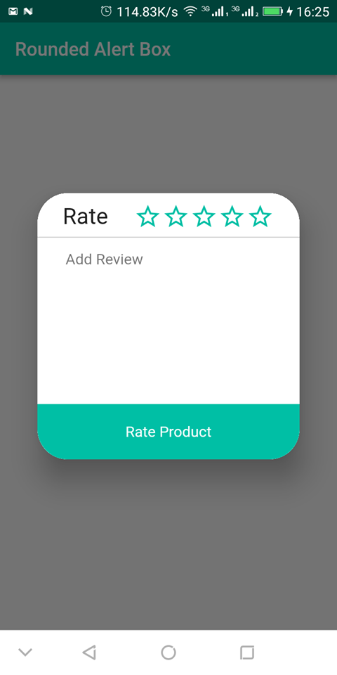
I am trying to create an alert dialog with rounded corners in Flutter same as below screenshot. also add my code here, but my output is exactly different from the expected one. anyone, please help me.

Expected Alert Dialog

Expected Alert Dialog

my code is here.

void _showAlert() {
AlertDialog dialog = new AlertDialog(
  content: new Container(
    width: 260.0,
    height: 230.0,
    decoration: new BoxDecoration(
      shape: BoxShape.rectangle,
      color: const Color(0xFFFFFF),
      borderRadius: new BorderRadius.all(new Radius.circular(32.0)),
    ),
    child: new Column(
      crossAxisAlignment: CrossAxisAlignment.stretch,
      children: <Widget>[
        // dialog top
        new Expanded(
          child: new Row(
            children: <Widget>[
              new Container(
                // padding: new EdgeInsets.all(10.0),
                decoration: new BoxDecoration(
                  color: Colors.white,
                ),
                child: new Text(
                  'Rate',
                  style: TextStyle(
                    color: Colors.black,
                    fontSize: 18.0,
                    fontFamily: 'helvetica_neue_light',
                  ),
                  textAlign: TextAlign.center,
                ),
              ),
            ],
          ),
        ),

        // dialog centre
        new Expanded(
          child: new Container(
              child: new TextField(
            decoration: new InputDecoration(
              border: InputBorder.none,
              filled: false,
              contentPadding: new EdgeInsets.only(
                  left: 10.0, top: 10.0, bottom: 10.0, right: 10.0),
              hintText: ' add review',
              hintStyle: new TextStyle(
                color: Colors.grey.shade500,
                fontSize: 12.0,
                fontFamily: 'helvetica_neue_light',
              ),
            ),
          )),
          flex: 2,
        ),

        // dialog bottom
        new Expanded(
          child: new Container(
            padding: new EdgeInsets.all(16.0),
            decoration: new BoxDecoration(
              color: const Color(0xFF33b17c),
            ),
            child: new Text(
              'Rate product',
              style: TextStyle(
                color: Colors.white,
                fontSize: 18.0,
                fontFamily: 'helvetica_neue_light',
              ),
              textAlign: TextAlign.center,
            ),
          ),
        ),
      ],
    ),
  ),
);

showDialog(context: context, child: dialog);
}
}

The output I get from the above code is.

screenshot

CopsOnRoad
  • 237,138
  • 77
  • 654
  • 440
Rosemary
  • 1,049
  • 2
  • 11
  • 13

17 Answers17

111

Though i am late with the solution, but this may help others searching for it. The following code snippets details how it can be achieved.

import 'package:flutter/material.dart';

void main() => runApp(MyApp());
Color myColor = Color(0xff00bfa5);

class MyApp extends StatelessWidget {
  @override
  Widget build(BuildContext context) {
    return MaterialApp(
      debugShowCheckedModeBanner: false,
      title: "Rounde Alert Box",
      home: Scaffold(
        appBar: AppBar(
          backgroundColor: myColor,
          title: Text("Rounded Alert Box"),
        ),
        body: RoundedAlertBox(),
      ),
    );
  }
}

class RoundedAlertBox extends StatefulWidget {
  @override
  _RoundedAlertBoxState createState() => _RoundedAlertBoxState();
}

class _RoundedAlertBoxState extends State<RoundedAlertBox> {
  @override
  Widget build(BuildContext context) {
    return Center(
      child: RaisedButton(
        onPressed: openAlertBox,
        color: myColor,
        child: Text(
          "Open Alert Box",
          style: TextStyle(color: Colors.white),
        ),
      ),
    );
  }

  openAlertBox() {
    return showDialog(
        context: context,
        builder: (BuildContext context) {
          return AlertDialog(
            shape: RoundedRectangleBorder(
                borderRadius: BorderRadius.all(Radius.circular(32.0))),
            contentPadding: EdgeInsets.only(top: 10.0),
            content: Container(
              width: 300.0,
              child: Column(
                mainAxisAlignment: MainAxisAlignment.start,
                crossAxisAlignment: CrossAxisAlignment.stretch,
                mainAxisSize: MainAxisSize.min,
                children: <Widget>[
                  Row(
                    mainAxisAlignment: MainAxisAlignment.spaceEvenly,
                    mainAxisSize: MainAxisSize.min,
                    children: <Widget>[
                      Text(
                        "Rate",
                        style: TextStyle(fontSize: 24.0),
                      ),
                      Row(
                        mainAxisSize: MainAxisSize.min,
                        children: <Widget>[
                          Icon(
                            Icons.star_border,
                            color: myColor,
                            size: 30.0,
                          ),
                          Icon(
                            Icons.star_border,
                            color: myColor,
                            size: 30.0,
                          ),
                          Icon(
                            Icons.star_border,
                            color: myColor,
                            size: 30.0,
                          ),
                          Icon(
                            Icons.star_border,
                            color: myColor,
                            size: 30.0,
                          ),
                          Icon(
                            Icons.star_border,
                            color: myColor,
                            size: 30.0,
                          ),
                        ],
                      ),
                    ],
                  ),
                  SizedBox(
                    height: 5.0,
                  ),
                  Divider(
                    color: Colors.grey,
                    height: 4.0,
                  ),
                  Padding(
                    padding: EdgeInsets.only(left: 30.0, right: 30.0),
                    child: TextField(
                      decoration: InputDecoration(
                        hintText: "Add Review",
                        border: InputBorder.none,
                      ),
                      maxLines: 8,
                    ),
                  ),
                  InkWell(
                    child: Container(
                      padding: EdgeInsets.only(top: 20.0, bottom: 20.0),
                      decoration: BoxDecoration(
                        color: myColor,
                        borderRadius: BorderRadius.only(
                            bottomLeft: Radius.circular(32.0),
                            bottomRight: Radius.circular(32.0)),
                      ),
                      child: Text(
                        "Rate Product",
                        style: TextStyle(color: Colors.white),
                        textAlign: TextAlign.center,
                      ),
                    ),
                  ),
                ],
              ),
            ),
          );
        });
  }
}

The output of the code snippet looks like this: Rounded Alert Box

Sarbagya Dhaubanjar
  • 1,494
  • 1
  • 8
  • 6
  • 1
    Awesome solution, I guess I should have checked if AlertDialog had a shape parameter lol – Tyler Petrov Jan 24 '23 at 20:48
  • Many thanks! I was skeptical at first, but after a while I get it, set Dialog's shape to RoundedRectangleBorder first, then also add decoratedBox (with round corner) for the dialog content. – Chandler Jan 30 '23 at 05:06
78

The container where you set the BoxDecoration is in the widget tree under the alert dialog. Which means you are setting just a box within the padding of your Dialog. You need to create a custom AlertDialog/showDialog and set the radius there. In the custom widget you also add the button and everything where you need to work beyond that padding.

When you include the customShowDialog.dart file in your project (gist.github.com) where you can edit the radius here borderRadius: BorderRadius.all(Radius.circular(20.0)) and call it like this:

return new CustomAlertDialog(
    content: new Container(
        width: 260.0,
        height: 230.0,
        decoration: new BoxDecoration(
        shape: BoxShape.rectangle,
        color: const Color(0xFFFFFF),
        borderRadius:
            new BorderRadius.all(new Radius.circular(32.0)),
        ),
        child: new Column(
        crossAxisAlignment: CrossAxisAlignment.stretch,
        children: <Widget>[
            // dialog top
            new Expanded(
            child: new Row(
                children: <Widget>[
                new Container(
                    // padding: new EdgeInsets.all(10.0),
                    decoration: new BoxDecoration(
                    color: Colors.white,
                    ),
                    child: new Text(
                    'Rate',
                    style: TextStyle(
                        color: Colors.black,
                        fontSize: 18.0,
                        fontFamily: 'helvetica_neue_light',
                    ),
                    textAlign: TextAlign.center,
                    ),
                ),
                ],
            ),
            ),

            // dialog centre
            new Expanded(
            child: new Container(
                child: new TextField(
                decoration: new InputDecoration(
                border: InputBorder.none,
                filled: false,
                contentPadding: new EdgeInsets.only(
                    left: 10.0,
                    top: 10.0,
                    bottom: 10.0,
                    right: 10.0),
                hintText: ' add review',
                hintStyle: new TextStyle(
                    color: Colors.grey.shade500,
                    fontSize: 12.0,
                    fontFamily: 'helvetica_neue_light',
                ),
                ),
            )),
            flex: 2,
            ),

            // dialog bottom
            new Expanded(
            child: new Container(
                padding: new EdgeInsets.all(16.0),
                decoration: new BoxDecoration(
                color: const Color(0xFF33b17c),
                ),
                child: new Text(
                'Rate product',
                style: TextStyle(
                    color: Colors.white,
                    fontSize: 18.0,
                    fontFamily: 'helvetica_neue_light',
                ),
                textAlign: TextAlign.center,
                ),
            ),
            ),
        ],
        ),
    ),
    );
});

You will get something like this:

enter image description here

EDIT:

Although Flutter lately introduced the shape property which would help you with the rounded corners by setting a ShapeBorder with e.g.

shape: RoundedRectangleBorder(
    borderRadius: BorderRadius.all(Radius.circular(20.0))
),

you would still need to quickly add a custom widget for some customizations, like custom padding, as stated above.

Bostrot
  • 5,767
  • 3
  • 37
  • 47
52

Add this attribute inside AlertDialog:

shape: RoundedRectangleBorder(
    borderRadius: BorderRadius.all(Radius.circular(32.0))),
Benjamin Buch
  • 4,752
  • 7
  • 28
  • 51
Manikandan
  • 690
  • 5
  • 5
22

Try this code :

AlertDialog(
   shape: RoundedRectangleBorder(borderRadius: 
    BorderRadius.all(Radius.circular(15))),
    title: Text('Your title!'),
    content: Container(),
);
anmol.majhail
  • 48,256
  • 14
  • 136
  • 105
Naveen Aluri
  • 271
  • 3
  • 3
13

add

showDialog(
        context: context,
        builder: (BuildContext context) {
          return AlertDialog(
            shape: RoundedRectangleBorder(borderRadius: BorderRadius.all(Radius.circular(10.0))),
            title: Text("Loading..."),
            content: CircularProgressIndicator(),
          );
        },
      );
jeidison farias
  • 490
  • 5
  • 9
8

Try this code

showDialog(
        context: context,
        builder: (BuildContext context) {
          return AlertDialog(
            shape: RoundedRectangleBorder(
                     borderRadius: BorderRadius.circular(10.0),
                   ),
            title: Text('title'),
            content: Text('content'),
          );
        },
      );
Mohamed Kamel
  • 841
  • 10
  • 15
5

You can simply use shape property of AlertDialog

shape: RoundedRectangleBorder(
      borderRadius: BorderRadius.all(Radius.circular(16)))
penguru
  • 4,342
  • 11
  • 46
  • 56
4
 shape: RoundedRectangleBorder(borderRadius: BorderRadius.circular(20)),

This line of code will make alert dialog with rounded corner.

Mohd Danish Khan
  • 1,044
  • 11
  • 12
3

Use like this

AlertDialog(
  shape:RoundedRectangleBorder(
    borderRadius:BorderRadius.circular(10.0,),
  ),
  content: yourContent()
);
Hamed
  • 5,867
  • 4
  • 32
  • 56
3

Try this code

Theme(
      data: Theme.of(context).copyWith(
        dialogTheme: DialogTheme(
          backgroundColor: Theme.of(context).cardColor,
          shape: RoundedRectangleBorder(
            borderRadius: radius(6),
          ),
        ),
      ),
      child: AlertDialog()

devsakil
  • 41
  • 2
1

I was looking at these answers and none of them helped me achieve the desired look.

I noticed that there was a default padding so all I did was:

AlertDialog(
          titlePadding: EdgeInsets.all(0),
          title: Container(
            height: 30.00,
            width: 300.00,
            decoration: BoxDecoration(
              color: Colors.redAccent,
              borderRadius: BorderRadius.only(topLeft: Radius.circular(32), topRight: Radius.circular(32)),
            ),
        ), 
)

I overrode the titlePadding attribute and it came just right. There is also a contentPadding attribute if you find any trouble with that. I copied this from one of my apps just to show the attribute, but it is applicable to this case as well.

Pika Supports Ukraine
  • 3,612
  • 10
  • 26
  • 42
miloskarakas
  • 266
  • 5
  • 11
1

If you want to use the standard Dialog you can just apply a Decoration to the Container that matches your Dialog settings

showDialog(
      context: context,
      child: Dialog(
        shape: RoundedRectangleBorder(borderRadius: BorderRadius.circular(10)),
        child: Column(
          children: <Widget>[
            Container(
              decoration: BoxDecoration(     
                borderRadius: BorderRadius.only(topLeft: Radius.circular(10), topRight: Radius.circular(10)),
              ),          
              child: Text('foobar'),
            )
          ],
        ),
      ),
    );
1

To change the appearance of the shape of the dialog, you can set the shape property of the AlertDialog to the desired shape.

AlertDialog default shape is a RoundedRectangleBorder with a radius of 4.0

AlertDialog(
  shape: RoundedRectangleBorder(
    borderRadius: BorderRadius.circular(32.0),
  ),
)
UNW
  • 442
  • 4
  • 6
0
AlertDialog(
                            shape: RoundedRectangleBorder(
                                borderRadius: BorderRadius.all(
                                    Radius.circular(12.0))),
                            contentPadding: EdgeInsets.only(top: 10.0),
                            content: Container(
                              width: 300.0,
                              child: Column(
                                mainAxisAlignment: MainAxisAlignment.start,
                                //crossAxisAlignment: CrossAxisAlignment.stretch,
                                mainAxisSize: MainAxisSize.min,
                                children: <Widget>[
                                  Row(
                                    mainAxisAlignment:
                                        MainAxisAlignment.end,
                                    children: [
                                      IconButton(
                                          icon: Icon(
                                              Icons.highlight_off_outlined, color: Color(0xff5A5D60),),
                                          onPressed: () {
                                            Navigator.of(context,
                                                rootNavigator: true)
                                                .pop();
                                          }),
                                      SizedBox(
                                        width: 10,
                                      )
                                    ],
                                  ),
                                  Image(
                                    image: AssetImage(
                                        'assets/warningicon.png'),
                                  ),
                                  SizedBox(
                                    height: mdq.height * .01,
                                  ),
                                  Text(
                                    'Registered Successfully',
                                    style: GoogleFonts.roboto(
                                        color: Color(0xff11171C),
                                        fontSize: mdq.width * .04,
                                        fontWeight: FontWeight.bold),
                                  ),
                                  Text(
                                    'Your account has been Successfully\ncreated.',
                                    textAlign: TextAlign.center,
                                    style: GoogleFonts.roboto(
                                      color: Color(0xff11171C),
                                      fontSize: mdq.width * .04,
                                    ),
                                  ),
                                  SizedBox(
                                    height: mdq.height * .04,
                                  ),
                                  Row(
                                    //mainAxisAlignment: MainAxisAlignment.start,
                                    // crossAxisAlignment: CrossAxisAlignment.center,
                                    children: [
                                      InkWell(
                                        onTap: (){
                                          Navigator.push(
                                              context,
                                              MaterialPageRoute(
                                                  builder: (context) => Login1()));
                                        },
                                        child: Container(
                                          padding: EdgeInsets.only(
                                              top: 20.0, bottom: 20.0),
                                          decoration: BoxDecoration(
                                            color: Color(0xffEEEEEE),
                                            borderRadius: BorderRadius.only(
                                              bottomLeft:
                                                  Radius.circular(12.0),
                                              //bottomRight: Radius.circular(32.0)
                                            ),
                                          ),
                                          width: 150,
                                          child: Text(
                                            "No",
                                            style: TextStyle(
                                                color: Color(0xff5A5D60),
                                                fontSize: 17),
                                            textAlign: TextAlign.center,
                                          ),
                                        ),
                                      ),
                                      InkWell(
                                       onTap: (){
                                         Navigator.push(
                                             context,
                                             MaterialPageRoute(
                                                 builder: (context) => Testing()));
                                       },
                                        child: Container(
                                          padding: EdgeInsets.only(
                                              top: 20.0, bottom: 20.0),
                                          decoration: BoxDecoration(
                                            color: Color(0xffFFDC00),
                                            borderRadius: BorderRadius.only(
                                                //bottomLeft: Radius.circular(32.0),
                                                bottomRight:
                                                    Radius.circular(12.0)),
                                          ),
                                          child: Text(
                                            "Yes",
                                            style: TextStyle(
                                                color: Colors.white,
                                                fontSize: 17),
                                            textAlign: TextAlign.center,
                                          ),
                                          width: 150,
                                        ),
                                      ),
                                    ],
                                  ),
                                ],
                              ),
                            ),
                          ),[You can also show and design dialog box like this**strong text**][1]
0

You can use like this

using get: ------------->

Get.generalDialog(
        pageBuilder: (BuildContext buildContext, Animation animation,
                Animation secondaryAnimation) =>
            AlertDialog(
              contentPadding: EdgeInsets.zero,
               // this padding user for outside of alert padding
              insetPadding: EdgeInsets.symmetric(horizontal: 10),
              content: Container(
                height: Get.height - 300, // Change as per your requirement
                width: Get.width, // Change as per your requirement
                
                child: <Your Widget>
                ),
              ),
            ));

using alert dialog:------>

CustomAlertDialog(
    content: new Container(
        width: 260.0,
        height: 230.0,
        decoration: new BoxDecoration(
        shape: BoxShape.rectangle,
        color: const Color(0xFFFFFF),
        borderRadius:
            new BorderRadius.all(new Radius.circular(32.0)),
        ),
        child: <Your widget>
    ),
    );
});
Rasel Khan
  • 2,976
  • 19
  • 25
0
Padding(
        padding: const EdgeInsets.symmetric(horizontal: 23.0),
        child: IconButton(
            onPressed: (){},
            icon: const Icon(
              Icons.fiber_new_rounded,
              size: 25,
              color: Colors.white,
            )
        ),
      ),
Yakup
  • 28
  • 4
0
AlertDialog(
            elevation: 20,
            shadowColor: blue4,
            backgroundColor: Colors.transparent,
            actions: [
              Container(
                decoration: BoxDecoration(
                    color: blue0,
                    borderRadius: BorderRadius.all(Radius.circular(20))),
                height: 200,
              ),
            ],
          );
Tomerikoo
  • 18,379
  • 16
  • 47
  • 61
  • 4
    Your answer could be improved with additional supporting information. Please [edit] to add further details, such as citations or documentation, so that others can confirm that your answer is correct. You can find more information on how to write good answers [in the help center](/help/how-to-answer). – Community May 02 '23 at 13:59