8

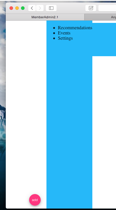
I have an angular4 app and am using the angular materials framework https://material.angular.io/components/sidenav/examples. I want to make the md-sidenav-container stretch the whole height of the div without covering up the header. I have attached the fullscreen directive, which causes the sidenav to fill the whole height of the screen thus covering up the header component. This is not what I want. The images show the sidenav stretch above the header, as well as another attempt where it stops at the header but does not stretch to the bottom. I want it to stretch all the way up to the header and all the way down to the bottom of the screen. How do I accomplish this? Thanks!

Html

<div class="bar">
  <md-sidenav-container class="example-sidenav-fab-container">
  <md-sidenav #sidenav mode="side" opened="true" align="end">
    <!--<button md-mini-fab class="example-fab" (click)="sidenav.toggle()">-->
      <!--<md-icon>add</md-icon>-->
    <!--</button>-->
    <div class="example-scrolling-content">
      <ul>
        <li>Recommendations</li>
        <li>Events</li>
        <li>Settings</li>
      </ul>
    </div>
  </md-sidenav>
  <button md-mini-fab class="example-fab" (click)="sidenav.toggle()">
    <md-icon>add</md-icon>
  </button>
</md-sidenav-container>
</div>

Css

md-sidenav-container
  :background-color white
  :float right
  :width 300px
  :height 400px

md-sidenav
  :background-color $light-blue


//.example-sidenav-fab-container
//  width: 300px
//  height: 400px
  //border: 1px solid rgba(0, 0, 0, 0.5)


.example-sidenav-fab-container md-sidenav
  max-width: 300px

.example-sidenav-fab-container md-sidenav
  display: flex
  overflow: visible

.example-scrolling-content
  overflow: auto


.example-fab
  position: absolute
  right: 20px
  bottom: 10px

.bar
  :height 100%

Not what I want

slipperypete
  • 5,358
  • 17
  • 59
  • 99

3 Answers3

27

I have found this workaround that works ok

HTML

<md-sidenav-container id="container" fullscreen >

CSS

#container {
 top: 64px !important;
}

@media(max-width: 599px) {
  #container {
    top: 56px !important;
  }
}

top has to have the same height of your toolbar. Remember that the standard Angular Material toolbar height becomes smaller when the width is less than 600px .

  • 2
    It works, although I agree it works ok, there has to be a better solution for this out there. – slipperypete Jul 04 '17 at 18:10
  • 1
    The answer below by @bdiloreto is a better solution! – Eric Bishard Oct 05 '17 at 23:53
  • 1
    In the latest version of Material design (at the moment of writing), you can set `fixedInViewport="true"` and `fixedTopGap="72"` or whatever value is relevant, see https://material.angular.io/components/sidenav/api – toongeorges Aug 09 '20 at 23:10
25

I struggled with the same problem. The solution of setting the top to 64px did not work for me.

I found two different solutions.

  1. The first solution uses flexbox. Put the md-toolbar and md-sidenav-container inside of a div with height: 100% and uses display: flex with flex-direction: column.

  2. Alternatively, and this solution may actually do the same thing, you can leave the md-toolbar and md-sidenav-container items at the root level, and then make the md-sidenav-container have a height: calc(100% - 64px) where the height of the toolbar is 64px.

Jules
  • 1,677
  • 1
  • 19
  • 25
bdiloreto
  • 366
  • 4
  • 9
  • This is the correct answer. I have a navigation that acts like a frame around my whole site, it has a top-nav, sidenav that slides out on mobile. And this is what I used for it. Also within it's content area, on some of our pages we have advanced search forms that also slide out. So this is a sidenav-container nested within another sidenav-container's content area. Again, the same problem arises on pges where the content does not push past the fold or bottom of the viewport we use this same code there. REmember that if your navigation is smaller like mine (45px) don't just plug in 65px lol – Eric Bishard Oct 05 '17 at 23:52
  • None of the suggestions works. However, the accepted answer does. Sorry to say ... ;) – Trinimon Aug 24 '20 at 19:52
  • I set `flex-grow: 1` on the sidenav-container – Yuval Jun 11 '23 at 21:11
9
html, body, material-app, mat-sidenav-container {
  height: 100%;
  width: 100%;
  margin: 0;
}
Eran Nahum
  • 101
  • 1
  • 5
  • 1
    u mean classes `.material-app, .mat-sidenav-container` ? – Andre Elrico Mar 14 '19 at 18:31
  • The only one answer that really works. Thanks a lot. – amedina Oct 18 '19 at 17:44
  • This seems to work if the sidenav occupies 100% of the height of the page, but when there is a toolbar and the sidenav is under it, this style makes the height too big: 100% + the height of the toolbar, so you end up with a vertical scrollbar – toongeorges Aug 09 '20 at 22:37