70

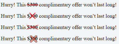
I've got a div that looks like a orange square

enter image description here

I'd like to draw a white X in this div somehow so that it looks more like

enter image description here

Anyway to do this in CSS or is it going to be easier to just draw this in Photoshop and use the image as the div background? The div code just looks like

div {
    height: 100px;
    width: 100px;
    background-color: #FA6900;
    border-radius: 5px;
}
Gildas.Tambo
  • 22,173
  • 7
  • 50
  • 78
natsuki_2002
  • 24,239
  • 21
  • 46
  • 50

15 Answers15

101

You want an entity known as a cross mark:

http://www.fileformat.info/info/unicode/char/274c/index.htm

The code for it is ❌ and it displays like ❌

If you want a perfectly centered cross mark, like this:

cross mark demo

try the following CSS:

div {
    height: 100px;
    width: 100px;
    background-color: #FA6900;
    border-radius: 5px;
    position: relative;
}

div:after {
    position: absolute;
    top: 0;
    bottom: 0;
    left: 0;
    right: 0;
    content: "\274c"; /* use the hex value here... */
    font-size: 50px; 
    color: #FFF;
    line-height: 100px;
    text-align: center;
}

See Demo Fiddle

Cross-Browser Issue

The cross-mark entity does not display with Safari or Chrome. However, the same entity displays well in Firefox, IE and Opera.

It is safe to use the smaller but similarly shaped multiplication sign entity, × which displays as ×.

Marc Audet
  • 46,011
  • 11
  • 63
  • 83
  • 6
    Any idea how to force a color on the cross mark in Safari? It is always rendered as red... – minlare Jul 07 '15 at 14:20
  • 7
    The hex code for the Unicode character 'MULTIPLICATION SIGN' is `\D7` (U+00D7), thus the CSS code would be `content: "\D7";` – Spyryto Sep 20 '17 at 10:19
73

single element solution:enter image description here

body{
    background:blue;
}

div{
    width:40px;
    height:40px;
    background-color:red;
    position:relative;
    border-radius:6px;
    box-shadow:2px 2px 4px 0 white;
}

div:before,div:after{
    content:'';
    position:absolute;
    width:36px;
    height:4px;
    background-color:white;
    border-radius:2px;
    top:16px;
    box-shadow:0 0 2px 0 #ccc;
}

div:before{
    -webkit-transform:rotate(45deg);
    -moz-transform:rotate(45deg);
    transform:rotate(45deg);
    left:2px;
}
div:after{
    -webkit-transform:rotate(-45deg);
    -moz-transform:rotate(-45deg);
    transform:rotate(-45deg);
    right:2px;
}
<div></div>
Gildas.Tambo
  • 22,173
  • 7
  • 50
  • 78
  • Probably overly complex for this application, but a very good demonstration of what can be done with transforms. – Marc Audet Sep 20 '13 at 16:24
  • 15
    This is the real answer! Nice. Definitely not "overly complex" it is perfect because it doesn't use a font and it can scale to any size. Upvoted! – FirstVertex Sep 10 '14 at 20:57
  • 2
    I completely agree with H Dog, this is the correct answer. Using the ❌ in Chrome displays a question mark in a box. Using a font angles the ends of the cross. Well done Tambo!! – Rogala Mar 09 '15 at 16:01
  • 1
    Amazing solution, upvoted. I've added an answer which adds adaptive math to your work, full credit for the solution itself given to you of course. – Rashid Clark Jul 10 '20 at 18:08
45

Yet another pure CSS solution (i.e. without the use of images, characters or additional fonts), based on @Bansoa is the answer's answer .

I've simplified it and added a bit of Flexbox magic to make it responsive.

Cross in this example automatically scales to any square container, and to change the thickness of its lines one have just to tune height: 4px; (to make a cross truly responsive, you may want to set the height in percents or other relative units).

div {
    position: relative;
    height: 150px; /* this can be anything */
    width: 150px;  /* ...but maintain 1:1 aspect ratio */
    display: flex;
    flex-direction: column;
    justify-content: center;
}

div::before,
div::after {
    position: absolute;
    content: '';
    width: 100%;
    height: 4px; /* cross thickness */
    background-color: black;
}

div::before {
    transform: rotate(45deg);
}

div::after {
    transform: rotate(-45deg);
}
<div></div>
Neurotransmitter
  • 6,289
  • 2
  • 51
  • 38
23

You can make a pretty nice X with CSS gradients:

screenshot

demo: https://codepen.io/JasonWoof/pen/rZyRKR

code:

<span class="close-x"></span>
<style>
    .close-x {
        display: inline-block;
        width: 20px;
        height: 20px;
        border: 7px solid #f56b00;
        background:
            linear-gradient(45deg, rgba(0,0,0,0) 0%,rgba(0,0,0,0) 43%,#fff 45%,#fff 55%,rgba(0,0,0,0) 57%,rgba(0,0,0,0) 100%),
            linear-gradient(135deg, #f56b00 0%,#f56b00 43%,#fff 45%,#fff 55%,#f56b00 57%,#f56b00 100%);
    }
</style>
JasonWoof
  • 4,176
  • 1
  • 19
  • 28
19

Yet another attempt... this one uses ×. A lot of the examples on this page only show for me as a box, but &times; works

HTML

<div class="close"></div>

CSS

.close {
    height: 100px;
    width: 100px;
    background-color: #FA6900;
    border-radius: 5px;
}
.close:after {
    position:relative;
    content:"\d7";
    font-size:177px;
    color:white;
    font-weight:bold;
    top:-53px;
    left:-2px
}

JSFIDDLE

Gray
  • 7,050
  • 2
  • 29
  • 52
  • Reference for the `×` entity: http://www.fileformat.info/info/unicode/char/00d7/index.htm – Marc Audet Sep 20 '13 at 16:33
  • @MarcAudet Thanks for that link. I hadn't seen that site before, and it is pretty helpful. For your answer though, I only see boxes. Do you have a Mac by any chance? – Gray Sep 20 '13 at 16:35
  • I am working on a Windows 7 machine. So you don't see the cross mark in my fiddle? – Marc Audet Sep 20 '13 at 17:05
  • Correct. I am using Windows 7 with Chrome (same results with IE/FF). Here is a screencap: http://i.imgur.com/u9UwCQZ.png – Gray Sep 20 '13 at 17:27
  • Also a nice solution, especially with the entity. I just had to reposition it a bit to center the 'x' - see updated [jsFiddle](http://jsfiddle.net/wKhsW/1/) – Netsurfer Sep 20 '13 at 17:34
  • @Gray Indeed, you are right, the cross mark does not display in Chrome, see the following test page: http://www.fileformat.info/info/unicode/char/274c/browsertest.htm I am not sure why this is happening, the same problem is seen in Safari on Windows. Works in Opera and IE, however. – Marc Audet Sep 20 '13 at 18:20
18

You could just put the letter X in the HTML inside the div and then style it with css.

See JSFiddle: http://jsfiddle.net/uSwbN/

HTML:

<div id="orangeBox">
  <span id="x">X</span>
</div>

CSS:

#orangeBox {
  background: #f90;
  color: #fff;
  font-family: 'Helvetica', 'Arial', sans-serif;
  font-size: 2em;
  font-weight: bold;
  text-align: center;
  width: 40px;
  height: 40px;
  border-radius: 5px;
}
AJT
  • 216
  • 2
  • 6
  • 31
  • 8
    Since this was selected, I will extract the (possibly) useful info from my answer and put it here. `×` might look nicer than an `X` depending on your font. – Gray Sep 20 '13 at 15:55
  • 6
    All other answers proposing the use of a pseudo element (`::before` or `::after`) are much more to prefer, because this would be semantically correct in contrast to this answer. That the questioner has chosen this answer shows that there might be a lack of understanding ...! – Netsurfer Sep 20 '13 at 16:05
  • 1
    @Netsurfer I agree that using the pseudo-elements are preferred, but I am not sure I would say that doing this is "semantically incorrect." There are many benefits to using a pseudo-element (I think the most important is the fact that you cannot select the text), but that doesn't make this solution wrong. – Gray Sep 20 '13 at 16:33
  • 4
    @Gray: It does! Because if the 'X' has a 'function' then it should be an `` or ` – Netsurfer Sep 20 '13 at 17:06
  • @Netsurfer Interesting point of view. Thanks for the clarification. I can see your point when you put it like that. – Gray Sep 20 '13 at 17:26
  • Just add ``line-height: 2.5rem;`` for vertical centralization of X. – Alexander Shtang Jul 31 '19 at 07:50
  • @Netsurfer In what way is that "semantically correct"? Simply using a pseudo element doesn't make the answer any more or less correct. In fact, it leads to more lines of code and makes things slightly harder to read, which means it is a worse solution since it has the exact same result. AT92 understands this problem perfectly well and has provided the simplest and most readable solution out of any of the answerers, which means he has the best answer (so long as you're okay with your X looking like the character X) Just saying something is semantically incorrect is not useful to anyone. Explain – ICW Feb 23 '21 at 21:21
  • @ICW - Re: _"In what way is that "semantically correct"?"_ I agree, it's important to have an explanation, so here's one: The markup above is a `
    ` containing a `` containing a _text node_. But it's a user-interactive element which requires focus-ability and tab-ability. So it should be `
    – Rounin Nov 23 '22 at 23:38
11

You can use the CSS property "content":

div {
    height: 100px;
    width: 100px;
    background-color: #FA6900;
    border-radius: 5px;
}

div:after {
    content: "X";
    font-size: 2em; 
    color: #FFF;
}

Like this: http://jsfiddle.net/HKtFV/

António Regadas
  • 714
  • 4
  • 11
9

#x{
    width: 20px;
    height: 20px;
    background-color:orange;
    position:relative;
    border-radius:2px;
}
#x::after,#x::before{
    position:absolute;
    top:9px;
    left:0px;
    content:'';
    display:block;
    width:20px;
    height:2px;
    background-color:red;
    
}
#x::after{
    -webkit-transform: rotate(45deg);
    -moz-transform: rotate(45deg);
    -ms-transform: rotate(45deg);
    -o-transform: rotate(45deg);
    transform: rotate(45deg);
}
#x::before{
    -webkit-transform: rotate(-45deg);
    -moz-transform: rotate(-45deg);
    -ms-transform: rotate(-45deg);
    -o-transform: rotate(-45deg);
    transform: rotate(-45deg);
}
<div id=x>
</div>
9

I love this question! You could easily adapt my code below to be a white × on an orange square:

enter image description here

Demo fiddle here

Here is the SCSS (which could easily be converted to CSS):

$pFontSize: 18px;
p {
  font-size: $pFontSize;
}
span{
  font-weight: bold;
}
.x-overlay,
.x-emoji-overlay {
  position: relative;
}

.x-overlay,
.x-emoji-overlay {
  &:after {
    position: absolute;
    top: 0;
    bottom: 0;
    left: 0;
    right: 0;
    color: red;
    text-align: center;
  }
}

.x-overlay:after {
  content: '\d7';
  font-size: 3 * $pFontSize;
  line-height: $pFontSize;
  opacity: 0.7;
}

.x-emoji-overlay:after {
  content: "\274c";
  padding: 3px;
  font-size: 1.5 * $pFontSize;
  line-height: $pFontSize;
  opacity: 0.5;
}

.strike {
  position: relative;
  display: inline-block;
}

.strike::before {
  content: '';
  border-bottom: 2px solid red;
  width: 110%;
  position: absolute;
  left: -2px;
  top: 46%;
}

.crossed-out {
  /*inspired by https://www.tjvantoll.com/2013/09/12/building-custom-text-strikethroughs-with-css/*/
  position: relative;
  display: inline-block;
  &::before,
  &::after {
    content: '';
    width: 110%;
    position: absolute;
    left: -2px;
    top: 45%;
    opacity: 0.7;
  }
  &::before {
    border-bottom: 2px solid red;
    -webkit-transform: skewY(-20deg);
    transform: skewY(-20deg);
  }
  &::after {
    border-bottom: 2px solid red;
    -webkit-transform: skewY(20deg);
    transform: skewY(20deg);
  }
}
Ryan
  • 22,332
  • 31
  • 176
  • 357
5

You could do this by styling an "x"

text-align: center;
font-size: 120px;
line-height: 100px;
color: white;
font-family: monospace;

http://jsfiddle.net/Ncvyj/1/

Explosion Pills
  • 188,624
  • 52
  • 326
  • 405
4

Here is a single div and dynamic size version without using pseudo element.

body {
  display: flex;
  gap: 30px;
}

.x {
  --color: #444;
  --l: 5px; /* line-width */
  width: 50px;
  height: 50px;
  background: linear-gradient(to top right, transparent calc(50% - var(--l) / 2), var(--color) calc(50% - var(--l) / 2) calc(50% + var(--l) / 2), transparent calc(50% + var(--l) / 2)),
              linear-gradient(to bottom right, transparent calc(50% - var(--l) / 2), var(--color) calc(50% - var(--l) / 2) calc(50% + var(--l) / 2), transparent calc(50% + var(--l) / 2));
              
  --clip-path: polygon(var(--l) 0%, calc(100% - var(--l)) 0%, 100% var(--l), 100% calc(100% - var(--l)), calc(100% - var(--l)) 100%, var(--l) 100%, 0% calc(100% - var(--l)), 0% var(--l));
  -webkit-clip-path: var(--clip-path);
          clip-path: var(--clip-path);
}
<div class="x"></div>

<div class="x" style="--l: 10px;"></div>

<div class="x" style="--l: 15px; --color: red"></div>

<div class="x" style="--l: 15px; --color: dodgerblue; width: 100px; height: 100px;"></div>
doğukan
  • 23,073
  • 13
  • 57
  • 69
2

A modern answer with good browser support.

<span>&times;</span>

This technically puts the multiplication symbol there, but no one will really notice (found some websites that have a popup box and most use this for the x button).

If you need more control you can style it with color opacity etc...

example (index.html)

<span class="x-button">&times;</span>

styles.css

span.x-button {
    color:gray;
    opacity:0.7;
    font-size:1.5em;
}

Result (first example)

<span>&times</span>

Result (2nd example)

span {
    color:gray;
    opacity:0.7;
    font-size:1.5em;
}
<span class="x-button">&times;</span>

Note: you can highlight this unlike other solutions, but this may not be desirable depending on the application. You can solve this in pure css too, just add

    user-select:none;
    -webkit-user-select:none;
Fighter178
  • 303
  • 2
  • 9
  • You also shouldn't really need to worry about the aspect ratio as most English text is already 1:1. (though it is often centered). – Fighter178 Nov 23 '22 at 23:46
1

HTML

<div class="close-orange"></div>

CSS

.close-orange {
  height: 100px;
  width: 100px;
  background-color: #FA6900;
  border-radius: 5px;
}
.close-orange:before,.close-orange:after{
  content:'';
  position:absolute;
  width: 50px;
  height: 4px;
  background-color:white;
  border-radius:2px;
  top: 55px;
}
.close-orange:before{
  -webkit-transform:rotate(45deg);
  -moz-transform:rotate(45deg);
  transform:rotate(45deg);
  left: 32.5px;
}
.close-orange:after{
  -webkit-transform:rotate(-45deg);
  -moz-transform:rotate(-45deg);
  transform:rotate(-45deg);
  left: 32.5px;
}

https://jsfiddle.net/cooperwebdesign/dw4xd289/

0

This is an adaptable version of the amazing solution provided by @Gildas.Tambo elsewhere in this page. Simply change the values of the variables at the top to change the size of the "X".

Credit for the solution itself goes to Gildas. All I've done is given it adaptable math.

:root {
  /* Width and height of the box containing the "X" */
  --BUTTON_W:             40px;
  /* This is the length of either of the 2 lines which form the "X", as a
  percentage of the width of the button. */
  --CLOSE_X_W:            95%;
  /* Thickness of the lines of the "X" */
  --CLOSE_X_THICKNESS:    4px;
}
  

body{
    background:blue;
}

div{
    width:           var(--BUTTON_W);
    height:          var(--BUTTON_W);
    background-color:red;
    position:        relative;
    border-radius:   6px;
    box-shadow:      2px 2px 4px 0 white;
}

/* The "X" in the button. "before" and "after" each represent one of the two lines of the "X" */
div:before,div:after{
    content:         '';
    position:        absolute;
    width:           var(--CLOSE_X_W);
    height:          var(--CLOSE_X_THICKNESS);
    background-color:white;
    border-radius:   2px;
    top:             calc(50% - var(--CLOSE_X_THICKNESS) / 2);
    box-shadow:      0 0 2px 0 #ccc;
}
/* One line of the "X" */
div:before{
    -webkit-transform:rotate(45deg);
    -moz-transform:   rotate(45deg);
    transform:        rotate(45deg);
    left:             calc((100% - var(--CLOSE_X_W)) / 2);
}
/* The other line of the "X" */
div:after{
    -webkit-transform:rotate(-45deg);
    -moz-transform:   rotate(-45deg);
    transform:        rotate(-45deg);
    right:            calc((100% - var(--CLOSE_X_W)) / 2);
}
<div></div>
Rashid Clark
  • 81
  • 1
  • 2
-1

Check & and Cross:

<span class='act-html-check'></span>
<span class='act-html-cross'><span class='act-html-cross'></span></span>

<style type="text/css">
span.act-html-check {
                display: inline-block;
                width: 12px;
                height: 18px;
                border: solid limegreen;
                border-width: 0 5px 5px 0;
                transform: rotate( 45deg);
            }


            span.act-html-cross {
                display: inline-block;
                width: 10px;
                height: 10px;
                border: solid red;
                border-width: 0 5px 5px 0;
                transform: rotate( 45deg);
                position: relative;
            }

            span.act-html-cross > span { {
                transform: rotate( -180deg);
                position: absolute;
                left: 9px;
                top: 9px;
            }
</style>
realmag777
  • 2,050
  • 1
  • 24
  • 22