Is it possible to detect change in orientation of the browser on the iPad or Galaxy Tab using javascript? I think it's possible using css media queries.
Asked
Active
Viewed 7.5k times
11 Answers
51
NOTE: orientationChange is deprecated
Instead use screen.orientation using the screenOrientation interface
which is triggered by the screenorientation.onchange event
window.addEventListener("DOMContentLoaded", () => {
  const output = document.getElementById("o9n");
  const displayOrientation = () => {
    const screenOrientation = screen.orientation.type;
    output.innerHTML = `The orientation of the screen is: ${screenOrientation}`;
    if (screenOrientation === "landscape-primary") {
      console.log("That looks good.");
    } else if (screenOrientation === "landscape-secondary") {
      console.log("Mmmh... the screen is upside down!");
    } else if (screenOrientation === "portrait-secondary" || screenOrientation === "portrait-primary") {
      console.log("Mmmh... you should rotate your device to landscape");
    } else if (screenOrientation === undefined) {
      console.log("The orientation API isn't supported in this browser :(");
    }
  };

  if (screen && screen.orientation !== null) {
    try {
      window.screen.orientation.onchange = displayOrientation;
      displayOrientation();
    }
    catch (e) { output.innerHTML = e.message; }
  }
});
Orientation: <span id="o9n"></span>However note the support as of July 2022
The screen.orientation is not supported by Safari at all
window.addEventListener("orientationchange", function() {
    alert("the orientation of the device is now " + screen.orientation.angle);
});
or jQuery mobile orientationchange
$(window).on("orientationchange", function( event ) {
  $("#orientation").text( "This device is in " + event.orientation + " mode!");
});
The older orientationChange and window.orientation should still work for Safari
window.addEventListener("orientationchange", function() {
  alert(window.orientation);
}, false);
Older answer
http://www.nczonline.net/blog/2010/04/06/ipad-web-development-tips/
Safari on the iPad does support the window.orientation property, so if necessary, you can use that to determine if the user is in horizontal or vertical mode. As reminder of this functionality:
window.orientation is 0 when being held vertically
window.orientation is 90 when rotated 90 degrees to the left (horizontal)
window.orientation is -90 when rotated 90 degrees to the right (horizontal)
There is also the orientationchange event that fires on the window object when the device is rotated.
You can also use CSS media queries to determine if the iPad is being held in vertical or horizontal orientation, such as:
<link rel="stylesheet" media="all and (orientation:portrait)" href="portrait.css">
<link rel="stylesheet" media="all and (orientation:landscape)" href="landscape.css">
<script type="text/javascript">
var updateLayout = function() {
  if (window.innerWidth != currentWidth) {
    currentWidth = window.innerWidth;
    var orient = (currentWidth == 320) ? "profile" : "landscape";
    document.body.setAttribute("orient", orient);
    window.scrollTo(0, 1);
  }
};

iPhone.DomLoad(updateLayout);
setInterval(updateLayout, 400);
</script>
mplungjan
- 169,008
- 28
- 173
- 236
-
It seems that starting from iOS 4.0 UIWebView version does no more support Javascript window.orientation property, or at least I have experienced so. So, the only way I've found to notify UIWebView's internal Javascript about orientation changes was to call [webView stringByEvaluatingJavaScriptFromString:[NSString stringWithFormat:@"didRotateTo('%@')", orient]]; where webView is my UIWebView and orient is a string representation of current device orientation. didRotateTo is a javascript function which accepts one parameter (the orientation as string) – Dmitri Sologoubenko Apr 28 '11 at 10:05
-
Wrt to polling, there is a `orientationchange` event that is fired when the device's orientation changes. – alex Jul 04 '12 at 06:16
-
Is this also possible for Windows Surface tablets? I see the given answer is somewhat obsolete so I wondered if anyone would happen to know. I tried running the script but only developer console (in Chrome) seems to register an orientation change. – Barrosy Nov 14 '18 at 08:13
-
Does this work? `window.addEventListener("orientationchange", function() { console.log("the orientation of the device is now " + screen.orientation.angle); });` – mplungjan Nov 14 '18 at 08:19
-
I found this https://msdn.microsoft.com/en-us/windows/dn760723(v=vs.71) – mplungjan Nov 14 '18 at 08:22
-
4And I found this: Deprecated. Not for use in new websites, from here https://developer.mozilla.org/en-US/docs/Web/API/Window/orientationchange_event May-b this answer should be updated. – Blue Aug 22 '19 at 09:06
-
This is deprecated as noted earlier. See CSSBurner's answer for an updated solution for 2022. – nishanthshanmugham Jun 29 '22 at 23:54
-
So what is the new event then? -1 for not including the events in the answer. – Dan Froberg Jun 04 '23 at 21:34
-
@DanFroberg Actually it was there all along!!! `MDN: window.addEventListener("orientationchange", function() { alert("the orientation of the device is now " + screen.orientation.angle); });` – mplungjan Jun 05 '23 at 05:33
-
1@mplungjan, the answer mixed an event name with link to a property. Then you have same event on screen instead of window. But MDN say: Listen for the ScreenOrientation.onchange event instead. – Dan Froberg Jun 05 '23 at 14:17
-
Sorry, I confused myself over this – mplungjan Jun 05 '23 at 14:37
-
It is not working in mobile chrome. Neither `window.screen.orientation.onchange = displayOrientation;` nor `screen.orientation.addEventListener("change",displayOrientation);` - very irritating. I will investigate – mplungjan Jun 05 '23 at 15:04
11
In 2022, instead of adding a window orientationchange listener (listener not recommended due to deprecation) you should listen for a screen.orientation change event:
if (screen.orientation) { // Property doesn't exist on screen in IE11
    screen.orientation.addEventListener("change", callback);
}
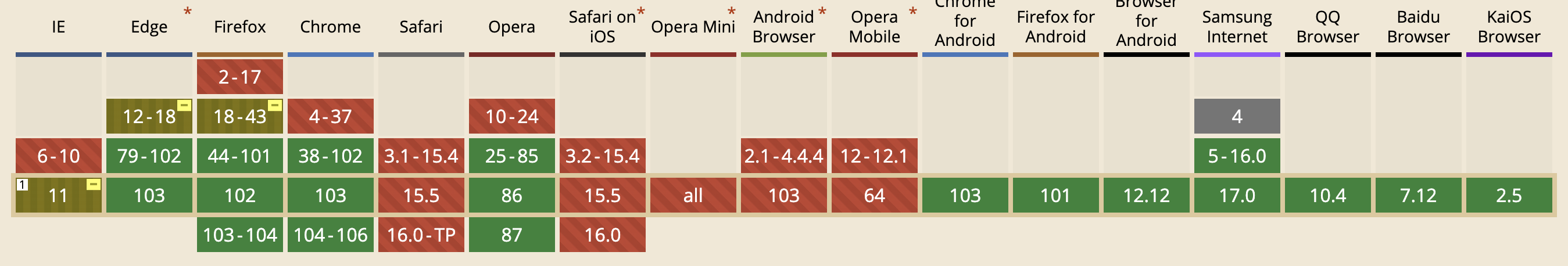
All browsers except IE and Safari now support it. (here is a screenshot of screen from IE11:
... notice that orientation is not a supported attribute of screen in IE11)
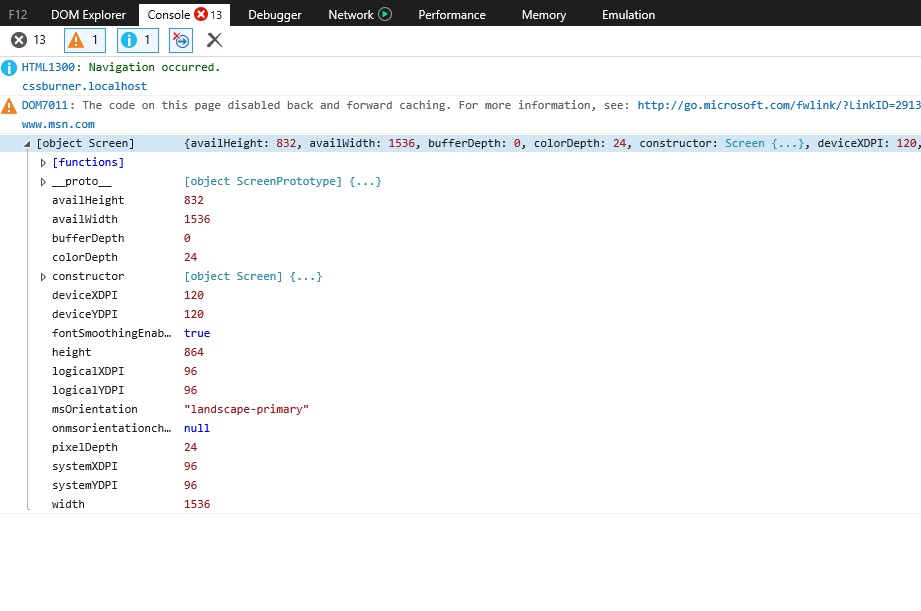
The Screen Orientation API is thoroughly documented. The main focus is the ScreenOrientation interface, which extends Screen. Here are 2 screenshots of the orientation attribute of Screen, which shows how the angle changes from 0 (portrait) to 90 (landscape) on an Android device:
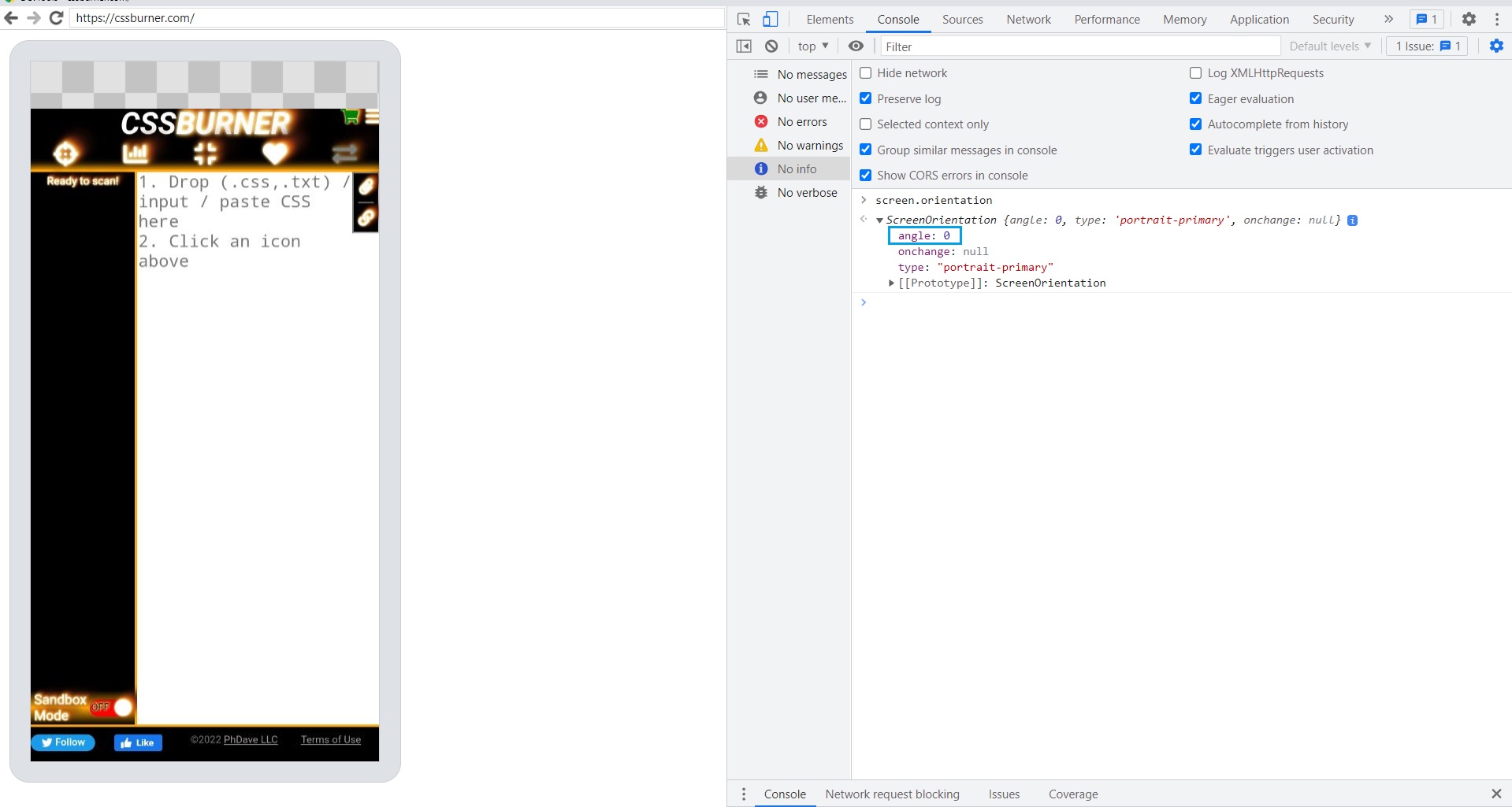
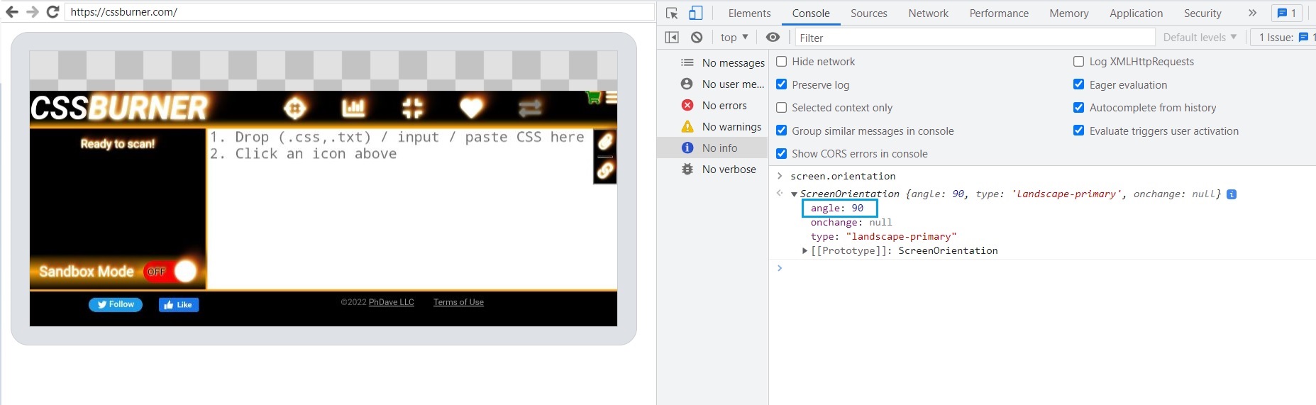
CSSBurner
- 1,565
- 15
- 13
9
You can use mediaMatch to evaluate CSS media queries, e.g.
window
    .matchMedia('(orientation: portrait)')
    .addListener(function (m) {
        if (m.matches) {
            // portrait
        } else {
            // landscape
        }
    });
CSS media query fires before the orientationchange. If you are looking to capture the end of the event (when the rotation has been completed), see mobile viewport height after orientation change.
7
You can use the orientationchange event like so:
window.addEventListener('orientationchange', function(event) {
     /* update layout per new orientation */
});
Nikola Lukic
- 4,001
- 6
- 44
- 75
mdale
- 97
- 1
- 3
4
I realized that nobody mentioned what happens when the device is held upside-down in this thread.
window.orientation returns -90 or 90 when held horizontal. It returns 0 or 180 when held vertical. Some devices do and some don't support being held upside-down. I recommend,
window.addEventListener("orientationchange", function() {

  if ( window.orientation == 0 || window.orientation == 180) {
    // WHEN IN PORTRAIT MODE

  } else {
    // WHEN IN LANDSCAPE MODE

  }
}, false);
Also note that window.orientation returns undefined on desktops.
HolyResistance
- 594
- 1
- 8
- 26
-
As for the deprecation of window.orientation it is unclear if browsers will really stop recognizing it. You must follow both the Android and the iOS side of the world. – HolyResistance Oct 17 '21 at 17:10
1
From "Cross-device, cross-browser portrait-landscape detection"
This is about finding out whether a mobile device is in portrait or landscape mode; you don't need to care about its orientation. For all you know, if you hold your iPad upside down, it's in portrait mode.
$(window).bind("resize", function(){
    screenOrientation = ($(window).width() > $(window).height())? 90 : 0;
});
90 means landscape, 0 means portrait, cross browser, cross device.
The window.onresize event is available everywhere, and it's always fired at the right time; never too early, never too late. As a matter of fact, the size of the screen is always accurate as well.
The JavaScript version would be this, correct me please if I am wrong.
  function getScreenOrientation() {
    screenOrientation = window.outerWidth > window.outerHeight ? 90 : 0;
    console.log("screenOrientation = " + screenOrientation);
  }
  window.addEventListener("resize", function(event) {
    getScreenOrientation();
  });
  getScreenOrientation();
lowtechsun
- 1,915
- 5
- 27
- 55
-
1How about situation when user holds his phone in a portrait orientation, then opens a virtual keyboard which causes width became bigger then height on small screens? User still holds the phone in same portrait orientation, but your approach can give false-positive result of orientation change. – Illia Ratkevych Jul 26 '16 at 15:22
-
@IlliaRatkevych Good point. However this could easily be stopped by checking if both sides changed since the beginning / since the previous check. – lowtechsun Jun 14 '18 at 11:17
-
For me using the jquery event worked both on android and iphone. http://api.jquerymobile.com/orientationchange/ – Sotiris Zegiannis Jan 31 '19 at 15:29
0
An easy to use snippet :
function doOnOrientationChange()
{
    switch(window.orientation)
    {
        case -90:
        case 90:
          // alert('landscape');
          $('#portrait').css({display:'none'});
          $('#landscape').css({display:'block'});

          break;
        default:
          // alert('portrait');
          $('#portrait').css({display:'block'});
          $('#landscape').css({display:'none'});
          break;
    }
}

window.addEventListener('orientationchange', doOnOrientationChange);

// First launch
doOnOrientationChange();
brydar
- 151
- 1
- 4
0
window.orientation is what you're looking for. there's also an onOrientationChange event works for android, iphone and, i'm mostly sure, for ipad
rootless
- 139
- 12
0
orientationChange is deprecated and also not supported in some browsers, innerHeight and outerHeight sometimes give inconsistent results in ios so we can use document.documentElement to check orientation along with resize event
const { clientWidth, clientHeight } = document.documentElement;

if (clientHeight > clientWidth) {
      setOrientation("portrait-secondary");
    } else {
      setOrientation("landscape-primary");
    }
Shadab Ali
- 369
- 3
- 10
-
1While this code snippet may answer the question, it's better to include explaination on what the code actually does. – dan1st Jan 07 '23 at 17:09
0
Adding to the @mplungjan answer, I found better results using the webkit "native" (I don't really how to called it) event, 'deviceorientation'.
In the Mozilla Developer network they have a good explanation about how to normalize between webkit and Gecko that helped me to solve this problem.
Hugo
- 6,244
- 8
- 37
- 43
-1
As of 2022
Once you get ready like this,
let theDeviceIsRotated;
function handlePortraitOrLandscape() {
  setTimeout(afterAnUnnoticableDelay,100); // This solves the wrong-firing-order issue on Samsung Browser.
  function afterAnUnnoticableDelay() {
    if (screen.orientation) { // Mainly for Android (as of 2022)
      // Returns 0 or 90 or 270 or 180
      if (screen.orientation.angle == 0)   {    theDeviceIsRotated="no";     }
      if (screen.orientation.angle == 90)  {    theDeviceIsRotated="toTheLeft";     }
      if (screen.orientation.angle == 270) {    theDeviceIsRotated="toTheRight";     }
      if (screen.orientation.angle == 180) {    theDeviceIsRotated="upsideDown";     }
    } else { // Mainly for iOS (as of 2022)
      // Returns 0 or 90 or -90 or 180
      if (window.orientation == 0)   {    theDeviceIsRotated="no";     }
      if (window.orientation == 90)  {    theDeviceIsRotated="toTheLeft";     }
      if (window.orientation == -90) {    theDeviceIsRotated="toTheRight";     }
      if (window.orientation == 180) {    theDeviceIsRotated="upsideDown";     }
    }
  }
}
handlePortraitOrLandscape(); // Set for the first time
window.addEventListener("resize",handlePortraitOrLandscape); // Update when change happens
you can
if (theDeviceIsRotated == "no") {
  // Do your thing
} else if (theDeviceIsRotated == "toTheLeft") {
  // Do your thing
} else if (theDeviceIsRotated == "toTheRight") {
  // Do your thing
} else if (theDeviceIsRotated == "upsideDown") {
  // Do your thing
} else {
  // The mysterious 5th orientation nobody has ever seen yet
}
but note that
RESIZE does not fire when switching from 90 to 270 directly (without triggering a portrait view in between)
THEREFORE WE CANNOT RELY ON
window.addEventListener("resize",screenOrientationHasChanged);
AND THERE IS THE EXACT SAME PROBLEM WITH
window.screen.orientation.addEventListener('change',screenOrientationHasChanged);
ALSO WITH
window.addEventListener("orientationchange",screenOrientationHasChanged);
THIS SADLY MEANS THAT AS OF 2022 THERE IS NO RELIABLE WAY TO DETECT SCREEN ORIENTATION CHANGE even by using setInterval
BECAUSE neither screen.orientation.angle nor screen.orientation.type is updated when you go from 90 to 270 without triggering a portrait view in between.
So the following is not any better than resize on mobile devices
if (screen.orientation) {
  window.screen.orientation.addEventListener('change',screenOrientationHasChanged); // https://whatwebcando.today/screen-orientation.html
} else {
  window.addEventListener("orientationchange",screenOrientationHasChanged); // https://developer.mozilla.org/en-US/docs/Web/API/Window/orientationchange_event
}
You may try to lock the screen orientation to avoid errors but that does not work on iOS as of 2022 and it only works with fullscreen mode on Android.
HolyResistance
- 594
- 1
- 8
- 26