Make the container inline-block (or any shrink-to-fit configuration like table,inline-grid,inline-flex, float,absolute etc) then force the width of text to be 0 so the width of the container is defined by the image (the text doesn't contribute to the width) then force the width again to be 100% using min-width
.parent {
  background: pink;
  display:inline-block;
}

img {
  display: block;
  max-height: 70vh;
}

.description {
  width:0;
  min-width:100%;
}
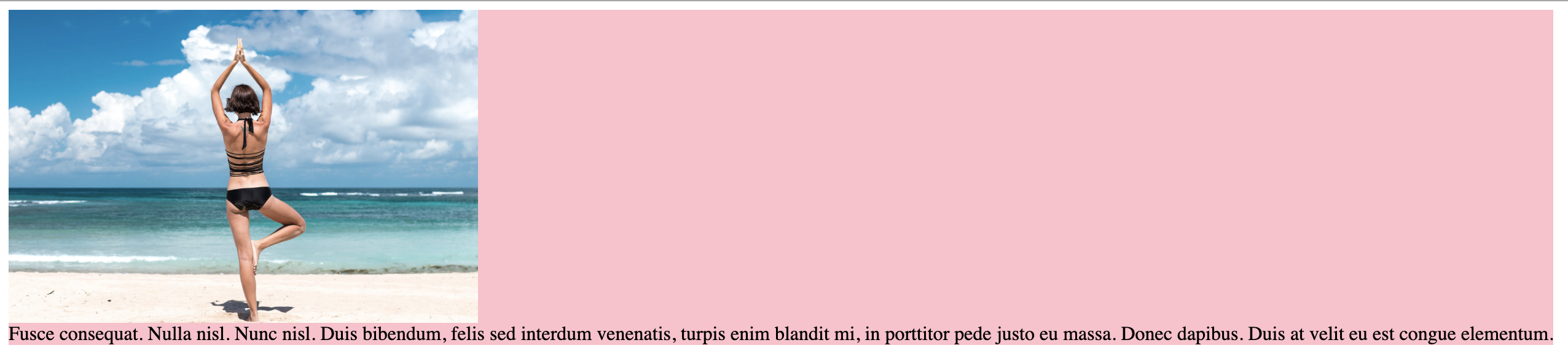
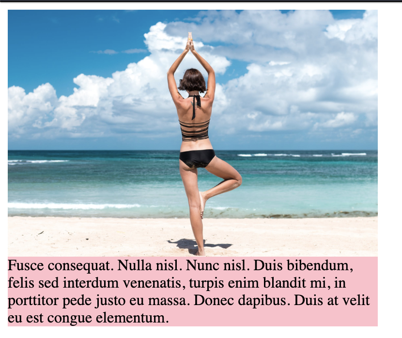
<div class="parent">
    <img src="https://picsum.photos/id/1004/900/600">
  <div class="description">
    Fusce consequat. Nulla nisl. Nunc nisl. Duis bibendum, felis sed interdum   venenatis, turpis enim blandit mi, in porttitor pede justo eu massa. Donec dapibus. Duis at velit eu est congue elementum.
  </div>
</div>
The same trick work even without image where you need any element to be sized based on another one.
Example with text defining the size of another text:
.parent {
  background: pink;
  display:inline-block;
}

.description {
  width:0;
  min-width:100%;
}
<div class="parent">
   <h2>a title that will define the width</h2>
  <div class="description">
    Fusce consequat. Nulla nisl. Nunc nisl. Duis bibendum, felis sed interdum   venenatis, turpis enim blandit mi, in porttitor pede justo eu massa. Donec dapibus. Duis at velit eu est congue elementum.
  </div>
</div>
Example with text defining the size of the image (the opposite of the first snippet)
.parent {
  background: pink;
  display:inline-block;
}

img {
  width:0;
  min-width:100%;
}
<div class="parent">
    <img src="https://picsum.photos/id/1004/900/600">
   <h2>a title that will define the width</h2>
</div>

<div class="parent">
    <img src="https://picsum.photos/id/1004/900/600">
   <h2>define the width</h2>
</div>

<div class="parent">
    <img src="https://picsum.photos/id/1004/900/600">
   <h2>very small</h2>
</div>
It can also work with complex structure.
Example using CSS grid:
.container {
  display: inline-grid;
  border: 1px solid;
  grid-template-columns: auto auto;
}
.container > div {
  padding:2px;
  border:1px solid green;
}
.auto {
  grid-column:1/-1;
  width:0;
  min-width:100%;
}
<div class="container">
  <div>some text here</div>
  <div>and here</div>
  <img src="https://picsum.photos/id/1004/900/600" class="auto">
</div>
<br>

<div class="container">
  <div>some text here</div>
  <div>and a long one here</div>
  <p class="auto">Lorem ipsum dolor sit amet, consectetur adipiscing elit. Duis ornare lacus at nisi laoreet, a fermentum augue vestibulum. Cras convallis ultrices quam, ac fermentum nibh posuere eu. Cras in pellentesque lorem. In et condimentum justo. Phasellus scelerisque nisi vitae vestibulum volutpat. Duis sit amet augue </p>
</div>
another one with table:
table {
  display: table;
  border:1px solid green;
}

td {
  padding: 5px;
  text-align: center;
  border:1px solid green;
}

.auto {
  width: 0;
  min-width: 100%;
  display: block;
}
<table>
  <tr>
    <td>text </td>
    <td>more text</td>
    <td>A</td>
  </tr>
  <tr>
    <td colspan="3"><img src="https://picsum.photos/id/1004/900/600" class="auto"></td>
  </tr>
</table>

<table>
  <tr>
    <td>long text here</td>
    <td>more text</td>
    <td>AAAAAAAA</td>
  </tr>
  <tr>
    <td colspan="3"><p class="auto">Lorem ipsum dolor sit amet, consectetur adipiscing elit. Duis ornare lacus at nisi laoreet, a fermentum augue vestibulum. Cras convallis ultrices quam, ac fermentum nibh posuere eu. Cras in pellentesque lorem. In et condimentum justo. Phasellus scelerisque nisi vitae vestibulum volutpat. Duis sit amet augue </p></td>
  </tr>
</table>
We can also use contain: size that will do the same job as width:0; min-width:100%;
.parent {
  background: pink;
  display: inline-block;
}

img {
  display: block;
  max-height: 70vh;
}

.description {
  contain: size;
}
<div class="parent">
  <img src="https://picsum.photos/id/1004/900/600">
  <div class="description">
    Fusce consequat. Nulla nisl. Nunc nisl. Duis bibendum, felis sed interdum venenatis, turpis enim blandit mi, in porttitor pede justo eu massa. Donec dapibus. Duis at velit eu est congue elementum.
  </div>
</div>