SwiftUI 3.0
Using tint
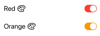
A new modifier was introduced that can also change the Toggle color:
Toggle(isOn: $isToggleOn) {
    Text("Red")
    Image(systemName: "paintpalette")
}
.tint(.red)

Toggle(isOn: $isToggleOn) {
    Text("Orange")
    Image(systemName: "paintpalette")
}
.tint(.orange)

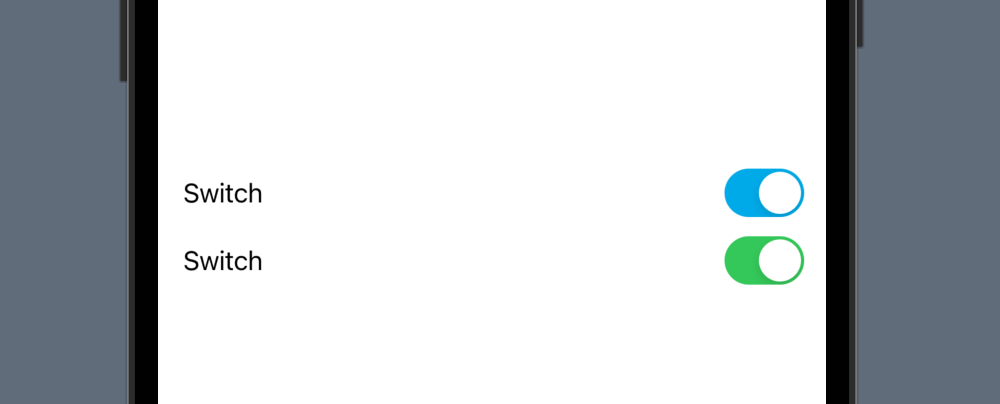
SwiftUI 2.0
Using SwitchToggleStyle
You can now set a tint color for the on position only in SwiftUI 2.0:
Toggle(isOn: $isToggleOn) {
    Text("Red")
    Image(systemName: "paintpalette")
}
.toggleStyle(SwitchToggleStyle(tint: Color.red))

Toggle(isOn: $isToggleOn) {
    Text("Orange")
    Image(systemName: "paintpalette")
}
.toggleStyle(SwitchToggleStyle(tint: Color.orange))
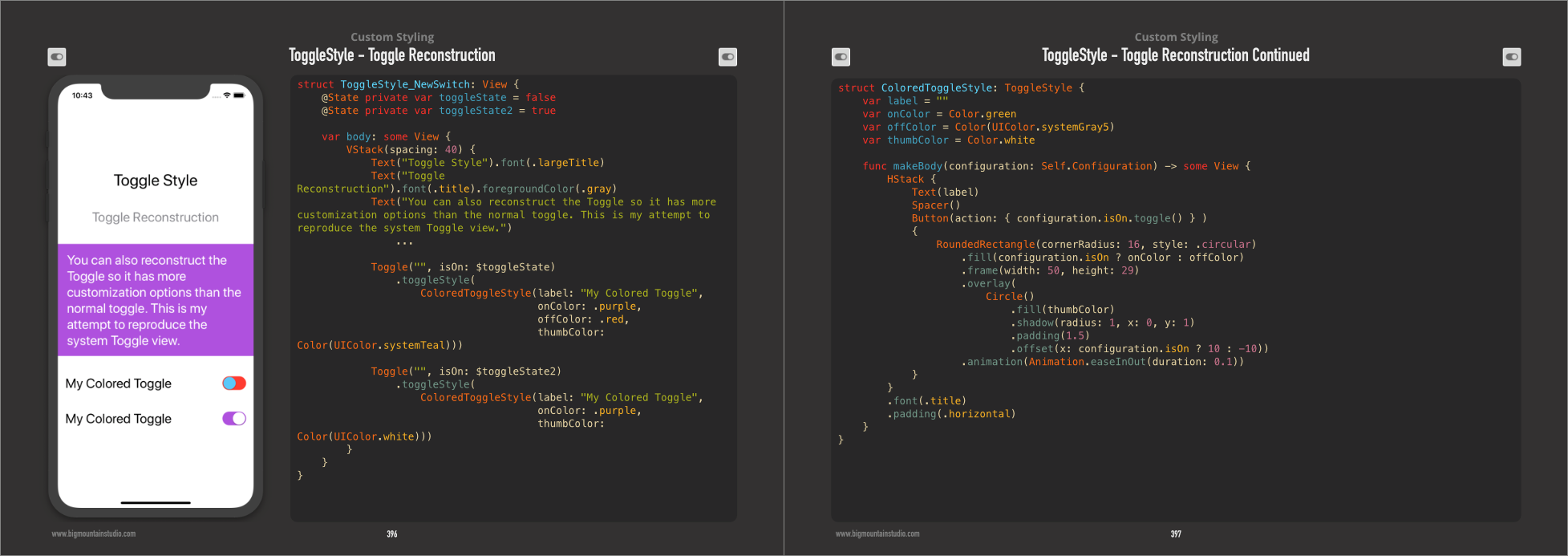
SwiftUI 1.0
Using ToggleStyle
I created a new ToggleStyle to change the three colors of the Toggle (on color, off color, and the thumb).
struct ColoredToggleStyle: ToggleStyle {
    var label = ""
    var onColor = Color(UIColor.green)
    var offColor = Color(UIColor.systemGray5)
    var thumbColor = Color.white

    func makeBody(configuration: Self.Configuration) -> some View {
        HStack {
            Text(label)
            Spacer()
            Button(action: { configuration.isOn.toggle() } )
            {
                RoundedRectangle(cornerRadius: 16, style: .circular)
                    .fill(configuration.isOn ? onColor : offColor)
                    .frame(width: 50, height: 29)
                    .overlay(
                        Circle()
                            .fill(thumbColor)
                            .shadow(radius: 1, x: 0, y: 1)
                            .padding(1.5)
                            .offset(x: configuration.isOn ? 10 : -10))
                    .animation(Animation.easeInOut(duration: 0.1))
            }
        }
        .font(.title)
        .padding(.horizontal)
    }
}
Examples of Use
Toggle("", isOn: $toggleState)
    .toggleStyle(
        ColoredToggleStyle(label: "My Colored Toggle",
                           onColor: .green,
                           offColor: .red,
                           thumbColor: Color(UIColor.systemTeal)))

Toggle("", isOn: $toggleState2)
    .toggleStyle(
        ColoredToggleStyle(label: "My Colored Toggle",
                           onColor: .purple))
From the SwiftUI Book


