17

How can I create the following shape with CSS?

Enter image description here

I tried this to be a solution:

.triangle:after {
  position: absolute;
  content: "";
  width: 0;
  height: 0;
  margin-top: 1px;
  margin-left: 2px;
  border-left: 10px solid transparent;
  border-right: 10px solid transparent;
  border-bottom: 10px solid white;
}

.triangle:before {
  position: absolute;
  content: "";
  width: 0;
  height: 0;
  border-left: 12px solid transparent;
  border-right: 12px solid transparent;
  border-bottom: 12px solid black;
}
<div class="triangle"></div>

You can see it working at Triangle. This is working, but with a trick of borders. Is there another way it could be done?

Using SVG vectors this can be done easily, but I don't want to go that lengthy way.

InSync
  • 4,851
  • 4
  • 8
  • 30
Manoz
  • 6,507
  • 13
  • 68
  • 114
  • Only with CSS ? And with transparent body? – Maen Apr 26 '13 at 07:47
  • http://apps.eky.hk/css-triangle-generator/ – Dipesh Parmar Apr 26 '13 at 07:48
  • http://hedgerwow.appspot.com/demo/arrows – Dipesh Parmar Apr 26 '13 at 07:49
  • http://jonrohan.me/guide/css/creating-triangles-in-css/ – Dipesh Parmar Apr 26 '13 at 07:49
  • @Bigood: Yeah only with CSS, because i know Using SVG graphics is pretty lengthy. – Manoz Apr 26 '13 at 07:51
  • @Manoz Do you want only borders of your triangle? – Maen Apr 26 '13 at 07:52
  • @Bigood: yes! I think giving strokes will do that? isn't it? – Manoz Apr 26 '13 at 07:55
  • 9
    In all seriousness, SVG is the most appropriate solution here. Yes you can acheive some very clever things with CSS, but SVG is designed for drawing arbitrary shapes; CSS isn't. The irony is that you're discounting SVG because you think it's hard, but really it isn't. It's honestly pretty easy. Sure SVG can get complex if you're drawing complex shapes, but a basic triangle is not complex; it takes less SVG code to draw a triangle than CSS, and it's easier to understand the code too. – Spudley Apr 26 '13 at 08:06

9 Answers9

18

I've found a webkit-only solution, using the ▲ character:

.triangle {
  -webkit-text-stroke: 12px black;
  color: transparent;
  font-size: 200px;
}
<div class="triangle">&#9650;</div>

Extras:

Maen
  • 10,603
  • 3
  • 45
  • 71
  • @Bigood: This is finest solution i get in this question & tricky ;) – Manoz Apr 26 '13 at 08:16
  • @Manoz Even samuel was good, he got my upvote, as that will be cross browser where this is not, but this is real cool – Mr. Alien Apr 26 '13 at 08:17
  • @softvar Sure, but I won't post it here. Please ask a new question, and I'll try to answer it quickly. – Maen Dec 27 '13 at 13:03
10

CSS-border version:

.triangle {
  position: relative;
  width: 0;
  border-bottom: solid 50px black;
  border-right: solid 30px transparent;
  border-left: solid 30px transparent;
}

.triangle .empty {
  position: absolute;
  top: 9px;
  left: -21px;
  width: 0;
  border-bottom: solid 36px white;
  border-right: solid 21px transparent;
  border-left: solid 21px transparent;
}
<div class="triangle">
  <div class="empty"></div>
</div>

Adding a white triangle inside the black one: http://jsfiddle.net/samliew/Hcfsx/

InSync
  • 4,851
  • 4
  • 8
  • 30
Samuel Liew
  • 76,741
  • 107
  • 159
  • 260
9

In addition to the below answer using gradients, I also have an online generator for polygon shapes where you can get a border-only triangle: https://css-generators.com/polygon-shape/

.box {
  width: 200px;
  aspect-ratio: 1;
  clip-path: polygon(93.30% 75.00%,6.70% 75.00%,50.00% 0.00%,93.30% 75.00%,calc(50.00% - -0.00px) calc(0.00% - -35.00px),calc(6.70% - -30.31px) calc(75.00% - 17.50px),calc(93.30% - 30.31px) calc(75.00% - 17.50px),calc(50.00% - -0.00px) calc(0.00% - -35.00px));
  background: red;
}
<div class="box"></div>

Here is an idea using multiple background and linear-gradient:

.triangle {
  width:100px;
  height:100px;
  
  background:
    /* Left side */
    linear-gradient(to bottom left,
      transparent 49.5%,#000 50% calc(50% + 10px),
      transparent calc(50% + 11px)) right/50% 100%,
    /* right side */
    linear-gradient(to bottom right,
      transparent 49.5%,#000 50% calc(50% + 10px),
      transparent calc(50% + 11px)) left/50% 100%,
    /* bottom side*/
    linear-gradient(#000,#000) bottom/calc(100% - 20px) 10px;
  background-repeat:no-repeat;
}
<div class="triangle"></div>

You can consider CSS variables to easily adjust the shape:

.triangle {
  --t:10px;  /* Thickness */
  --c:black; /* Color */

  width:100px;
  height:100px;
  display:inline-block;
  
  background:
    /* Left side */
    linear-gradient(to bottom left,
      transparent 49.5%,var(--c) 50% calc(50% + var(--t)),
      transparent calc(50% + var(--t) + 1px)) right/50% 100%,
    /* right side */
    linear-gradient(to bottom right,
      transparent 49.5%,var(--c) 50% calc(50% + var(--t)),
      transparent calc(50% + var(--t) + 1px)) left/50% 100%,
    /* bottom side*/
    linear-gradient(var(--c),var(--c)) bottom/calc(100% - 2*var(--t)) var(--t);
  background-repeat:no-repeat;
}

body {
 background:pink;
}
<div class="triangle"></div>

<div class="triangle" style="--t:5px;--c:blue;width:150px"></div>

<div class="triangle" style="--t:8px;--c:red;height:150px"></div>

<div class="triangle" style="--t:15px;--c:green;width:80px"></div>

CSS triangle with border

A different syntax with less gradient:

.triangle {
  --t:10px;  /* Thickness */
  --c:black; /* Color */

  width:100px;
  height:100px;
  display:inline-block;
  border:var(--t) solid transparent;
  border-bottom-color:var(--c);
  background:
    /* Left side */
    linear-gradient(to bottom left,
      transparent 49.5%,var(--c) 50% calc(50% + var(--t)),
      transparent calc(50% + var(--t) + 1px)) right,
    /* right side */
    linear-gradient(to bottom right,
      transparent 49.5%,var(--c) 50% calc(50% + var(--t)),
      transparent calc(50% + var(--t) + 1px)) left;
  background-size:50% 100%;
  background-origin:border-box;
  background-repeat:no-repeat;
}

body {
 background:pink;
}
<div class="triangle"></div>

<div class="triangle" style="--t:5px;--c:blue;width:150px"></div>

<div class="triangle" style="--t:8px;--c:red;height:150px"></div>

<div class="triangle" style="--t:15px;--c:green;width:80px"></div>

You can consider the same idea to create a rectangle triangle:

.triangle {
  --t:10;  /* Thickness */
  --c:black; /* Color */

  width:100px;
  height:100px;
  display:inline-block;
  border:calc(var(--t)*1px) solid transparent;
  border-image:
    linear-gradient(to bottom left,
      transparent 49.5%,var(--c) 50%) var(--t);
  background:
    /* Left side */
    linear-gradient(to bottom left,
      transparent 49.5%,var(--c) 50% calc(50% + var(--t)*1px),
      transparent calc(50% + var(--t)*1px + 1px));
  background-origin:border-box;
  background-repeat:no-repeat;
}

body {
 background:pink;
}
<div class="triangle"></div>

<div class="triangle" style="--t:5;--c:blue;width:150px"></div>

<div class="triangle" style="--t:8;--c:red;height:150px"></div>

<div class="triangle" style="--t:15;--c:green;width:80px"></div>

CSS triangle with border

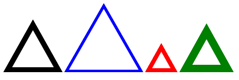
If you want an equilateral triangle simply keep a ratio bettween the width/height using the initial code

.triangle {
  --t:10px;  /* Thickness */
  --c:black; /* Color */

  width:100px;
  display:inline-block;
  border:var(--t) solid transparent;
  border-bottom-color:var(--c);
  background:
    /* Left side */
    linear-gradient(to bottom left,
      transparent 49.5%,var(--c) 50% calc(50% + var(--t)),
      transparent calc(50% + var(--t) + 1px)) right,
    /* right side */
    linear-gradient(to bottom right,
      transparent 49.5%,var(--c) 50% calc(50% + var(--t)),
      transparent calc(50% + var(--t) + 1px)) left;
  background-size:50% 100%;
  background-origin:border-box;
  background-repeat:no-repeat;
}

.triangle:before {
  content:"";
  display:block;
  padding-top:86.6%;
}

body {
 background:pink;
}
<div class="triangle"></div>

<div class="triangle" style="--t:5px;--c:blue;width:150px"></div>

<div class="triangle" style="--t:8px;--c:red;width:50px"></div>

<div class="triangle" style="--t:15px;--c:green;width:80px"></div>

CSS triangle with border

Related answer for more details about the calculation: How do CSS triangles work?

Temani Afif
  • 245,468
  • 26
  • 309
  • 415
  • Why does this solution turn into a solid black triangle if the width and the height is set to a low number like 30px? What would be the correction in that instance? – klewis Jul 14 '22 at 19:01
  • @klewis if you set a width/height that is smaller than the twice the border thickness then you have no room for a space inside and you will end with a solid triangle – Temani Afif Jul 14 '22 at 20:36
7

Try using SVG

<svg xmlns="http://www.w3.org/2000/svg" version="1.1">
  <polygon points="200,10 250,190 160,210"
  style="fill:lime;stroke:purple;stroke-width:1"/>
</svg>

Here is the tutorial

Sowmya
  • 26,684
  • 21
  • 96
  • 136
  • 3
    @Bigood That wasn't mentioned in question. My answer is older than his comment – Sowmya Apr 26 '13 at 07:54
  • 3
    +1 because SVG is far a more appropriate solution even if it isn't what the OP actually asked for. Plus the OP is obviously mistaken about SVG -- the answer given here can hardly be described as "lengthy". – Spudley Apr 26 '13 at 08:01
4

You can use the method I described here : How does this CSS triangle shape work? with a rotated pseudo element. You can then add a border to the rotated pseudo element to create the effect you are looking for.

You can also use this technique to display the triangle with borders over an image, gradient or any non plain backgrounds :

DEMO

.tr{
  width:40%;
  padding-bottom: 28.28%; /* = width / sqrt(2) */
  position:relative;
  border-bottom: 6px solid rgba(0,0,0,0.8);
  border-right: 6px solid transparent;
  border-left: 6px solid transparent;
  overflow:hidden;
}
.tr:before{
  content:'';
  position:absolute;
  bottom:0; left:0;
  width:100%; height:100%;
  border-top:6px solid rgba(0,0,0,0.8);
  border-left:6px solid rgba(0,0,0,0.8);
  
  -moz-box-sizing:border-box;
  box-sizing:border-box;
    
  -webkit-transform-origin:0 100%;
  -ms-transform-origin:0 100%;
  transform-origin:0 100%;
    
  -webkit-transform: rotate(45deg);
  -ms-transform: rotate(45deg);
  transform: rotate(45deg);
}


/* FOLLOWING JUST FOR THE DEMO */
body{background:url('https://picsum.photos/id/100/1000/1000');background-size:cover;}
<div class="tr"></div>
Temani Afif
  • 245,468
  • 26
  • 309
  • 415
web-tiki
  • 99,765
  • 32
  • 217
  • 249
3

Consider using the <canvas> element. I build a simple triangle on jsfiddle - nothing fancy, yet.

    var canvas = document.getElementById('myCanvas');
    var context = canvas.getContext('2d');

    context.beginPath();
    context.moveTo(10, 0);
    context.lineTo(20, 20);
    context.lineTo(0, 20);
    context.closePath();
    context.fill();
<canvas id="myCanvas" width="20" height="20"></canvas>
enxaneta
  • 31,608
  • 5
  • 29
  • 42
Imperative
  • 3,138
  • 2
  • 25
  • 40
2

    .triangle{
        width:0;
        border-bottom:solid 30px black;
        border-right:solid 30px transparent;
        border-left:solid 30px transparent;
    }
    <div class="triangle">
    </div>

This will be a triangle pointed towards the top. Don't specify the border to the side where you need it to be pointed.

The above is an equilateral triangle. Remove border-left to make it a right-angled triangle.

enxaneta
  • 31,608
  • 5
  • 29
  • 42
sakthi
  • 929
  • 6
  • 18
2

clip-path could also be considered:

html {
  /* init size and shape to the triangle*/
  --base: 155px;
  --ratio: 1;
  /* try too 0.71*/
  ;
}

[data-triangle] {
  width: var(--base);
  height: calc(var(--base) * var(--ratio));
  clip-path: polygon( 0 100%, 50% 0, 100% 100%, 94% 96%, 50% 8%, 6% 96%, 96% 96%, 100% 100%);
  background: gray;
}


/* demo makup */

html {
  display: grid;
  min-height: 100vh;
}

body {
  background: repeating-linear-gradient(45deg, silver 0, #444, gold, blue, lime, tomato, purple, gray 5em) 0 0 / 100% 100%;
  margin: auto;
  text-align: center;
  box-shadow: inset 0 0 0 100vw rgba(0, 0, 0, 0.5), 0 0 0 100vw rgba(0, 0, 0, 0.5);
  color:gray
}

[data-triangle] {
  transition: 1s;
}

body:hover [data-triangle]{
  background: black;
}

body:hover {
  filter: drop-shadow(0 0 1px gold)drop-shadow(0 0 1px white)drop-shadow(0 0 1px white)drop-shadow(0 0 1px white)drop-shadow(0 0 1px white)drop-shadow(0 0 10px white);
  /*make that triangle obvious over that funny gradient*/
  color: transparent;
  box-shadow: 0 0;
}


}
<div data-triangle></div>
hover to highlight

to help you create your clip-path, you can use this online tool https://bennettfeely.com/clippy/

G-Cyrillus
  • 101,410
  • 14
  • 105
  • 129
0

I found a nice solution, a bit tricky but for me it was the most easy way to do it: link to code-pen

.triangle {
position: absolute;
margin: auto;
top: -70px;
left: 0;
right: 0;
width: 137px;
height: 137px;
transform: rotate(45deg);
-webkit-transform: rotate(45deg);
-moz-transform: rotate(45deg);
-o-transform: rotate(45deg);
-ms-transform: rotate(45deg);
border-right: 4px solid #e74c3c;
border-bottom: 4px solid #e74c3c;

}

NNH
  • 265
  • 3
  • 10