I have written a detailed explanation about using GeometryReader, view preferences and anchor preferences. The code below uses those concepts. For further information on how they work, check this article I posted: https://swiftui-lab.com/communicating-with-the-view-tree-part-1/
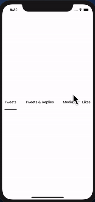
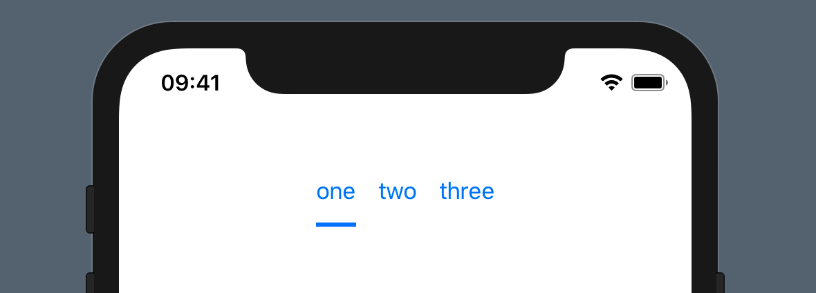
The solution below, will properly animate the underline:

I struggled to make this work and I agree with you. Sometimes, you just need to be able to pass up or down the hierarchy, some framing information. In fact, the WWDC2019 session 237 (Building Custom Views with SwiftUI), explains that views communicate their sizing continuously. It basically says Parent proposes size to child, childen decide how they want to layout theirselves and communicate back to the parent. How they do that? I suspect the anchorPreference has something to do with it. However it is very obscure and not at all documented yet. The API is exposed, but grasping how those long function prototypes work... that's a hell I do not have time for right now.
I think Apple has left this undocumented to force us rethink the whole framework and forget about "old" UIKit habits and start thinking declaratively. However, there are still times when this is needed. Have you ever wonder how the background modifier works? I would love to see that implementation. It would explain a lot! I'm hoping Apple will document preferences in the near future. I have been experimenting with custom PreferenceKey and it looks interesting.
Now back to your specific need, I managed to work it out. There are two dimensions you need (the x position and width of the text). One I get it fair and square, the other seems a bit of a hack. Nevertheless, it works perfectly.
The x position of the text I solved it by creating a custom horizontal alignment. More information on that check session 237 (at minute 19:00). Although I recommend you watch the whole thing, it sheds a lot of light on how the layout process works.
The width, however, I'm not so proud of... ;-) It requires DispatchQueue to avoid updating the view while being displayed. UPDATE: I fixed it in the second implementation down below
First implementation
extension HorizontalAlignment {
private enum UnderlineLeading: AlignmentID {
static func defaultValue(in d: ViewDimensions) -> CGFloat {
return d[.leading]
}
}
static let underlineLeading = HorizontalAlignment(UnderlineLeading.self)
}
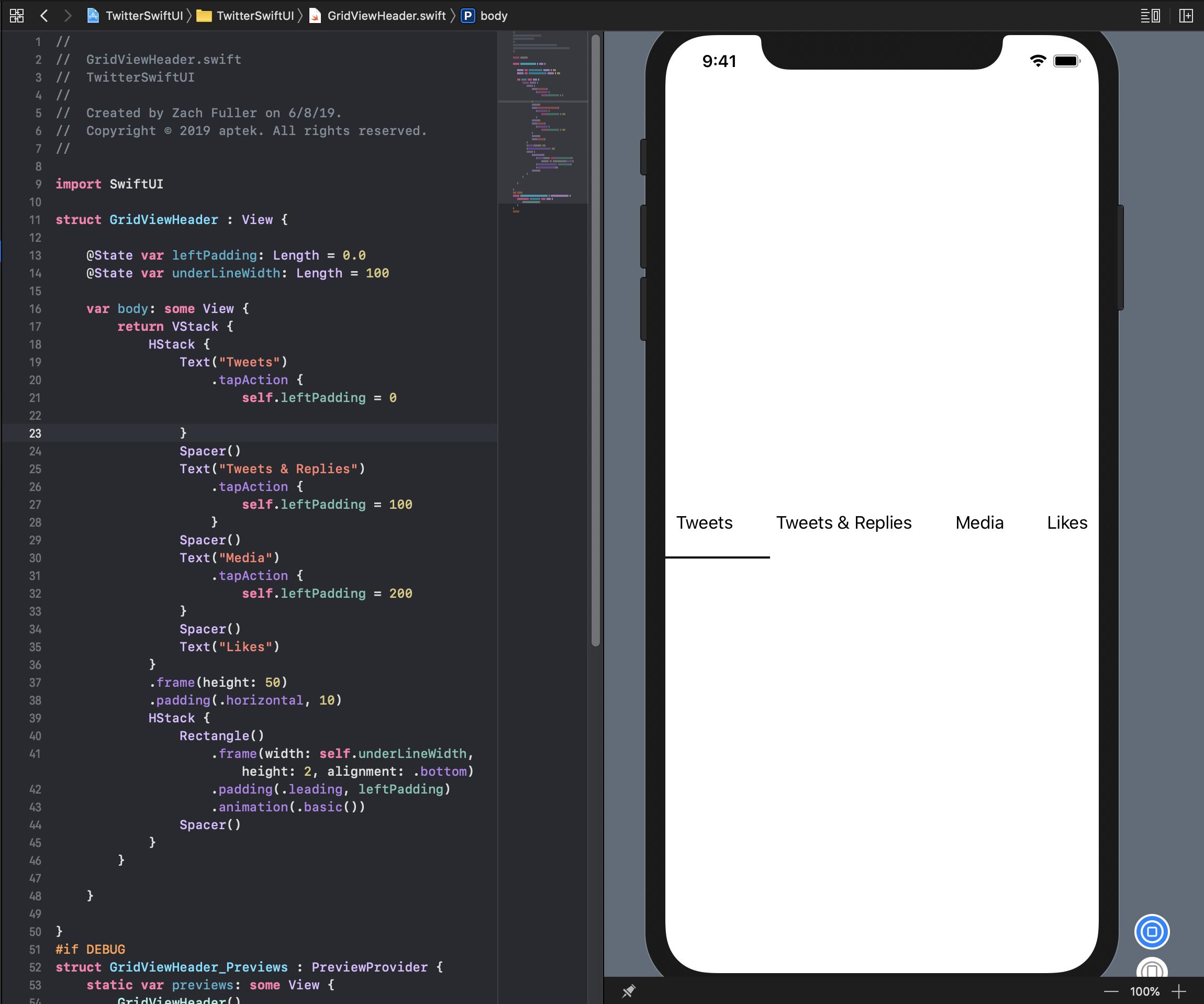
struct GridViewHeader : View {
@State private var activeIdx: Int = 0
@State private var w: [CGFloat] = [0, 0, 0, 0]
var body: some View {
return VStack(alignment: .underlineLeading) {
HStack {
Text("Tweets").modifier(MagicStuff(activeIdx: $activeIdx, widths: $w, idx: 0))
Spacer()
Text("Tweets & Replies").modifier(MagicStuff(activeIdx: $activeIdx, widths: $w, idx: 1))
Spacer()
Text("Media").modifier(MagicStuff(activeIdx: $activeIdx, widths: $w, idx: 2))
Spacer()
Text("Likes").modifier(MagicStuff(activeIdx: $activeIdx, widths: $w, idx: 3))
}
.frame(height: 50)
.padding(.horizontal, 10)
Rectangle()
.alignmentGuide(.underlineLeading) { d in d[.leading] }
.frame(width: w[activeIdx], height: 2)
.animation(.linear)
}
}
}
struct MagicStuff: ViewModifier {
@Binding var activeIdx: Int
@Binding var widths: [CGFloat]
let idx: Int
func body(content: Content) -> some View {
Group {
if activeIdx == idx {
content.alignmentGuide(.underlineLeading) { d in
DispatchQueue.main.async { self.widths[self.idx] = d.width }
return d[.leading]
}.onTapGesture { self.activeIdx = self.idx }
} else {
content.onTapGesture { self.activeIdx = self.idx }
}
}
}
}
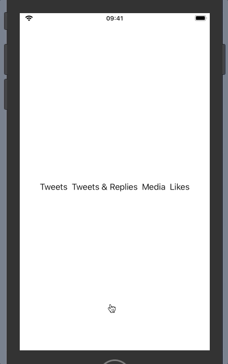
Update: Better implementation without using DispatchQueue
My first solution works, but I was not too proud of the way the width is passed to the underline view.
I found a better way of achieving the same thing. It turns out, the background modifier is very powerful. It is much more than a modifier that can let you decorate the background of a view.
The basic steps are:
- Use
Text("text").background(TextGeometry()). TextGeometry is a custom view that has a parent with the same size as the text view. That is what .background() does. Very powerful.
- In my implementation of TextGeometry I use GeometryReader, to get the geometry of the parent, which means, I get the geometry of the Text view, which means I now have the width.
- Now to pass the width back, I am using Preferences. There's zero documentation about them, but after a little experimentation, I think preferences are something like "view attributes" if you like. I created my custom PreferenceKey, called WidthPreferenceKey and I use it in TextGeometry to "attach" the width to the view, so it can be read higher in the hierarchy.
- Back in the ancestor, I use onPreferenceChange to detect changes in the width, and set the widths array accordingly.
It may all sound too complex, but the code illustrates it best. Here's the new implementation:
import SwiftUI

extension HorizontalAlignment {
    private enum UnderlineLeading: AlignmentID {
        static func defaultValue(in d: ViewDimensions) -> CGFloat {
            return d[.leading]
        }
    }

    static let underlineLeading = HorizontalAlignment(UnderlineLeading.self)
}

struct WidthPreferenceKey: PreferenceKey {
    static var defaultValue = CGFloat(0)

    static func reduce(value: inout CGFloat, nextValue: () -> CGFloat) {
        value = nextValue()
    }

    typealias Value = CGFloat
}


struct GridViewHeader : View {

    @State private var activeIdx: Int = 0
    @State private var w: [CGFloat] = [0, 0, 0, 0]

    var body: some View {
        return VStack(alignment: .underlineLeading) {
            HStack {
                Text("Tweets")
                    .modifier(MagicStuff(activeIdx: $activeIdx, idx: 0))
                    .background(TextGeometry())
                    .onPreferenceChange(WidthPreferenceKey.self, perform: { self.w[0] = $0 })

                Spacer()

                Text("Tweets & Replies")
                    .modifier(MagicStuff(activeIdx: $activeIdx, idx: 1))
                    .background(TextGeometry())
                    .onPreferenceChange(WidthPreferenceKey.self, perform: { self.w[1] = $0 })

                Spacer()

                Text("Media")
                    .modifier(MagicStuff(activeIdx: $activeIdx, idx: 2))
                    .background(TextGeometry())
                    .onPreferenceChange(WidthPreferenceKey.self, perform: { self.w[2] = $0 })

                Spacer()

                Text("Likes")
                    .modifier(MagicStuff(activeIdx: $activeIdx, idx: 3))
                    .background(TextGeometry())
                    .onPreferenceChange(WidthPreferenceKey.self, perform: { self.w[3] = $0 })

                }
                .frame(height: 50)
                .padding(.horizontal, 10)
            Rectangle()
                .alignmentGuide(.underlineLeading) { d in d[.leading]  }
                .frame(width: w[activeIdx],  height: 2)
                .animation(.linear)
        }
    }
}

struct TextGeometry: View {
    var body: some View {
        GeometryReader { geometry in
            return Rectangle().fill(Color.clear).preference(key: WidthPreferenceKey.self, value: geometry.size.width)
        }
    }
}

struct MagicStuff: ViewModifier {
    @Binding var activeIdx: Int
    let idx: Int

    func body(content: Content) -> some View {
        Group {
            if activeIdx == idx {
                content.alignmentGuide(.underlineLeading) { d in
                    return d[.leading]
                }.onTapGesture { self.activeIdx = self.idx }

            } else {
                content.onTapGesture { self.activeIdx = self.idx }
            }
        }
    }
}