264

I have two columns:

<div class="col-md-6"></div>

How can I add a space between them?

The output would simply be two columns right next to each other taking up the whole width of the page. Say the width was set to 1000px then each div would be 500px wide.

If I wanted a 100px space between the two how could I achieve this automatically with Bootstrap: the divs sizes would become 450px each to compensate for the spacing.

Alexander Abakumov
  • 13,617
  • 16
  • 88
  • 129
Muhammed Bhikha
  • 4,881
  • 9
  • 36
  • 47

36 Answers36

381

I was facing the same issue; and the following worked well for me.

<div class="row">
  <div class="col-md-6">
     <div class="col-md-12">
        Some Content.. 
     </div>
  </div>
  <div class="col-md-6">
     <div class="col-md-12">
        Some Second Content.. 
     </div>
  </div>
</div>

This will automatically render some space between the 2 divs.

enter image description here

Halo
  • 1,730
  • 1
  • 8
  • 31
Utpal - Ur Best Pal
  • 4,472
  • 3
  • 17
  • 28
  • mainly due to gutter widths. – Utpal - Ur Best Pal Feb 19 '16 at 06:13
  • 21
    "gutter widths" refers to the spacing in padding and margins defined in the core of bootstrap's grid system. In short, adding in a second div with `col-xs-12` is the same as adding a div with `width:100%; padding:0px 15x;` – mix3d Apr 12 '16 at 13:39
  • @sixty4bit could you share your code; may be I can help you. – Utpal - Ur Best Pal Sep 09 '16 at 06:37
  • that'd be great @Utpal-UrBestPal, thanks! here's a gist: https://gist.github.com/davidcpell/8d344ff18d5d188115c0ff9ba6ef7d14 – sixty4bit Sep 09 '16 at 13:11
  • Hi @sixty4bit, it is working; to see the space kindly give border around col-12 class. Use bootstrap CDN http://getbootstrap.com/getting-started/ – Utpal - Ur Best Pal Sep 09 '16 at 16:30
  • 2
    If you're using this fix and it's not working, read why it works in @mix3d 's explanation and you'll understand what you're doing wrong. – MauF Apr 18 '17 at 19:34
  • This doesn't maintain the spacing when the columns stack :( – ScottyBlades Feb 15 '20 at 15:37
  • excellent solution because this is so simple and feels right when you are not bound to use specific widths to child divs/contents. Thanks a lot ;) – Akhil May 11 '20 at 16:20
  • Good sollution but this doesnt just add spacing between the divs. It also adds it at the sides. – Bas van Dijk Jul 12 '20 at 00:57
  • Great solution! As someone mentioned it doesn't just add spacing between the cols but was just what I needed. Much better than the above offset-solution, that leaves a oddly looking space between the cols. – marjon4 Sep 16 '20 at 14:00
  • This causes the columns to no longer have the same height (as shown in the screenshot). – Jon Schneider Nov 01 '20 at 14:33
  • Hi @JonSchneider no that is not true. I deliberately had created to of them with different heights as that was what I needed. – Utpal - Ur Best Pal Nov 02 '20 at 15:09
188

You can achieve spacing between columns using the col-md-offset-* classes, documented here. The spacing is consistent so that all of your columns line up correctly. To get even spacing and column size I would do the following:

<div class="row">
  <div class="col-md-5"></div>
  <div class="col-md-5 col-md-offset-2"></div>
</div>

In Bootstrap 4 use: offset-2 or offset-md-2

K. W. Cooper
  • 313
  • 3
  • 12
Ben
  • 10,106
  • 3
  • 40
  • 58
  • 39
    that would work when I want to stick with the default column sizes, what if I want a specific size of spacing, rather than offsetting the columns? – Muhammed Bhikha Sep 11 '13 at 12:14
  • 3
    In this case I would recommend using the provided mixins to adjust column gutters: http://getbootstrap.com/css/#grid-less - Bootstrap doesn't do what you ask in the question, it can't "adjust" grid widths to account for extra spacing in between because it is based on a pixel grid. – Ben Sep 11 '13 at 13:39
  • Ben, is it wise to suggest adding non semantic empty divs to the HTML in order to add grid gutters? – George Katsanos Sep 24 '14 at 12:49
  • 2
    George - you have the offset classes for this. But if you find the built in gutters insufficient then you might want to try compiling your own version of bootstrap, either from less or sass depending on your preferences. You can then modify the column widths and gutters to match your website. Adding empty divs isn't really bad though, what is important is coming up with something that you (and/or your team) can use consistently; if empty divs is the way that you achieve that then it's fine; remember that your markup is meant to be read by your developers, not your end users. – Ben Sep 24 '14 at 15:16
  • 52
    This post is not an answer at all, it creates a gap much bigger than asked. – Sebastien Nov 21 '16 at 14:12
  • 3
    In Bootstrap 4, this is offset-md-2 or offset-2 – Mahesh Mar 26 '20 at 19:12
82

I know I'm late to the party, but you could try spacing the boxes with padding.

<div class="col-md-6 box">
        <div class="inner">Hello</div>
</div>
<div class="col-md-6 box">
        <div class="inner">Hello</div>
</div>

CSS:

.box {
    padding: 0 5px 0 5px;
}
.box .inner {
    background-color: #fff;
}

Have a go at it

Robin Jonsson
  • 2,761
  • 3
  • 22
  • 42
30

you can use background-clip and box-model with border proprety

.box{
  box-sizing: border-box;
  border: 3px solid transparent;
  background-clip:padding-box;
}
<div class="row">
  <div class="col-xs-4 box"></div>
  <div class="col-xs-4 box"></div>
  <div class="col-xs-4 box"></div>
</div>
anon
  • 4,578
  • 3
  • 35
  • 54
Ali El Habchi
  • 401
  • 5
  • 3
  • The best hack I found in all the answers, thanks man it solved my issue as in my case this boxes comes dynamic from database. – Yousef Altaf Mar 06 '21 at 21:57
  • this is great! thanks, i can't change tags elements in my code, and this resolve changing only css, thank you! – Alisson Diel Jul 21 '22 at 12:08
14

I have had similar issues with space between columns. The root problem is that columns in bootstrap 3 and 4 use padding instead of margin. So background colors for two adjacent columns touch each other.

I found a solution that fit our problem and will most likely work for most people trying to space columns and maintain the same gutter widths as the rest of the grid system.

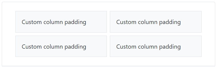
This was the end result we were going for

enter image description here

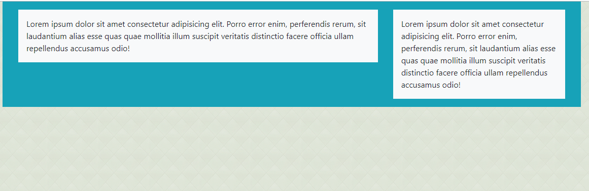
Having the gap with a drop shadow between columns was problematic. We did not want extra space between columns. We just wanted the gutters to be "transparent" so the background color of the site would appear between two white columns.

this is the markup for the two columns

<div class="row">
    <div class="col-sm-7">
        <div class="raised-block">
            <h3>Facebook</h3>
        </div>
    </div>
    <div class="col-sm-5">
        <div class="raised-block">
            <h3>Tweets</h3>
        </div>
    </div>
</div>

CSS

.raised-block {
    background-color: #fff;
    margin-bottom: 10px;
    margin-left: 0;
    margin-right: -0.625rem; // for us 0.625rem == 10px
    padding-left: 0.625rem;
    padding-right: 0.625rem;
}
@media (max-width: 33.9em){ // this is for our mobile layout where columns stack
    .raised-block {
        margin-left: -0.625rem;
    }
}
.row [class^="col-"]:first-child>.raised-block {
    // this is so the first column has no margin so it will not be "indented"
    margin-left: -0.625rem;
}

This approach does require an inner div with negative margins just like the "row" class bootstrap uses. And this div, we called it "raised-block", must be the direct sibling of a column

This way you still get proper padding inside your columns. I have seen solutions that appear to work by creating space, but unfortunately the columns they create have extra padding on either side of the row so it ends up making the row thinner that the grid layout was designed for. If you look at the image for the desired look, this would mean the two columns together would be smaller than the one larger one on top which breaks the natural structure of the grid.

The major drawback to this approach is that it requires extra markup wrapping the content of each columns. For us this works because only specific columns needed space between them to achieve the desired look.

TylerH
  • 20,799
  • 66
  • 75
  • 101
Joe Fitzgibbons
  • 331
  • 3
  • 8
13

According to Bootstrap 4 documentation you should give the parent a negative margin mx-n*, and the children a positive padding px-*

<link href="https://stackpath.bootstrapcdn.com/bootstrap/4.3.1/css/bootstrap.min.css" rel="stylesheet" />
<div class="row mx-n5">
  <div class="col px-5">
    <div class="p-3 border bg-light">Custom column padding</div>
  </div>
  <div class="col px-5">
    <div class="p-3 border bg-light">Custom column padding</div>
  </div>
</div>
estani
  • 24,254
  • 2
  • 93
  • 76
12

This will allow a space between the two columns and obviously if you want to change the default width you can go for mixins to modify the default bootstrap width. Or, you can give the width using the inline CSS style.

<div class="col-md-5 pull-left"></div>
<div class="col-md-5 pull-right"></div>
TylerH
  • 20,799
  • 66
  • 75
  • 101
Amit
  • 2,495
  • 14
  • 22
  • 4
    The semantic of this is not exactly what @Muhammed is asking. You are adding a change in the order of the columns with pull-left, pull-right. – Luchux Apr 16 '14 at 00:49
8

You can achieve spacing between columns using the col-xs-* classes,within in a col-xs-* div coded below. The spacing is consistent so that all of your columns line up correctly. To get even spacing and column size I would do the following:

<div class="container">
    <div class="col-md-3 ">
        <div class="col-md-12 well">
            Some Content..
        </div>
    </div>
    <div class="col-md-3 ">
        <div class="col-md-12 well">
            Some Second Content..
        </div>
    </div>
    <div class="col-md-3 ">
        <div class="col-md-12 well">
            Some Second Content..
        </div>
    </div>
    <div class="col-md-3 ">
        <div class="col-md-12 well">
            Some Second Content..
        </div>
    </div>
    <div class="col-md-3 ">
        <div class="col-md-12 well">
            Some Second Content..
        </div>
    </div>
    <div class="col-md-3 ">
        <div class="col-md-12 well">
            Some Second Content..
        </div>
    </div>
    <div class="col-md-3 ">
        <div class="col-md-12 well">
            Some Second Content..
        </div>
    </div>
    <div class="col-md-3 ">
        <div class="col-md-12 well">
            Some Second Content..
        </div>
    </div>
</div>
User_3535
  • 826
  • 1
  • 13
  • 30
7

Since you're using bootstrap, I guess you want to make the thing responsive. In that case you should'n use fixed sizes, in 'px' for example.

As a workaround to other solutions, I propose make both columns "col-md-5" instead of "col-md-6", and then in the parent element "row" that contains the columns, add the class "justify-content-between", which puts the free space in the middle, as you can check in the bootstrap doc here

This solution is also valid for more than two columns adjusting the "col-md-x" of course

hope it helps ;)

Hugo
  • 1,662
  • 18
  • 35
5

bootstrap 5 provides a more comfortable way to add gaps:

  1. using g-* class to make cols/rows spacings equal
  2. gx-* gy-* classes to make cols/rows spacings different
<div class="row g-2">
  <div class="col-6">...</div>
  <div class="col-6">...</div>
  <div class="col-6">...</div>
  <div class="col-6">...</div>
</div>

example

docs: https://getbootstrap.com/docs/5.0/layout/gutters/

Alex Shepel
  • 381
  • 5
  • 7
4

Inside the col-md-?, create another div and put picture in that div, than you can easily add padding like so.

<div class="row">
  <div class="col-md-8">
     <div class="thumbnail">
       <img src="#"/>
     </div>
  </div>
  <div class="col-md-4">
     <div class="thumbnail">
       <img src="#"/>
     </div>
  </div>   
</div>

<style>
  thumbnail{
     padding:4px;
           }
</style>
Farac
  • 41
  • 1
  • 1
4

Bootstrap 4, file custom.scss you can add following code:

$grid-gutter-width-base: 20px;

$grid-gutter-widths: ( xs: $grid-gutter-width-base, 
sm: $grid-gutter-width-base, 
md: $grid-gutter-width-base, 
lg: $grid-gutter-width-base, 
xl: $grid-gutter-width-base
);

by default $grid-gutter-width-base: 30px;

4

Since you are using Bootstrap, the column-gap property will be useful to implement. W3Schools Column-Gap for Bootstrap has documentation on how this can be used.

  • CSS:
.col-gap {
  column-gap: 2rem;
}

And for the HTML, have the class (col-gap) in the row div. But also note this may throw off the spacing of the col-md-6 (or other sizes) so to compensate reduce the size for each column. (i.e. col-md-6 -> col-md-5, even if there are only 2 columns)

  • HTML:
    //Row
    <div class="row col-gap justify-content-center">
 
    //Col 1
        <div class="col-md-5 ms-3 card p-5">
            <p>Div 1</p>
        </div>

    //Col 2
        <div class="col-md-5 ms-3 card p-5">
            <p>Div 2</p>
        </div>          
    </div>
Micah
  • 479
  • 1
  • 7
  • 17
3

enter image description here

Bootstrap 4 - Separate columns using nested rows.

<div class="container">
    <div class="row bg-info p-3">

        <!-- left column -->
        <div class="col-8 ">
            <div class="col-12 bg-light p-3">
                Lorem ipsum dolor sit amet consectetur adipisicing elit. Porro error enim, perferendis rerum, sit laudantium alias esse quas quae mollitia illum suscipit veritatis distinctio facere officia ullam repellendus accusamus odio!
            </div>
        </div>

        <!-- right column -->
        <div class="col-4 ">
            <div class="col-12 bg-light p-3">
                Lorem ipsum dolor sit amet consectetur adipisicing elit. Porro error enim, perferendis rerum, sit laudantium alias esse quas quae mollitia illum suscipit veritatis distinctio facere officia ullam repellendus accusamus odio!
            </div>
        </div>
    </div>
</div>
  • Maybe using the [answer](https://stackoverflow.com/a/57124328/6813732) provided by @estani is a more "classic" way to do this with bootstrap4 ? – sodimel Oct 09 '19 at 12:03
2

I had to figure out how to do this for 3 columns. I wanted to round the corners of the divs and couldn't get the spacing to work. I used margins. In my case I figured for 90% of the screen to be filled in by the divs and 10% for margins:

html:

<div class="row">
  <div id="orange" class="col-md-4">
    <h1>Orange Div</h1>
  </div>
  <div id="green" class="col-md-4">
    <h1>Green Div</h1>
  </div>
  <div id="aqua" class="col-md-4">
    <h1>Aqua Div</h1>
  </div>
</div>

and CSS:

#orange {
    background-color:orange;
    border-radius: 30px;
    padding: 20px;
    margin: 2.5% 2.5% 0 2.5%;
    width:30%;
}
#green {
    background-color:green;
    border-radius: 30px;
    padding: 20px;
    margin: 2.5% 0 0 0;
    width:30%;
}
#aqua {
    background-color:#39F;
    border-radius: 30px;
    padding: 20px;
    margin: 2.5% 2.5% 0 2.5%;
    width: 30%;
}

To make it resize correctly for mobile devices, I had the CSS change the width from 30% to width:92.5%; under @media (max-width:1023px)

T J
  • 42,762
  • 13
  • 83
  • 138
1

Use bootstrap's .form-group class. Like this in your case:

<div class="col-md-6 form-group"></div>
TylerH
  • 20,799
  • 66
  • 75
  • 101
S..
  • 5,511
  • 2
  • 36
  • 43
1

it's simple .. you have to add solid border right, left to col-* and it should be work ..:)

it looks like this : https://i.stack.imgur.com/CF5ZV.png

HTML :

<div class="row">
     <div class="col-sm-3" id="services_block">

     </div>
     <div class="col-sm-3" id="services_block">

     </div>
     <div class="col-sm-3" id="services_block">

     </div>
     <div class="col-sm-3" id="services_block">

     </div>
</div>

CSS :

div#services_block {
   height: 355px;
   background-color: #33363a;
   border-left:3px solid white;
   border-right:3px solid white;
}
1

Just white border around wrap element

.padding-pls{
  border-left: 13px solid white;
  border-right: 13px solid white;
}
.row .col-md-6:first-child>.padding-pls {
  border-left: 0px solid white;
}
.row .col-md-6:last-child>.padding-pls {
  border-right: 0px solid white;
}

and first+last child no border

    <div class="row">
      <div class="col-md-6">
        <div class="col-md-12 padding-pls">
          Keci
        </div>
      </div>
      <div class="col-md-6">
        <div class="col-md-12 padding-pls">
          Keci
        </div>
      </div>
  </div>
1

I know this post is a little dated but I ran in to this same problem. Example of my html.

<div class="row">
    <div class="col-xs-3">
        <div class="form-group">
            <label asp-for="FirstName" class="control-label"></label>
            <input asp-for="FirstName" class="form-control" />
            <span asp-validation-for="FirstName" class="text-danger"></span>
        </div>
    </div>
    <div class="col-xs-3">
        <div class="form-group">
            <label asp-for="LastName" class="control-label"></label>
            <input asp-for="LastName" class="form-control" />
            <span asp-validation-for="LastName" class="text-danger"></span>
        </div>
    </div>            
</div>

In order to create space between the groups I overrode bootstrap's margin of -15px in my site.css file by reducing the negative margin by 5.

Here's what I did...

.form-group {
    margin-right: -10px;
}

I hope this helps somebody else.

Mark Libner
  • 113
  • 1
  • 7
1

I needed one column on mobile and two columns from tablet portrait up, with equal spacing between them in the middle (also without any grid-added padding inside columns). Could be achieved using spacing utilities and omitting the number in col-md:

    <div class="container-fluid px-0">
        <div class="row no-gutters">
            <div class="col-sm-12 col-md mr-md-3" style="background-color: orange">
                <p><strong>Column 1</strong></p>
            </div>
            <div class="col-sm-12 col-md ml-md-3" style="background-color: orange">
                <p><strong>Column 1</strong></p>
            </div>
        </div>
    </div>

1

Bootstrap col slightly uses some spaces both to the left and right. I have just added a block element like div and set the border for the differences. Also, adding some extra padding or margin in that extra div will work perfectly..

<link href="https://stackpath.bootstrapcdn.com/bootstrap/4.5.2/css/bootstrap.min.css" rel="stylesheet"/>

<br><br>

<div class="container">
    <div class="row">
        <div class="col-6 ">
            <div class="border border-danger ">
                <h2 class="text-center">1</h2>
            </div>
        </div>
        <div class="col-6">
            <div class="border border-warning">
                <h2 class="text-center">2</h2>
            </div>
        </div>
    </div>
</div>
Micah
  • 479
  • 1
  • 7
  • 17
  • Bootstrap col slightly use some spaces both left and right. I have just added a block element like div and set border for the differences. also adding some extra padding or margin in that extra div will work perfectly – Shahi Papon Jan 09 '21 at 00:58
  • thanks for your comment, but can you please edit your answer and add that within the answer (to make it more usefull, and simpler to understand) – phoenixstudio Jan 09 '21 at 00:58
1

I don't think you can do this with Bootstrap alone. The space between columns is automatically added/maintained. If you need to add a specific width between columns you can do this trick to simulate the space: https://jsfiddle.net/loginet/3rogbh9s/5/

<div class="row">
    <div class="col-6">
        <div class="left-column">Left column</div>
    </div>
    <div class="col-6">
        <div class="right-column">Right column</div>
    </div>
</div>

and CSS

.left-column {
    padding: 10px;
    padding-right: 50px;
    background: white;
}

.right-column { 
    padding: 10px;
    padding-left: 50px; 
    background: white;  
}
Adrian P.
  • 5,060
  • 2
  • 46
  • 47
0

How about just adding a border the same color as the background using css? I'm new to this, so maybe there's a good reason not to, but it looked good when I tried it.

Brian
  • 19
  • 1
0

To obtain a particular width of spacing between columns, we have to set up padding in the standard Bootstrap's layout.

@import url('https://maxcdn.bootstrapcdn.com/bootstrap/3.3.6/css/bootstrap.min.css');

/* Check breakpoint at http://getbootstrap.com/css/#grid-media-queries */
@media (min-width: 992px) { 
  .space-100-px > .row > .col-md-6:first-child {
    padding: 0 50px 0 0; /* The first half of 100px */
  }
  .space-100-px > .row > .col-md-6:last-child {
    padding: 0 0 0 50px; /* The second half of 100px */
  }
}

/* The result will be easier to see. */ 
.space-100-px img {
  width: 100%;
  height: auto;
}
<div class="container-fluid space-100-px">
  <div class="row">
    <div class="col-md-6">
      <img src="http://placehold.it/450x100?text=Left" alt="Left">
    </div>
    <div class="col-md-6">
      <img src="http://placehold.it/450x100?text=Right" alt="Right">
    </div>
  </div>
</div>
Gleb Kemarsky
  • 10,160
  • 7
  • 43
  • 68
0

This will be useful..

.list-item{
  margin-right:-10px;
   margin-top:10px;
    margin-bottom: 10px;
    border: 1px solid #eee;
    padding: 0px;
  }
<div class="col-md-4">
  <div class="list-item">
      <h2>Your name</h2> 
  </div>
</div>
<div class="col-md-4">
   <div class="list-item"></div>
</div>

If use want to increase or decrease further margin in right side of the box then simply edit margin-right property of list-item.

sample output

enter image description here

Moumit
  • 8,314
  • 9
  • 55
  • 59
arulraj
  • 1
  • 1
0
    <div class="col-md-12 no_padding header_row"></div>


    <div class="second_row">
        <div class="col-md-4 box_shadow"></div>
        <div class="col-md-8 no_padding_right">
            <div class="col-md-12 box_shadow"></div>
        </div>
    </div>


    body{
    background:#F0F0F0;
}

.main_holder{
    min-height: 600px;
    margin-top: 40px;
    height: 600px;
}
.box_shadow{
    box-shadow: 0 1px 2px rgba(0,0,0,.1);
    background: white;
    height: auto;
    min-height: 500px;
}

.no_padding{
    padding: 0px !important;
}

.no_padding_right{
    padding-right: 0px !important;
}

.header_row{
    height: 60px;
    background: #00796B;
    -webkit-box-shadow: 0px 0px 9px 1px rgba(143,140,143,1);
    -moz-box-shadow: 0px 0px 9px 1px rgba(143,140,143,1);
    box-shadow: 0px 0px 9px 1px rgba(143,140,143,1); 
}

.second_row{
    position: relative;
    width: 100% !important;
    top: 20px;
}
RITHIN K
  • 9
  • 3
0
<div class="col-md-6">
    <div class="inner">
        <!-- Put the col-6 elements in the inner div -->
    </div>
</div>

This by default provides some padding inside the outer div the way you seem to need. Moreover you can also modify the padding using custom CSS.

Akshay R
  • 166
  • 1
  • 6
0

Simple Way

.row div{
  padding-left: 8px;
  padding-right: 8px;
}
0

Bootstrap 4

Documentation says (here):

Rows are wrappers for columns. Each column has horizontal padding (called a gutter) for controlling the space between them. This padding is then counteracted on the rows with negative margins. This way, all the content in your columns is visually aligned down the left side.

So the right answer is: set cols' padding-left/right equal to minus your row's margin-left/right. That simple.

#my-row {
  margin-left: -80px;
  margin-right: -80px;
}

#my-col {
  padding-left: 80px;
  padding-right: 80px;
}

Demo: https://codepen.io/frouo/pen/OqGaWN

col with custom spacing

frouo
  • 5,087
  • 3
  • 26
  • 29
0

Create a class and use:

margin: 1.5em .5em; max-width: calc(50% - 1em)!important;

Where 1em on the max-width is equal to the left/right margin added together.

WebDude0482
  • 763
  • 1
  • 5
  • 12
0
<div class="row">

  <div class="col-sm-6">
    <div class="card">
        Content one
    </div>
  </div>

  <div class="col-sm-6">
    <div class="card">
        Content two
    </div>
  </div>

</div>
Darwin
  • 1,695
  • 1
  • 19
  • 29
0

In Bootstrap v5.0 you can set gap with cssvariable:

.row {
  --bs-gutter-x: 100px; // column-gap
  --bs-gutter-y: 100px;  // row-gap
}
0

Use these classes : row, col-sm-4, mb-3, card, card-body, card-text

<div *ngFor="let grade of grades">{{grade.gradeTitle}}
<hr>
<div class="row" style="margin-bottom: 40px;">
    <div *ngFor="let level of getLevelsByGradeId(grade.gradeId)" class="col-sm-4 mb-3">
        <div class="card">
            <div class="card-body card-content">
                <span class="card-text">{{level.levelTitle}}</span>
                <i class="fa-solid fa-trash text-red fa-xl"></i>
            </div>
        </div>
    </div>
</div>
.card-content {
    display: flex;
    justify-content: space-between;
    align-items: center;
}

enter image description here

M Komaei
  • 7,006
  • 2
  • 28
  • 34
-2

This also one way of doing it and its works. Please check the following url https://jsfiddle.net/sarfarazk/ofgqm0sh/

<div class="container">
 <div class="row">
  <div class="col-md-6">
    <div class="bg-success">Lorem ipsum dolor sit amet, consectetur adipisicing elit, sed do eiusmod tempor incididunt ut labore et dolore magna aliqua.
    </div>
  </div>
  <div class="col-md-6">
    <div class="bg-warning">Sed ut perspiciatis unde omnis iste natus error sit voluptatem accusantium doloremque laudantium.
    </div>
  </div>
</div>
</div>
-3

Using margin-left is the way to go:

<div style="margin-left:-2px" class="col-md-6"></div>
<div style="margin-left:2px" class="col-md-6"></div>

works perfectly

alanh
  • 1,153
  • 10
  • 14
-6

With latest bootstrap version, you can use "cards"

VFB
  • 11
  • 3