476

How do I align a navbar item to right?

I want to have the login and register to the right. But everything I try does not seem to work.

Picture of Navbar

This is what I have tried so far:

  • <div> around the <ul> with the atribute: style="float: right"
  • <div> around the <ul> with the atribute: style="text-align: right"
  • tried those two things on the <li> tags
  • tried all those things again with !important added to the end
  • changed nav-item to nav-right in the <li>
  • added a pull-sm-right class to the <li>
  • added a align-content-end class to the <li>

This is my code:

<div id="app" class="container">
  <nav class="navbar navbar-toggleable-md navbar-light bg-faded">
    <button class="navbar-toggler navbar-toggler-right" type="button" data-toggle="collapse" data-target="#navbarNavDropdown" aria-controls="navbarNavDropdown" aria-expanded="false" aria-label="Toggle navigation">
      <span class="navbar-toggler-icon"></span>
    </button>
    <a class="navbar-brand" href="#">Navbar</a>
    <ul class="navbar-nav">
      <li class="nav-item active">
        <a class="nav-link" href="#">Home <span class="sr-only">(current)</span></a>
      </li>
      <li class="nav-item">
        <a class="nav-link" href="#">Features</a>
      </li>
      <li class="nav-item">
        <a class="nav-link" href="#">Pricingg</a>
      </li>
    </ul>
    <ul class="navbar-nav " >
      <li  class="nav-item">
        <a class="nav-link" href="{{ url('/login') }}">Login</a>
      </li>
      <li  class="nav-item">
        <a class="nav-link" href="{{ url('/register') }}">Register</a>
      </li>
    </ul>
  </nav>
  @yield('content')
</div>
Carol Skelly
  • 351,302
  • 90
  • 710
  • 624
Luuk Wuijster
  • 6,678
  • 8
  • 30
  • 58

24 Answers24

789

Bootstrap 5 (update 2021)

In Bootstrap 5 (see this question), ml-auto has been replaced with ms-auto to represent start instead of left. Since the Navbar is still based on flexbox, auto margins OR flexbox utility classes are still used to align Navbar content.

For example, use me-auto...

<nav class="navbar navbar-expand-lg navbar-light bg-light">
    <div class="container-fluid">
        <a class="navbar-brand" href="#">Brand</a>
        <button class="navbar-toggler" type="button" data-bs-toggle="collapse" data-bs-target="#navbarContent" aria-controls="navbarSupportedContent" aria-expanded="false" aria-label="Toggle navigation">
            <span class="navbar-toggler-icon"></span>
        </button>
        <div class="collapse navbar-collapse" id="navbarContent">
            <ul class="navbar-nav me-auto mb-2 mb-lg-0">
                <li class="nav-item">
                    <a class="nav-link active" href="#">Home</a>
                </li>
                <li class="nav-item">
                    <a class="nav-link" href="#">Link</a>
                </li>
            </ul>
            <ul class="navbar-nav">
                <li class="nav-item dropdown">
                    <a class="nav-link dropdown-toggle" href="#" id="navbarDropdown" role="button" data-bs-toggle="dropdown" aria-expanded="false"> Menu </a>
                    <ul class="dropdown-menu dropdown-menu-end" aria-labelledby="navbarDropdown">
                        <li><a class="dropdown-item" href="#">Action</a></li>
                        <li><a class="dropdown-item" href="#">Another action</a></li>
                    </ul>
                </li>
            </ul>
        </div>
    </div>
</nav>

Bootstrap 5 right align Navbar content


Bootstrap 4 (original answer)

Bootstrap has many different ways to align navbar items. float-right won't work because the navbar is now flexbox.

You can use mr-auto for auto right margin on the 1st (left) navbar-nav. 
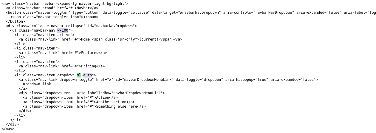
Alternatively, ml-auto could be used on the 2nd (right) navbar-nav , or if you just have a single navbar-nav.

<nav class="navbar navbar-expand-md navbar-light bg-light">
    <a class="navbar-brand" href="#">Navbar</a>
    <button class="navbar-toggler" type="button" data-toggle="collapse" data-target="#navbarNav">
        <span class="navbar-toggler-icon"></span>
    </button>
    <div class="collapse navbar-collapse" id="navbarNav">
        <ul class="navbar-nav mr-auto">
            <li class="nav-item active">
                <a class="nav-link" href="#">Home <span class="sr-only">(current)</span></a>
            </li>
            <li class="nav-item">
                <a class="nav-link" href="#">Features</a>
            </li>
            <li class="nav-item">
                <a class="nav-link" href="#">Pricing</a>
            </li>
        </ul>
        <ul class="navbar-nav">
            <li class="nav-item">
                <a class="nav-link" href="#">Login</a>
            </li>
            <li class="nav-item">
                <a class="nav-link" href="#">Register</a>
            </li>
        </ul>
    </div>
</nav>

https://codeply.com/go/P0G393rzfm

There are also flexbox utils. For example use justify-content-end on the collapse menu:

<nav class="navbar navbar-expand-lg navbar-dark bg-dark">
  <div class="container-fluid">
    <a class="navbar-brand" href="#">Brand</a>
    <button class="navbar-toggler" type="button" data-bs-toggle="collapse" data-bs-target="#navbarNav">
      <span class="navbar-toggler-icon"></span>
    </button>
    <div class="collapse navbar-collapse justify-content-end" id="navbarNav">
      <ul class="navbar-nav">
        <li class="nav-item">
          <a class="nav-link active" aria-current="page" href="#">Contact</a>
        </li>
        <li class="nav-item">
          <a class="nav-link" href="#">Pricing</a>
        </li>
        <li class="nav-item">
          <a class="nav-link" href="#">Download</a>
        </li>
      </ul>
    </div>
  </div>
</nav>

Or when you have 2 navbar-navs, use justify-content-between in navbar-collapse would work to even the space between the navbar-navs:

 <div class="navbar-collapse collapse justify-content-between">
     <ul class="navbar-nav mr-auto">
               ..
     </ul>
     <ul class="navbar-nav">
           ..
     </ul>
 </div>

Update for Bootstrap 4.0 and newer

As of Bootstrap 4 beta, ml-auto will still work to push items to the right. Just be aware the the navbar-toggleable- classes have changed to navbar-expand-*

Updated navbar right for Bootstrap 4


Another frequent Bootstrap 4 Navbar right alignment scenario includes a button on the right that remains outside the mobile collapse nav so that it is always shown at all widths.

Right align button that is always visible

enter image description here

enter image description here

Related: Bootstrap NavBar with left, center or right aligned items

Carol Skelly
  • 351,302
  • 90
  • 710
  • 624
  • 4
    `mr-auto` doesn't work if the right-most item is a `dropdown`. The dropdown items spill over the right edge of the page. – Ege Ersoz May 16 '17 at 17:13
  • 7
    It works: https://www.codeply.com/go/P0G393rzfm - the issue is not `mr-auto` as the question is about aligning right which works. Post a new question if you have concerns with the dropdown, but you're most likely referring to this issue: http://stackoverflow.com/questions/43867258/relocating-bootstrap-4-navigation-dropdown-menu/43868074#43868074 – Carol Skelly May 16 '17 at 17:20
  • 2
    You can also add `.dropdown-menu-right` to right-aligned dropdowns in the navbar. Not doing so can cut off the dropdown at certain widths. – rybo111 Jan 27 '18 at 22:36
  • @ZimSystem thank you for your answers. I have been following your answer over here https://stackoverflow.com/questions/19733447/bootstrap-navbar-with-left-center-or-right-aligned-items . I have a question how can I achieve one item to be on the left side and one item on the right side ? – Lokesh Pandey Apr 06 '18 at 14:32
  • In http://www.codeply.com/go/P0G393rzfm, you've shown one ul on the left and one ul on the right. That was achieved by adding _mr-auto_ to the first one. But what if I have only one ul? I don't want to create an empty ul just for aligning another one to the right. – Santosh Kumar May 26 '19 at 03:01
  • .justify-content-between worked like a charm. Thank you. – Botond Bertalan Jul 31 '19 at 09:11
  • I was needing to pull only one item inside a "nav" element to the right, so adds "ml-auto" to this child item solved my problem. Thanks – Jorge Matricali May 26 '20 at 00:49
  • If you want two Navs, with them pushed left and right, justify-content-between worked well for me. – Greg Mar 06 '21 at 12:56
  • Nice! Just add "ml-auto" on your first ul @SantoshKumar – Rbbn Apr 07 '21 at 06:46
174

In my case, I wanted just one set of navigation buttons / options and found that this will work:

<div class="collapse navbar-collapse justify-content-end" id="navbarCollapse">
  <ul class="navbar-nav">
    <li class="nav-item">
      <a class="nav-link" href="#">Sign Out</a>
    </li>
  </ul>
</div>

So, you will add justify-content-end to the div and omit mr-auto on the list.

Here is a working example.

Craig van Tonder
  • 7,497
  • 18
  • 64
  • 109
  • 3
    @numediaweb In the OPs example, he uses two elements within the nav, aligning one left and one right; where I used only one and aligned it to the right. It's not the right answer but it's helpful as an answer to a slight variation of the question ;) – Craig van Tonder Jan 25 '17 at 06:34
  • This works for a single navbar-nav, but the [`mr-auto` method](http://stackoverflow.com/a/41513784/171456) is used in the [Bootstrap docs](http://v4-alpha.getbootstrap.com/components/navbar/). – Carol Skelly Feb 03 '17 at 12:32
  • `mr-auto` is used in docs, but not to align items to the left. This answer is semantically correct as mentioned in this article: http://blog.getbootstrap.com/2017/01/06/bootstrap-4-alpha-6/ – qwaz Apr 27 '17 at 15:48
  • The question is are you trying to align 2 list of links or 1. If just 1, your answer works and was very helpful to me. Thanks! – barefootsanders Sep 15 '17 at 21:22
  • It worked for me, but I don't know why the one above this answer doesn't work. – Suhail Akhtar Dec 24 '18 at 19:10
  • `float-right` works the same way as `justify-content-end` , as long as `mr-auto` is removed. – desoga Apr 20 '19 at 23:55
78

For those who is still struggling with this issue in BS4 simply try below code -

<ul class="navbar-nav ml-auto">
Muhammad Tarique
  • 1,407
  • 1
  • 13
  • 17
  • 7
    No - that aligns everything to the right. The question says he only wants to align a single item to the right. – NickG Feb 08 '18 at 17:11
  • 2
    Check the official doc about [`m*-auto`](https://getbootstrap.com/docs/4.2/utilities/flex/#auto-margins) it pushes content to the left or right depending on where you put the class – Pierre de LESPINAY Jan 22 '19 at 16:05
  • @PierredeLESPINAY, yes `ml-auto` does push content to the rightmost position, but I just wondered why `mr-0` cannot do the job? – avocado Feb 02 '20 at 21:18
  • @NickG if you want some items aligned left and others right, you can just have multiple `
      ` elements, each with the appropriate `m*-auto`
    – Addison Klinke May 03 '21 at 03:11
52

On Bootstrap 4

If you want to align brand to your left and all the navbar-items to right, change the default mr-auto to ml-auto

<ul class="navbar-nav ml-auto">
geet Sebastian
  • 677
  • 6
  • 12
36

On Bootsrap 4.0.0-beta.2, none of the answers listed here worked for me. Finally, the Bootstrap site gave me the solution, not via its doc but via its page source code...

Getbootstrap.com align their right navbar-nav to the right with the help of the following class: ml-md-auto.

Mogsdad
  • 44,709
  • 21
  • 151
  • 275
ClemC
  • 614
  • 6
  • 14
19

Use this code to move items to the right.

<div class="collapse navbar-collapse justify-content-end">
Jaroslav Bezděk
  • 6,967
  • 6
  • 29
  • 46
Maizied Hasan Majumder
  • 1,197
  • 1
  • 12
  • 25
  • 1
    that will not work when you have a collapsed Menu, however, with the ml-auto it will still work because when the menu is collapsed, the
  • items still take 100% of the width so no margin will be applied.
  • – Ryan S Nov 20 '18 at 05:32
  • 1
    For me only this solution worked i am using bootstrap version 4 – Zain Ul Abidin Mar 06 '23 at 09:41