13

i have used range date picker from google material with this library

implementation 'com.google.android.material:material:1.2.0-alpha02'

this is my code

     MaterialDatePicker.Builder<Pair<Long, Long>> builder =
            MaterialDatePicker.Builder.dateRangePicker();

    CalendarConstraints.Builder constraintsBuilder = new CalendarConstraints.Builder();
    builder.setCalendarConstraints(constraintsBuilder.build());
    MaterialDatePicker<Pair<Long,Long>> picker = builder.build();
    assert getFragmentManager() != null;
    picker.show(getFragmentManager(), picker.toString());

i want to custom the dialog picker change text field,make dialog not full screen etc.. how can i make all this modifications

enter image description here

Gabriele Mariotti
  • 320,139
  • 94
  • 887
  • 841
zakaria
  • 365
  • 2
  • 5
  • 12

5 Answers5

30

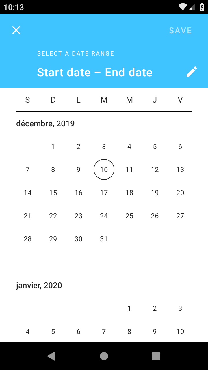
About the fullscreen.

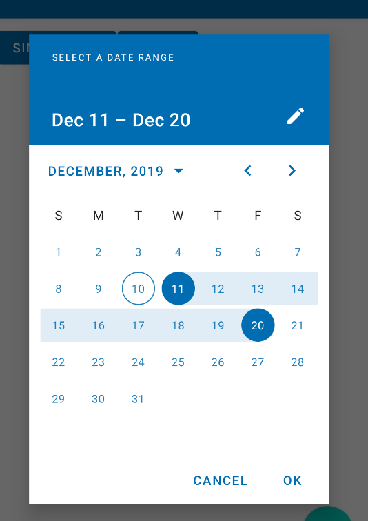
The range picker should cover the entire screen (default = dialog for single date, fullscreen for range). However you can change this behavior in your style.

You can use the setTheme method to apply a theme overlay:

//To apply a dialog
builder.setTheme(R.style.ThemeOverlay_MaterialComponents_MaterialCalendar);
//To apply the fullscreen:
builder.setTheme(R.style.ThemeOverlay_MaterialComponents_MaterialCalendar_Fullscreen);

Note: it requires at least the version 1.2.0-alpha01.

As alternative you can add in your app theme the materialCalendarFullscreenTheme attribute.

<style name="AppTheme" parent="Theme.MaterialComponents.DayNight">
   <item name="materialCalendarFullscreenTheme">@style/CustomThemeOverlay_MaterialCalendar_Fullscreen</item>
</style>

where:

  <style name="CustomThemeOverlay_MaterialCalendar_Fullscreen"
      parent="@style/ThemeOverlay.MaterialComponents.MaterialCalendar.Fullscreen">
    <item name="materialCalendarStyle">@style/Custom_MaterialCalendar.Fullscreen</item>
  </style>

Here you can override the value with the android:windowFullscreen attribute:

  <style name="Custom_MaterialCalendar.Fullscreen"
      parent="@style/Widget.MaterialComponents.MaterialCalendar.Fullscreen">
    <item name="android:windowFullscreen">false</item>
  </style>

enter image description here


About the strings.
Currently there isn't a method to change the strings.
The only existing method is builder.setTitleText to change the title.

However you can override all the existing strings in your project, but this workaround can stop to run in the next releases. For example:

  <string name="mtrl_picker_save" description="Confirms the selection [CHAR_LIMIT=12]">....</string>
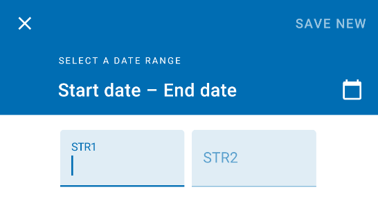
  <string name="mtrl_picker_text_input_date_range_start_hint" description="Label for the start date in a range selected by the user [CHAR_LIMIT=60]">...</string>
  <string name="mtrl_picker_text_input_date_range_end_hint" description="Label for the end date in a range selected by the user [CHAR_LIMIT=60]">...</string>

enter image description here

Here you can find all the strings used by the material calendar in the 1.2.0-alpha02.

Gabriele Mariotti
  • 320,139
  • 94
  • 887
  • 841
  • thinks so much for your response, to disable full screen it work like charm, but about override string in my code how can i do that ? – zakaria Dec 10 '19 at 13:51
  • @zakaria Just put in your strings.xml the items that you want to override as the sample above. – Gabriele Mariotti Dec 10 '19 at 14:03
  • yes i fixed just copy paste String in your String file and change the value thinks for your help now it work – zakaria Dec 10 '19 at 14:05
9

Basically, you should play with styles. In your AppTheme add an item materialCalendarTheme with your custom style that inherits parent ThemeOverlay.MaterialComponents.MaterialCalendar, and change the style.

  1. Change text field - call MaterialDatePicker.Builder function setTitleText()
  2. Make dialog not full screen - you can't change it for date range picker, the documentation says that it is fullscreen by default

Mobile date range pickers allow selection of a range of dates. They cover the entire screen.

Here's documentation https://material.io/components/pickers

Here's how I tweaked some colors to match my theme:

<style name="AppTheme" parent="Theme.MaterialComponents.Light">
    <item name="materialCalendarTheme">@style/ThemeMaterialCalendar</item>
</style>

<style name="ThemeMaterialCalendar" parent="ThemeOverlay.MaterialComponents.MaterialCalendar">
    <item name="buttonBarPositiveButtonStyle">@style/ThemeMaterialCalendarButton</item>
    <item name="buttonBarNegativeButtonStyle">@style/ThemeMaterialCalendarButton</item>
    <item name="materialButtonStyle">@style/ThemeMaterialCalendarTextButton</item>
</style>

<style name="ThemeMaterialCalendarButton" parent="Widget.MaterialComponents.Button.TextButton.Dialog">
    <item name="android:textColor">?themeTextColorPrimary</item>
</style>

<style name="ThemeMaterialCalendarTextButton" parent="Widget.MaterialComponents.Button.TextButton.Dialog.Flush">
    <item name="android:textColor">?themeTextColorPrimary</item>
    <item name="iconTint">?themeTextColorPrimary</item>
</style>
Vitalii Malyi
  • 874
  • 6
  • 13
5

Changing between fullscreen and dialog version can be as easy as that:

fullscreen:

val picker = MaterialDatePicker.Builder.dateRangePicker().setTheme(R.style.ThemeOverlay_MaterialComponents_MaterialCalendar_Fullscreen).build()

dialog:

val picker = MaterialDatePicker.Builder.dateRangePicker().setTheme(R.style.ThemeOverlay_MaterialComponents_MaterialCalendar).build()
postfixNotation
  • 181
  • 1
  • 5
  • It works. I had to upgrade the library to `'com.google.android.material:material:1.2.0-alpha06'` from 1.1.0 so that `R.style....` was not highlighted as private property by Lint. – CoolMind May 07 '20 at 15:22
  • Can we apply our own `layout` file for the DatePicker fragment? – IgorGanapolsky Dec 31 '20 at 16:15
1

While the posted answer totally work there seems to be no need to set the materialCalendarTheme globally - you can just set it to via the MaterialDatePicker.Builder and setTheme(int themeResId) method. Following an example how they do it in the Material Design Catalog App.

val datePicker = MaterialDatePicker.Builder.dateRangePicker().apply {
    context?.resolveOrNull(R.attr.materialCalendarTheme)?.let {
        setTheme(it)
    }
    setCalendarConstraints(getConstraints())
    }.build()
// ...

resolveOrThrow helper method:

fun Context.resolveOrNull(@AttrRes attributeResId: Int): Int? {
    val typedValue = TypedValue()
    if (theme.resolveAttribute(attributeResId, typedValue, true)) {
        return typedValue.data
    }
    return null
}

This way you DatePicker dialog won't be full screen but a regular dialog.

reVerse
  • 35,075
  • 22
  • 89
  • 84
0

The answer given by postfixNotation is correct but not entirely as he forgot to mention the package name where the style is available. I was scratching my head for about 30 mins to find that since its not directly available at R.style.... So here's the answer that will work out for all incase this happened to somebody else.

Changing between fullscreen and dialog version can be as easy as that:

fullscreen:

val picker = MaterialDatePicker.Builder.dateRangePicker().setTheme(com.google.android.material.R.style.ThemeOverlay_MaterialComponents_MaterialCalendar_Fullscreen).build()

dialog:

val picker =  MaterialDatePicker.Builder.dateRangePicker().setTheme(com.google.android.material.R.style.ThemeOverlay_MaterialComponents_MaterialCalendar).build()