71

I'd like to achieve a custom-colored shape like this using no Javascript: 3 corner rounded triangle

Currently I'm overlaying an image of the 'frame' over an orange rectangular div, but this is pretty hacky. I suppose I could use a dynamically generated canvas element, but that not only requires JS, but HTML5 canvas support. Any ideas?

TylerH
  • 20,799
  • 66
  • 75
  • 101
Murray Rowan
  • 3,597
  • 2
  • 19
  • 32
  • 1
    +1 Interesting challenge! Yeah, you can do it using just CSS. I'll make a demo :) – Ana Jan 21 '13 at 21:39

10 Answers10

141

My best attempt: http://dabblet.com/gist/4592062 final

Pixel perfection at any size, uses simpler math than Ana's original solution, and is more intuitive in my opinion :)

.triangle {
 position: relative;
 background-color: orange;
 text-align: left;
}
.triangle:before,
.triangle:after {
 content: '';
 position: absolute;
 background-color: inherit;
}
.triangle,
.triangle:before,
.triangle:after {
 width:  10em;
 height: 10em;
 border-top-right-radius: 30%;
}

.triangle {
 transform: rotate(-60deg) skewX(-30deg) scale(1,.866);
}
.triangle:before {
 transform: rotate(-135deg) skewX(-45deg) scale(1.414,.707) translate(0,-50%);
}
.triangle:after {
 transform: rotate(135deg) skewY(-45deg) scale(.707,1.414) translate(50%);
}
<div class="triangle"></div>
Murray Rowan
  • 3,597
  • 2
  • 19
  • 32
  • 3
    How about an isosceles triangle, pointing left? Being the right side the largest. – rubens.lopes Nov 20 '14 at 00:38
  • Thanks much for this - I'm using it in a site of mine now. Just a heads up for future readers: if you use 'vmin' for sizing, it can end up looking a little skewed depending on the resulting px values. Not sure why, because if you manually type in those same px values, the triangle looks fine. Hopefully near-future browsers will render this comment obsolete! – aaaaaa Nov 23 '14 at 09:22
  • It's a great solution! For some browsers at some triangle sizes, I found I needed more digits of sqrt(2) and sqrt(2)/2, though, to get a perfect image. – Ben Dilts May 12 '16 at 16:08
  • Great solution, note that need to `direction:ltr` for rtl pages. – Mehran Prs May 02 '18 at 11:27
  • Looks great. Do you know how I can make the one pointing to the right? And also, how to stretch it a little bit width-wise? – Vladimir Despotovic Jul 26 '18 at 15:25
  • Great solution, perfection would be fitting a background image in it :) – Jack May 29 '19 at 08:02
  • 1
    @VladimirDespotovic Change `rotate(-60deg)` to `rotate(-30deg)` and it will point to the right – Harry Wood Jul 29 '21 at 15:00
  • If the transparency of the color is low, the color will appear strange. Is there any solution? – Sh031224 Aug 26 '21 at 06:30
  • @Sh031224 could you use the full alpha color and then just reduce the opacity of the parent `.triangle`? – Murray Rowan Aug 29 '21 at 18:41
32

.triangle, .triangle:before, .triangle:after { width: 4em; height: 4em; }
.triangle {
    overflow: hidden;
    position: relative;
    margin: 7em auto 0;
    border-radius: 20%;
    transform: translateY(50%) rotate(30deg) skewY(30deg) scaleX(.866);
    cursor: pointer;
    pointer-events: none;
} 
.triangle:before, .triangle:after {
    position: absolute;
    background: orange;
    pointer-events: auto;
    content: '';
}
.triangle:before {
    border-radius: 20% 20% 20% 53%;
    transform: scaleX(1.155) skewY(-30deg) rotate(-30deg) translateY(-42.3%) 
            skewX(30deg) scaleY(.866) translateX(-24%);
}
.triangle:after {
    border-radius: 20% 20% 53% 20%;
    transform: scaleX(1.155) skewY(-30deg) rotate(-30deg) translateY(-42.3%) 
            skewX(-30deg) scaleY(.866) translateX(24%);
}

/** extra styles to show how it works **/

.triangle:hover { overflow: visible; }
.triangle:hover:before, .triangle:hover:after { background: none; }
.triangle:hover, .triangle:hover:before, .triangle:hover:after {
    border: dashed 1px;
}
<div class='triangle'></div>

The idea is really simple: you first apply a series of transforms to your .triangle element (which has overflow: hidden; - you can remove that to see what happens ;) ) in order to get a rhombus.

Then you apply the same transforms to the :before and :after pseudo-elements, plus a few more to make them rhomboidal as well.

And in the end, you have three rhombuses which intersect, the orange shape being their intersection. Hover the triangle to see the intersecting shapes ;)

It scales nicely, you just have to change the width and the height of the .triangle element.

For Firefox, Chrome and Safari, only the orange triangle with rounded corners is sensitive to hover (thanks to pointer-events: none; on the .triangle element and pointer-events: auto; on the pseudo-elements). Otherwise, this could be achieved by wrapping .triangle in an element having the same width and height (and the same border-radius) and overflow: hidden;.


Notes

  • You could also do it with CSS gradients. However, unlike 2D transforms, CSS gradients won't work in IE9.
  • I'd wish I didn't have to unskew the pseudo-elemets which inherit the skew from their parent only to skew them again after a rotation, but it doesn't seem to work otherwise.
Temani Afif
  • 245,468
  • 26
  • 309
  • 415
Ana
  • 35,599
  • 6
  • 80
  • 131
18

First we create the triangle using clip-path:

.triangle {
  display: inline-block;
  width: 150px;
  color:orange;
}

.triangle::before {
  content: "";
  display: block;
  padding-top: 86%;
  background: currentColor;
  clip-path: polygon(50% 0, 100% 100%, 0 100%);
}
<div class="triangle"></div>

And then we apply and SVG filter inspired from this article

.triangle {
  display: inline-block;
  width: 150px;
  color:orange;
  filter: url('#goo');
}

.triangle::before {
  content: "";
  display: block;
  padding-top: 86%;
  background: currentColor;
  clip-path: polygon(50% 0, 100% 100%, 0 100%);
}
<div class="triangle"></div>
<div class="triangle" style="color:red;width:200px;"></div>
<div class="triangle" style="color:blue;width:250px;"></div>


<svg style="visibility: hidden; position: absolute;" width="0" height="0" xmlns="http://www.w3.org/2000/svg" version="1.1">
  <defs>
        <filter id="goo"><feGaussianBlur in="SourceGraphic" stdDeviation="8" result="blur" />    
            <feColorMatrix in="blur" mode="matrix" values="1 0 0 0 0  0 1 0 0 0  0 0 1 0 0  0 0 0 19 -9" result="goo" />
            <feComposite in="SourceGraphic" in2="goo" operator="atop"/>
        </filter>
    </defs>
</svg>

CSS rounded triangle

To control the radius, we simply adjust the stdDeviation of the filter


Considering this, you can make it working with any kind of triangle and even a random shape:

.triangle {
  display: inline-block;
  width: 150px;
  color:orange;
  filter: url('#goo');
}

.triangle::before {
  content: "";
  display: block;
  padding-top: 86%;
  background: currentColor;
  clip-path: polygon(50% 0, 100% 100%, 0 100%);
}

.triangle.type2::before {
  padding-top: 70%;
  clip-path: polygon(0 0, 100% 100%, 0 100%);
}

.triangle.type3::before {
  padding-top: 100%;
  clip-path: polygon(50% 0, 80% 100%, 0 70%);
}

.triangle.hex::before {
  padding-top: 100%;
  clip-path: polygon(25% 0%, 75% 0%, 100% 50%, 75% 100%, 25% 100%, 0% 50%);
}
<div class="triangle"></div>
<div class="triangle type2" style="color:red;"></div>
<div class="triangle type3" style="color:blue;"></div>
<div class="triangle hex" style="color:purple;"></div>


<svg style="visibility: hidden; position: absolute;" width="0" height="0" xmlns="http://www.w3.org/2000/svg" version="1.1">
  <defs>
        <filter id="goo"><feGaussianBlur in="SourceGraphic" stdDeviation="8" result="blur" />    
            <feColorMatrix in="blur" mode="matrix" values="1 0 0 0 0  0 1 0 0 0  0 0 1 0 0  0 0 0 19 -9" result="goo" />
            <feComposite in="SourceGraphic" in2="goo" operator="atop"/>
        </filter>
    </defs>
</svg>

CSS rounded corner shapes

Worth to note that we can easily add complex background to the shapes:

.triangle {
  display: inline-block;
  width: 150px;
  filter: url('#goo');
}

.triangle::before {
  content: "";
  display: block;
  padding-top: 86%;
  background: var(--b,orange);
  clip-path: polygon(50% 0, 100% 100%, 0 100%);
}

.triangle.type2::before {
  padding-top: 70%;
  clip-path: polygon(0 0, 100% 100%, 0 100%);
}

.triangle.type3::before {
  padding-top: 100%;
  clip-path: polygon(50% 0, 80% 100%, 0 70%);
}

.triangle.hex::before {
  padding-top: 100%;
  clip-path: polygon(25% 0%, 75% 0%, 100% 50%, 75% 100%, 25% 100%, 0% 50%);
}
<div class="triangle"></div>
<div class="triangle type2" style="--b:linear-gradient(red,blue);"></div>
<div class="triangle type3" style="--b:conic-gradient(green,pink,green);"></div>
<div class="triangle hex" style="--b:url(https://picsum.photos/id/1067/200/200) center/cover;"></div>


<svg style="visibility: hidden; position: absolute;" width="0" height="0" xmlns="http://www.w3.org/2000/svg" version="1.1">
  <defs>
        <filter id="goo"><feGaussianBlur in="SourceGraphic" stdDeviation="8" result="blur" />    
            <feColorMatrix in="blur" mode="matrix" values="1 0 0 0 0  0 1 0 0 0  0 0 1 0 0  0 0 0 19 -9" result="goo" />
            <feComposite in="SourceGraphic" in2="goo" operator="atop"/>
        </filter>
    </defs>
</svg>

Rounded shape with CSS gradient

Temani Afif
  • 245,468
  • 26
  • 309
  • 415
11

Use an image of some sort. That's what images are for. If you need it to scale, SVG is a good choice, otherwise, just use a png as a background, or an <img> element if it's part of content.

If you absolutely must have it in a CSS file, you could try data: urls (not supported in IE7 and below).

zzzzBov
  • 174,988
  • 54
  • 320
  • 367
6

Ana's answer inspired me to try another approach, one that's just as far from perfect, but is at least symmetrical. Here's a preview at real-size and blown up. It's simply a border-hack trangle wrapped in a clipping circle/border-radius:

Preview

And the code (adjust the overall size via single font-size property):

.triangle {
    font-size: .8em;
    position: relative;
    width: 3.8em;
    height: 3.8em;
    text-align: center;
    margin: 10% auto 0;
    overflow: hidden;
    border-radius: 100%;
} 
.triangle:before {
    content: '';
    position: absolute;
    width:0;
    height: 0;
    border: solid 2em transparent;
    border-bottom-color: orange;
    border-bottom-width: 3.2em;
    border-top-width: 0;
    margin: -.3em -2em;
}

Play with it here: http://dabblet.com/gist/4590714

Murray Rowan
  • 3,597
  • 2
  • 19
  • 32
  • 2
    Amazing! because the :after is available to use for the exclamation mark ! to make a warning icon ! – allenski Oct 19 '20 at 19:16
3

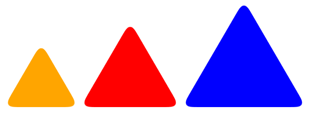
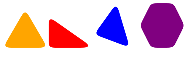
Played around with Murray Smiths most upvoted version. Wrote it as a Stylus mixin and fixed some margin issues and added a direction option. The mixin also scales the triangle to somewhat pixelperfect size. Not tested very well. Use with care

http://codepen.io/perlundgren/pen/VYGdwX

    triangle(direction = up, color = #333, size = 32px)
        position: relative
        background-color: color
        width:  2*(round(size/3.25))
        height: 2*(round(size/3.25))
        border-top-right-radius: 30%
        &:before,
        &:after
          content: ''
          position: absolute
          background-color: inherit
          width:  2*(round(size/3.25))
          height: 2*(round(size/3.25))
          border-top-right-radius: 30%

        if direction is up
          transform: rotate(-60deg) skewX(-30deg) scale(1,.866)
          margin: (@width/4) (@width/2.5) (@width/1.2) (@width/2.5)

        if direction is down
          transform: rotate(-120deg) skewX(-30deg) scale(1,.866)
          margin: 0 (@width/1.5) (@width/1.5) (@width/6)

        if direction is left
          transform: rotate(-30deg) skewX(-30deg) scale(1,.866)
          margin: (@width/5) 0 (@width) (@width/1.4)

        if direction is right
          transform: rotate(-90deg) skewX(-30deg) scale(1,.866)
          margin: (@width/5) (@width/1.4) (@width) 0

        &:before
          transform: rotate(-135deg) skewX(-45deg) scale(1.414,.707) translate(0,-50%)
        &:after
          transform: rotate(135deg) skewY(-45deg) scale(.707,1.414) translate(50%)

and then just add the mixin to your class

    .triangle
      &.up
        triangle()
      &.down
        triangle(down)
      &.left
        triangle(left)
      &.right
        triangle(right)
Per Lundgren
  • 47
  • 1
  • 2
2

-- Simplified version --

In my case I needed text to accompany the triangle icon with three rounded corners, however the overflow: hidden; suggested simply did not work because the text was ultimately rendered hidden.

End Result: The word "Mandatory" along with a triangular warning icon ...Demo: https://jsfiddle.net/allenski/7p4tbznr/

I was able to achieve similar mask by using clip-path. Note: does not work in IE; however most already stopped supporting IE, especially since Microsoft did. Works great in their new Edge browser.

HTML:

<span class="warning">
    Mandatory
</span>

CSS:

.warning {
    position: relative;
    display: inline-block;
    font-weight: bold;
    color: #FF5500;
}
.warning:before {
    position: absolute;
    top: 50%;
    right: 12px;
    font-size: 18px;
    font-weight: bold;
    color: #FFFFFF;
    transform: translateY(-36%);
    text-shadow: 0 0 7px #111111;
    z-index: 1;
    content: '!';
}
.warning:after {
    display: inline-block;
    margin-left: 3px;
    font-size: 5px;
    border: solid 3em transparent;
    border-top-width: 0;
    border-bottom-width: 5em;
    border-bottom-color: #FF5500;
    clip-path: circle(54% at 50% 69%);
    vertical-align: bottom;
    content: '';
}

In the CSS, the triangle is the :after pseudo-element.

allenski
  • 1,652
  • 4
  • 23
  • 39
  • The goal in my case was to also contain these elements within one HTML tag, therefore the triangle could only be the `:before` or `:after` – allenski Oct 26 '20 at 00:51
1

I saw there was someone asking for an isosceles triangle and through some tampering with the accepted answer above I found how to manipulate it to get what I wanted considering I needed the same. This should help anyone looking for a slight change in the rounded corner triangle.

You'll notice that I separated out the width, height, and border-top-right-radius then proceeded to change the border-top-right-radius to shape the corners. The only other thing I changed was the transform property on the element directly. You can shape it how you see fit, but those seem to be the only necessary changes.

.diff-arrow {
  margin-left:30px;
  position: relative;
  background-color: #20C0F1;
  text-align: left;
  width: 10em;
  height: 10em;
  border-top-right-radius: 20%;
}

.diff-arrow:before,
.diff-arrow:after {
  content: '';
  position: absolute;
  background-color: inherit;
  width: 10em;
  height: 10em;
  border-top-right-radius: 15%;
}

.diff-arrow {
  transform: rotate(-45deg) skewX(0deg) scale(0.5);
}

.diff-arrow:before {
  transform: rotate(-135deg) skewX(-45deg) scale(1.414, .707) translate(0, -50%);
}

.diff-arrow:after {
  transform: rotate(135deg) skewY(-45deg) scale(.707, 1.414) translate(50%);
}
<div class="diff-arrow"></div>
Jester
  • 141
  • 4
  • 15
-1

.triangle {
    position: relative;
    background-color: orange;
    text-align: left;
}
.triangle:before,
.triangle:after {
    content: '';
    position: absolute;
    background-color: inherit;
}
.triangle,
.triangle:before,
.triangle:after {
    width:  10em;
    height: 10em;
    border-top-right-radius: 30%;
}

.triangle {
    transform: rotate(-60deg) skewX(-30deg) scale(1,.866);
}
.triangle:before {
    transform: rotate(-135deg) skewX(-45deg) scale(1.414,.707) translate(0,-50%);
}
.triangle:after {
    transform: rotate(135deg) skewY(-45deg) scale(.707,1.414) translate(50%);
}
<div class="triangle"></div>
  • As it’s currently written, your answer is unclear. Please [edit] to add additional details that will help others understand how this addresses the question asked. You can find more information on how to write good answers [in the help center](/help/how-to-answer). – Community Mar 14 '23 at 01:27
-2

Started with the typical border triangle and then added svg filter to the triangle.

.c-paper-plane {
    position: relative;
}
.scene {
    transform-style: preserve-3d;
    transform: rotate3d(0.2, -1, -0.8, -177deg);
}
svg.paper-plane {
    transform: rotateX(0) translateZ(-3px);
    transform-origin: center;
}
.paper-tail {
    transform: rotateX(0deg) translate(31px, 10px) translateZ(-5px);
    transform-origin: center;
    fill: grey;
}
.paper-tail-div {
    transform: rotateX(269deg) translate(237px, 55px) translateZ(139px);
    fill: grey;
    transform-origin: center;
    position: absolute;
    top: 0;
    width: 0;
    height: 0;
    border-top: 100px solid red;
    border-right: 150px solid transparent;
    filter: url('#goo');
}
<div class="c-paper-plane">
  <div class="scene">
    <svg id="paper-plane" xmlns="http://www.w3.org/2000/svg" viewBox="0 0 139.549 79.269">
                <defs>
                    <filter id="goo"><feGaussianBlur in="SourceGraphic" stdDeviation="8" result="blur" />    
                        <feColorMatrix in="blur" mode="matrix" values="1 0 0 0 0  0 1 0 0 0  0 0 1 0 0  0 0 0 19 -9" result="goo" />
                        <feComposite in="SourceGraphic" in2="goo" operator="atop"/>
                    </filter>
                </defs>
                <g class="plane-group">
                    <path class="paper-wing" d="M47.377,76.654V47.025c0-1.137,0.871-2.084,2.003-2.178l60.357-5.062c0.2-0.01,0.2-0.29,0-0.31l-60.356-5.052
                    c-1.133-0.095-2.004-1.042-2.004-2.179V2.615c0-1.878,1.922-3.142,3.646-2.399l87.37,37.662c1.54,0.664,1.54,2.848,0,3.512
                    l-87.37,37.662C49.299,79.796,47.377,78.531,47.377,76.654z"/>
                </g>
            </svg>
    <div class="paper-tail-div"></div>
  </div>
</div>
Brad Vanderbush
  • 173
  • 1
  • 13