I am searching how create custom dialog in Jetpack Compose. In XML or Material Design we can create easily custom Dialog in which we can take user input, radio button etc. but i am not finding such thing in Jetpack Compose.
Asked
Active
Viewed 6.2k times
58
Gabriele Mariotti
- 320,139
- 94
- 887
- 841
Rohit Jakhar
- 1,231
- 2
- 12
- 21
-
ref link : https://compose-example.blogspot.com/2021/12/custom-dialog.html – Bolt UIX Dec 28 '21 at 04:15
9 Answers
71
Starting from M3 1.1.0-alpha04 there is an AlertDialog composable function with a slot for content.
val openDialog = remember { mutableStateOf(true) }

if (openDialog.value) {
    androidx.compose.material3.AlertDialog(
        onDismissRequest = {
            // Dismiss the dialog when the user clicks outside the dialog or on the back
            // button. If you want to disable that functionality, simply use an empty
            // onDismissRequest.
            openDialog.value = false
        }
    ) {
        Surface(
            modifier = Modifier
                .wrapContentWidth()
                .wrapContentHeight(),
            shape = MaterialTheme.shapes.large
        ) {
            Column(modifier = Modifier.padding(16.dp)) {

                //... AlertDialog content
            }
        }
    }
}
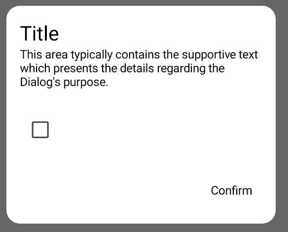
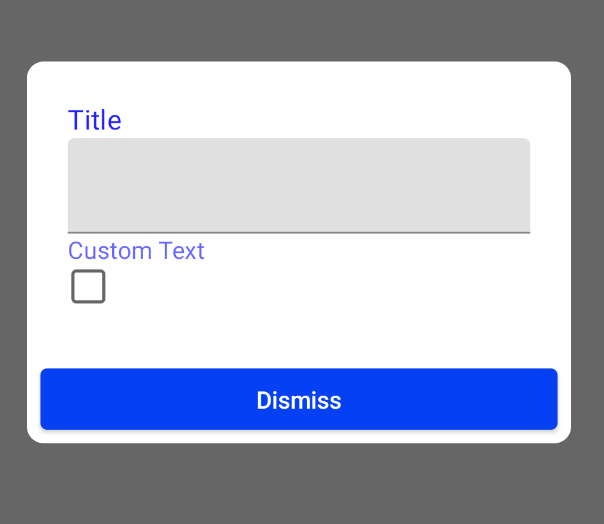
Before M3 1.1.0-alpha04 or with M2, you can use the standard AlertDialog.
The text,title and buttons parameters support @Composable functions and in this way you can customize the dialog as you prefer.
For example:
val openDialog = remember { mutableStateOf(true) }
var text by remember { mutableStateOf("") }

if (openDialog.value) {
    AlertDialog(
        onDismissRequest = {
            openDialog.value = false
        },
        title = {
            Text(text = "Title")
        },
        text = {
            Column() {
                TextField(
                    value = text,
                    onValueChange = { text = it }
                )
                Text("Custom Text")
                Checkbox(checked = false, onCheckedChange = {})
            }
        },
        buttons = {
            Row(
                modifier = Modifier.padding(all = 8.dp),
                horizontalArrangement = Arrangement.Center
            ) {
                Button(
                    modifier = Modifier.fillMaxWidth(),
                    onClick = { openDialog.value = false }
                ) {
                    Text("Dismiss")
                }
            }
        }
    )
}
KuhakuPixel
- 212
- 2
- 4
- 11
Gabriele Mariotti
- 320,139
- 94
- 887
- 841
-
-
You are putting a `TextField`, `Text`, and a `Checkbox` inside of the `text` parameter? That is counter intuitive. So basically any content (minus maybe confirm and dismiss button) should go inside there? – kc_dev Feb 22 '22 at 22:11
-
FYI: You can put anything you want inside the `Column`, including an `Image` – MSpeed Jun 28 '22 at 11:21
-
Could someone please explain why we have to use `openDialog.value` and not just `openDialog`. I use the second one and it works well. Do I use it wrong? Thanks- – Mark Delphi Aug 23 '22 at 21:03
-
1@MarkDelphi, the rule is simple: If you declare `openDialog` with `=`, you **must** use `.value.` If instead of `=` you use `by`, then you **must not** use `.value`. – MarianD Aug 31 '22 at 00:31
-
@MarianD thank you very much for clarification. Sometimes are Google documents too much difficult to get it understood correctly. Thanks again. – Mark Delphi Aug 31 '22 at 13:14
38
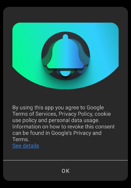
This example demonstrates how to make custom dialog in android jet compose.
Read more https://www.boltuix.com/2022/01/ice-cream-app-ui-ux.html
import android.annotation.SuppressLint
import androidx.compose.foundation.Image
import androidx.compose.foundation.background
import androidx.compose.foundation.layout.*
import androidx.compose.foundation.shape.RoundedCornerShape
import androidx.compose.material.Card
import androidx.compose.material3.MaterialTheme
import androidx.compose.runtime.Composable
import androidx.compose.runtime.MutableState
import androidx.compose.runtime.mutableStateOf
import androidx.compose.ui.Modifier
import androidx.compose.ui.graphics.Color
import androidx.compose.ui.graphics.ColorFilter
import androidx.compose.ui.layout.ContentScale
import androidx.compose.ui.res.painterResource
import androidx.compose.ui.text.font.FontWeight
import androidx.compose.ui.text.style.TextAlign
import androidx.compose.ui.text.style.TextOverflow
import androidx.compose.ui.tooling.preview.Preview
import androidx.compose.ui.unit.dp
import androidx.compose.ui.window.Dialog
import com.compose.example.ui.theme.Pink80
import com.compose.example.ui.theme.Purple40
import com.compose.example.ui.theme.Purple80
import com.compose.example.ui.theme.PurpleGrey40

@Composable
fun CustomDialog(openDialogCustom: MutableState<Boolean>) {
    Dialog(onDismissRequest = { openDialogCustom.value = false}) {
        CustomDialogUI(openDialogCustom = openDialogCustom)
    }
}

//Layout
@Composable
fun CustomDialogUI(modifier: Modifier = Modifier, openDialogCustom: MutableState<Boolean>){
    Card(
        //shape = MaterialTheme.shapes.medium,
        shape = RoundedCornerShape(10.dp),
        // modifier = modifier.size(280.dp, 240.dp)
        modifier = Modifier.padding(10.dp,5.dp,10.dp,10.dp),
        elevation = 8.dp
    ) {
        Column(
            modifier
                .background(Color.White)) {

            //.......................................................................
            Image(
                painter = painterResource(id = R.drawable.notification),
                contentDescription = null, // decorative
                contentScale = ContentScale.Fit,
                colorFilter  = ColorFilter.tint(
                    color = Purple40
                ),
                modifier = Modifier
                    .padding(top = 35.dp)
                    .height(70.dp)
                    .fillMaxWidth(),

                )

            Column(modifier = Modifier.padding(16.dp)) {
                androidx.compose.material3.Text(
                    text = "Get Updates",
                    textAlign = TextAlign.Center,
                    modifier = Modifier
                        .padding(top = 5.dp)
                        .fillMaxWidth(),
                    style = MaterialTheme.typography.labelLarge,
                    maxLines = 2,
                    overflow = TextOverflow.Ellipsis
                )
                androidx.compose.material3.Text(
                    text = "Allow Permission to send you notifications when new art styles added.",
                    textAlign = TextAlign.Center,
                    modifier = Modifier
                        .padding(top = 10.dp, start = 25.dp, end = 25.dp)
                        .fillMaxWidth(),
                    style = MaterialTheme.typography.bodyMedium
                )
            }
            //.......................................................................
            Row(
                Modifier
                    .fillMaxWidth()
                    .padding(top = 10.dp)
                    .background(Purple80),
                horizontalArrangement = Arrangement.SpaceAround) {

                androidx.compose.material3.TextButton(onClick = {
                    openDialogCustom.value = false
                }) {

                    androidx.compose.material3.Text(
                        "Not Now",
                        fontWeight = FontWeight.Bold,
                        color = PurpleGrey40,
                        modifier = Modifier.padding(top = 5.dp, bottom = 5.dp)
                    )
                }
                androidx.compose.material3.TextButton(onClick = {
                    openDialogCustom.value = false
                }) {
                    androidx.compose.material3.Text(
                        "Allow",
                        fontWeight = FontWeight.ExtraBold,
                        color = Color.Black,
                        modifier = Modifier.padding(top = 5.dp, bottom = 5.dp)
                    )
                }
            }
        }
    }
}


@SuppressLint("UnrememberedMutableState")
@Preview (name="Custom Dialog")
@Composable
fun MyDialogUIPreview(){
    CustomDialogUI(openDialogCustom = mutableStateOf(false))
}

Bolt UIX
- 5,988
- 6
- 31
- 58
-
1
-
-
1
-
4
-
1For close it must be: if (openDialogCustom.value){ Dialog(onDismissRequest = { openDialogCustom.value = false}) { CustomDialogUI(openDialogCustom = openDialogCustom) } } – Sadegh J Dec 15 '22 at 14:15
20
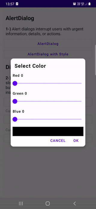
Also adding a lambda to return value from dialog back to any other composable is possible with
@Composable
private fun CustomDialogWithResultExample(
    onDismiss: () -> Unit,
    onNegativeClick: () -> Unit,
    onPositiveClick: (Color) -> Unit
) {
    var red by remember { mutableStateOf(0f) }
    var green by remember { mutableStateOf(0f) }
    var blue by remember { mutableStateOf(0f) }

    val color = Color(
        red = red.toInt(),
        green = green.toInt(),
        blue = blue.toInt(),
        alpha = 255
    )

    Dialog(onDismissRequest = onDismiss) {

        Card(
            elevation = 8.dp,
            shape = RoundedCornerShape(12.dp)
        ) {

            Column(modifier = Modifier.padding(8.dp)) {

                Text(
                    text = "Select Color",
                    fontWeight = FontWeight.Bold,
                    fontSize = 20.sp,
                    modifier = Modifier.padding(8.dp)
                )
                Spacer(modifier = Modifier.height(8.dp))

                // Color Selection
                Row(
                    verticalAlignment = Alignment.CenterVertically,
                    horizontalArrangement = Arrangement.Center
                ) {


                    Column {

                        Text(text = "Red ${red.toInt()}")
                        Slider(
                            value = red,
                            onValueChange = { red = it },
                            valueRange = 0f..255f,
                            onValueChangeFinished = {}
                        )
                        Spacer(modifier = Modifier.height(8.dp))

                        Text(text = "Green ${green.toInt()}")
                        Slider(
                            value = green,
                            onValueChange = { green = it },
                            valueRange = 0f..255f,
                            onValueChangeFinished = {}
                        )
                        Spacer(modifier = Modifier.height(8.dp))

                        Text(text = "Blue ${blue.toInt()}")
                        Slider(
                            value = blue,
                            onValueChange = { blue = it },
                            valueRange = 0f..255f,
                            onValueChangeFinished = {}
                        )

                        Spacer(modifier = Modifier.height(8.dp))
                        Surface(
                            border = BorderStroke(1.dp, Color.DarkGray),
                            color = color,
                            modifier = Modifier
                                .fillMaxWidth()
                                .height(40.dp)
                        ) {}
                    }
                }

                // Buttons
                Row(
                    horizontalArrangement = Arrangement.End,
                    modifier = Modifier.fillMaxWidth()
                ) {

                    TextButton(onClick = onNegativeClick) {
                        Text(text = "CANCEL")
                    }
                    Spacer(modifier = Modifier.width(4.dp))
                    TextButton(onClick = {
                        onPositiveClick(color)
                    }) {
                        Text(text = "OK")
                    }
                }
            }
        }
    }
}
And show it with
   var showCustomDialogWithResult by remember { mutableStateOf(false) }


  if (showCustomDialogWithResult) {
        CustomDialogWithResultExample(
            onDismiss = {
                showCustomDialogWithResult = !showCustomDialogWithResult
                Toast.makeText(context, "Dialog dismissed!", Toast.LENGTH_SHORT)
                    .show()
            },
            onNegativeClick = {
                showCustomDialogWithResult = !showCustomDialogWithResult
                Toast.makeText(context, "Negative Button Clicked!", Toast.LENGTH_SHORT)
                    .show()

            },
            onPositiveClick = { color ->
                showCustomDialogWithResult = !showCustomDialogWithResult
                Toast.makeText(context, "Selected color: $color", Toast.LENGTH_SHORT)
                    .show()
            }
        )
    }
And result is
Thracian
- 43,021
- 16
- 133
- 222
13
I had to achieve something like this:
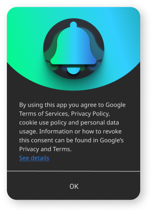
Putting image in "title" slot and text in "text" slot of compose AlertDialog, ended with this:
Because "title" and "text" are wrapped with AlertDialogBaselineLayout that is adding padding, and I did not have a clue how to change it.
However, "buttons" slot was not wrapped, and my solution was like in following code ("title" and "text" slot must be set to null and all of dialog content goes into "buttons" slot):
@Composable
fun AppDialog(
modifier: Modifier = Modifier,
dialogState: Boolean = false,
onDialogPositiveButtonClicked: (() -> Unit)? = null,
onDialogStateChange: ((Boolean) -> Unit)? = null,
onDismissRequest: (() -> Unit)? = null,
) {
    val textPaddingAll = 24.dp
    val buttonPaddingAll = 8.dp
    val dialogShape = RoundedCornerShape(16.dp)

    if (dialogState) {
        AlertDialog(
            onDismissRequest = {
                onDialogStateChange?.invoke(false)
                onDismissRequest?.invoke()
            },
            title = null,
            text = null,
            buttons = {

                Column{
                    Image(
                        painter = painterResource(R.drawable.dialog_top_image),
                        contentDescription = "",
                        contentScale = ContentScale.FillWidth,
                        modifier = Modifier.fillMaxWidth()
                    )
                    Row(Modifier.padding(all = textPaddingAll)){
                        TextWithHTMLSupport(
                            text = stringResource(R.string.gdprText)
                        )
                    }
                    Divider(color = MaterialTheme.colors.onSurface, thickness = 1.dp)

                    Row(
                        modifier = Modifier.padding(all = buttonPaddingAll),
                        horizontalArrangement = Arrangement.Center
                    ) {
                        TextButton(
                            modifier = Modifier.fillMaxWidth(),
                            onClick = {
                                onDialogStateChange?.invoke(false)
                                onDialogPositiveButtonClicked?.invoke()
                            }
                        ) {
                            Text(text = stringResource(R.string.dialog_ok), color = MaterialTheme.colors.onSurface)
                        }
                    }
                }

            },
            properties = DialogProperties(dismissOnBackPress = true, dismissOnClickOutside = false),
            modifier = modifier,
            shape = dialogShape
        )
    }
}
Zoran
- 1,502
- 19
- 22
-
Thank you!, this works better if you have scroll inside, unlike the accepted answer which I tried, and it works, but the scroll is not smooth – Islam Mansour Oct 18 '21 at 14:23
10
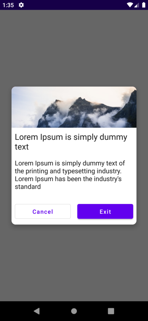
Custom dialog with Image
To create a custom dialog like this.
- First, create Dialog composable and set dismissRequest and dialog properties.
- Inside the dialog create your own view.
- finally, set up the dismiss dialog on the desired button.
@Composable
fun CustomAlertDialog(onDismiss: () -> Unit, onExit: () -> Unit) {

    Dialog(onDismissRequest = { onDismiss() }, properties = DialogProperties(
        dismissOnBackPress = false,dismissOnClickOutside = false
    )) {
        Card(
            //shape = MaterialTheme.shapes.medium,
            shape = RoundedCornerShape(10.dp),
            // modifier = modifier.size(280.dp, 240.dp)
            modifier = Modifier
                .fillMaxWidth()
                .padding(8.dp),
            elevation = 8.dp
        ) {
            Column(
                Modifier
                    .fillMaxWidth()
                    .background(Color.White)
            ) {


                Row(
                    modifier = Modifier
                        .fillMaxWidth()
                        .height(100.dp)
                        .background(Color.Red.copy(alpha = 0.8F)),
                    verticalAlignment = Alignment.CenterVertically,
                    horizontalArrangement = Arrangement.Center,

                    ) {

                    Image(
                        painter = painterResource(id = R.drawable.background_image),
                        contentDescription = "Exit app",
                        modifier = Modifier.fillMaxSize(),
                        contentScale = ContentScale.FillWidth
                    )
                }

                Text(
                    text = "Lorem Ipsum is simply dummy text",
                    modifier = Modifier.padding(8.dp), fontSize = 20.sp
                )

                Text(
                    text = "Lorem Ipsum is simply dummy text of the printing and typesetting industry. Lorem Ipsum has been the industry's standard",
                    modifier = Modifier.padding(8.dp)
                )

                Row(Modifier.padding(top = 10.dp)) {
                    OutlinedButton(
                        onClick = { onDismiss() },
                        Modifier
                            .fillMaxWidth()
                            .padding(8.dp)
                            .weight(1F)
                    ) {
                        Text(text = "Cancel")
                    }


                    Button(
                        onClick = { onExit() },
                        Modifier
                            .fillMaxWidth()
                            .padding(8.dp)
                            .weight(1F)
                    ) {
                        Text(text = "Exit")
                    }
                }


            }
        }
    }
}
Now we have created the Custom dialog, to show the dialog on button click, you need to create a mutableStateOf() variable to maintain the dialog show and dismiss state.
Also, create conditions like if the variable is true call the dialog, otherwise don’t call the dialog function.
@Composable
fun Content() {
    val context = LocalContext.current
    var showCustomDialog by remember {
        mutableStateOf(false)
    }

    Column(
        Modifier.fillMaxSize(),
        Arrangement.Center,
        horizontalAlignment = Alignment.CenterHorizontally
    ) {
        Button(onClick = { showCustomDialog = !showCustomDialog }, Modifier.wrapContentSize()) {
            Text(text = "Show Alert Dialog")
        }


    }

    if (showCustomDialog) {
        CustomAlertDialog({
            showCustomDialog = !showCustomDialog
        }, {
            val activity = (context as? Activity)
            activity?.finish()
        })
    }
}
when clicking on the dismiss button on the dialog, need to update a variable to false to hide the dialog.
The final output of the code is below,
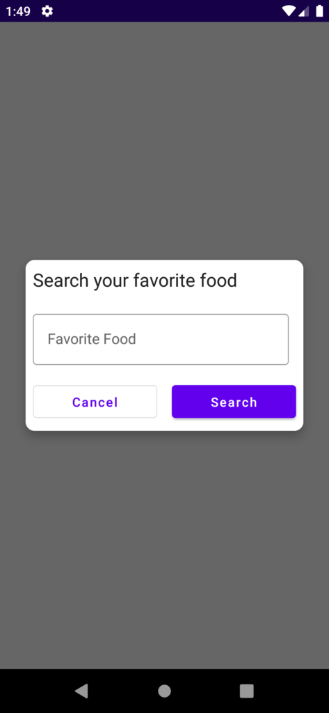
Alert dialog with Input field
As mentioned above, we need to create the dialog with a Dialog() composable function. But for the input field, we need to create a mutableStateOf() variable to hold the values of the input field.
@Composable
fun InputDialogView(onDismiss:() -> Unit) {
    val context = LocalContext.current
    var searchedFood by remember {
        mutableStateOf("")
    }

    Dialog(onDismissRequest = { onDismiss() }) {
        Card(
            //shape = MaterialTheme.shapes.medium,
            shape = RoundedCornerShape(10.dp),
            // modifier = modifier.size(280.dp, 240.dp)
            modifier = Modifier.padding(8.dp),
            elevation = 8.dp
        ) {
            Column(
                Modifier
                    .background(Color.White)
            ) {

                Text(
                    text = "Search your favorite food",
                    modifier = Modifier.padding(8.dp),
                    fontSize = 20.sp
                )

                OutlinedTextField(
                    value = searchedFood,
                    onValueChange = { searchedFood = it }, modifier = Modifier.padding(8.dp),
                    label = { Text("Favorite Food") }
                )

                Row {
                    OutlinedButton(
                        onClick = { onDismiss() },
                        Modifier
                            .fillMaxWidth()
                            .padding(8.dp)
                            .weight(1F)
                    ) {
                        Text(text = "Cancel")
                    }


                    Button(
                        onClick = {
                            Toast.makeText(context, searchedFood, Toast.LENGTH_SHORT).show()
                            onDismiss() },
                        Modifier
                            .fillMaxWidth()
                            .padding(8.dp)
                            .weight(1F)
                    ) {
                        Text(text = "Search")
                    }
                }


            }
        }
    }
}
To display the dialog you need to follow the same way above. by creating the mutableStateOf() variable and making it true or false.
The output of the above code is,
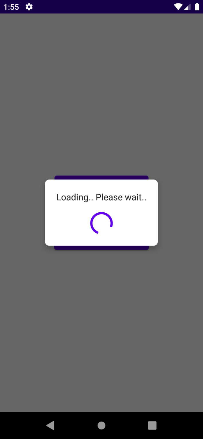
Loading Dialog
For the loading dialog, we need to use CircularProgressIndicator() composable function for loading animation. Apart from that everything is the same as other custom dialogs.
@Composable
fun LoadingView(onDismiss:() -> Unit) {
    Dialog(onDismissRequest = { onDismiss() }) {

        Card(
            shape = RoundedCornerShape(8.dp),
            modifier = Modifier,
            elevation = 8.dp
        ) {
            Column(
                Modifier
                    .background(Color.White)
                    .padding(12.dp)
            ) {
                Text(
                    text = "Loading.. Please wait..",
                    Modifier
                        .padding(8.dp), textAlign = TextAlign.Center
                )

                CircularProgressIndicator(
                    strokeWidth = 4.dp,
                    modifier = Modifier
                        .align(Alignment.CenterHorizontally)
                        .padding(8.dp)
                )
            }
        }
    }
}
The output of the about loading dialog code,
user3921740
- 520
- 6
- 7
7
If the content of your custom alert dialog need to scroll (eg: landscape mode or the content get longer). You can do like
@Composable
fun CustomDialogScrollable(
    onConfirmClicked: () -> Unit,
    onDismiss: () -> Unit,
) {
    Dialog(
        onDismissRequest = onDismiss,
    ) {
        Surface(
            shape = MaterialTheme.shapes.medium,
            color = MaterialTheme.colors.surface,
        ) {
            Column(modifier = Modifier.padding(16.dp)) {
                // TITLE
                Text(text = "Title", style = MaterialTheme.typography.subtitle1)

                Column(
                    modifier = Modifier
                        .fillMaxWidth()
                        .verticalScroll(rememberScrollState())
                        .weight(weight = 1f, fill = false)
                        .padding(vertical = 16.dp)
                ) {
                    Text(
                        text = "Lorem Ipsum is simply dummy text of the printing and typesetting industry. Lorem Ipsum has been the industry's standard dummy text ever since the 1500s",
                        style = MaterialTheme.typography.body2
                    )
                    OutlinedTextField(value = "", onValueChange = {
                    }, Modifier.padding(top = 8.dp), label = { Text(text = "Email") })

                    // other content can go here
                }

                // BUTTONS
                Row(modifier = Modifier.fillMaxWidth(), horizontalArrangement = Arrangement.End) {
                    TextButton(onClick = onDismiss) {
                        Text(text = "Cancel")
                    }
                    TextButton(onClick = onConfirmClicked) {
                        Text(text = "OK")
                    }
                }
            }
        }
    }
}
Using
val openDialog = remember { mutableStateOf(true) }
if (openDialog.value) {
    CustomDialog({
        // confirm clicked
    }, {
        openDialog.value = false
    })
}

Linh
- 57,942
- 23
- 262
- 279
5
It's easy to create a custom dialog in Jetpack Compose.
Here is a dialog box that asks to enalbe 2 Step verification. I have also added click events.
Output:
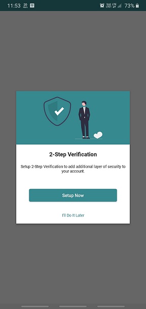
Code:
For more designs with source code, see Jetpack Compose Samples
import android.os.Bundle
import android.widget.Toast
import androidx.activity.ComponentActivity
import androidx.activity.compose.setContent
import androidx.compose.foundation.Image
import androidx.compose.foundation.background
import androidx.compose.foundation.layout.*
import androidx.compose.foundation.shape.RoundedCornerShape
import androidx.compose.material.*
import androidx.compose.runtime.*
import androidx.compose.ui.Alignment
import androidx.compose.ui.Modifier
import androidx.compose.ui.graphics.Color
import androidx.compose.ui.platform.LocalContext
import androidx.compose.ui.res.painterResource
import androidx.compose.ui.text.TextStyle
import androidx.compose.ui.text.font.Font
import androidx.compose.ui.text.font.FontFamily
import androidx.compose.ui.text.font.FontWeight
import androidx.compose.ui.text.style.TextAlign
import androidx.compose.ui.unit.dp
import androidx.compose.ui.unit.sp
import androidx.compose.ui.window.Dialog

/*
For more designs with source code,
visit: https://semicolonspace.com/jetpack-compose-samples/
 */
class MainActivity : ComponentActivity() {
    override fun onCreate(savedInstanceState: Bundle?) {
        super.onCreate(savedInstanceState)
        setContent {
            BlogPostsTheme(darkTheme = false) {
                Column(
                    modifier = Modifier.fillMaxSize(),
                    horizontalAlignment = Alignment.CenterHorizontally,
                    verticalArrangement = Arrangement.Center
                ) {
                    Column(
                        modifier = Modifier
                            .fillMaxSize()
                            .background(color = MaterialTheme.colors.background),
                        verticalArrangement = Arrangement.Center,
                        horizontalAlignment = Alignment.CenterHorizontally
                    ) {

                        var openDialog by remember {
                            mutableStateOf(false) // Initially dialog is closed
                        }

                        ButtonClick(buttonText = "Open Dialog") {
                            openDialog = true
                        }

                        if (openDialog) {
                            DialogBox2FA {
                                openDialog = false
                            }
                        }

                    }
                }
            }
        }
    }
}

@Composable
fun DialogBox2FA(onDismiss: () -> Unit) {
    val contextForToast = LocalContext.current.applicationContext

    Dialog(
        onDismissRequest = {
            onDismiss()
        }
    ) {
        Surface(
            modifier = Modifier
                .fillMaxWidth(),
            elevation = 4.dp
        ) {
            Column(
                verticalArrangement = Arrangement.Center,
                horizontalAlignment = Alignment.CenterHorizontally
            ) {

                Box(
                    modifier = Modifier
                        .fillMaxWidth()
                        .height(150.dp)
                        .background(color = Color(0xFF35898f)),
                    contentAlignment = Alignment.Center
                ) {
                    Image(
                        modifier = Modifier
                            .padding(top = 16.dp, bottom = 16.dp),
                        painter = painterResource(id = R.drawable.image_security),
                        contentDescription = "2-Step Verification",
                        alignment = Alignment.Center
                    )
                }

                Text(
                    modifier = Modifier.padding(top = 16.dp, bottom = 16.dp),
                    text = "2-Step Verification",
                    textAlign = TextAlign.Center,
                    style = TextStyle(
                        fontFamily = FontFamily(Font(R.font.roboto_bold, FontWeight.Bold)),
                        fontSize = 20.sp
                    )
                )

                Text(
                    modifier = Modifier.padding(start = 12.dp, end = 12.dp),
                    text = "Setup 2-Step Verification to add additional layer of security to your account.",
                    textAlign = TextAlign.Center,
                    style = TextStyle(
                        fontFamily = FontFamily(Font(R.font.roboto_regular, FontWeight.Normal)),
                        fontSize = 14.sp
                    )
                )

                Button(
                    modifier = Modifier
                        .fillMaxWidth()
                        .padding(top = 36.dp, start = 36.dp, end = 36.dp, bottom = 8.dp),
                    colors = ButtonDefaults.buttonColors(backgroundColor = Color(0xFF35898f)),
                    onClick = {
                        onDismiss()
                        Toast.makeText(
                            contextForToast,
                            "Click: Setup Now",
                            Toast.LENGTH_SHORT
                        ).show()
                    }) {
                    Text(
                        text = "Setup Now",
                        color = Color.White,
                        style = TextStyle(
                            fontFamily = FontFamily(
                                Font(
                                    R.font.roboto_medium,
                                    FontWeight.Medium
                                )
                            ),
                            fontSize = 16.sp
                        )
                    )
                }

                TextButton(
                    onClick = {
                        onDismiss()
                        Toast.makeText(
                            contextForToast,
                            "Click: I'll Do It Later",
                            Toast.LENGTH_SHORT
                        ).show()
                    }) {
                    Text(
                        text = "I'll Do It Later",
                        color = Color(0xFF35898f),
                        style = TextStyle(
                            fontFamily = FontFamily(
                                Font(
                                    R.font.roboto_regular,
                                    FontWeight.Normal
                                )
                            ),
                            fontSize = 14.sp
                        )
                    )
                }
            }
        }
    }
}

@Composable
fun ButtonClick(
    buttonText: String,
    onButtonClick: () -> Unit
) {
    Button(
        shape = RoundedCornerShape(5.dp),
        colors = ButtonDefaults.buttonColors(backgroundColor = MaterialTheme.colors.primary),
        onClick = {
            onButtonClick()
        }) {
        Text(
            text = buttonText,
            fontSize = 16.sp,
            color = Color.White
        )
    }
}
SemicolonSpace
- 1,007
- 11
- 20
0
Who wants to use a custom dialog like iOS uses.

@Composable
fun CustomAlertDialog(onDismiss: () -> Unit, onExit: () -> Unit) {
Dialog(
    onDismissRequest = { onDismiss() }, properties = DialogProperties(
        dismissOnBackPress = false, dismissOnClickOutside = false
    )
) {
    Card(
        shape = RoundedCornerShape(10.dp),
        modifier = Modifier
            .fillMaxWidth().padding(0.dp).height(IntrinsicSize.Min),
        elevation = 0.dp
    ) {
        Column(
            Modifier
                .fillMaxWidth()
                .background(Color.White)
        ) {
            Text(
                text = "Logout",
                modifier = Modifier.padding(8.dp, 16.dp, 8.dp, 2.dp)
                    .align(Alignment.CenterHorizontally).fillMaxWidth(), fontSize = 20.sp,
                fontWeight = FontWeight.Bold,
                textAlign = TextAlign.Center
            )
            Text(
                text = "Are you sure you want to logout?",
                modifier = Modifier.padding(8.dp, 2.dp, 8.dp, 16.dp)
                    .align(Alignment.CenterHorizontally).fillMaxWidth(),
                textAlign = TextAlign.Center
            )
            Divider(color = Color.Gray, modifier = Modifier.fillMaxWidth().width(1.dp))
            Row(Modifier.padding(top = 0.dp)) {
                CompositionLocalProvider(
                    LocalMinimumTouchTargetEnforcement provides false,
                ) {
                    TextButton(
                        onClick = { onDismiss() },
                        Modifier
                            .fillMaxWidth()
                            .padding(0.dp)
                            .weight(1F)
                            .border(0.dp, Color.Transparent)
                            .height(48.dp),
                        elevation = ButtonDefaults.elevation(0.dp, 0.dp),
                        shape = RoundedCornerShape(0.dp),
                        contentPadding = PaddingValues(0.dp)
                    ) {
                        Text(text = "Cancel", color = Color.Blue)
                    }
                }
                Divider(color = Color.Gray, modifier =
                Modifier.fillMaxHeight().width(1.dp))
                CompositionLocalProvider(
                    LocalMinimumTouchTargetEnforcement provides false,
                ) {
                    TextButton(
                        onClick = {
                         onExit.invoke()
                        },
                        Modifier
                            .fillMaxWidth()
                            .padding(0.dp)
                            .weight(1F)
                            .border(0.dp, color = Color.Transparent)
                            .height(48.dp),
                        elevation = ButtonDefaults.elevation(0.dp, 0.dp),
                        shape = RoundedCornerShape(0.dp),
                        contentPadding = PaddingValues()
                    ) {
                        Text(text = "Logout", color = Color.Red)
                    }
                }
            }
        }
    }
}
}
and use the composable anywhere!
CustomAlertDialog(
        onDismiss = {
            /*do something*/
        },
        onExit = {
            /*do something*/
        })
Ahmet Özaydın
- 21
- 2
0
If you are struggling like me how the dialog works in Compose and how to use it with View Model, let me explain
Where to put the actual dialog showing logic?
Ans.It doesn't matter where you put it, as long as it is accessible in code, you can see your dialogWill it be a pop up or I've to manually overlay it over my existing UIs?
Ans: It will be a dialog and not part of your existing UIHow to manage the state with it in a viewModel?
You Sir have come to the right place, find the example below:
Example on how to use with ViewModel
Activity
class MainActivity : ComponentActivity() {

    private val viewModel by lazy { MainViewModel() }

    override fun onCreate(savedInstanceState: Bundle?) {
        super.onCreate(savedInstanceState)
        setContent {
            YourAppTheme {
                HomeScreen(viewModel)
            }
        }
    }
}
Main Screen UI
@Composable
fun HomeScreen(signUpViewModel: SignUpViewModel) {


    Scaffold(
    ) { pd ->
       //ignore
        pd.calculateBottomPadding()
        Column(
            modifier = Modifier
                .fillMaxSize()
                .background(BackgroundColor)
                .wrapContentSize(Alignment.Center)
                .padding(20.dp)
        ) {

            Spacer(modifier = Modifier.weight(1.0f)) // fill height with spacer
            Text(
                text = "HomeUI",
                fontSize = 20.sp,
                fontWeight = FontWeight(700),
                color = Color(0xFF344054),
                textAlign = TextAlign.Center,
                modifier = Modifier
                    .align(alignment = CenterHorizontally)
                    .padding(0.dp)
            )
            Spacer(modifier = Modifier.fillMaxHeight(.1f))

            CommonButton(buttonLabel = "Capture") {
                signUpViewModel.showDialog.value = !signUpViewModel.showDialog.value
                Log.e("error", "showDialog.value ${signUpViewModel.showDialog.value}")
            }
            if(signUpViewModel.showDialog.collectAsState().value)
                CustomDialog(signUpViewModel = signUpViewModel)

            Spacer(modifier = Modifier.weight(1.0f)) // fill height with spacer

        }
    }
}
Dialog UI: Copied shamelessly from here:SO answer
@Composable
fun CustomDialog(signUpViewModel: SignUpViewModel) {
    Dialog(onDismissRequest = { signUpViewModel.showDialog.value = false }) {
        CustomDialogUI(signUpViewModel = signUpViewModel)
    }
}

//Layout
@Composable
fun CustomDialogUI(modifier: Modifier = Modifier, signUpViewModel: SignUpViewModel) {
    Card(
        //shape = MaterialTheme.shapes.medium,
        shape = RoundedCornerShape(10.dp),
        // modifier = modifier.size(280.dp, 240.dp)
        modifier = Modifier.padding(10.dp, 5.dp, 10.dp, 10.dp),
        elevation = CardDefaults.cardElevation(defaultElevation = 20.dp)
//        elevation = Shadow
    ) {
        Column(
            modifier.background(Color.White)
        ) {

            //.......................................................................
            Image(
                painter = painterResource(id = R.drawable.ic_home),
                contentDescription = null, // decorative
                contentScale = ContentScale.Fit,
                colorFilter = ColorFilter.tint(
                    color = PrimaryGreen
                ),
                modifier = Modifier
                    .padding(top = 35.dp)
                    .height(70.dp)
                    .fillMaxWidth(),

                )

            Column(modifier = Modifier.padding(16.dp)) {
                androidx.compose.material3.Text(
                    text = "Get Updates",
                    textAlign = TextAlign.Center,
                    modifier = Modifier
                        .padding(top = 5.dp)
                        .fillMaxWidth(),
                    style = MaterialTheme.typography.labelLarge,
                    maxLines = 2,
                    overflow = TextOverflow.Ellipsis
                )
                androidx.compose.material3.Text(
                    text = "Allow Permission to send you notifications when new art styles added.",
                    textAlign = TextAlign.Center,
                    modifier = Modifier
                        .padding(top = 10.dp, start = 25.dp, end = 25.dp)
                        .fillMaxWidth(),
                    style = MaterialTheme.typography.bodyMedium
                )
            }
            //.......................................................................
            Row(
                Modifier
                    .fillMaxWidth()
                    .padding(top = 10.dp)
                    .background(PrimaryGreen),
                horizontalArrangement = Arrangement.SpaceAround
            ) {

                androidx.compose.material3.TextButton(onClick = {
                    signUpViewModel.showDialog.value = false
                }) {

                    androidx.compose.material3.Text(
                        "Not Now",
                        fontWeight = FontWeight.Bold,
                        color = PrimaryGreen,
                        modifier = Modifier.padding(top = 5.dp, bottom = 5.dp)
                    )
                }
                androidx.compose.material3.TextButton(onClick = {
                    signUpViewModel.showDialog.value = false
                }) {
                    androidx.compose.material3.Text(
                        "Allow",
                        fontWeight = FontWeight.ExtraBold,
                        color = Color.Black,
                        modifier = Modifier.padding(top = 5.dp, bottom = 5.dp)
                    )
                }
            }
        }
    }
}

ViewModel:
class MainViewModel : ViewModel() {
var showDialog = MutableStateFlow(false)
}
touhid udoy
- 4,005
- 2
- 18
- 31