10

I'm creating xs view for my app, and my problem is, when i want to hide one div on small and extra small devices this extra small is not working, i followed bootstrap 4 documentation, and i don't know why this is not working.

<div class="headers">
        <div class="row">
          <div class="col-lg-6 col-md-4 col-sm-5">Produkt</div>
          <div class="col-2 d-sm-none d-md-block d-flex justify-content-start">Cena</div>
          <div class="col-lg-2 col-md-3 col-sm-4 d-flex justify-content-center">Ilość</div>
          <div class="col-lg-2 col-sm-3 d-flex justify-content-end">Wartość</div>
        </div>
      </div>

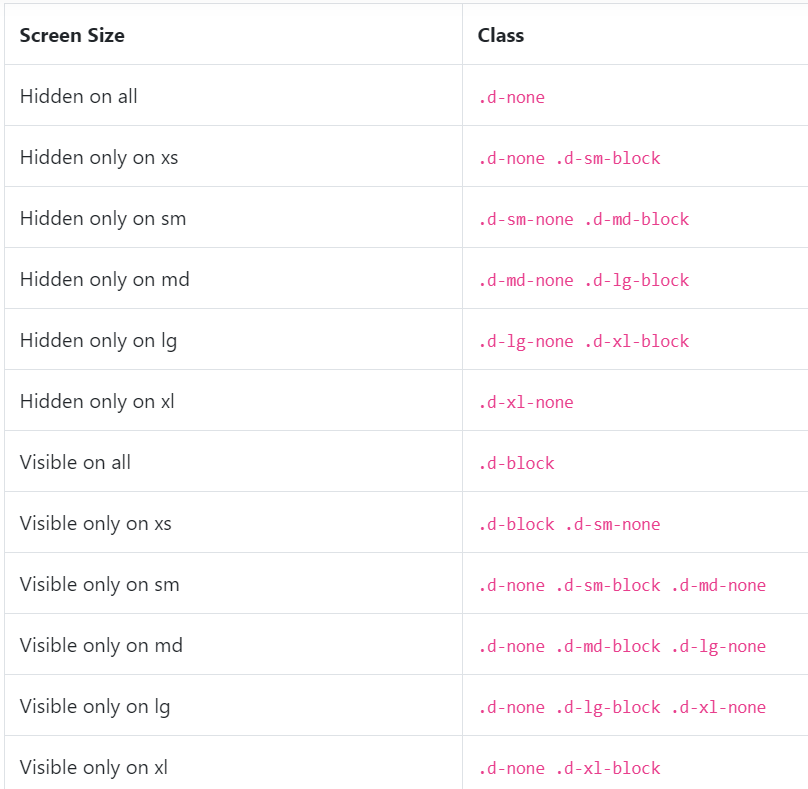
I want to put on second div:

d-none d-md-block

Show when screen is on md mode. When i set this on sm and xs is not hidding. When i add only d-sm-none to this line it's working well but not on xs.

https://getbootstrap.com/docs/4.0/utilities/display/#hiding-elements

3 Answers3

18

It's because you should use d-none instead of d-flex.

<div class="container">
    <div class="row">
        <div class="col-lg-6 col-md-4 col-sm-5">Produkt</div>
        <div class="col-2 d-none d-md-flex justify-content-start">Cena</div>
        <div class="col-lg-2 col-md-3 col-sm-4 d-flex justify-content-center">Ilość</div>
        <div class="col-lg-2 col-sm-3 d-flex justify-content-end">Wartość</div>
    </div>
</div>

https://codeply.com/go/XUSWoSdFcP

Related:
Missing visible-** and hidden-** in Bootstrap v4

Carol Skelly
  • 351,302
  • 90
  • 710
  • 624
  • Wrong, the "`d-flex`" and/or "`d-none`" classes can never override "`d-sm-none`" or "`d-md-block`" classes, because the way CSS override mechanism works, it prefers styles written later in CSS-file (so line-order matters, and class-attribute order is ignored). – Top-Master Jan 06 '22 at 15:25
  • @Top-Master what are you talking about? `d-flex` and `d-none` work at the smallest screen width. Yes, they are overridden by wider device media queries, but this is not what the OP was having a problem with. the problem is they had `d-flex` instead of `d-none` which was making it display on XS which is not what the OP wanted – Carol Skelly Jan 06 '22 at 16:56
  • I know what OP meant, but not what your "It's because the `d-flex` is overriding it." means, in fact see [my answer's](https://stackoverflow.com/a/70610086/8740349) **Understanding** section (which was originally meant as edit to your answer). – Top-Master Jan 06 '22 at 17:03
14

For Bootstrap 4.0 and above:

bootstrap display property

Documentation: https://getbootstrap.com/docs/4.3/utilities/display/

Additional information:

  • Hidden only for screen size sm and smaller(like xs) or Visible only for screen size md and larger(like lg): d-none d-md-block
  • Visible only for screen size sm and smaller(like xs) or Hidden only for screen size md and larger(like lg): d-block d-md-none
Aashish Kumar
  • 2,771
  • 3
  • 28
  • 43
0

OP was trying to hide something on xs (extra-small screen-size) with classes:

d-sm-none d-md-block d-flex

But in short, should instead use:

d-none d-md-block

Continue reading to learn why.

Understanding

First the terms; xs = extra-small screen-size, sm = small screen-size, md = medium screen-size, lg = large screen-size, xl = extra-large screen-size, and so on ...

Looking in Bootstrap 4's CSS source-files, we learn that:

  • d-sm-none means if screen-width >= 576px (i.e. greater or equal to smallest-size of sm range, which is 576px), then hide.
    @media (min-width: 576px) {
       .d-sm-none {
           display: none !important;
       }
    }
    
  • d-md-block means if screen-width >= 768px, then show as "block".
  • Finally, d-flex means set DEFAULT display to "flex" (I mean, it can NOT override any of above, because it's written in CSS-file before those).

Note that because screen-size >= xs condition would always be meet, Bootstrap does NOT provide d-xs-none, and we should use d-none for that.

Steps

  1. Replace d-sm-none with d-none (which basically means d-xs-none).
  2. Leave d-md-block as is (if showing on screen-size >= md is what you want).
  3. Remove d-flex, because it overrides d-none (since d-flex is written in CSS-file after d-none, although can never override d-md-block).

In short simply use classes:

d-none d-md-block

Example

<div class="container">
    <div class="row">
        <div class="col-lg-6 col-md-4 col-sm-5">Produkt</div>
        <div class="col-2 d-none d-md-flex justify-content-start">Cena</div>
        <div class="col-lg-2 col-md-3 col-sm-4 d-flex justify-content-center">Ilość</div>
        <div class="col-lg-2 col-sm-3 d-flex justify-content-end">Wartość</div>
    </div>
</div>

https://www.codeply.com/go/XUSWoSdFcP

Related:
Missing visible-** and hidden-** in Bootstrap

Top-Master
  • 7,611
  • 5
  • 39
  • 71
  • 1
    Thank you for interpreting Bootstrap's cryptic documentation. You're the first one I found that's stated the LOGICAL way to use this, "Show for medium or larger" or "Hide for small or smaller." – MrMoxy Mar 18 '23 at 22:04