Update 2023
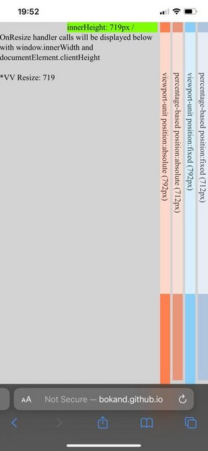
All modern browsers support CSS dvh units (dynamic view height).
100dvh equals 100% height of the visible area and dynamically changes when a mobile browser header or footer visibility is switched.

The large, small, and dynamic viewport units article provides more details, and @jwseph correctly mentioned it in the answer.
An example of usage with a modal window and phone input to test a mobile keyboard:
* {
  box-sizing: border-box;
}

html, body {
  margin: 0;
}
.modal {
  position: fixed;
  top: 0;
  left: 0;
  right: 0;
  bottom: 0;

  height: 100vh; /* old browsers */
  height: 100dvh; /* new browsers */

  width: 100%;

  padding: 16px;
}

.modal__container {
    display: grid;
    grid-template-rows: 1fr auto;

    background: #2a9efa;
    height: 100%;
}

.modal__content {
  margin: 16px 0 0 16px;
  padding-right: 16px;

  height: 100%;
  overflow-y: scroll;
}

.modal__footer {
  padding: 8px 24px;
  background: black;
}

.long-text {
   min-height: 1800px;
   background: yellow;
}
<div class="modal">
  <div class="modal__container">
     <div class="modal__content">
        <label>Phone:</label>
        <input type="tel" placeholder="+1 000">

        <p class="long-text">Long text</p>
    </div>
    <div class="modal__footer">
       <button>Close</button>
    </div>
  </div>
</div>
Previous answer
The community still has no strict agreement on how browsers should behave with the movement of top, bottom, and side panels from the developers' point of view.
The mentioned problem in the question is well known:

It all started with the Apple Webkit Issue. One of the problems was that website developers used vh for the calculation of the font size (calc(100 / vh * something)). If 100vh would be dynamic, when a user scrolls down and the address bar is hidden, then font size, as with any other bound elements, will be distorted, producing a very bad user experience, not to mention being CPU/GPU intensive task.
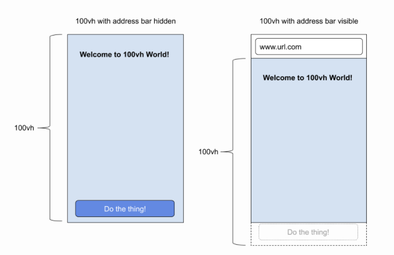
Apple's decision was to match the larger size of the screen (without the address bar) to 100vh constantly. So, when the address bar is displayed, and you use 100vh height, the bottom part will go out of the screen.
Many developers do not agree with that decision and consider viewport units to be dynamic and exactly equal to the visible "view port".
The Google Chrome team decided to be compatible with the Apple browser and stuck to the same decision.
height: 100% in most modern browsers is equal to the real visible part, i.e., the height varies and depends on whether the address bar is visible or hidden during the scroll.
Bars can appear not only on the top of the screen but also at the bottom (modern iOS), as well as an onscreen keyboard can make the view shorter.
There is a nice demo to check in mobile devices the actual size of 100vh vs 100%.

Solution 1
html, body { height: 100%; }
.footer-element {
  position: fixed;
  bottom: 10px;
}
Solution 2
Compensate some dependency on the vh with the visible bar height equal to the "100vh - 100%", when the bar is hidden the difference will be 0.
html, body { height: 100vh; }
.footer-element {
  position: fixed;
  bottom: calc(10px + (100vh - 100%));
}

