5

I have the following plot:

library(ggplot2)

ib<- data.frame(
  category =   factor(c("Cat1","Cat2","Cat1", "Cat1", "Cat2","Cat1","Cat1", "Cat2","Cat2")),
  city =       c("CITY1","CITY1","CITY2","CITY3", "CITY3","CITY4","CITY5", "CITY6","CITY7"),
  median =     c(1.3560, 2.4830, 0.7230, 0.8100, 3.1480, 1.9640, 0.6185, 1.2205, 2.4000),
  samplesize = c(851, 1794,   47,  189,  185,    9,   94,   16,   65)
  )


p<-ggplot(data=ib, aes(x=city, y=category, size=median, colour=category, label=samplesize)) +
  geom_point(alpha=.6) +
  scale_area(range=c(1,15)) +
  scale_colour_hue(guide="none") +
  geom_text(aes(size = 1), colour="black")
p

(I'm plotting the circles proportional to a median value and overlaying with a text label representing the sample size. image at https://i.stack.imgur.com/dv5Yj.jpg)

Is there any way to SEPARATE the two legends? I would like one legend (labeled "median") to give the scale of circles, and the other legend with a single letter "a" (or even better a number) which I could label "sample size". Since the two properties are not related in any way, it doesn't make sense to bundle them in the same legend.

I've tried all sorts of combinations but the best I can come up with is loosing the text legend altogether :)

thanks for the answer!

Krizbi
  • 457
  • 4
  • 10
  • I think the challenge will be trying to apply the two different size mappings. See @joran's comments [here](http://stackoverflow.com/questions/10359963/edits-in-a-ggplot2-geom-line) and the solution (refering to diffent color mappings). But I don't see how that style of solution can be applied easily to your problem. – Sandy Muspratt Apr 28 '12 at 22:38
  • In light of [kohske's comments here](http://stackoverflow.com/questions/10405823/changing-the-symbol-in-the-legend-key-in-ggplot2), I've changed the plot so that upper case "N" is plotted instead of lower case "a". – Sandy Muspratt May 02 '12 at 02:55

3 Answers3

4

Updated scale_area has been deprecated; scale_size used instead. The gtable function gtable_filter() is used to extract the legends. And modified code used to replace default legend key in one of the legends.

If you are still looking for an answer to your question, here's one that seems to do most of what you want, although it's a bit of a hack in places. The symbol in the legend can be changes using kohske's comment here

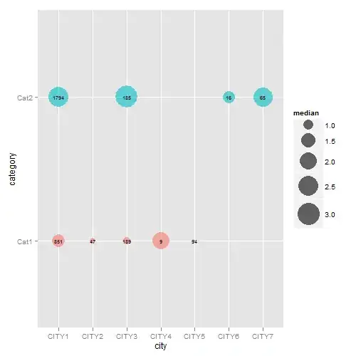
The difficulty was trying to apply the two different size mappings. So, I've left the dot size mapping inside the aesthetic statement but removed the label size mapping from the aesthetic statement. This means that label size has to be set according to discrete values of a factor version of samplesize (fsamplesize). The resulting chart is nearly right, except the legend for label size (i.e., samplesize) is not drawn. To get round that problem, I drew a chart that contained a label size mapping according to the factor version of samplesize (but ignoring the dot size mapping) in order to extract its legend which can then be inserted back into the first chart.

## Your data
ib<- data.frame(
  category =   factor(c("Cat1","Cat2","Cat1", "Cat1", "Cat2","Cat1","Cat1", "Cat2","Cat2")),
  city =       c("CITY1","CITY1","CITY2","CITY3", "CITY3","CITY4","CITY5", "CITY6","CITY7"),
  median =     c(1.3560, 2.4830, 0.7230, 0.8100, 3.1480, 1.9640, 0.6185, 1.2205, 2.4000),
  samplesize = c(851, 1794,   47,  189,  185,    9,   94,   16,   65)
  )

## Load packages
library(ggplot2)
library(gridExtra)
library(gtable)
library(grid)

##  Obtain the factor version of samplesize.   
ib$fsamplesize = cut(ib$samplesize, breaks = c(0, 100, 1000, Inf))

## Obtain plot with dot size mapped to median, the label inside the dot set 
## to samplesize, and the size of the label set to the discrete levels of the factor
## version of samplesize. Here, I've selected three sizes for the labels (3, 6 and 10)
## corresponding to samplesizes of 0-100, 100-1000, >1000. The sizes of the labels are
## set using three call to geom_text - one for each size.

p <- ggplot(data=ib, aes(x=city, y=category)) +
   geom_point(aes(size = median, colour = category), alpha = .6) +
   scale_size("Median", range=c(0, 15)) +
   scale_colour_hue(guide = "none") + theme_bw()

p1 <- p + 
  geom_text(aes(label = ifelse(samplesize > 1000, samplesize, "")), 
         size = 10, color = "black", alpha = 0.6) +
  geom_text(aes(label = ifelse(samplesize < 100, samplesize, "")), 
         size = 3, color = "black", alpha = 0.6) +
  geom_text(aes(label = ifelse(samplesize > 100 & samplesize < 1000, samplesize, "")), 
         size = 6, color = "black", alpha = 0.6)


## Extracxt the legend from p1 using functions from the gridExtra package
g1 = ggplotGrob(p1) 
leg1 = gtable_filter(g1, "guide-box")


## Keep p1 but dump its legend
p1 = p1 + theme(legend.position = "none")


## Get second legend - size of the label.
## Draw a dummy plot, using fsamplesize as a size aesthetic. Note that the label sizes are
## set to 3, 6, and 10,  matching the sizes of the labels in p1. 

dummy.plot = ggplot(data = ib, aes(x = city, y = category, label = samplesize)) +
  geom_point(aes(size = fsamplesize), colour = NA) +
  geom_text(show.legend = FALSE) + theme_bw() +
  guides(size = guide_legend(override.aes = list(colour = "black", shape = utf8ToInt("N")))) +
scale_size_manual("Sample Size", values = c(3, 6, 10),
     breaks = levels(ib$fsamplesize), labels = c("< 100", "100 - 1000", "> 1000"))

## Get the legend from dummy.plot using functions from the gridExtra package
g2 = ggplotGrob(dummy.plot) 
leg2 = gtable_filter(g2, "guide-box")


## Arrange the three components (p1, leg1, leg2) using functions from the gridExtra package
## The two legends are arranged using the inner arrangeGrob function. The resulting
## chart is then arranged with  p1 in the outer arrrangeGrob function.
ib.plot = arrangeGrob(p1, arrangeGrob(leg1, leg2, nrow = 2), ncol = 2, 
      widths = unit(c(9, 2), c("null", "null")))

## Draw the graph
grid.newpage()
grid.draw(ib.plot)

enter image description here

Community
  • 1
  • 1
Sandy Muspratt
  • 31,719
  • 12
  • 116
  • 122
  • Wow @Sandy, thanks for the effort! This is great, many many thanks! – Krizbi May 01 '12 at 09:09
  • see [here](https://github.com/hadley/ggplot2/wiki/Share-a-legend-between-two-ggplot2-graphs) for a way to deal with the legend width more reliably. – baptiste May 01 '12 at 09:17
1

This actually doesn't directly address your question, but it is how I might go about creating a graph with the general characteristics you describe:

ib$ss <- paste("n = ",ib$samplesize,sep = "")

ggplot(data=ib, aes(x=city, y=category, size=median, colour=category, label=ss)) +
  geom_point(alpha=.6) +
  geom_text(size = 2, vjust = -1.2,colour="black") +
  scale_colour_hue(legend = FALSE)

I removed the scale_area piece, as I'm not sure what purpose it served and it was causing errors for me.

So the rationale here is that the sample size information feels more like an annotation to me than something that deserves its own scale and legend. Opinions may differ on that, of course, but I thought I'd put it out there in case you find it useful.

enter image description here

joran
  • 169,992
  • 32
  • 429
  • 468
  • Thanks @joran, this is feasible, however, I'm quite confined with space in my final plot (some 30 cities and ~100 categories) so I'd prefer to describe the meaning of these numbers outside the plot. I agree this is not the best solution, but I cannot afford that much text in the plot itself... – Krizbi Apr 28 '12 at 20:50
  • @Krizbi I figured. Though, is plotting > (30 x 100) individual numbers on the plot going to be any more readable than having each preceded by "n = "? – joran Apr 29 '12 at 00:55
  • you do have a point - surely I'm in the "info overload" zone with this plot already (even without the numbers) :). Therefore, I'd like to be as spartan as possible with the extra text. A "n = " adds 4 char spaces to a number with 2-3 digits on average, so I think the impact and visual clutter will be considerable. Think of what I want to achieve as the data in the periodic table of elements (ex here: http://www.ptable.com/), there are several pieces of information for each element and we have a visual guide on how to read them (second box in the first row). – Krizbi Apr 29 '12 at 06:54
0

This too doesn't answer your question. I've left samplesize inside the circle. Also, samplesize to me is more like an annotation than a legend. But I think you are using an old version of ggplot2. There have been some changes in ggplot2 version 0.9.0. I've made the changes below.

p<-ggplot(data=ib, aes(x=city, y=category, size=median, colour=category, label=samplesize)) +
  geom_point(alpha=.6) +
  scale_area(range = c(1,15)) +  # range instead of to
  scale_colour_hue(guide = "none") +    # guide instead of legend
  geom_text(size = 2.5, colour="black")
 p

enter image description here

Sandy Muspratt
  • 31,719
  • 12
  • 116
  • 122
  • Thanks @Sandy, indeed it seems I was using the older version - I did upgrade but somehow forgot to restart Rstudio :) – Krizbi Apr 28 '12 at 21:53