4

I have a 3D scatter plot which, on one of its planes, plots 2 points for each date. I've asked about how to draw a LINE between every pair of points, and received an answer for which I'm thankful. What I want now is to draw a BAR or a RECTANGLE to connect the points instead of just a line.

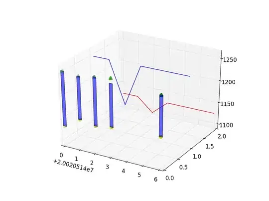
Here's what the plot looks like at the moment, but I want it to look a bit like the plot from the 3D bar demo from matplolib's docs except with the bars "floating" instead of anchored to the axis.

I've tried using Axes3D.bar (as explained on the matplotlib page) but it expects me to supply a "height" for each bar instead of two actual coordinates, and that height will be anchored to the axis.

This is the code, and any help is appreciated.

import matplotlib.pyplot
from mpl_toolkits.mplot3d import Axes3D

dates       = [20020514, 20020515, 20020516, 20020517, 20020520]
highs       = [1135, 1158, 1152, 1158, 1163]
lows        = [1257, 1253, 1259, 1264, 1252]
upperLimits = [1125.0, 1125.0, 1093.75, 1125.0, 1125.0]
lowerLimits = [1250.0, 1250.0, 1156.25, 1250.0, 1250.0]

zaxisvalues0= [0, 0, 0, 0, 0]
zaxisvalues1= [1, 1, 1, 1, 1]
zaxisvalues2= [2, 2, 2, 2, 2]

fig = matplotlib.pyplot.figure()
ax  = fig.add_subplot(111, projection = '3d')

ax.plot(dates, zaxisvalues1, lowerLimits, color = 'b')
ax.plot(dates, zaxisvalues2, upperLimits, color = 'r')

for i,j,k,h in zip(dates,zaxisvalues0,lows,highs):
    ax.plot([i,i],[j,j],[k,h],color = 'g')

ax.scatter(dates, zaxisvalues0, highs, color = 'g', marker = "o")
ax.scatter(dates, zaxisvalues0, lows, color = 'y', marker = "^")

matplotlib.pyplot.show()
Community
  • 1
  • 1
Zambi
  • 363
  • 1
  • 3
  • 9

3 Answers3

5

I think it'll be easier to use a PolyCollection. Is this close to what you are after?

enter image description here

import matplotlib.pyplot
from mpl_toolkits.mplot3d import Axes3D
from matplotlib.collections import PolyCollection
import random

dates       = [20020514, 20020515, 20020516, 20020517, 20020520]
highs       = [1135, 1158, 1152, 1158, 1163]
lows        = [1257, 1253, 1259, 1264, 1252]
upperLimits = [1125.0, 1125.0, 1093.75, 1125.0, 1125.0]
lowerLimits = [1250.0, 1250.0, 1156.25, 1250.0, 1250.0]

zaxisvalues0= [0, 0, 0, 0, 0]
zaxisvalues1= [1, 1, 1, 1, 1]
zaxisvalues2= [2, 2, 2, 2, 2]

fig = matplotlib.pyplot.figure()
ax  = fig.add_subplot(111, projection = '3d')

ax.plot(dates, zaxisvalues1, lowerLimits, color = 'b')
ax.plot(dates, zaxisvalues2, upperLimits, color = 'r')

verts = []; fcs = []
for i in range(len(dates)-1):
   xs = [dates[i],dates[i+1],dates[i+1],dates[i],dates[i]] # each box has 4 vertices, give it 5 to close it, these are the x coordinates
   ys = [highs[i],highs[i+1],lows[i+1],lows[i], highs[i]]  # each box has 4 vertices, give it 5 to close it, these are the y coordinates
   verts.append(zip(xs,ys))
   fcs.append((random.random(),random.random(),random.random(),0.6))

poly = PolyCollection(verts, facecolors = fcs, closed = False)
ax.add_collection3d(poly, zs=[zaxisvalues0[0]] * len(verts), zdir='y') # in the "z" just use the same coordinate

ax.scatter(dates, zaxisvalues0, highs, color = 'g', marker = "o")
ax.scatter(dates, zaxisvalues0, lows, color = 'y', marker = "^")

matplotlib.pyplot.show()
Mark
  • 106,305
  • 20
  • 172
  • 230
  • Thanks. Even though it's not exactly what I was hoping to achieve, your code is a real eye-opener. I should read up on the PolyCollections class. And many thanks for commenting the code - it really helps. I've come close to what I want by going back to your original code and adding "linewidth = 5" to the ax.plot command in the for loop. It draws a line, but thick enough to look like a bar/rectangle. – Zambi May 16 '12 at 08:58
2

You should be able to make a mix between:

3D bar demo from matplolib's docs

and

Bar stacked example

ie to draw bars in a 3D graph, but use the "bottom" parameter to set the starting heigh of your bars.

Alexis

Alexis
  • 707
  • 8
  • 33
  • thanks for the tip, but I just can't get it to work. I tried replacing Mark's for loop in the original code with this: ax.bar(dates, zaxisvalues2, highs) but it's drawing the bars in the wrong plane. I tried zaxisvalue0 and zaxisvalues1, and I tried shuffling the order but no luck so far. – Zambi May 16 '12 at 09:07
  • Maybe this is what you're looking for [hist3D example](http://matplotlib.sourceforge.net/examples/mplot3d/hist3d_demo.html). You then can use the zpos to set the lowest edges of the boxes ( to make an example, get hist3D example and change line 16 for _zpos = hist.flatten()_ ). – Alexis May 16 '12 at 09:41
  • As for the wrong plane problem, you can fix it with parameter zdir, for instance _ax.bar(dates, highs,zdir='y',bottom=highs, zs=0, color = 'b')_ – Alexis May 16 '12 at 09:43
2

Thanks for your help Alexis and Mark. I think it's sorted out now.

I've used Alexis' tip for using the 'zdir' property.

As for the wrong plane problem, you can fix it with parameter zdir, for instance ax.bar(dates, highs,zdir='y',bottom=highs, zs=0, color = 'b') – Alexis

At first it was generating bars that are twice as high as they should be, because it was measuring from the bottom (i.e. the 'lows' value) and then ADDING to it a height (from the 'highs' value).

So I ended up introducing a new list, 'displacements', which measures the distance between each high and each low (and in the process discovered that I had my lows and highs swapped around. Duh, sorry about that). So now I'm plotting 'displacements' rather than highs.

I added to Alexis' line a width, alignment, edgecolor and alpha (for transparency); then thickened the markers for the ax.scatter plots. Now the code works (well, almost, except for that arrow on the 4th bar being higher than it should be... hmmm)

import matplotlib.pyplot
from mpl_toolkits.mplot3d import Axes3D

dates       = [20020514, 20020515, 20020516, 20020517, 20020520]
lows        = [1135, 1158, 1152, 1158, 1163]
highs       = [1257, 1253, 1259, 1264, 1252]
upperLimits = [1125.0, 1125.0, 1093.75, 1125.0, 1125.0]
lowerLimits = [1250.0, 1250.0, 1156.25, 1250.0, 1250.0]

zaxisvalues0= [0, 0, 0, 0, 0]
zaxisvalues1= [1, 1, 1, 1, 1]
zaxisvalues2= [2, 2, 2, 2, 2]

fig = matplotlib.pyplot.figure()
ax  = fig.add_subplot(111, projection = '3d')

ax.plot(dates, zaxisvalues1, lowerLimits, color = 'b')
ax.plot(dates, zaxisvalues2, upperLimits, color = 'r')

ax.scatter(dates, zaxisvalues0, highs, color = 'g', marker = "^", linewidth=4)
ax.scatter(dates, zaxisvalues0, lows,  color = 'y', marker = "o", linewidth=4)

displacements = []
for i in lows:
    position = lows.index(i)
    disp = highs[position] - i
    displacements.append(disp)

ax.bar(dates, displacements, zdir='y', bottom=lows, zs=0, width=0.2, align='center', alpha=0.6, edgecolor='k')

matplotlib.pyplot.show()

This is the result:

Plot

Zambi
  • 363
  • 1
  • 3
  • 9
  • Zambi, your last issue with the 4th arrows comes from your for loop: you have duplicate values in lows, so lows.index(i) always returns 1for 1158. Change for _for i in range(len(lows)):\\ disp = highs[i] - lows[i]_ – Alexis May 16 '12 at 11:41
  • Thank you Alexis. You just saved me several hours of trying to fix that 4th bar. Much appreciated. – Zambi May 16 '12 at 13:05