2

I'm trying to fit a normalized curve to my data. I have thousands of datapoints in a csv file, and I'm using matplotlib to plot it. I'm not sure which statistic to use exactly. I was thinking that this would be a normal/Gaussian distribution. If so I'm still not sure how I would calculate/graph it.

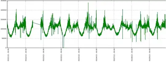
Here's an example of my currently graphed data:

Example Graph

Here's a small snip of my data:

71910, 2012-06-01 05:16:58.823148
78540, 2012-06-01 05:17:58.975718
73350, 2012-06-01 05:18:59.112917
74700, 2012-06-01 05:19:59.264698
69270, 2012-06-01 05:20:59.408202
69270, 2012-06-01 05:21:59.521627
71580, 2012-06-01 05:22:59.643570
75450, 2012-06-01 05:23:59.796075
70320, 2012-06-01 05:24:59.966520
69900, 2012-06-01 05:26:00.089748
76950, 2012-06-01 05:27:00.248423
72300, 2012-06-01 05:28:00.407092
71220, 2012-06-01 05:29:00.588237
71370, 2012-06-01 05:30:00.748330
75750, 2012-06-01 05:31:00.903936
76320, 2012-06-01 05:32:01.064029
65430, 2012-06-01 05:33:01.212079
75870, 2012-06-01 05:34:01.369971
77190, 2012-06-01 05:35:01.541307
74910, 2012-06-01 05:36:01.713357
82830, 2012-06-01 05:37:01.892127
75390, 2012-06-01 05:38:02.059375
78690, 2012-06-01 05:39:02.238673
74460, 2012-06-01 05:40:02.394993
78180, 2012-06-01 05:41:02.636044
77370, 2012-06-01 05:42:02.801483
75510, 2012-06-01 05:43:02.974502
73830, 2012-06-01 05:44:03.149257
75960, 2012-06-01 05:45:03.349482
71970, 2012-06-01 05:46:03.522843
80460, 2012-06-01 05:47:03.655879
76200, 2012-06-01 05:48:03.797326
75090, 2012-06-01 05:49:03.976444
78510, 2012-06-01 05:50:04.114751
71220, 2012-06-01 05:51:04.301188
78540, 2012-06-01 05:52:04.489870
75540, 2012-06-01 05:53:04.684908
76710, 2012-06-01 05:54:04.857187
72810, 2012-06-01 05:55:05.061263
84810, 2012-06-01 05:56:05.243845
72900, 2012-06-01 05:57:05.468686
80730, 2012-06-01 05:58:05.690607
80160, 2012-06-01 05:59:05.843441
81990, 2012-06-01 06:00:06.011187
79560, 2012-06-01 06:01:06.210168
82050, 2012-06-01 06:02:06.390090
84870, 2012-06-01 06:03:06.599912
76620, 2012-06-01 06:04:06.808242
78750, 2012-06-01 06:05:07.023915

Finally, here's the code I'm currently employing to graph the data:

import matplotlib
matplotlib.use('Agg')                                     
from matplotlib.mlab import csv2rec                             
import matplotlib.pyplot as plt                                
import matplotlib.dates as mdates                             
from pylab import *                                           

output_image_name='output.png'                                     
input_filename="counter.log"
output_tmp_filename="counter.log_noneg"

input = open(input_filename, 'r')
output = open(output_filename, 'w')                                                                                                                            

filtered = (line for line in input if not line.startswith('-'))
for line in filtered:                                                                                                                                                   
        output.write(line)     

input.close()
output.close()

data = csv2rec(output_tmp_filename, names=['values', 'time'])   
rcParams['figure.figsize'] = 10, 5                              
rcParams['font.size'] = 8                                     

fig = plt.figure()                                                                                 

plt.plot(data['time'], data['values'])                                             

ax = fig.add_subplot(111)                                     
ax.plot(data['time'], data['values'])                          
hours = mdates.HourLocator()                                   
fmt = mdates.DateFormatter('%D - %H:%M')                       
ax.xaxis.set_major_locator(hours)                            
ax.xaxis.set_major_formatter(fmt)                              

ax.grid()                                              

plt.ylabel("Values")                                          
plt.title("Capture Log")            

fig.autofmt_xdate(bottom=0.2, rotation=90, ha='left')          

plt.savefig(output_image_name)

os.remove(output_tmp_filename)

My end goal here is to get rid of all the upper and lower bound spikes in the data/graph and fit a nice line on top of the existing data.

Marco Cerliani
  • 21,233
  • 3
  • 49
  • 54
secumind
  • 1,141
  • 1
  • 17
  • 38

3 Answers3

3

This isn't really anything related to programming, but I'd say you're just looking to smooth the data, so just plot a rolling average rather than the raw data. I'd make it a variable-sized list that you append() and pop(0) to. Note that you want pop(0), not just pop(), which would remove the item you just appended.

You'll probably want to plot it with different amounts of smoothing (i.e. with different size lists you're plotting the average of), to see what gives you the result you want.

rossdavidh
  • 1,966
  • 2
  • 22
  • 33
2

This looks to be experimental data measuring some noisy value. The notion of "fitting" a normal distribution to something that clearly exhibits some periodic behaviour is probably not the right way to go. You could test if the data is approximately normally distributed by plotting a histogram of it using a suitable amount of intervals. For the purposes of smoothing the data I would suggest applying some type of low pass filter to lose the high frequency noise you have.

mathematician1975
  • 21,161
  • 6
  • 59
  • 101
  • After a lot of reading and playing around in excel I really think that a continuous moving average is the way to go: [wikipedia entry](http://en.wikipedia.org/wiki/Moving_average) now I just need to figure out how to implement it in python – secumind Jun 05 '12 at 01:00
2

I decided to go with a rolling mean approach, it worked well and is fast enough for my purposes. This creates an array where the first part is the original values, the second is the rolling continuous mean, and the third is the datatime.

import matplotlib
from matplotlib.mlab import csv2rec                           
import matplotlib.pyplot as plt                                                           
import numpy
import datetime

inputfilename="test_tpm_log.log"


data = csv2rec(inputfilename, names=['packets', 'time'])

old_value = 0
counter_tpm = []
counter_rollmean = []

for tpm in data['packets']:
        new_value = (tpm + old_value) / 2
        old_value = tpm
        counter_tpm.append(tpm)
        counter_rollmean.append(new_value)


dates_in_file = str(data['time'])
for dates in dates_in_file:
        print dates

rec = zip(counter_tpm, counter_rollmean, data['time'])

print rec
secumind
  • 1,141
  • 1
  • 17
  • 38