1

I have the following code to plot something. I show also the the result. My question is, I want the lines to be in sync with the ticks.

Any advise?

Thanks for your time.

g <- qplot(hora, puntual, colour=part, data=x, group=part) +
geom_line() +
geom_pointrange(aes(ymin = inf, ymax = sup)) +
scale_color_manual(values=c("red", "green")) + 
scale_y_continuous(breaks=seq(1, 55, 0.5)) + 
opts(panel.background = theme_rect(fill='white', colour='gray'))
jpeg("plot.jpg", width=800, height=800)
print(g)
dev.off()

To Chase: This is the DF I am reading (excerpt)

72000,   40.920,  44.478,
72010,   41.197,  42.212,
72020,   41.462,  41.893,
72030,   41.523,  41.759,
72045,   41.509,  41.725,
72050,   41.504,  41.719,
72055,   40.920,  44.478,

First column is X, Second and Third is the interval shown in the jpg sample in red.

result

notuo
  • 1,091
  • 2
  • 9
  • 15
  • 3
    we like questions to be [reproducible](http://stackoverflow.com/questions/5963269/how-to-make-a-great-r-reproducible-example) before answering them. – Chase Jun 16 '12 at 18:17
  • @Chase. Meaning? The data is not important here. If you see `scale_y_continuous(breaks=seq(1, 55, 0.5))` defines the tick marks. I want the light gray lines aligned with them – notuo Jun 16 '12 at 18:51
  • 2
    meaning that I don't think it is unreasonable for someone asking a question to construct that question in such a format so that it is *easy* for those trying to help to duplicate those problems. Your data may not be important, but it is critical to understanding your specific problem. Sure, I could probably read between the lines, make up some data that is somewhat close, and probably answer your question in no time. Or, I may miss some nuance of your dataset that is critical, i.e. `factor` vs `character` or something else. It is really *quite* trival to give us the output of – Chase Jun 16 '12 at 18:59
  • 1
    `dput(head(yourSpecialDataHere))` so that we are all playing on the same field. If that is too difficult for you to do, maybe someone else will come along who is better at mind reading than I am. If this is a problem that persists across all data, why not use the built in diamons or mtcars dataset so we can reproduce it? – Chase Jun 16 '12 at 18:59
  • I just add some data. Thanks for you comment. – notuo Jun 16 '12 at 19:04

1 Answers1

1

Your example is still quite far from reproducible. We aren't trying to be difficult when we ask for reproducibility. Please keep in mind that you are asking random strangers to take time out of their day (on a weekend!) to help you. It's only polite for you to do as much of the work up front as possible. If I can simply copy+paste some code and run it in a clean R session to see what's happening, I'm much more likely to devote time to the question. Here's what I mean:

Create some reproducible data:

dat <- data.frame(x = 1:10,y = sample(10,10,replace = TRUE))

That was one line, and makes life for the answerer so much easier. The other reason we ask that people provide reproducible examples is that doing so often causes you to solve your own problem.

As I went through the process of developing this reproducible example, I first made this plot:

ggplot(dat,aes(x = x,y = y)) + 
    geom_point() + 
    scale_y_continuous(breaks = seq(1,10,0.5))

enter image description here

Everything looks fine, right? But note that since the default panel background is grey, the grid lines are white. Alarm bells should be going off in your head at this point...

Next I plotted this:

ggplot(dat,aes(x = x,y = y)) + 
    geom_point() + 
    scale_y_continuous(breaks = seq(1,10,0.5)) + 
    opts(panel.background = theme_rect(fill='white', colour='gray'))

enter image description here

Note that the "grid lines" now are not actually the grid lines. They are the borders of of your theme_rect background. That's what happens when you specify a color for a 2D object; the borders are colored.

At this point I realized that the we just need to recolor the grid lines:

ggplot(dat,aes(x = x,y = y)) + 
    geom_point() + 
    scale_y_continuous(breaks = seq(1,10,0.5)) + 
    opts(panel.background = theme_rect(fill='white', colour='gray'),
         panel.grid.minor = theme_blank(),
         panel.grid.major = theme_line(colour = "grey80"))

enter image description here

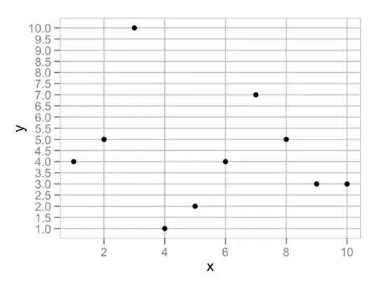
I've removed the minor grid lines with theme_blank and simply recolored the major ones. They were there all the time, just drawn in white!

So the lesson here is that making a reproducible example isn't just us answerers being lazy...it benefits you too! :)

joran
  • 169,992
  • 32
  • 429
  • 468
  • Joran, thank you for your time. I understand about asking reproducible questions, this time I didn't put anything just because I never realize the issue was with the data. I apologize for that. The sample code and the DF are copy/paste from my actual code. I have a really hard time with the plot routines in R. This border colored white is just an example of the many details of this plot routine and actually was the answer of my question. Thank you for your time and have a great weekend. I promise the next time I'll put more detail in reproducible question. – notuo Jun 16 '12 at 21:37
  • @notuo No problem. I hope you didn't think I was being condescending. I try, when possible, to write answers that help not just the OP, but also others who will stumble across this down the road. – joran Jun 16 '12 at 22:11