199

What is a good way to overcome the unfortunate fact that this code will not work as desired:

<div class="required">
    <label>Name:</label>
    <input type="text">
</div>

<style>
    .required input:after { content:"*"; }
</style>

In a perfect world, all required inputs would get the little asterisk indicating that the field is required. This solution impossible since the CSS is inserted after the element content, not after the element itself, but something like it would be ideal. On a site with thousands of required fields, I can move the asterisk in front of the input with one change to one line (:after to :before) or I can move it to the end of the label (.required label:after) or in front of the label, or to a position on the containing box, etc...

This is important not just in case I change my mind about where to place the asterisk everywhere, but also for odd cases where the form layout doesn't allow the asterisk in the standard position. It also plays well with validation that checks the form or highlights improperly completed controls.

Lastly, it doesn't add additional markup.

Are there any good solutions that have all or most of the advantages of the impossible code?

brentonstrine
  • 21,694
  • 25
  • 74
  • 120

20 Answers20

356

Is that what you had in mind?

http://jsfiddle.net/erqrN/1/

<label class="required">Name:</label>
<input type="text">

<style>
  .required:after {
    content:" *";
    color: red;
  }
</style>

.required:after {
  content:" *";
  color: red;
}
<label class="required">Name:</label>
<input type="text">

See https://developer.mozilla.org/en-US/docs/Web/CSS/pseudo-elements

Abraham
  • 8,525
  • 5
  • 47
  • 53
gherkins
  • 14,603
  • 6
  • 44
  • 70
  • 2
    That is a good solution in many situations, however it doesn't work if absolute positioning or floats are being used to line up the forms (e.g. http://jsfiddle.net/erqrN/2/). I am actually using absolute positioning to line up my forms. I could absolutely position the `*` but it would mean that I would have to manually put in the distance for every length of form input, and wouldn't be able to have any flexible inputs. – brentonstrine Jun 25 '12 at 22:11
  • 6
    @brentonstrine Odds are, you shouldn't be using absolute positioning to line up your forms. Though commonly used, absolute positioning is not responsive (unless you have JS modding the DOM on resize) while the same effects can always be achieved using static or relative position, which can be responsive in design. Readers, please avoid using styles such as absolute positioning on things such as form elements, as this is a quite archaic approach to positioning. I know your comment was very old, but this is for the readers. – WebWanderer Jul 19 '16 at 20:08
  • The asterisk does not appear using [Lynx](http://lynx.browser.org/), which could be an accessibility issue. – Dave Jarvis Nov 16 '16 at 21:48
  • can I put this in my .css? If yes, could you please give an example? I didn't know that **:** syntax – Leonardo Maffei Aug 25 '18 at 14:29
  • @LeonardoMaffei sure, have a look at https://developer.mozilla.org/en-US/docs/Web/CSS/pseudo-elements & https://developer.mozilla.org/en-US/docs/Web/CSS/Pseudo-classes – gherkins Aug 26 '18 at 07:08
  • If there was previous element selector it would make life much easier to add a star after all labels that the following input has the attribute 'required'. I guess this will be possible when 'has' selector is supported by the major browsers.. Adding a class 'required' for label does not really make sense to me. – akd Mar 31 '20 at 09:09
  • I'd suggest to use a non-breaking space (`'\00a0*'`) so an asterisk won't be displayed on a separate line. – Slava Semushin Jan 12 '21 at 17:13
79
.required label {
    font-weight: bold;
}
.required label:after {
    color: #e32;
    content: ' *';
    display:inline;
}

Fiddle with your exact structure: http://jsfiddle.net/bQ859/

laffuste
  • 16,287
  • 8
  • 84
  • 91
  • You are still needing classes on your labels, really the only way to keep the document structure neat is the background image method. Concise though. – Henry's Cat Mar 01 '19 at 16:25
25

To put it exactly INTO input as it is shown on the following image:

enter image description here

I found the following approach:

.asterisk_input::after {
content:" *"; 
color: #e32;
position: absolute; 
margin: 0px 0px 0px -20px; 
font-size: xx-large; 
padding: 0 5px 0 0; }
 <form>
    <div>              
        <input type="text" size="15" />                                 
        <span class="asterisk_input">  </span>            
    </div>            
</form> 

Site on which I work is coded using fixed layout so it was ok for me.

I'm not sure that that it's good for liquid design.

Artur INTECH
  • 6,024
  • 2
  • 37
  • 34
Tebe
  • 3,176
  • 8
  • 40
  • 60
  • yes, it looks the same. The difference is that he used background-image. (or I've misunderstood something) – Tebe May 31 '14 at 02:07
  • 2
    adding empty span markup for something like this defeats the whole point of css, doesn't it? – Jason Silver Jun 20 '18 at 17:28
  • 1
    span costs nothing, it's a common trick to simplify things found pretty often among vast quantity of libraries I've seen – Tebe Jun 22 '18 at 14:14
19
input[required]{
    background-image: radial-gradient(#F00 15%, transparent 16%), radial-gradient(#F00 15%, transparent 16%);
    background-size: 1em 1em;
    background-position: right top;
    background-repeat: no-repeat;
}
Jazi
  • 6,569
  • 13
  • 60
  • 92
faisal
  • 209
  • 2
  • 3
  • 1
    why are there two `radial-gradient` terms on `background-image`? I can't get this syntax to marry up with https://developer.mozilla.org/en-US/docs/Web/CSS/radial-gradient however is working correctly when I try it. – Chris Walsh May 17 '16 at 10:19
  • This is preferred because it doesn't require any additional markup to make it work. I'd like to see a solution that made use of ::after for more customizable options, however. – Jason Silver Jun 20 '18 at 17:26
  • This was almost what I was looking for, but I just wanted it for labels.. so this worked for me: label[required]:after{ content: " *"; } – jacktrader Dec 02 '22 at 03:23
16

write in CSS

.form-group.required .control-label:after {content:"*";color:red;}

and HTML

<div class="form-group required">

    <label class="control-label">Name:</label>

    <input type="text">

</div>
Kondal
  • 2,870
  • 5
  • 26
  • 40
  • I think your approach only works if you assign the control-label class in the label tag like ``. But it does the job (Y) – MarcoLe Jul 10 '18 at 09:39
  • I gave you only sample example purpose control-label Mr.creep-story – Kondal Jan 24 '19 at 05:52
  • This has the older pseudo element syntax plus there is no need for div soup. I have added an answer that keeps the form div and class free. – Henry's Cat Mar 01 '19 at 16:24
12
input[required], select[required] {
    background-image: url('/img/star.png');
    background-repeat: no-repeat;
    background-position-x: right;
}

Image has some 20px space on the right not to overlap with select dropdown arrow

enter image description here

And it looks like this: enter image description here

Toolkit
  • 10,779
  • 8
  • 59
  • 68
12

Here is a simple "CSS only" trick I created and am using to dynamically add a red asterisk on the labels of required form elements without losing browsers' default form validation.

The following code works perfectly on all the browsers and for all the main form elements.

.form-group {
  display: flex;
  flex-direction: column;
}

label {
  order: 1;
  text-transform: capitalize;
  margin-bottom: 0.3em;
}

input,
select,
textarea {
  padding: 0.5em;
  order: 2;
}

input:required+label::after,
select:required+label::after,
textarea:required+label::after {
  content: " *";
  color: #e32;
}
<div class="form-group">
  <input class="form-control" name="first_name" id="first_name" type="text" placeholder="First Name" required>
  <label class="small mb-1" for="first_name">First Name</label>
</div>

<br>

<div class="form-group">
  <input class="form-control" name="last_name" id="last_name" type="text" placeholder="Last Name">
  <label class="small mb-1" for="last_name">Last Name</label>
</div>

Important: You must preserve the order of elements that is the input element first and label element second. CSS is gonna handle it and transform it in the traditional way, that is the label first and input second.

Utsav Barnwal
  • 985
  • 11
  • 14
8

It is 2019 and previous answers to this problem are not using

  1. CSS grid
  2. CSS variables
  3. HTML5 form elements
  4. SVG in CSS

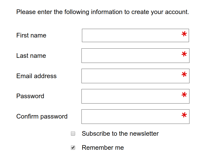
CSS grid is the way to do forms in 2019 as you can have your labels preceding your inputs without having extra divs, spans, spans with asterisks in and other relics.

Here is where we are going with minimal CSS:

Example screenshot

The HTML for the above:

<form action="https://www.example.com/register/" method="post" id="form-validate" enctype="multipart/form-data">
    <p class="form-instructions">Please enter the following information to create your account.</p>
    <label for="firstname">First name</label>
    <input type="text" id="firstname" name="firstname" value="" title="First name" maxlength="255" required="">
    <label for="lastname">Last name</label>
    <input type="text" id="lastname" name="lastname" value="" title="Last name" maxlength="255" required="">
    <label for="email_address">Email address</label>
    <input type="email" autocapitalize="off" autocorrect="off" spellcheck="false" name="email" id="email_address" value="" title="Email address" size="30" required="">
    <label for="password">Password</label>
    <input type="password" name="password" id="password" title="Password" required="">
    <label for="confirmation">Confirm password</label>
    <input type="password" name="confirmation" title="Confirm password" id="confirmation" required="">
    <input type="checkbox" name="is_subscribed" title="Subscribe to our newsletter" value="1" id="is_subscribed" class="checkbox">
    <label for="is_subscribed">Subscribe to the newsletter</label>
    <input type="checkbox" name="persistent_remember_me" id="remember_meGCJiRe0GbJ" checked="checked" title="Remember me">
    <label for="remember_meGCJiRe0GbJ">Remember me</label>
    <p class="required">* Required</p>
    <button type="submit" title="Register">Register</button>
</form>

Placeholder text can be added too and is highly recommended. (I am just answering this mid-form).

Now for the CSS variables:

--icon-required: url('data:image/svg+xml,\
<svg xmlns="http://www.w3.org/2000/svg" width="100" height="100" viewBox="-10 -6 16 16"> \
  <line id="line" y1="-3" y2="3" stroke="%23df0000" stroke-linecap="butt" transform="rotate(15)"></line> \
  <line id="line" y1="-3" y2="3" stroke="%23df0000" stroke-linecap="butt" transform="rotate(75)"></line> \
  <line id="line" y1="-3" y2="3" stroke="%23df0000" stroke-linecap="butt" transform="rotate(-45)"></line> \
</svg>');

--icon-tick: url('data:image/svg+xml,\
<svg xmlns="http://www.w3.org/2000/svg" xmlns:xlink="http://www.w3.org/1999/xlink" width="100" height="100" viewBox="-2 -2 16 16"> \
            <path fill="green" stroke-linejoin="round" d="M2 6L1 7l3 4 7-10h-1L4 8z"/> \
</svg>');

The CSS for the form elements:

input[type=text][required],
input[type=email][required],
input[type=password][required],
input[type=tel][required] {
    background-image: var(--icon-required);
    background-position-x: right;
    background-repeat: no-repeat;
    background-size: contain;
}

input:valid {
    --icon-required: var(--icon-tick);
}

The form itself should be in CSS grid:

form {
    align-items: center;
    display: grid;
    grid-gap: var(--form-grid-gap);
    grid-template-columns: var(--form-grid-template-columns);
    margin: auto;
}

The values for the columns can be set to 1fr auto or 1fr with anything such as <p> tags in the form set to span 1/-1. You change the variables in your media queries so that you have the input boxes going full width on mobile and as per above on desktop. You can also change your grid gap on mobile if you wish by using the CSS variables approach.

When the boxes are valid then you should get a green tick instead of the asterisk.

The SVG in CSS is a way of saving the browser from having to do a round trip to the server to get an image of the asterisk. In this way you can fine tune the asterisks, the examples here are at an unusual angle, you can edit this out as the SVG icon above is entirely readable. The viewbox can also be amended to place the asterisk above or below the centre.

Henry's Cat
  • 796
  • 12
  • 9
5

Use jQuery and CSS

jQuery(document).ready(function() {
 jQuery("[required]").after("<span class='required'>*</span>");
});
.required {
    position: absolute;
    margin-left: -10px;
    color: #FB0000;
    font-size: 15px;
}
<script src="https://ajax.googleapis.com/ajax/libs/jquery/2.1.1/jquery.min.js"></script>
<input type="text" value="xxx" required>
Falah
  • 191
  • 3
  • 9
5

I think this is the efficient way to do, why so much headache

    <div class="full-row">
     <label for="email-id">Email Address<span style="color:red">*</span></label>
  <input type="email" id="email-id" name="email-id"  ng-model="user.email" >
    </div> 
user2903536
  • 1,716
  • 18
  • 25
  • 1
    Note the span is applied to the label tag and not the input tag. If appled to the input tag, the red asterisk drops to the next line - which is not what most devs would want – MarcoZen Aug 07 '17 at 05:56
4

If you are using "floating labels" (like https://css-tricks.com/float-labels-css/ or https://dev.to/adrianbdesigns/let-s-create-a-floating-label-input-with-html-and-css-only-4mo8) then you can use this:

input[required]+label:after {
    content: '*';
    color: red;
}

Easy, no images, will not be lost in user's eyes. Theoretically, you can padd the :after as well, if you want some spacing between label and the asterisk. You can also use :before instead of :after if you like.

Simbiat
  • 339
  • 2
  • 12
4

if you have a label with the field name inside some tag with the required attribute, a common scenario in angular forms that add this attribute automatically to required fields

[required] label::after {
  content: '*';
  font-size: 24px;
  line-height: 0;
  vertical-align: middle;
}
David Lopes
  • 227
  • 2
  • 10
2

.asterisc {
  display: block;
  color: red;
  margin: -19px 185px;
}
<input style="width:200px">
<span class="asterisc">*</span>
Vitaly Zdanevich
  • 13,032
  • 8
  • 47
  • 81
2

There can be a lot of possibilities. You can reverse flex-direction and use the attribute required of your input like follows:

fieldset {
    border: none;
    padding: 0;
    display: flex;
    flex-direction: column-reverse;
}
fieldset p {
    margin-bottom: 4px;
}
fieldset input[required] ~ p:after {
    content: '*';
    color: red;
    font-size: 12px;
    margin-left: 4px;
}
<form>
    <fieldset>
        <input type="text" placeholder="Severus" name="first_name" required />
        <p>First Name</p>
    </fieldset>
    <fieldset>
        <input type="text" placeholder="Snape" name="last_name" />
        <p>Last Name</p>
    </fieldset>
</form>
2

Solution for 2023:

Adds a * to any label that comes immediately before a required input:

label:has(+ input:required):after {
  content: ' *';
  color: red;
}
<label>label for optional</label>
<input>

<label>label for required</label>
<input required>
danday74
  • 52,471
  • 49
  • 232
  • 283
0

This example puts an asterisk symbol in front of a label to denote that particular input as a required field. I set the CSS properties using % and em to makesure my webpage is responsive. You could use px or other absolute units if you want to.

#name {
   display: inline-block;
   margin-left: 40%;
   font-size:25px;
    
}
.nameinput{
   margin-left: 10px;
   font-size:90%;
   width: 17em;
   
}

.nameinput::placeholder {
  font-size: 0.7em;
  vertical-align: middle;
}

#name p{
   margin:0;
   border:0;
   padding:0;
   display:inline-block;
   font-size: 40%;
   vertical-align: super;
}
<label id="name" value="name">
<p>*</p> 
Name:  <input class="nameinput" type="text" placeholder="Enter your name" required>
</label>
0

What you need is :required selector - it will select all fields with 'required' attribute (so no need to add any additional classes). Then - style inputs according to your needs. You can use ':after' selector and add asterisk in the way suggested among other answers

Skiff
  • 123
  • 1
  • 2
-1

You can achieve the desired result by encapsulating the HTML code in a div tag which contains the "required' class followed by the "form-group" class. *however this works only if you have Bootstrap.

<div class="form-group required">
    <div class="required">
        <label>Name:</label>
        <input type="text">
    </div>
  <div>
-2

For those who end up here, but have jQuery:

// javascript / jQuery
$("label.required").append('<span class="red-star"> *</span>')

// css
.red-star { color: red; }
Andy Hayden
  • 359,921
  • 101
  • 625
  • 535
-2

Simple & Short

<label>Name:<span class="required">*</span></label>

.required {
    color: red;
  }
Yash D.
  • 15
  • 1
  • 3
    The original post required the answer to be pure-CSS. Adding the `*` in the HTML potentially means many changes in many forms instead of just one line in the CSS. – Peter Krebs Mar 03 '21 at 12:48