Any style for input affects every input element. Is there a way to specify styling to apply for only checkboxes without applying a class to each check box element?
Asked
Active
Viewed 5.3e+01k times
11 Answers
401
With CSS 2 you can do this:
input[type='checkbox'] { ... }
This should be pretty widely supported by now. See support for browsers
isherwood
- 58,414
- 16
- 114
- 157
Andrew Hare
- 344,730
- 71
- 640
- 635
-
20I believe IE 7 and greater support attribute selectors, which are actually CSS 2.1. http://www.quirksmode.org/css/contents.html – TJ L Jul 13 '09 at 17:27
-
2@realtebo: Note many styles (border, background, etc) cannot be applied directly to HTML checkboxes. – Roy Tinker Apr 09 '15 at 23:06
-
1@RoyTinker You would use `outline`, not `border`, for checkboxes. – TylerH Jul 07 '15 at 20:35
63
I create my own solution without label
input[type=checkbox] {
         position: relative;
        cursor: pointer;
    }
    input[type=checkbox]:before {
         content: "";
         display: block;
         position: absolute;
         width: 16px;
         height: 16px;
         top: 0;
         left: 0;
         border: 2px solid #555555;
         border-radius: 3px;
         background-color: white;
}
    input[type=checkbox]:checked:after {
         content: "";
         display: block;
         width: 5px;
         height: 10px;
         border: solid black;
         border-width: 0 2px 2px 0;
         -webkit-transform: rotate(45deg);
         -ms-transform: rotate(45deg);
         transform: rotate(45deg);
         position: absolute;
         top: 2px;
         left: 6px;
}
<input type="checkbox" name="a">
<input type="checkbox" name="a">
<input type="checkbox" name="a">
<input type="checkbox" name="a">input[type=checkbox] {
position: relative;
cursor: pointer;
}
input[type=checkbox]:before {
content: "";
display: block;
position: absolute;
width: 20px;
height: 20px;
top: 0;
left: 0;
background-color:#e9e9e9;
}
input[type=checkbox]:checked:before {
content: "";
display: block;
position: absolute;
width: 20px;
height: 20px;
top: 0;
left: 0;
background-color:#1E80EF;
}
input[type=checkbox]:checked:after {
content: "";
display: block;
width: 5px;
height: 10px;
border: solid white;
border-width: 0 2px 2px 0;
-webkit-transform: rotate(45deg);
-ms-transform: rotate(45deg);
transform: rotate(45deg);
position: absolute;
top: 2px;
left: 6px;
}<input type="checkbox" name="a">
<input type="checkbox" name="a">
<input type="checkbox" name="a">
<input type="checkbox" name="a">
Cenk YAGMUR
- 3,154
- 2
- 26
- 42
-
How to do with the gray background as in this image (https://i.stack.imgur.com/Q23fy.png), if you can look at my post (https://pt.stackoverflow.com/questions/436890/estilizar-checkbox). Thanks. – Tiago Feb 21 '20 at 22:48
-
-
2After hours of searching and testing this is the only thing that worked for me. Thanks! – Mark May 14 '20 at 17:52
-
2
-
-
25
Something I recently discovered for styling Radio Buttons AND Checkboxes. Before, I had to use jQuery and other things. But this is stupidly simple.
input[type=radio] {
    padding-left:5px;
    padding-right:5px;
    border-radius:15px;

    -webkit-appearance:button;

    border: double 2px #00F;

    background-color:#0b0095;
    color:#FFF;
    white-space: nowrap;
    overflow:hidden;

    width:15px;
    height:15px;
}

input[type=radio]:checked {
    background-color:#000;
    border-left-color:#06F;
    border-right-color:#06F;
}

input[type=radio]:hover {
    box-shadow:0px 0px 10px #1300ff;
}
You can do the same for a checkbox, obviously change the input[type=radio] to input[type=checkbox] and change border-radius:15px; to border-radius:4px;.
Hope this is somewhat useful to you.
-
-
1If you want to apply your own styling to a checkbox/input, [checkout my blogpost about custom input elements via CSS](http://blog.felixhagspiel.de/index.php/posts/custom-inputs). Then you can style it however you want with CSS only, including an IE8 fallback. – Felix Hagspiel Jan 03 '15 at 19:50
8
Thanks to everyone who contributed to this post. Take a look at just what I was able to accomplish using pure CSS.
input[type=checkbox] {
  position: absolute;
  cursor: pointer;
  width: 0px;
  height: 0px;
}

input[type=checkbox]:checked:before {
      content: "";
  display: block;
  position: absolute;
  width: 34px;
  height: 34px;
  border: 4px solid #FFCB9A;
  border-radius: 20px;
  background-color: #445768;
  transition: all 0.2s linear;
}


input[type=checkbox]:before {
  content: "";
  display: block;
  position: absolute;
  width: 34px;
  height: 34px;
  border: 4px solid #FFCB9A;
  border-radius: 3px;
  background-color: #445768;
}


input[type=checkbox]:after {
  content: "";
  display: block;
  width: 0px;
  height: 0px;
  border: solid #FFCB9A;
  border-width: 0 0px 0px 0;
  -webkit-transform: rotate(180deg);
  -ms-transform: rotate(180deg);
  transform: rotate(180deg);
  position: absolute;
  top: 0px;
  left: 50px;
  transition: all 0.2s linear;
}

input[type=checkbox]:checked:after {
  content: "";
  display: block;
  width: 12px;
  height: 21px;
  border: solid #FFCB9A;
  border-width: 0 5px 5px 0;
  -webkit-transform: rotate(45deg);
  -ms-transform: rotate(45deg);
  transform: rotate(45deg);
  position: absolute;
  top: 2px;
  left: 14px;
}
<input type="checkbox">SUMMARY
So the following controls the actual checkbox which we've hidden by adding h:0 & w:0.
input[type=checkbox] {...}
And the rest controls the virtual checkbox.
This controls the virtual checkbox's background when CHECKED.
input[type=checkbox]:checked:before {...}
This controls the virtual checkbox's background when UNCHECKED.
input[type=checkbox]:before {...}
This controls the virtual checkbox's foreground when UNCHECKED.
input[type=checkbox]:after {...}
This controls the virtual checkbox's foreground when CHECKED.
input[type=checkbox]:checked:after {...}
I really hope it helps you as much as it helped me :)
Errorising
- 113
- 2
- 7
-
This solution seems to work only in chromium based browsers. In Firefox the checkbox has still the default design. [JSFiddle](https://jsfiddle.net/42oxtr3e/) – CodyKL May 07 '21 at 04:43
-
8
Classes also work well, such as:
<style>
  form input .checkbox
  {
    /* your checkbox styling */
  }
</style>

<form>
  <input class="checkbox" type="checkbox" />
</form>
Jim Fell
- 13,750
- 36
- 127
- 202
-
It's probably not necessary to nest the .checkbox inside form because you're unlikely to find a checkbox outside of an form. Also input .checkbox should be input.checkbox – Duncan Walker Mar 07 '14 at 16:42
-
@DuncanWalker I haven't tested it, but wouldn't the `form` tags be necessary to tie the input control to a default submit control? – Jim Fell Jun 01 '16 at 20:25
-
1@Jim Fell this does not work. If I create two different classes for two different styled checkboxes i.e. .checkbox1 [input='checkbox'] and .checkbox2[input='checkbox'], the styles always will effect both regardless..how do you ensure stylings are separate? – Krys Jul 20 '16 at 07:25
-
4
input[type="checkbox"] {
 /* your style */
}
But this will only work for browsers except IE7 and below, for those you will have to use a class.
cdm9002
- 1,930
- 1
- 15
- 15
-
_below_ IE7 it is, IE7 itself is fine with selectors. Tested and see here: http://kimblim.dk/css-tests/selectors/ – Frank N Aug 14 '13 at 09:42
4
Trident provides the ::-ms-check pseudo-element for checkbox and radio button controls. For example:
<input type="checkbox">
<input type="radio">

::-ms-check {
    color: red;
    background: black;
    padding: 1em;
}
This displays as follows in IE10 on Windows 8:

Anselm
- 7,450
- 3
- 28
- 37
3
Although CSS does provide a way for you to do the style specific to the checkbox type or another type, there are going to be problems with browsers that do not support this.
I think your only option in this case is going to be to apply classes to your checkboxes.
just add the class="checkbox" to your checkboxes.
Then create that style in your css code.
One thing you could do is this:
main.css
input[type="checkbox"] { /* css code here */ }
ie.css
.checkbox{ /* css code here for ie */ }
Then use the IE specific css include:
<!--[if lt IE 7]>
   <link rel="stylesheet" type="text/css" href="ie.css" />
<![endif]-->
You will still need to add the class for it to work in IE, and it will not work in other non-IE browsers that do not support IE. But it will make your website forward-thinking with css code and as IE gets support, you will be able to remove the ie specific css code and also the css classes from the checkboxes.
Jamie Taylor
- 4,709
- 5
- 44
- 66
Brian
- 2,191
- 3
- 20
- 30
-
thanks for the tip about the 2 style sheet. although im trying to avoid that kind of thing i think i will just create a style for the check box and thats it... – Jul 13 '09 at 17:34
2
As IE6 doesn't understand attribute selectors, you can combine a script only seen by IE6 (with conditional comments) and jQuery or IE7.js by Dean Edwards.
IE7(.js) is a JavaScript library to make Microsoft Internet Explorer behave like a standards-compliant browser. It fixes many HTML and CSS issues and makes transparent PNG work correctly under IE5 and IE6.
The choice of using classes or jQuery or IE7.js depends on your likes and dislikes and your other needs (maybe PNG-24 transparency throughout your site without having to rely on PNG-8 with complete transparency that fallbacks to 1-bit transparency on IE6 - only created by Fireworks and pngnq, etc)
FelipeAls
- 21,711
- 8
- 54
- 74
1
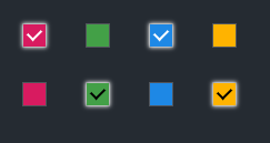
You can apply your style to checkbox input by using this selector:
input[type='checkbox']{}
but unfortunately, it does not support custom style so you can use "after" and "before" in order to cover the original input: See the: Demo
HTML
 <input
    type="checkbox"
    style="background-color: #d81b60; color: #fff"
    name="checkboxGreen"
  />
CSS
input[type='checkbox'] {
      position: relative;
      cursor: pointer;
      margin: 20px;
 }
 input[type='checkbox']:before {
      content: '';
      display: block;
      position: absolute;
      width: 20px;
      height: 20px;
      top: 50%;
      left: 50%;
      background-color: inherit;
      outline: 1px rgba(255, 255, 255, 0.2) solid;
      transform: translate(-50%, -50%);
 }
 input[type='checkbox']:checked:before {
      content: '';
      display: block;
      position: absolute;
      width: 20px;
      height: 20px;
      top: 50%;
      left: 50%;
      background-color: inherit;
      outline: 1px rgba(255, 255, 255, 0.2) solid;
      transform: translate(-50%, -50%);
      box-shadow: 0px 0px 4px 1px #fff;
 }
 input[type='checkbox']:checked:after {
      content: '';
      display: block;
      width: 6px;
      height: 10px;
      border: solid;
      border-width: 0 2px 2px 0;
      border-color: inherit;
      position: absolute;
      top: 35%;
      left: 50%;
      transform: translate(-50%, -50%) rotate(45deg);
 }
The result:
Yaseen
- 598
- 6
- 7