5

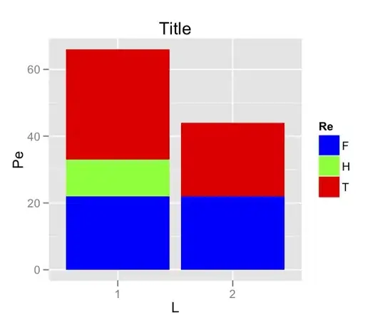
Consider the following data frame:

x = read.table(text = 'Lo Re Pe
1 T 33
1 F 22
1 H 11
2 T 22
2 F 22', header = TRUE)

and the following plot:

qplot(factor(Lo), data=x, geom='bar', fill=Re, weight=Pe, 
      xlab='L', main='Title', ylab='Pe')

Now consider this data frame:

x <- read.table(text = 'Lo Re Pe
1 D 33
1 K 22
2 D 22
2 K 22', header=TRUE)

with the same qplot statement.

The colors assigned to each Re value are not consistent between the plots, so it is difficult to compare the plots directly.

How do I specify that Re value T should always be "Red", for example, and that Re value F should always be "Blue", for example, so that the qplot command always uses consistent colors for each Re value, regardless of the contents of the data frame? There are a finite and known number of values for Re, so I could specify them all.

I tried the following when the data frame contained values T, F and H:

qplot(factor(Lo), data=x, geom='bar', fill=Re, weight=Pe, 
      xlab='Loci', main='Title', ylab='Pe', 
      scale_fill_manual(values=c("Blue","Red","Green"),labels=c("T","F","H")))

but R reports an error about incorrect length and does not produce a plot.

The solution would ideally allow me to specify colors for all possible values of Re, even though all of these may not be present in the data frame.

joran
  • 169,992
  • 32
  • 429
  • 468
SabreWolfy
  • 5,392
  • 11
  • 50
  • 73
  • Maybe you want to provide us with a reproducible example? http://stackoverflow.com/questions/5963269/how-to-make-a-great-r-reproducible-example – Roman Luštrik Jul 06 '12 at 13:01
  • @RomanLuštrik: Done. Reworked question completely. – SabreWolfy Jul 06 '12 at 13:13
  • 2
    I think this will work OK if you just make sure to use factors with the same levels and `scale_colour_discrete(drop=FALSE)` – Ben Bolker Jul 06 '12 at 13:32
  • @BenBolker: I'd like to use the same `qplot` statement regardless of the contents of the data frame, so the `qplot` would have to list the color for each of the possible values of `Re`. – SabreWolfy Jul 06 '12 at 13:40
  • Ben is right. You don't need to specify the palette. The colours will be unique and consistent as long as `x$Re` is defined with the whole list of levels each time. – RobinGower Jul 06 '12 at 13:51
  • But `x$Re` is different each time the plot is run depending on the input data. Where/how do I include the other `Re` values if there are no data for them? And I wouldn't want the non-existent values to appear in the legend. – SabreWolfy Jul 06 '12 at 13:53
  • Not wanting the non-existent values to appear in the legend makes the problem a lot harder. If you're not worried about that you can just say (e.g.) `x$Re <- factor(x$Re,levels=c("T","F","H","D","K"))` and use `scale_colour_discrete(drop=FALSE)` – Ben Bolker Jul 06 '12 at 14:09
  • I just want to be able to compare different runs of the `qplot` with different data, such that "T" in one run always has the same color as "T" in the second run. – SabreWolfy Jul 06 '12 at 14:12

1 Answers1

6

This is perfectly possible using the modular nature of ggplot. I'm going to recommend that you drop qplot, though, and switch to using ggplot(). It will cost you nothing and will be more convenient in the long run, as it is more suited to doing "complicated" things.

Let's start with your two data sets:

x1 = read.table(text = 'Lo Re Pe
1 T 33
1 F 22
1 H 11
2 T 22
2 F 22', header = TRUE)

x2 <- read.table(text = 'Lo Re Pe
1 D 33
1 K 22
2 D 22
2 K 22', header=TRUE)

Now here's your first plot, but translated into ggplot():

p <- ggplot(x1,aes(x = factor(Lo))) + 
        geom_bar(aes(fill = Re,weight = Pe)) + 
        labs(x = 'L',y = 'Pe') + 
        opts(title = 'Title')

To keep the color consistent across plots, and to prevent unused colors from appearing in the legend, we will simply create a master color key, and pass only the needed subset of it to our scale:

color_key <- c('red','blue','green','black','orange')
#If Re is a character variable:
names(color_key) <- unique(c(x1$Re,x2$Re))
#If Re is a factor:
names(color_key) <- unique(c(as.character(x1$Re),as.character(x2$Re)))

(You could also do something similar using the levels function, but I wanted to guard against including levels that do not appear in the data set.)

Obviously, you can choose whatever colors you like. Now I can customize the fill scale for our plot p by passing only that segment of color_key that is relevant to scale_fill_manual:

p + scale_fill_manual(values = color_key[names(color_key) %in% x1$Re])

enter image description here

Additionally, if your plots all really do have the same structure, we don't even need to replicate the ggplot call over and over. We can simply apply our plot p to a new data set:

p1 <- p %+% x2

And then add the fill scale in the same manner:

p1 + scale_fill_manual(values = color_key[names(color_key) %in% x2$Re])

enter image description here

Finally, let's mix and match ourselves a new data set:

x3 <- rbind(x1[1:2,],x2[3:4,])

Same process works again:

p3 <- p %+% x3
p3 + scale_fill_manual(values = color_key[names(color_key) %in% x3$Re])

enter image description here

joran
  • 169,992
  • 32
  • 429
  • 468
  • Thanks for the detailed answer. I am working through it now. The line starting with `p + scale_fill_manual` gives error `Error: Insufficient values in manual scale. 3 needed but only 0 provided.` and no plot. – SabreWolfy Jul 06 '12 at 14:46
  • @SabreWolfy You may not have run the code in my post _exactly_ as it appears, because it all runs fine for me. Run each piece in sequence (including generating `x1` and `x2`) and check that each had run correctly. – joran Jul 06 '12 at 14:52
  • Yes, I have done that :) I copied and pasted each section in order. The `unique` command is only returning 3 values. I'm trying to find out why now. – SabreWolfy Jul 06 '12 at 14:53
  • @SabreWolfy It's probably because your versions of the `Re` variables are factors, not characters. I'll edit with an adjustment momentarily. – joran Jul 06 '12 at 14:55
  • Thanks. I tried `as.character`, but in the wrong place :) Your edit has resolved this. – SabreWolfy Jul 06 '12 at 14:59
  • One more question: please point me in the right direction to read about the `%+%` operator. It's hard to search for these characters. – SabreWolfy Jul 06 '12 at 15:02
  • ?'%+%' but there currently aren't any examples there. It only does one thing really, "add" a new data frame to an existing plot object, recreating the plot with the new data frame. – joran Jul 06 '12 at 15:04
  • Ok, thanks. Didn't have the quotes around it when I tried with `?` :) – SabreWolfy Jul 06 '12 at 15:06