19

Any suggestions on how improve the resolution on the geom_text so that the resolution is comparable to that of the axis labels? Thanks

df <- data.frame("x" = c(1,2,3,4),"y" = c(15,19,35,47))

p<-ggplot(df,aes(x,y))
p<- p + geom_point(size=1)

p<- p + geom_smooth(method="lm", se=FALSE, formula=y~x)
p<- p + xlab("Better Resolution")
p<- p +ylab("Better Resolution")

p<- p +opts(axis.title.x = theme_text(family="Times",face="bold", size=25, colour = "Black",vjust=0)) 

p<- p +opts(axis.title.y = theme_text(family="Times",face="bold", size=25, angle =90, colour ="Black",vjust=0.4))

p<- p + geom_text(aes(x = 3.5, y = 37, label ="123456789"),size=12, parse = TRUE)
p

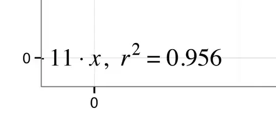
#The zoomed in text looks like this after saving using ggsave

enter image description here

#Information about my version of R and OS

sessionInfo()
R version 2.15.1 (2012-06-22)
Platform: x86_64-apple-darwin9.8.0/x86_64 (64-bit)

R.version
           _                            
platform       x86_64-apple-darwin9.8.0     
arch           x86_64                       
os             darwin9.8.0                  
system         x86_64, darwin9.8.0          
status                                      
major          2                            
minor          15.1                         
year           2012                         
month          06                           
day            22                           
svn rev        59600                        
language       R                            
version.string R version 2.15.1 (2012-06-22)
nickname       Roasted Marshmallows  

##############
#The actual code I am using looks like this:

#function that creates the line equation
lm_eqn = function(df){
m = lm(y ~ x, df)
eq <- substitute(italic(y) == a + b %.% italic(x)*","~~italic(r)^2~"="~r2,
list(a = format(coef(m)[1], digits = 2),
b = format(coef(m)[2], digits = 2),
r2 = format(summary(m)$r.squared, digits = 3)))
as.character(as.expression(eq))
}


#creates basic plot and adds a line
p<-ggplot(df, aes(x,y))
p<- p + geom_point(alpha=1/10, colour="blue", size=5)

#controls background colours
p<-p + theme_bw()

#adds the labels, titles and makes them pretty

p<- p + geom_smooth(method="lm", se=FALSE, formula=y~x,colour="black")
p<- p + xlab("Species similarity for site pair (Tsim variable 'a')")
p<- p +ylab("Trait similarity for site pairs (Tsim)")
p<- p +opts(title="Species vs. Trait combination similarity 2-5m")
p<- p +opts(plot.title = theme_text(family="Times",face="bold", size=18, colour =   "Black",vjust=1)) 
p<- p +opts(axis.title.x = theme_text(family="Times",face="bold", size=15, colour = "Black",vjust=0)) 
p<- p +opts(axis.title.y = theme_text(family="Times",face="bold", size=15, angle =90, colour =  "Black",vjust=0.4))

#adds the equation
p<- p + geom_text(aes(x = 0.015, y = 0.08, label = lm_eqn(df)),size=6,  family="Times",face="italic", parse = TRUE)

ggsave(p,file="tsim.a.0-2.pdf") 
Elizabeth
  • 6,391
  • 17
  • 62
  • 90
  • 4
    you're probably plotting multiple times the same text labels. Try using `annotate` instead, or give a data to the last layer. – baptiste Jul 21 '12 at 22:48
  • I don't see much of a difference between the two when I plot them. (And I'm pretty sure they aren't plotting it multiple times, @baptiste) – joran Jul 21 '12 at 22:56
  • i don't see any difference either, but the operating system might be to blame for not doing antialiasing. – baptiste Jul 21 '12 at 23:22
  • Thanks for having a look! I am going to have to disagree with you though @joran the resolution is definitely worse. It is perhaps more prominent when using numbers. I am using geom_text to add an equation describing the line and it looks sloppy. I will change the example text to numbers to show you what I mean – Elizabeth Jul 21 '12 at 23:30
  • @baptiste I am on Mac OS X version 10.7.4. What do you mean by antialiasing? Thanks – Elizabeth Jul 21 '12 at 23:34
  • can you check you're running the latest version of R and ggplot2? Also, a picture illustrating the problem would help - I don't see anything unusual. – baptiste Jul 22 '12 at 00:30
  • I _might_, _kind of_ see a very slight difference when viewed in a Quartz device, but when I save it to file in a pdf or png and blow it up, I literally see zero difference in resolution. – joran Jul 22 '12 at 04:11
  • do you see the problem on other devices, e.g png? It might be a pdf viewer oddity. – baptiste Jul 22 '12 at 20:59

3 Answers3

15

Why don't you save the onscreen plot using ggsave. What you see on-screen may not necessarily be what will render in output graphics using the pdf or ps devices. I did not see any problems using your un-edited code with R2.15.1 on Windows 7 using ggplot 0.9.1.

I saved your on-screen plot using ggsave and zoomed right in and the pdf looks great:

Zoom of geom_text rendering

Use ggsave("plot.pdf") (there are several other optional arguments you can set, including saving as eps). This will save the last plot (by default) to the current working directory. Examine the plot. If the text still looks funny I would suggest that there might be something wrong with your Times font installation.

In which case you should try this omitting the font specification so R selects it's default font family.

You should also swicth to theme instead of opts and element_text instead of theme_text (at present!).

**EDIT**

Ok, I think I found the solution to your problem here thanks to kohske and mbask. Apparently better results can be acheived by creating a dataframe for your label and passing it to geom_text this way.

Try using:

df <- data.frame("x" = c(1,2,3,4),"y" = c(15,19,35,47))

lm_eqn = function(df){
m = lm(y ~ x, df)
eq <- substitute(italic(y) == a + b %.% italic(x)*","~~italic(r)^2~"="~r2,
list(a = format(coef(m)[1], digits = 2),
b = format(coef(m)[2], digits = 2),
r2 = format(summary(m)$r.squared, digits = 3)))
as.character(as.expression(eq))
}

### NEW ###
# Create a data frame to hold your label variables
data.label <- data.frame(
x = 0.015,
y = 0.08,
label = c(lm_eqn(df))
)

#creates basic plot and adds a line
p<-ggplot(df, aes(x,y))
p<- p + geom_point(alpha=1/10, colour="blue", size=5)

#controls background colours
p<-p + theme_bw()

#adds the labels, titles and makes them pretty

p<- p + geom_smooth(method="lm", se=FALSE, formula=y~x,colour="black")
p<- p + xlab("Species similarity for site pair (Tsim variable 'a')")
p<- p +ylab("Trait similarity for site pairs (Tsim)")
p<- p +opts(title="Species vs. Trait combination similarity 2-5m")
p<- p +opts(plot.title = theme_text(family="Times",face="bold", size=18, colour =   "Black",vjust=1)) 
p<- p +opts(axis.title.x = theme_text(family="Times",face="bold", size=15, colour = "Black",vjust=0)) 
p<- p +opts(axis.title.y = theme_text(family="Times",face="bold", size=15, angle =90, colour =  "Black",vjust=0.4))

### NEW
####   Change your call to geom_text ####
p<- p + geom_text(data = data.label, aes(x = x , y = y , label = label ) , size=6,  family="Times" , face="italic" , parse = TRUE)

ggsave(p,file="tsim.a.0-2.pdf") 

I got this on Mac OS X 10.7.4 and R 2.15.1:

Full size pdf

Zoom of equation annotation

Community
  • 1
  • 1
Simon O'Hanlon
  • 58,647
  • 14
  • 142
  • 184
  • Thanks for taking a look. I am using ggsave but my resolution is far worse than your screenshot. I included in my question above the actual code I am using in addition to the simplified example in case there are any font conflicts within the code? My Times font looks fine on the axis labels and title. It is just what I add through geom_text that seems to have poor resolution. Any other ideas? Thanks for your time. – Elizabeth Jul 22 '12 at 09:48
  • @Elizabeth At this point, you're going to have to upload a PDF to demonstrate what's happening, because so far no one is able to reproduce what you describe. – joran Jul 22 '12 at 10:14
  • @joran Sure of course. Just added an image showing the problem. – Elizabeth Jul 22 '12 at 11:27
  • @Elizabeth What version of R are you using? Use `sessionInfo()` and `R.version` and paste the output. Also what version of ggplot2 (`packageVersion("ggplot2")`) are you using? Your plot rendered above looks markedly different from current ggplot2 defaults. – Simon O'Hanlon Jul 22 '12 at 11:43
  • @SimonO101 Just added the system details to the question. Thanks. – Elizabeth Jul 22 '12 at 11:54
  • @Elizabeth I can see what you mean using your actual code now. Although the output on my screen doesn't look nearly as bad as what you have posted. It does look _different_! I will have a play around this evening and see if I can be of any help. – Simon O'Hanlon Jul 22 '12 at 12:16
  • @Simono101. You're a star! Thanks for having a go at it. – Elizabeth Jul 22 '12 at 12:20
  • @Elizabeth Did the suggestion above help? – Simon O'Hanlon Jul 24 '12 at 13:25
  • @SimonO101 Thanks ever so much. Yes that resolved the issue and my dissertation may not look so bad after all...well not the graphs anyway(self-deprecation is my method of coping by the way) Thanks again! – Elizabeth Jul 24 '12 at 20:17
  • 1
    @Elizabeth If you're happy with the answer can you press the green tick so I can get my first accepted answer?! Thanks – Simon O'Hanlon Jul 24 '12 at 21:04
3

Using annotate() instead of geom_text() for single annotation on graph. Otherwise, ggplot() will try to draw the same text for each data point which results in weird resolution.

Ru Chern Chong
  • 3,692
  • 13
  • 33
  • 43
Ronnie Z
  • 31
  • 3
0

Echoing @RonnieZavata's answer above (which I think is the correct one for this question), geom_text can cause ggplot to write the same text multiple times in the same location, creating fuzzy-looking text in the output. However, using ggplot2::annotate(), which has similar syntax, allows you to print the annotation text only once, which makes the annotations as crisp as other text in the plot.

# load library
library(ggplot2)

# OP example up to adding text to plot
df <- data.frame("x" = c(1,2,3,4),"y" = c(15,19,35,47))

p <- ggplot(df, aes(x,y)) + 
  geom_point(size=1) +
  geom_smooth(method = "lm", se=FALSE, formula=y~x) + 
  xlab("Better Resolution") +
  ylab("Better Resolution")

# lousy resolution from geom_text

p + geom_text(aes(x = 3.5, y = 37, label ="123456789"),size=12, parse = TRUE)

# but fine resolution from `annotate()`
p + annotate("text", x = 3.5, y = 37, label ="123456789", size = 12)

It's interesting to me that in comments, some noted this might be specific to a particular OS or PDF viewer; Although the low resolution in the examples is apparent but subtle for me using Rstudio's graphics device, I searched this issue after running into a pretty extreme version of @Elizabeth's problem viewing a .pdf created with pdf() in Preview on macOS 12.5.

Michael Roswell
  • 1,300
  • 12
  • 31