3

I asked a question about making bubble charts in ggplot2 here.

My follow-up questions are:

1)how do I interprete the scale_size in the legend?

2) Does small dot (labeled 10) mean the data can be anything from 5-10? If the data for a particular point is 8, does scale_area function change the data point to 10 before it is presented as a dot size 10 on the graph.

3) is there a way to plot negative number on ggplot bubble chart? Some software can make the negative data a color bubble.

4) I tried to incorporate scale_area and scale_alpha but the legend shows 2 scales. I just want a combined one. How do I do that?

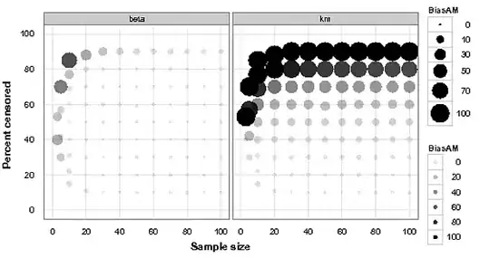
ggplot(dataset, aes(x = N, y = PctCens, size = BiasAM, alpha=BiasAM ,label = NULL)) +
geom_point(shape = 16) + 
scale_area(to = c(1, 10), breaks = c(0, 10, 30, 50, 70, 100)) +
scale_x_continuous("Sample size", limits = c(0, 100)) + 
scale_y_continuous("Percent censored", limits = c(0, 100)) +
facet_wrap(~Method,ncol=2) + 
theme_bw()+
opts(
panel.grid.minor = theme_blank(),
panel.background = theme_blank(),
axis.ticks = theme_blank(),
axis.title.x=theme_text(face='bold',vjust=0.2, size =12), 
axis.title.y=theme_text(face='bold',angle=90, vjust=0.2,size =12))

enter image description here

Community
  • 1
  • 1
Amateur
  • 1,247
  • 6
  • 20
  • 30
  • 1
    It's a continuous scale, so you'd interpret it the same way you'd interpret a continuous x or y axis. The dots shown in the legend are just like the axis tick marks on the x/y axis. – joran Jul 22 '12 at 22:55
  • Thank you Joran. I added a couple of questions too. – Amateur Jul 23 '12 at 00:10
  • 2
    As for negative values you could perhaps plot the absolute value as the size of the circle, and then use a bipolar color ramp, see examples on the [scale_gradient2](http://had.co.nz/ggplot2/scale_gradient2.html) page. – Andy W Jul 23 '12 at 12:28
  • Thanks Andy. Read it but haven't been able to figure it out how to do it though. Also I prefer to do it in grey scale for back and white printing. It would be more helpful to have the code though. – Amateur Jul 23 '12 at 17:02
  • 1
    Having the same scale for size and alpha sort of doesn't make sense. Then you can only have circle of size 100 and alpha 100, circle of size 70 and alpha 80. You lose one variable. Hence, you need two scales. – Roman Luštrik Jul 24 '12 at 13:39

1 Answers1

2

Here is how I ended up solving my problem with negative numbers in bubble chart.

The original BiasAM (called OrgBiasAM) variable has negative numbers so I took the absolute value of it and created a new variable called BiasAM which i used in the above code. To distinguish between the negative and positive numbers, I made a new categorical variable called BiasAMCat using ifelse statement

dataset$BiasAMCat <-ifelse(dataset$OrgBiasMA < 0, 'Negative', 'Positive')

The modified code is now:

ggplot(dataset, aes(x = N, y = PctCens, size = BiasAM, colour=factor(BiasAMCat) ,label =       NULL)) +
  geom_point(shape = 16) + 
  scale_area(to = c(1, 10), breaks = c(0, 10, 30, 50, 70, 100)) +
  scale_colour_manual(name=NULL, values=c('grey','black')) +  # for bw printing
  scale_x_continuous("Sample size", limits = c(0, 100)) + 
  scale_y_continuous("Percent censored", limits = c(0, 100)) +
  facet_wrap(~Method,ncol=2) + 
  theme_bw()+
  opts(
  panel.grid.minor = theme_blank(),
  panel.background = theme_blank(),
  axis.ticks = theme_blank(),
  axis.title.x=theme_text(face='bold',vjust=0.2, size =12), 
  axis.title.y=theme_text(face='bold',angle=90, vjust=0.2,size =12))

Note: If you like gradient color, you can use color_gradient as suggested by Andy W instead of scale_colour_manual.

Amateur
  • 1,247
  • 6
  • 20
  • 30