28

I'm currently working on a responsive design site prototype. So far so good, but for one really strange thing which I can only seem to reproduce in Chrome. When expanding the window, sometimes the browser seems to get trapped between states, showing duplicate elements, and two scrollbars - that is, until I click somewhere outside of the browser window, then everything gets redrawn and looks just fine. Screenshot:
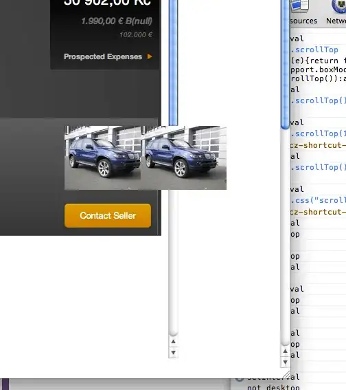
enter image description here

I've tried a plethora of "tricks" to get chrome to "re-jig" the interface programmatically, such as changing the padding of the body element, modifying the scrollY position, and about 10 or so others, but nothing seems to do the trick. Does anyone have any experience with this? Any advice?

Community
  • 1
  • 1
karim79
  • 339,989
  • 67
  • 413
  • 406
  • 4
    this must be mac specific issue, I don't see this on Windows or Linux. – Meitham Jul 24 '12 at 14:35
  • You know what, that might just be it. Good guess, that I'm using Mac. Still, I wonder if there's a way to force Chrome to redraw when this funkiness happens. – karim79 Jul 24 '12 at 14:36
  • I've never seen this issue on a mac, and I've worked on a number of responsive sites.. are you using the Chrome Stable channel or something else? (Dev/beta for eg) – Dan Smith Jul 24 '12 at 14:37
  • I'm using the idiot-proof stable channel: Version 20.0.1132.57 – karim79 Jul 24 '12 at 14:38
  • 3
    Might be worth checking another build, just to rule it out - the Chromium project iterates a lot and I've noticed strange behaviour like this crop up for a version or two and then disappear. – Dan Smith Jul 24 '12 at 14:39
  • Good idea - I'll look into that. Such a damn shame I can't just do something like `window.onresize = function () { Webkit.redraw() };` – karim79 Jul 24 '12 at 14:41
  • http://stackoverflow.com/questions/3485365/how-can-i-force-webkit-to-redraw-repaint-to-propagate-style-changes possibly? – Dan Smith Jul 24 '12 at 14:42
  • Hehe, been there already. In fact, have that open in another tab, but thanks :) – karim79 Jul 24 '12 at 14:42
  • Nuts :) I can't think of anything else short of some horrific page refresh hack, and no one wants that.. – Dan Smith Jul 24 '12 at 14:44
  • Refreshing the page is a no-go. Any hack other than that would make me happy, regardless of how evil or ugly it might be. – karim79 Jul 24 '12 at 14:46
  • I've seen this bug in a windows environment as well. Its edge case -only seems to happen in certain scenarios. – 1nfiniti Nov 08 '12 at 19:39
  • I can confirm this bug happens for a site I'm working on in Linux too. Any chance you're using Bootstrap @karim79 and @mikeyUX? I haven't seen this bug on many other sites (bug I don't randomly resize on a lot of other sites either)... – jlovison Jul 01 '13 at 09:08
  • I've seen similar issues on chrome/win7, but what I can remember only when I have the chrome devtools opened... and often when I resize the window and later move to another tab... – Johan Aug 16 '13 at 12:52
  • Are you using any type of debounce? – William Entriken Feb 21 '14 at 16:00
  • Is there any javascript in the background that changes any css? or are you using mostly media queries? I remember I had a very similar problem with a few of my elements (specifically in chrome and android) using window resize functions, which don't work if the (mobile) browser never changes size. – Grapho May 13 '14 at 16:08
  • Can you do us a [jsFiddle](http://jsfiddle.net) so we can see if it's possible to reproduce? – ArtOfCode May 13 '14 at 16:12
  • Setting up some code in codepen or jsfiddle. so we can test the problem – Timothy Nov 17 '14 at 01:51
  • i suspect that an event is not triggering correctly. – THE AMAZING Nov 19 '14 at 15:41
  • If this is only occasionally happening, I would check the extensions you have installed; I find that some of mine have bizarre and adverse effects on overall browser performance in Chrome. One prime example being, ironically, the Hangouts extension. – skybondsor Jan 29 '15 at 20:56
  • did you try using device screen size emulation from the inspector window? I find it quite usefull and less "buggy". – Jmorvan Feb 10 '15 at 16:19

5 Answers5

1

This looks like a bug in Chrome.

I searched Chromium bugs and found a few that are similar:

But actually none of them seems to describe your problem exactly. If you think so too, you can report your bug here.

Note that this might be as well an issue related to your old Mac OS version or even the graphics card.

mik01aj
  • 11,928
  • 15
  • 76
  • 119
0

Try adding this just after <head> tag

<meta name="viewport"
content="width=device-width, initial-scale=1, maximum-scale=1, user-scalable=no">    
Javed
  • 169
  • 1
  • 9
0

I had the same problem using cordova (hybrid html5/css3 mobile platform), when rotating the device the internal browser did not refresh correctly. I had a div containing everything with a fixed position. After some tries, I used style width/height: 100% and when rotating the browser refreshed correctly.

Manuel M
  • 21
  • 3
0

I second the suggestion to check plugins installed in case there's a conflict. Looking on Google's forums, the issue has arisen before and was scheduled for a bugfix. Noticed while reading there that they also removed the support for browser window resizing via javascript :/

Graham
  • 162
  • 1
  • 16
0

I'm guessing you have a retina display Mac and another external display connected? I see this sometimes on my setup and have tentatively narrowed it down to this situation. When using just the native screen I never see it and not in all screen configurations either.

Try and see if it happens when you use only the built in screen. If that works try switching which screen is the main screen or switch to another external screen altogether.

Sorry for the no fix, but maybe it will get you closer to a solution in your setup at least.