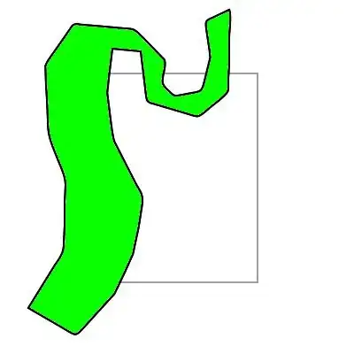
I am trying to create the following effect using a div and CSS3. To achieve the right side I used the border-radius property. Is there any way to make the border on the left concave?
Asked
Active
Viewed 5,066 times
4
-
3You cannot technically make it concave (as in put a negative border radius), but [the visual effect can be achieved as demonstrated in the answer to this question](http://stackoverflow.com/questions/10501488/css-3-shape-inverse-circle/10503105#10503105). – ScottS Jul 30 '12 at 19:55
-
3For the left part, simply include a white colored div with required border-radius, set it to overlap the div in question by absolute positioning, and include both within a wrapper div. – SexyBeast Jul 30 '12 at 20:02
-
@Cupidvogel--what you propose is essentially the same as my "Orginal Answer" in the link above (only I used a pseudo-element rather than an extra `div`). However, the revised answer in that link actually allows for that concave part to be _transparent_, which can be quite nice if there is something more than just a solid color behind the concave area. – ScottS Jul 30 '12 at 20:14
1 Answers
2
Are you looking for something like this?
Basically insert a second div using :before and give it a background color the same as the background behind the div. Here's the code simplified, the JSFiddle makes some attempts to match the shape of your image.
div {
    width: 100px;
    height: 80px;
    background: green;
    border-radius: 0 45px 45px 0;
}
div:before {
    content:"";
    width: 45px;
    height: 80px;
    background: #fff;
    border-radius: 0 45px 45px 0;
    position: absolute;
}
brentonstrine
- 21,694
- 25
- 74
- 120