9

I've been trying to figure out how to make a custom shape in CSS that visually will look like this:

shape with cut out edges and border

With the property of background:rgba(44, 44, 48, 0.9) and border:6px solid rgba(29, 30, 35, 0.9);

My problem is that I cannot find a way to make the top-right and bottom-left border look like the image I provided. Tried the tips on CSS Custom Shape on CSS-Tricks but it doesn't seem to solve the problem as it cannot have background. Any ideas?

web-tiki
  • 99,765
  • 32
  • 217
  • 249
deathlock
  • 2,756
  • 5
  • 27
  • 48

6 Answers6

7

If you think in 3d, you can use the perspective and rotateX() properties to alter only one or two angles of an element.

This will allow you to style pseudo elements of the container to give them the desired shape and cut out the top right and bottom left corners.

You can also give the desired borders to the shape, output :

CSS shape with cut out edges and border

Demo :

div {
  position: relative;
  width: 50%;
  height: 300px;
  margin: 10% auto;
  background: rgba(0, 0, 0, 0.7);
  border-top: 6px solid rgba(0, 0, 0, 0.8);
  border-bottom: 6px solid rgba(0, 0, 0, 0.8);
}
div:before,
div:after {
  content: '';
  position: absolute;
  top: -6px;
  width: 20%;
  height: 100%;
}
div:before {
  right: 100%;
  background: inherit;
  border-top: 6px solid rgba(0, 0, 0, 0.8);
  border-left: 6px solid rgba(0, 0, 0, 0.8);
  border-bottom: 6px solid rgba(0, 0, 0, 0.8);
  transform-origin: 100% 0;
  transform: perspective(1px) rotateY(-0.15deg);
}
div:after {
  left: 100%;
  border-top: 6px solid rgba(0, 0, 0, 0.8);
  border-right: 6px solid rgba(0, 0, 0, 0.8);
  border-bottom: 6px solid rgba(0, 0, 0, 0.8);
  border-left: none;
  background: inherit;
  transform-origin: 0 100%;
  transform: perspective(1px) rotateY(0.15deg);
}
<div></div>
web-tiki
  • 99,765
  • 32
  • 217
  • 249
4

You can create that shape by using only one element, with simple transforms and overflow: hidden; properties

You can add content in another element:

body {
    background: url(http://i.imgur.com/RT7XR3C.jpg);
    background-size: cover;
}
div {
    height: 200px;
    width: 300px;
    margin: 40px auto;
    overflow: hidden;
    position: relative;
}
div:before {
    content: '';
    position: absolute;
    left: -58px; /*-half buffer -left border*/
    height: 188px;
    width: 400px;
    background: rgba(30, 30, 30, 0.8);
    -webkit-transform: skewX(45deg);
    -moz-transform: skewX(45deg);
    transform: skewX(45deg);
    border-left: 8px solid #222;
    border-right: 8px solid #222;
    border-top: 6px solid #222;
    border-bottom: 6px solid #222;
}
div:after {
    content: '';
    position: absolute;
    top: 0;
    left: 0;
    height: 157px;
    width: 6px;
    background: #222;
    box-shadow:0 0 0 0 #222, 294px 43px 0 0 #222;
}
<div></div>

FIDDLE

Output:

enter image description here

The Pragmatick
  • 5,379
  • 27
  • 44
1

Unfortunately you cannot have a pseudo-element added to a pseudo-element (i.e. :after:after{} will not work) - with a complex shape like yours, you might have to cheat a little and rely on pseudo-elements of its children.

<div class="fancy-box">
    <h2>Title</h2>
    <p>Content</p>
</div>

.fancy-box{/*container, top+bottom borders*/}
.fancy-box:before{/*left-top "square" corner*/}
.fancy-box:after{/*right-bottom "square" corner*/}
.fancy-box>p:before{/*left-bottom "dog ear" border*/}
.fancy-box>p:after{/*right-top "dog ear" border*/}
.fancy-box>h2:before{{/*left-bottom "dog ear" background*/}
.fancy-box>h2:after{/*right-top "dog ear" background*/}

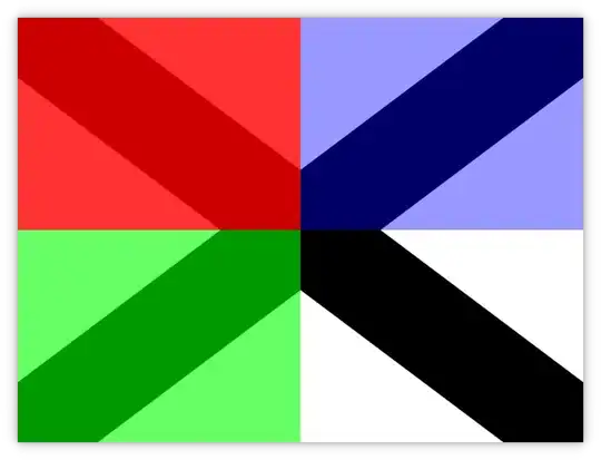
Again, this fiddle shows you how it would work with solid colors (reasonably well, although I don't like the "thinner" angles) - but this would fail when you apply opacity. Your best would probably be around having "dog ears" made into pre-rendered semitransparent PNGs, for extra credit you could base64-encode them.

The "solution" above is a complete semantic horror though - you may have better luck using multiple backgrounds with pre-rendered graphics.

Community
  • 1
  • 1
Oleg
  • 24,465
  • 8
  • 61
  • 91
  • After several tries, it seems this is indeed the closest as it can get. :s Really difficult to create this one. Thanks for the keypoints! – deathlock Oct 06 '12 at 03:09
0

Well, I think you need to use more than one elements..I can sort of achieve that shape with three elements and 2 pseudo elements.. Have a look at it here http://codepen.io/zwongso/pen/vgxdB

It's not exactly the same shape as your image, but you should get the idea..to get that border will be a bit tricky tho..

I'd like to know if anyone has a better solution..it's a bit non semantic to have 2 empty elements just for presentation purpose..

Zendy
  • 1,664
  • 1
  • 17
  • 24
0

An SVG background might be a good solution, although you might have some issues with support. See When can I use… SVG in CSS backgrounds. Also, they're tricky as anything to get working just right. If you do use an SVG background, definitely look into embedding it in your CSS as a Data URI (see fiddle, also heed warning in said fiddle :-p).

thirdender
  • 3,891
  • 2
  • 30
  • 33
0

With CSS3, you can use border-image to achieve this. I use an inline-svg here, but any image would work:

body {
  background: url(http://i.imgur.com/RT7XR3C.jpg);
  background-size: cover;
}
.fancy-box {
  border-width: 50px;
  border-image: url('data:image/svg+xml,<svg width="300" height="300" xmlns="http://www.w3.org/2000/svg" xmlns:svg="http://www.w3.org/2000/svg"><polygon stroke="rgba(29, 30, 35, 0.9)" stroke-width="6" fill="rgba(44, 44, 48, 0.9)" points="5,5 255,5 295,45 295,295 45,295 5,255 5,5"/></svg>') 50 50 repeat;
  background: rgba(44, 44, 48, 0.9);
  background-clip: content-box;
  /* other styling */
  color: #D7DBE1;
  text-align: justify;
  font-family: sans-serif;
  width: 400px;
  margin: 0 auto;
}
<div class="fancy-box">
  Lorem ipsum dolor sit amet, consectetur adipiscing elit. Vivamus nec interdum velit. Morbi quis leo ac ipsum volutpat imperdiet. Sed feugiat posuere nisl sit amet luctus.
</div>
chowey
  • 9,138
  • 6
  • 54
  • 84